Web Components Wednesday (WCW) blog series is created for two purposes: introducing easy-to-use components and educating people on the concept of Web Components. All the WCW blogs can be found here.
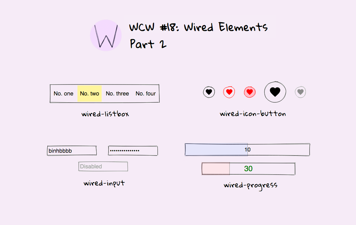
 In part 2, we shall unveil another part of the collection, which contains wired-listbox, wired-icon-button, wired-input, and wired-progress.
...
Note: Wired Elements enable focus ring automatically for accessibility purposes. Check this GitHub issue for more information. To disable it, add outline: none to the focus selector:
  wired-listbox:focus {
    outine: none;
  }
Wired-listbox

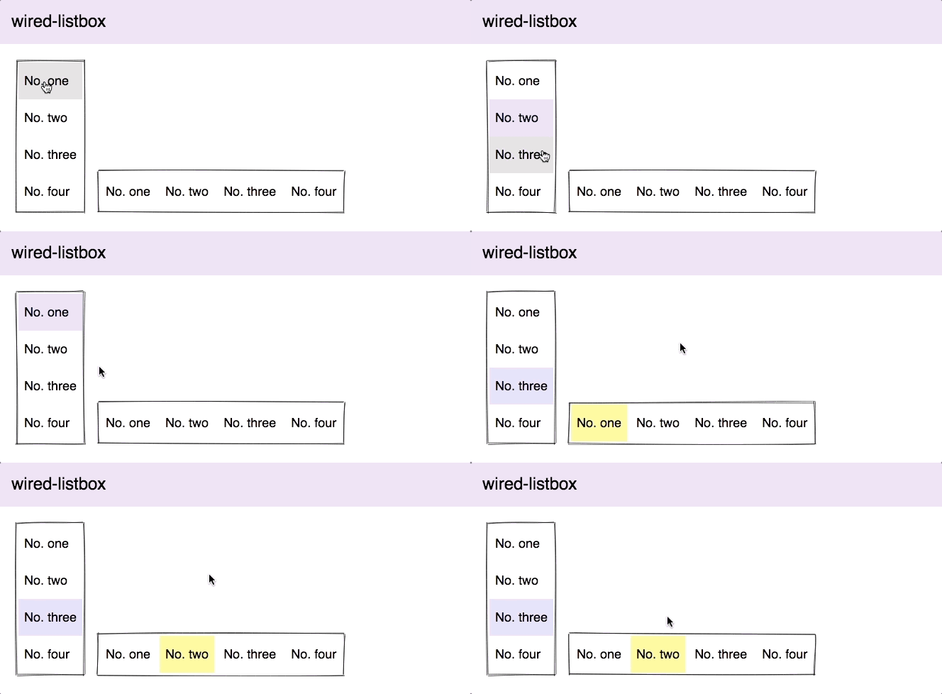
Wired-listbox utilizes the use of wired-items as its sub-items. You can set the text and the value of each option. By default, the layout direction is vertical, to make it appear horizontally, add the property horizontal. This component is great as a selection box or as a list of menu items.
Wired-icon-button

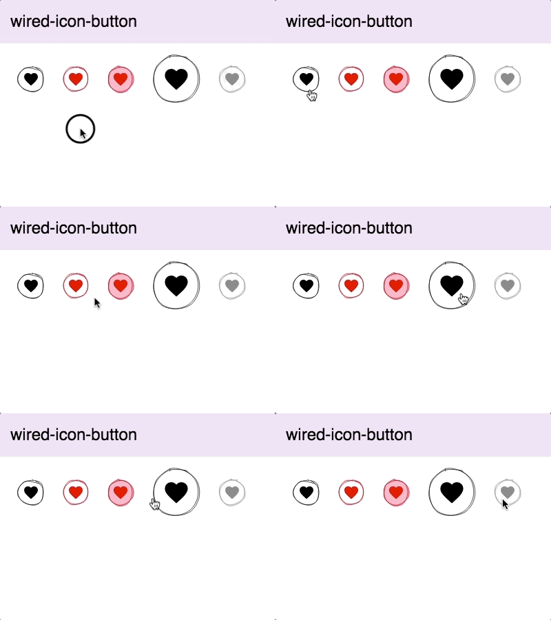
Wired-icon-button is all about customizations, from its size and colors to the icon inside. The component adopts the mwc-icon package, which is famous for its excellent Material Design icons collection. To use the custom figures, just put the name of the desired symbol inside the pair of tags. For more instructions for usage, check the demo.
Wired-input

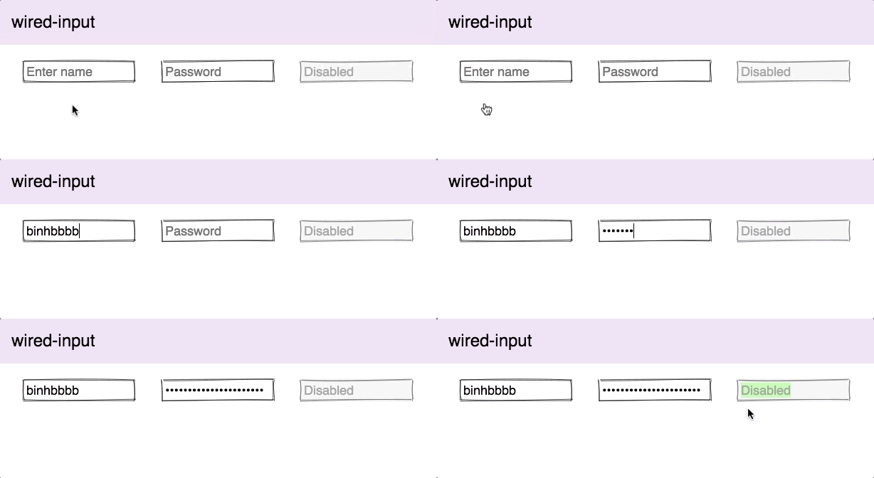
Wired-input can work both as a regular input or as a password input. It has a comprehensive list of properties to deal with data validations, which includes auto capitalization, minimum or maximum value (only for number type), minimum and maximum length, plus some more. It’s worth pointing out that the component is based on the native input elements and all the properties are native attributes, as well.
Wired-progress

Wired-progress can display the value in either numeric values or percentage. By default, the minimum amount is 0, while the maximum is 100, both being configurable. You can set the current progress manually or programmatically using the property value.
Compatibility table
The table below will shortly summarize the components’ info and compatibility on multiple platforms. None of the components are functioning properly in IE11.
| Component |
Library |
Mobile |
Browsers |
| wired-icon-button |
lit-element^0.5.2 |
✔ |
C,S,O,F |
| wired-input |
lit-element^0.5.2 |
✘ |
C,S,O,F,E |
| wired-listbox |
lit-element^0.5.2 |
✔ |
C,S,O,F,E |
| wired-progress |
lit-element^0.5.2 |
✔ |
C,S,O,F,E |
Final words
With these components, you can create great mock-ups, wireframes, or even illustrations for your next presentation.
Have you used Wired Elements before? How did you use it? Share your story below, and we might feature you in the next part.
...
That’s it for part 2. Next week, we will publish the final part of this series, featuring wired-radio & wired-radio-group, wired-toggle, wired-tooltip, and wired-slider. Stay tuned!
Click here for more awesome web components