
Web Components Wednesday (WCW) blog series is created for two purposes: introducing easy-to-use components and educating people on the concept of Web Components. All the WCW blogs can be found here.

Do you know that the first Thursday of May of each year is the World Password Day? The original idea of the day is to encourage better password practices and raise awareness for the vulnerability of online security. So, step up your game and add a password input to your application using these password-inputs components.
*Note: TLDR table can found at the bottom of the blog post
Gold-password-input by GeoloeG
GeoloeG team has contributed some components to the web components ecosystem, featuring some popular ones like iron-swipeable-pages and dom-repeat-n. Nonetheless, we will have gold-password-input as the protagonist today.
For styling, gold-password-input uses Material Design, which promises good UX. The strength meter is what makes this component unique; you can override the label as you wish (for example: Weak -> Weakness disgusts me, Strong -> Chuck Norris, etc.). Additionally, if you hover over the meter, some tips for a better password will show up.

You can also use the element <gold-password-input-validator> as a validator for <gold-password-input>.
  <!-- Validator -->
  <gold-password-input-validator pattern="[a-zA-Z0-9]*"></gold-password-input-validator>

  <!-- Remember to set the validator attribute to gold-password-input-validator -->
  <gold-password-input label='Only letters and digits' required auto-validate validator="gold-password-input-validator" error-message="The password must only contain letters and digits"></gold-password-input>
Mtz-update-password by MartizSTL
Developed by MartizSTL, mtz-update-password is the only one in the group to have a confirm password field. Mtz-update-password main task revolves around the password validations. Hence it has many properties for limiting the capacity of a specified field (uppercase letters, numbers, symbols and so on)
To make the authentication even stricter, you can configure it only to allow specific characters and symbols using allowed-characters and allowed-symbols. Those attributes will control which things can be typed in, and the input must be given in regex pattern.

Nonetheless, mtz-update-password needs to address two things in their next release. First, the position of the password error overlaps with the status section a bit. The second problem regards the validation of special symbols: numeric input is counted as a symbol, which should not happen.
Overall, this element is designed to facilitate the users’ control over input password, and it has done an excellent job regarding that.
Paper-masked-input by Advanced-rest-client
Coming from the advanced-rest-client team, paper-masked-input is a single-line generic password field. The name `paper` already suggests the styling it uses. We have an article talking about top sliders components using Material Design as well. At the component base, paper-masked-input uses paper-input, which implements iron-input. As a result, it inherits many properties from both of them.
For stricter authentication, this element has the attributes allowed-pattern and pattern. Allowed-pattern controls what users can input while the latter tests the string with a regular expression.

Even though paper-masked-input was initially designed for internal use, its concept is elementary and thus, a developer-friendly component. For those who wish to learn more about password-input, this could be a good start.
Mist-password by Mistio
Mist-password is a simple password input with a strength meter, which was created by Mistio.
This component is a good fit for testing, but not recommended to use in production mode, since it uses an experimental pseudo-element for the indicator, namely ::-webkit-meter-optimum-value.

Another nice-to-have feature for better UX will be to have some styling presentations if the score is 0. The current situation is that the meter only shows if the score is from 1 to 4 (4 being the maximum score). However, then, an empty password field or a super weak password (123456) will yield a grade of 0, which would not have any change in the meter bar.
Vaadin-password-field by Vaadin
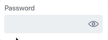
Last but not least, we have vaadin-password-field, a vaadin-text-field component for a password input with a reveal button. The component is styled nicely using the Lumo theme, which provides fantastic animations, colors and promises responsiveness on any platform.
In fact, vaadin-password-field does not have any function for validating the password at all. This component leaves it entirely open for the users to choose their favorite libraries, or to use with a strength meter component.
Nowadays, to pack the needs into one package, things can be created in a super complicated way that it removes the freedom of the users. Therefore, having a component like Vaadin-password-field is a good suit for a developer with a creative mind.
Bonus: Polymer-password-strength by Limonte
We found a hidden gem for you, a web component which can indicate how strong your password is. Moreover, it is fully compatible to use with the other inputs as well.

<polymer-password-strength> with <vaadin-password-field>
The component is developed by Limonte. Polymer-password-strength consists of a bar, whose colors and length will vary based on the toughness of your password. The estimation is calculated using zxcvbn, a library written by the Dropbox team. As a matter of fact, all the strength meters in this blog use this tool.
Do you also remember the problem we introduced with mist-password? The missing CSS style for grade 0? Polymer-password-strength will always indicate the strength, even for an empty or super weak password.
Compatibility
A few key things to mention during testing, all elements seem to perform exceptionally well. Even though mist-password is not expected to function properly with different platforms, the only platform that it shows errors is IE11. More can be seen from the summary table below.
*Note: All components have been tested on Chrome, Safari, Opera, Firefox, Edge and IE11 as well as on Chrome on iOS 11. I will use the initial letter of the browser to indicate that specific one (for example, C stands for Chrome)
| Component |
Library |
Mobile |
Working |
| gold-password-input |
Polymer ^2.0.0 |
✔ |
C,S,O,F,E,I |
| mtz-update-password |
Polymer ^1.9 || ^2.0 |
✔ |
C,S,O,F,E,I |
| paper-masked-input |
Polymer ^2.0.0 |
✔ |
C,S,O,F,E,I |
| vaadin-password-field |
Polymer ^2.0.0 |
✔ |
C,S,O,F,E,I |
| mist-password |
Polymer ^2.0.0 |
✔ |
C,S,O,F,E |
| polymer-password-strength |
Polymer ^2.0.0 |
✔ |
C,S,O,F,E,I |
Feature comparison
* The header row contains the abbreviations of each component based on their initials| Component |
gpi |
mup |
pmi |
mp |
vpf |
| Reveal button |
Yes |
Yes |
Yes |
Yes |
Yes |
| Strength meter |
Yes |
No |
No |
Yes |
No |
| Regular Expression |
Yes |
Yes |
Yes |
No |
No |
| Auto Validation |
Yes |
Yes |
Yes |
No |
No |
| Min/Max Length |
Yes |
Yes |
Yes |
No |
No |
| Limiting numbers of numbers, symbols, letters |
No |
Yes |
No |
No |
No |
| Re-write error message |
Yes |
Yes |
Yes |
No |
No |
| Re-write strength label |
Yes |
No |
No |
No |
No |
| Password confirm field |
No |
Yes |
No |
No |
No |
| Requirement status section |
No |
Yes |
No |
No |
No |
Final thoughts
These elements have a lot in common, from the composed components, the style to the libraries they used. Nonetheless, they are still distinct from their core value and purpose, even though all being password inputs. Choosing any of these may come down to one’s own preferences and taste. To sum up, they are all significant web components that work in various browsers.
Click here for more awesome web components