Web Components Wednesday (WCW) blog series is created for two purposes: introducing easy-to-use components and educating people on the concept of Web Components. All the WCW blogs can be found here.
 The slider is one of the most used components in any website or web app. We can use it for choosing a value, zooming a map, displaying a rating form, and changing the tuners in an audio app. As a matter of fact, the Youtube bar is actually a combination of a progress bar and a slider. Remember the famous race between the red and the grey bars? Give us a comment below, if you have been cheering for the grey bar. This blog post introduces and comptares two outstanding components, namely paper-slider by PolymerElements and paper-range-slider by IftachSadeh.
Paper-slider
We have featured a couple of elements from PolymerElements in a past article. Their components cover a lot of categorizations, including a slider, because why not? The component shows up as a simple slider; however, its details and features are much more incredible.

Paper-range-slider
Developed by IftachSadeh, one may mistake this element for paper-slider. It is understandable because paper-range-slider is, interestingly, composed of the same elements that paper-slider uses. However, similar enough, paper-range-slider is a range selector, which can also be converted into a single slider.

Material Design at its core
Both use Material design, hence the names start with paper, as a standard naming convention. Material design is a design language developed by Google; it is based on the paper and ink process of traditional design, and its focus on delivering the best possible UX. Therefore, animations feel smooth, plus the responsiveness and adaptiveness are on point.
Using with mouse and keyboard
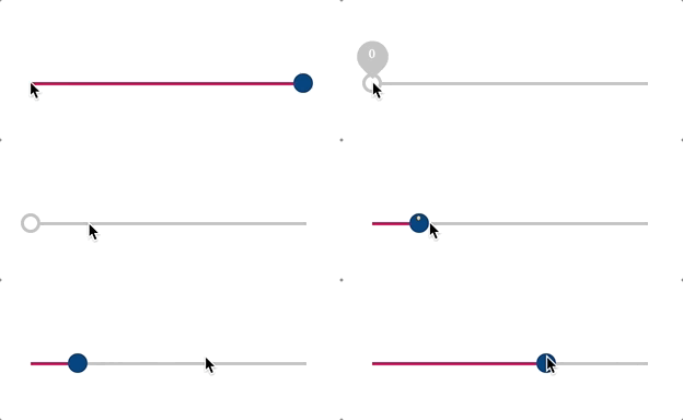
You can either drag the pointer or click anywhere in the bar (paper-slider), and the slider will move there within an instance. One cool thing is that keyboard control is available using the left and right arrow keys. However, paper-range-slider only allows keyboard control for the active knob. You can active a knob by clicking or moving it.

<paper-slider>
They can be segmented
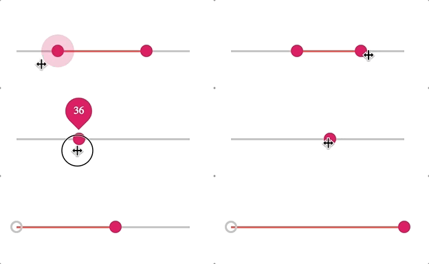
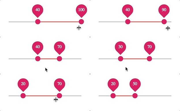
Both can be divided into smaller steps by giving a number to the attribute steps. Furthermore, to make the transition even smoother, use the attribute snaps to make the pointer catch the closest tick marks. Both have the attribute pin, in which upon using, a numerical value will show up as soon as you start sliding. As a side note, paper-range-slider also provides the attribute always-show-pin, if you want the number to be always present.

<paper-range-slider>
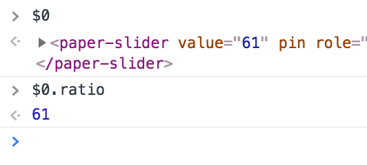
A handy feature for data-binding with other components is to get the ratio from the element using the property ratio. From that, you can use it to display a graphic chart, table, etc. Unfortunately, this is only available for paper-slider.

One key thing I want to note is that both of them provide tons of custom events (click, touch, keyboard, etc.) so that users can take advantage of them to make custom functions.
TLDR table version:
| Features |
paper-slider |
paper-range-slider |
| Keyboard Control |
Yes |
Yes |
| Steps with snaps |
Yes |
Yes |
| Show values upon sliding |
Yes |
Yes |
| Always show values |
No |
Yes |
| Getting ratio |
Yes |
No |
| Edit min/max values |
Yes |
Yes |
Customization
There's a bunch of customizations available for the two components, including colors of everything you can see, knob, slider, progress, as well as the width and the height. Customization is achieved through the use of CSS custom properties.
    paper-slider {
      --paper-slider-active-color: #D81159;
      --paper-slider-knob-color: #083D77;
      --paper-slider-pin-color: #FFBC42;
    }

    paper-range-slider {
      --paper-range-slider-knob-color: #D81E5B;
      --paper-range-slider-pin-color: #D81E5B;
      --paper-range-slider-active-color: #F0544F;
    }
As a result, it is always nice to leave room for the user to create their own slider. However, keep in mind that a good palette is always appreciated.
Compatibility
Overall, both elements perform well on many tested browsers and platforms. Paper-range-slider has unstable performance on mobile and Safari, the element always fails to load in the first few tries. Check the table below for a summary.
| Component | Mobile- |
Library |
Working |
| paper-slider |
✔ |
Polymer 1.9 - 2 |
C, S, O, F, E |
| paper-range-slider |
✔ (unstable) |
Polymer 1.9 - 2 |
C, S (unstable), O, F |
Final Verdict
In general, paper-range-slider is like a cousin to paper-slider, it can work both as a single slider and as a range selector. However, if you know that what you need is just a slider, merely use paper-slider for the simplicity and straightforwardness of it. They are both excellent elements with flawless design, which can work with various libraries and browsers.
Click here for more awesome web components