
Web Components Wednesday (WCW) blog series is created for two purposes: introducing easy-to-use components and educating people on the concept of Web Components. All the WCW blogs can be found here.
When it comes to loading or downloading, the longer you see a spinner, the more pain you will suffer. However, just like a beautiful 404 page, having a good-looking spinner will probably save you some customers. In this episode, we are featuring the top 5 free spinner web components.
*Note: All components have been tested on Chrome, Safari, Opera, Firefox, Edge, IE and iPhone X. I will use the initial letter of the browser to indicate that specific one (for example, C stands for Chrome)
Progress-spinner by Juraventor
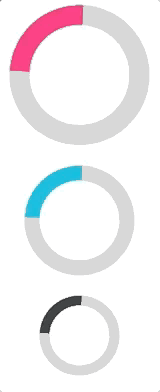
 Does this element look familiar to you? You’re probably using Chrome as it resembles the Chrome loading spinner to an extent. The stunning ease-in-out was achieved using only CSS keyframes. If you want a linear animation instead, you can use the property progress.
You can customise the element’s width & height, the bar size, as well as the active state. Without the active property, the component will stay hidden. The color of the circle can be changed, as well, by using a CSS custom property.
If you want to entertain the viewers while the website is “back-ending”, this spinner is a good fit for that. These gorgeous animations will attract their attention for hours.
Paper-spinning-icon by Collaborne
 Collaborne has a reputation for being the biggest free web component provider (PolymerElements excluded), and also for the quality of their elements. With only 64 lines of code, paper-spinning-icon truly proves that you don’t need hundreds lines of code to do big things.
But don’t be fooled by the simpleness, the component has implemented iron-icons under the hood. And that means you can use any icon which belongs to the iron-icons set with the property icon. However, you need to remember to import the according library (for example: device:airplanemode-active icon would need iron-icons/device-icons.html). Furthermore, since iron-icon is one of iron-icons dependencies, all the custom CSS variables can be used too (width, height, stroke, fill).
A nice-to-have feature for paper-spinning-icon would be the possibility to lazy-load the iconset, so that the whole library wouldn't need to be imported at once. It is not recommended to use it in your first loading screen since it might affect the payload. The good thing is that after it’s done importing, you can basically use every icon included in the set.
Check paper-spinning-icon on Vaadin Directory.
Granite-spinner by LostInBrittany
 Minimal and generic, granite-spinner comes with a steady-paced animation. Taking a look at the code, the element consists of a curved <div> rotating 360 degrees constantly. Simplicity at its finest.
You can alter the active condition, the minimal container height, the spinner’s line width, as well as the spinner size. You can pick the color by using the property color. There are, however, no CSS variables available.
Despite being simple and lightweight (1.9 KB), this component needs improvement in the responsiveness. The spinner will shrink to an oval shape when the window is smaller than the container dimension.
Check granite-spinner on Vaadin Directory.
Loading-spinner by BrightspaceUI
 While being infinite, the loading-spinner animation feels more determinate by having a start and end point. The animation was achieved by sophisticated keyframes code, thus, resulting in a beautiful spinner.
The only two things which you can customize are size and color, either by CSS custom properties or by element properties. As stated in the code, the author, however, does not recommend overriding the color.
Loading-spinner is no doubt one of my most favorite spinners. It would be a great placement for the message “Something is happening, please wait”.
Check loading-spinner on Vaadin Directory.
Wired-spinner by wiredjs
 As a part of the “wired” collection, wired-spinner is an avant-garde looking spinner. The “wired” collection consists of sketchy hand-drawn styled elements. It has around 20 UI components, such as wired-button, wired-checkbox, wired-toggle, wired-radio, etc. with wire-lib being the core rendering library.
With most of the code dedicated to the sketchy effect, the element comes with only two properties active and thickness. The color can be selected by using the CSS property color.
The use of this spinner might not fit business websites, but could be a perfect fit for sites that are related to kids, games or entertainment purposes. After all, it’s an extremely lightweight component so the loading should be instant.
Check wired-spinner on Vaadin Directory.
Compatibility table
The table below will shortly summarize the component’s info and compatibility on multiple platforms. Browsers include Chrome Canary, Safari Tech Preview, Opera, Firefox Nightly, Edge and Internet Explorer 11.
| Component |
Mobile |
Library |
Browsers |
| progress-spinner |
✔ |
Polymer#2.0.0-rc.3 |
C, S, O, F, E |
| paper-spinning-icon |
✔ |
Polymer#^2.0.1 |
C, S, O, F, E |
| granite-spinner |
✔ |
Polymer#1.9 - 2 |
C, S, O, F, E |
| loading-spinner |
✔ |
Polymer#1.9.3 - 2 |
C, S, O, F, E |
| wired-spinner |
✔ |
Polymer#^2.0.0 |
C, S, O, F, E |
Final thoughts
As a conclusion, choosing a spinner is a crucial part of your team’s branding. Each of these five elements is noticeable and useful in different scenarios. Pick the one with the styling and customization that fits most of your needs.
Click here for more awesome web components