Vaadin Blog
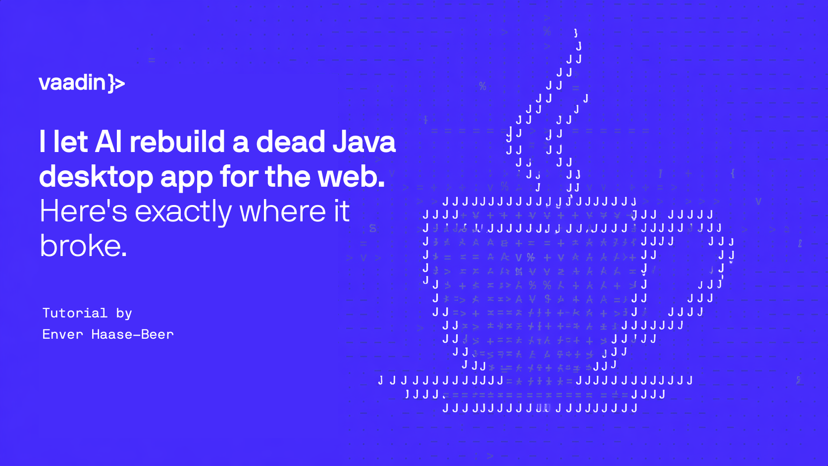
I came to RSS about twenty years late. When I finally went looking for a good reader, one beloved old Eclipse desktop app kept turning up on every "best of" list—RSSOwl—and it wouldn't even launch on my Mac. I'm a developer, so instead of shrugging I got nosy: how hard would it actually be to rebuild its main screen for the browser? Here's what I found, what came across in an afternoon, what fought me, and what turned out to be impossible.

Top 10 Backend Frameworks for Enterprise Development in 2026
Choosing a backend framework isn't just about picking the most popular technology anymore. In 2026, enterprise teams are weighing performance against ecosystem maturity, developer availability against cloud costs, and greenfield flexibility against a decade of institutional knowledge already baked ...

Spring Boot 3.5 to 4 Migration Playbook: A Step-by-Step Guide for Teams
Upgrading to Spring Boot 4 is about more than changing a version number in your pom.xml. Before you upgrade, it's worth taking stock of your project: your Java version, Spring Cloud release train, JSON serialization, servlet container, Vaadin version, Spring AI dependencies, native-image builds, CI ...

Maximizing Control and Flexibility in AI-Driven Software Development
2026 has been a watershed year in software engineering. The debate over whether AI would ever replace human developers is over: New, improved – often self-improved – AI tools are landing with startling regularity, and the results speak for themselves. Agentic coding assistants can now execute ...

.png)
Vaadin 25.2: Build UIs in plain language, and call the browser from Java
Vaadin 25.2 is the second feature release in the 25.x line. It brings three main additions: you can put AI to work inside your data views, call native browser capabilities from plain Java, and turn your existing end-to-end tests into load tests. You also get new and updated components, deeper ...

Introducing Vaadin Enterprise Edition
Today we are introducing Vaadin Enterprise Edition, a dedicated Vaadin product for organizations building and maintaining business-critical Java applications. Vaadin Enterprise Edition, or Vaadin EE, is the same Vaadin framework you already use, maintained as a separate edition for enterprise use, ...
SwingBridge 1.2: Java Swing and Vaadin, now talking to each other
SwingBridge 1.2 is out. The headline is interoperability: your existing Swing code and your new Vaadin views can now call each other directly, in plain Java, with the threading handled for you. The release also improves in-browser responsiveness, adds support for NetBeans RCP applications, and ...
How Dynasoft AG modernized its Oracle Forms ERP with Vaadin Flow
Learn how Dynasoft AG migrated a decades-old Oracle Forms ERP system to a modern Spring Boot and Vaadin Flow stack while preserving its database-driven business logic. The company Dynasoft AG is a Swiss software company that builds and maintains a comprehensive ERP system called Tosca covering ...
Free Maintenance for Vaadin 24 ended on June 16 – What does it mean and what to do?
The free maintenance for Vaadin 24 ended on June 16, 2026. If your application is still on Vaadin 24, it is no longer under the free maintenance window for security patches, browser compatibility fixes, or bug fixes. Your application will continue to run. But "run" and "supported" are no longer the ...
A Project Perspective on Using Vaadin in a Complex Engineering Environment
The Company 4Soft GmbH is a Munich-based software consultancy focused on building custom software for technically demanding domains. A core part of its work is understanding complex engineering problems in depth and translating them into software systems that remain maintainable over many years. ...