Web Components Wednesday (WCW) blog series is created for two purposes: introducing easy-to-use components and educating people on the concept of Web Components. All the WCW blogs can be found here.
 This blog post is the final part of the series “Wired Elements collection.” In this part, we are going to feature the rest of the set: wired-textarea, wired-slider, wired-tooltip, wired-radio, wired-radio-group & wired-toggle. Let’s dig in!
Wired-textarea

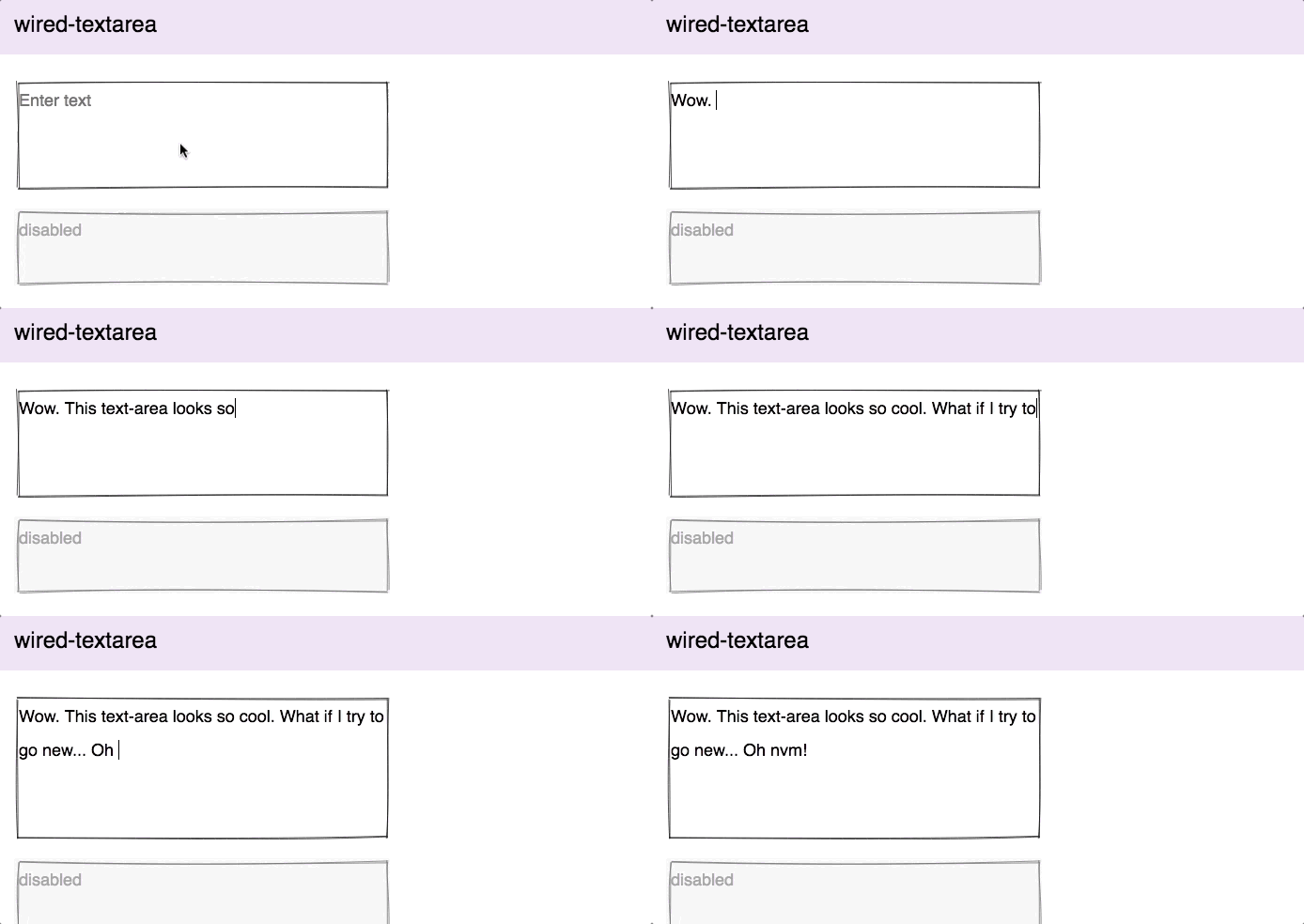
First, we have wired-textarea. The component makes use of the native textarea with its attributes. You can customize the number of rows, the minimum and maximum length of characters and give it a placeholder. For extra styling, the font and area inside may also be configured using regularules.
Wired-slider

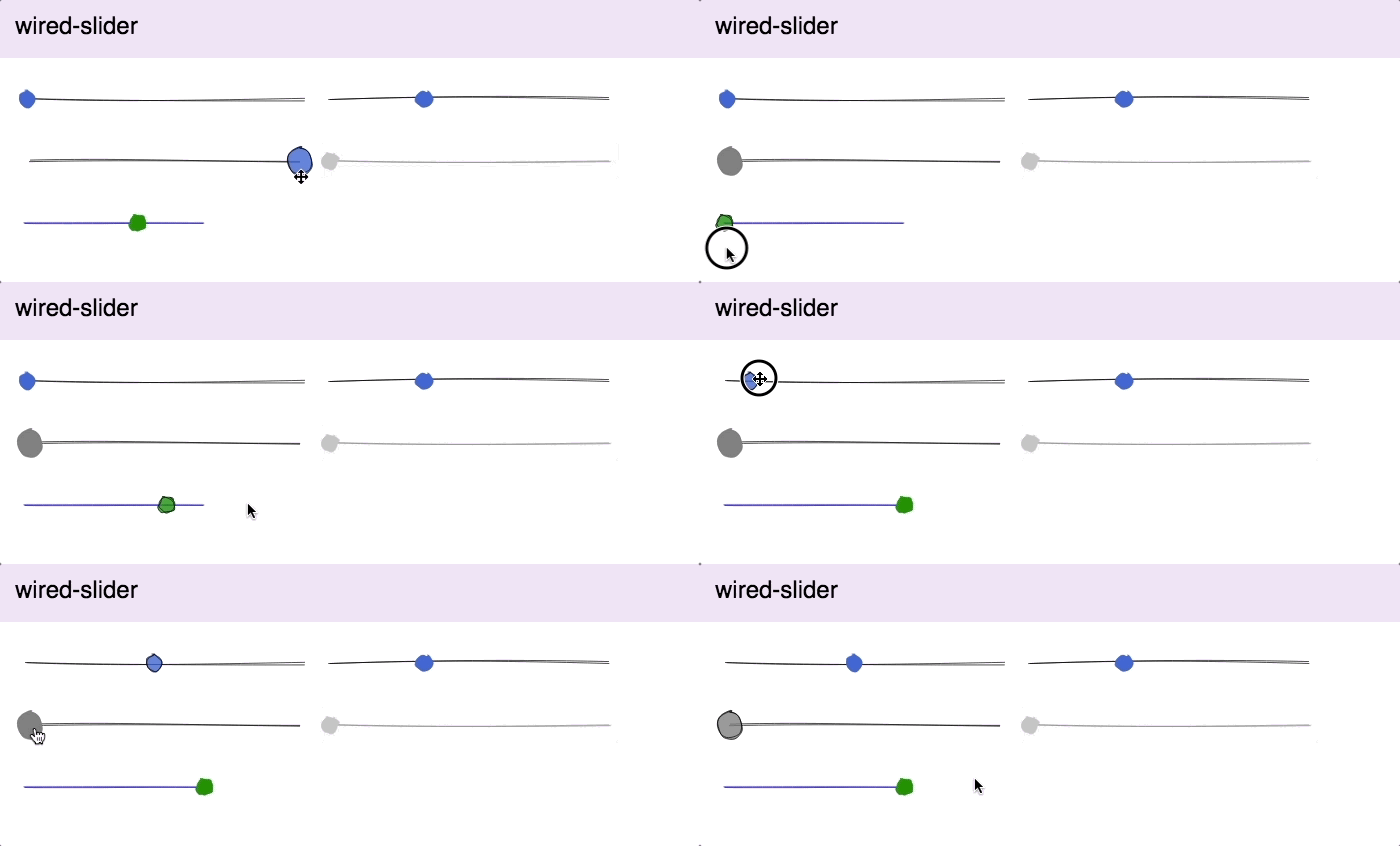
Just like wired-progress, wired-slider has a default minimum and maximum value of 0 and 100, respectively. Those numbers, as well as the knob radius & color, can be changed using the element’s attributes and CSS custom properties. You can either use an arrow key or drag to modify the value, however, clicking on the bar does not do the job. As always, check out the demo for more instructions on usage.
Wired-tooltip

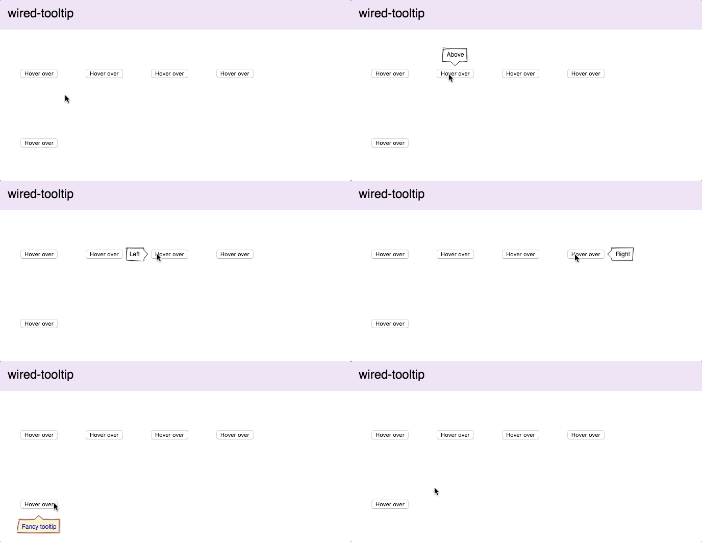
Wired-tooltip is a neat tool to show additional information to your users. However, you need to understand how to place it. By default, it will be centered to either an anchor element specified in the for attribute, or, if that doesn't exist, centered to the parent node containing it. So, get a good knowledge of the box model, and you will handle this with ease. Additionally, the text, offset and appearing position can all be customized.
Wired-radio

Have you ever wondered why they are called “radio”? That’s because they represent choices people can choose, just like push buttons on old-fashioned radios. Wired-radio provides attributes for altering the displayed text, icon size, checked status and some CSS properties for coloring. Are you looking for a form-like group of radio buttons instead? Check the component below.
Wired-radio-group

Wired-radio-group is a collection of wired-radio buttons, which are designed for getting only one option out of the group. This component is highly suitable for form questions, with the limit to one choice. You can have as many wired-radio(s) in one group as you like.
Wired-toggle

Wired-toggle is a funky toggle, and you can modify its on-off colors freely. It has only two attributes, checked and disabled.
Compatibility table
The table below will shortly summarize the components’ info and compatibility on multiple platforms. None of the components are functioning properly in IE11.
| Component |
Library |
Mobile |
Browsers |
| wired-textarea |
lit-element^0.5.2 |
✔ |
C,S,O,F,E |
| wired-slider |
lit-element^0.5.2 |
✔ |
C,S,O,F,E |
| wired-tooltip |
lit-element^0.5.2 |
✔ |
C,S,O,F,E |
| wired-radio |
lit-element^0.5.2 |
✔ |
C,S,O,F,E |
| wired-radio-group |
lit-element^0.5.2 |
✔ |
C,S,O,F,E |
| wired-toggle |
lit-element^0.5.2 |
✔ |
C,S,O,F,E |
Final words
This is the end of the series “Wired Elements”. We hope that after getting to know these components, you can make great mockups and wireframes.
Click here for more awesome web components