
Web Components Wednesday (WCW) blog series is created for two purposes: introducing easy-to-use components and educating people on the concept of Web Components. All the WCW blogs can be found here.
 Two “blogs” ago, I introduced some wonderful drop-down components with useful ready-to-use data. This week, we are going to look at some choices for a fresh drop-down instead.
shibui-dropdown-menu by ShibuiElements
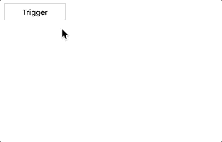
 An elegant drop-down with smooth animations and customized drop-down color. The author claims to have built this based on the inspiration from Heroku drop-down. The usage is simple, you add a button with this attribute
 slot = “trigger”, and to add rows, simply use the anchor tag.
simple-dropdown by SimpleElements
 Simple-dropdown is lightweight and style-agnostic, meaning that you can style the component with ease using simple CSS selectors. It loads fast and uses the rotating icon to display the opened state, although you can disable it. You can add more items to the menu by inputting as many pairs of anchors as needed.
tsante-dropdown by telecomsante
 Coming up next is also a style-agnostic drop-down component, except instead of the anchor, tsante-dropdown makes use of a trigger button, like shibui-dropdown-menu and
 ul list. You may change how the content is displayed, for example, the horizontal alignment can be left, right, or center and the vertical alignment can be below or above.
d2l-dropdown by BrightSpaceUI
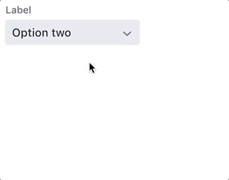
 D2l-dropdown is a part of the d2l collection, a set of reusable and accessible UI components. The reusability is highly prioritized, like how d2l-menu can be used within d2l-dropdown to create a comprehensive drop-down menu. The element looks convenient to use and has an extremely modern design, which can fit any of the apps you build. Apart from the menu, d2l-dropdown can also show generic content, such as a paragraph with texts.
vaadin-dropdown-menu by vaadin
 Similar to d2l collection, Vaadin also has a group that consists of reusable and cohesive UI elements. To add menu items to vaadin-dropdown-menu, you want to input a pair of vaadin-list-boxes with vaadin-item. It then will display a nice set of menu rows, and you can configure their labels, as well as the value. You may disable any selection, as well. Vaadin-dropdown-menu uses Lumo as its styling.
paper-dropdown-input by Juravenator
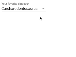 Paper-dropdown-input is a combination of paper-dropdown-menu and an input. It can be useful for a country selection box, or any box that includes a long list of choices. You can set the items with the attribute items, either by manual attribute or programmatically.
Compatibility
The table below will shortly summarize the component info and compatibility on multiple platforms. Browsers include Chrome Canary, Safari Tech Preview, Opera, Firefox Nightly, Edge and Internet Explorer 11.
| Component |
Library |
Browsers |
| shibui-dropdown-menu |
Polymer 1 - 2 |
C,S,O,F,E,I |
| simple-dropdown |
Polymer^2.0.0 |
C,S,O,F,E,I |
| tsante-dropdown |
Polymer^2.0.0 |
C,O,I |
| d2l-dropdown |
Polymer 1 - 2 |
C,S,O,F,E,I |
| vaadin-dropdown-menu |
Polymer^2.0.0 |
C,S,O,F,E,I |
| paper-dropdown-input |
Polymer 1.9 - 2 |
C,S,O,F,E,I |
Final Words
We can see how versatile and compact the drop-down UI element is. I hope you can choose the perfect one to adopt after reading this list. A good drop-down can indeed solve plenty of our problems and keep the users happy.
Click here for more awesome web components