
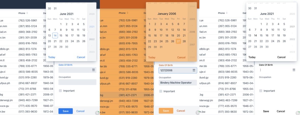
 The application with different theme variants
Whether for multi-tenancy or user preference, the need to dynamically change the theming of an application is a common business application need. In this post, we show how it’s done using CSS custom properties and HTML attributes.
Vaadin 14.6 brought an improved theming mechanism which makes it easy to package and reuse themes. While switching between packaged themes at runtime is not supported, a single theme can support multiple looks and feels with just a few lines of CSS. This approach also works well without the new theming mechanism.
The application used in this project was generated through start.vaadin.com. It consists of a menu, a header, and a master-detail view for editing personal information.
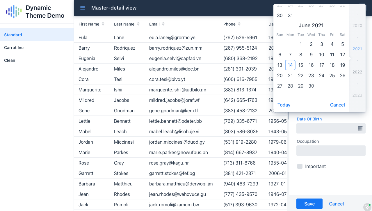 The application that we are styling
The distinguishing factor
To limit the scope of our style rules to a specific theme variant, we can set a class or attribute on the HTML body element. A good candidate is the theme attribute, which is also used for setting the Lumo theme variants.
Once the attribute is set, global style rules are easily limited to one or more theme variants.
body[theme~="my-theme-variant"] nav {
  background-color: blue;
}
By using the
~=operator, the selector will match even when multiple theme variants are defined. For example,[theme~="dark"]will match<body theme="plain dark">. If this is not needed, just using=is slightly more performant.
In Java, we can dynamically set the attribute at any time through the UI class. Depending on your use case, you might fetch the theme variant from the session, the database, or even the URL.
UI.getCurrent().getElement().setAttribute("theme", "my-theme-variant");
For convenience, I have created an enum to describe the available variants. The caption can be used to display the theme variant name to a user.
public enum ThemeVariant {
STANDARD("Standard"), CARROT_INC("Carrot Inc"), CLEAN("Clean");

private final String caption;

Theme(String caption) {
this.caption = caption;
}

public String getCaption() {
return caption;
}

public String getAttribute() {
return name().toLowerCase();
}
}
A utility class comes in handy to change the theme at runtime. By also storing it in the session, it is persisted across tabs and page reloads.
public class ThemeUtil {

  private static final String THEME_ATTRIBUTE = "theme";

  public static void selectThemeVariant(ThemeVariant themeVariant) {
    VaadinSession.getCurrent().setAttribute(THEME_ATTRIBUTE, themeVariant);
    UI ui = UI.getCurrent();
    ui.getElement().setAttribute(THEME_ATTRIBUTE, themeVariant.getAttribute());
  }

  public static ThemeVariant getCurrentThemeVariant() {
    ThemeVariant themeVariant =
      (ThemeVariant) VaadinSession.getCurrent().getAttribute(THEME_ATTRIBUTE);
    return themeVariant != null ? themeVariant : ThemeVariant.CARROT_INC;
  }
}
To set the initial value of the theme attribute when the page is first loaded, we can utilize an IndexHtmlResponseListener.
@Component
public class ThemeBoostrapListener implements
    VaadinServiceInitListener, IndexHtmlRequestListener {

  @Override
  public void serviceInit(ServiceInitEvent event) {
    event.addIndexHtmlRequestListener(this);
  }

  @Override
  public void modifyIndexHtmlResponse(IndexHtmlResponse indexHtmlResponse) {
    indexHtmlResponse.getDocument().body().attr(
        ThemeUtil.THEME_ATTRIBUTE,
        ThemeUtil.getCurrentThemeVariant().getAttribute());
  }
}
Creating a theme variant selector
A theme variant selector can be created in many ways. The code below shows one approach, using the Tabs component. Using the Vaadin ComponentUtil utility class, we associate a tab with a ThemeVariant.
public class ThemeSelector extends Tabs {

  public ThemeSelector() {
    addSelectedChangeListener(e -> {
      // Don't fire when we call setSelectedTab(tab) in the for-loop below
      if (e.isFromClient()) {
        ThemeVariant themeVariant = ComponentUtil.getData(e.getSelectedTab(), ThemeVariant.class);
        ThemeUtil.selectThemeVariant(themeVariant);
      }
    });

    ThemeVariant currentThemeVariant = ThemeUtil.getCurrentThemeVariant();
    for (ThemeVariant themeVariant : ThemeVariant.values()) {
      Tab tab = new Tab(themeVariant.getCaption());
      ComponentUtil.setData(tab, ThemeVariant.class, themeVariant);
      add(tab);

      if (currentThemeVariant == themeVariant) {
        setSelectedTab(tab);
      }
    }
  }
}
Efficient styling with CSS custom properties
Vaadin’s Lumo theme uses CSS custom properties to define properties that most styles are derived from. This allows us to make major changes to the look and feel of our application by only modifying some of these properties.
It is a good idea to define your own CSS custom properties for colors and other values that you will reuse.
body[theme~="carrot_inc"] {
  --yellow-carrot: #ffa84a;
  --orange-carrot: #d25700;

  --lumo-base-color: var(--yellow-carrot);
  --lumo-primary-color: var(--yellow-carrot);
  --lumo-primary-text-color: var(--orange-carrot);
}

body[theme~="carrot_inc"] [theme~="dark"] {
  --lumo-base-color: var(--orange-carrot);
  --lumo-primary-text-color: var(--yellow-carrot);
}
The application being styled uses Lumo’s dark theme variant on the navbar element, so an additional attribute selector is needed to override those styles.
As so many styles are derived from these properties, these few changes have a big effect on the look of the application.
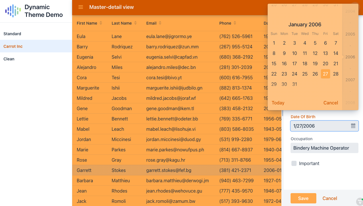 The application with the Carrot Inc theme variant selected
We can also add normal style rules under the theme attribute scope. The CSS custom properties can easily be set just for a specific component, so as not to affect other elements on the page.
body[theme~="clean"] vaadin-tab[selected]{
  background-color: rgba(0, 0, 0, 0);
}

body[theme~="clean"] .editor-layout {
    background: none;
}

body[theme~="clean"] vaadin-text-field,
body[theme~="clean"] vaadin-date-picker {
    --lumo-contrast-10pct: transparent;
}
Theme-attribute-based styles inside a shadow root is a trickier topic. While the host-context pseudo-class allows for styling a shadow root based on the attribute of a parent element, the class has not been, and will not be, implemented in Safari.
So, the remaining approach is to define the style as a CSS custom property. The default value can be defined under the :root pseudo-class, which refers to the html element, and the value can be overridden for a theme variant as desired.
Here I define the default value for the date picker overlay background, and I override it for my clean theme variant.
:root {
  --datepicker-overlay-background-image:
      linear-gradient(var(--lumo-shade-5pct), var(--lumo-shade-5pct));
}

body[theme~="clean"] {
  --datepicker-overlay-background-image: none;
}
I then use my property in my component-specific style sheet.
:host {
  background-image: var(--datepicker-overlay-background-image);
}
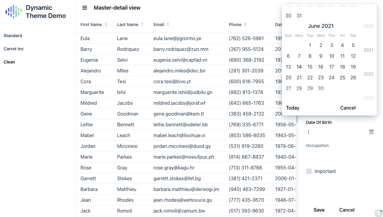 The application with the clean theme variant selected
If the lack of support for Internet Explorer 11 is not a concern, elements inside a shadow root that have the part attribute set can also be styled from the global style sheet using the ::part pseudo-element. This does not work in nested shadow roots.
body[theme~="clean"] vaadin-app-layout::part(navbar)::before {
  background: var(--navbar-background);
}
Listening to theme variant changes
Some theme-specific styles may need to be applied programmatically. One example is changing out an image, which can’t be done in CSS except by using the background-image property.
We can use the ComponentUtil#addListener method to add listeners. For this, we need a custom event class.
public static Registration addThemeChangedListener(
      UI ui, ComponentEventListener<ThemeVariantChangedEvent> listener) {
  return ComponentUtil.addListener(ui, ThemeVariantChangedEvent.class, listener);
}

public static class ThemeVariantChangedEvent extends ComponentEvent<UI> {

  private final ThemeVariant themeVariant;

  public ThemeVariantChangedEvent(UI source, ThemeVariant themeVariant) {
    super(source, false);
    this.themeVariant = themeVariant;
  }

  public ThemeVariant getThemeVariant() {
    return themeVariant;
  }
}
The Registration returned from addThemeChangeListener can be used to remove the listener. Use ComponentUtil#fireEvent to notify the listeners when the theme variant has changed.
public static void selectTheme(Theme theme) {
  ...
  ComponentUtil.fireEvent(ui, new ThemeVariantChangedEvent(ui, themeVariant));
}
We can use this in the MainView.java class to set a different logo for the Carrot Inc theme variant. We set the initial value based on the initial theme variant, and update the value whenever it changes.
private Component createDrawerContent(Tabs menu) {
  ...
  Image logo = new Image(
    getLogoSrc(ThemeUtil.getCurrentTheme()), "Dynamic Theme Demo logo");
  ThemeUtil.addThemeChangedListener(
    UI.getCurrent(),
    e -> logo.setSrc(getLogoSrc(e.getThemeVariant()))
  );

  ...
}

private String getLogoSrc(ThemeVariant themeVariant) {
  if (themeVariant == ThemeVariant.CARROT_INC) {
    return "images/carrot_inc.png";
  }
  return "images/logo.png";
}

That’s it, the application now supports multiple theme variants!
The complete code can be found on GitHub.