Latest stable
Vaadin 13
Here are the highlighted new and improved features in Vaadin 13. The rest of the bug fixes and improvements you can check from the full release notes.
To update to this release follow the update instructions. To start from a fresh project, we recommend using a starter.
Highlighted new and updated features
Data entry components
- Custom Field
- Email field
- Number Field
- Text Field clear button
- Text Field autoselect
- Time Picker
- Select
- Grid Pro (commercial)
- Rich Text Editor (commercial)
Layout components
Interaction components
Java only features
Data entry components
-
Custom Field
Custom field is a component that can wrap a set of any other components as a single composite field. The component provides commonly needed `label` and `error-message` features, and the `required` and `invalid` properties.
![]()
-
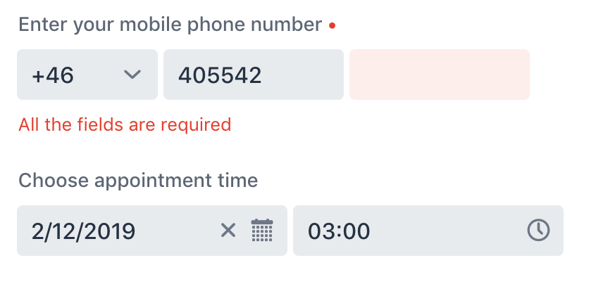
Email Field
Email field is a Text Field component extension that expects its value to be a valid email address. It also enables the specialized UI controls for typing an email address on mobile devices.
![]()
-
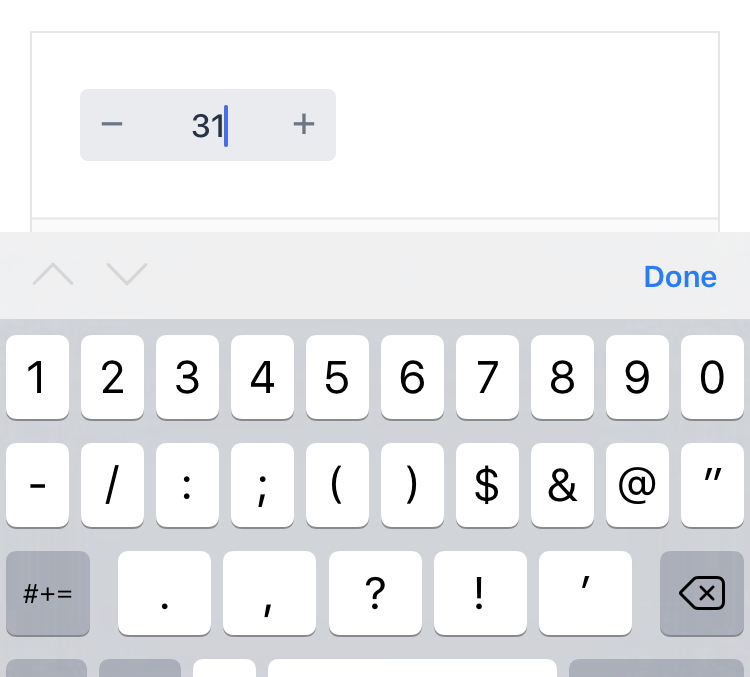
Number Field
The number field component is an extension of the text field that allows numeric value input and enables the dedicated UI controls for it on mobile. The component can be decorated with decrease/increase buttons for updating the value in steps.
![]()
-
Text Field clear
Text field now has a built-in clear button that can be enabled with a flag. When the feature is in use, a clear button is displayed on the right-hand side of the text field when there’s text in it. Clicking the button clears the value. The feature also works with other text field -family components like password field and text area.
![]()
-
Text Field autoselect
Setting the autoselect flag on will select the input text of the field, whenever it gets focused. The feature also works with other text field -family components like password field and text area.
![]()
-
Time Picker
Time Picker now has a Java API for using it from server side with Flow.
-
Select
The Select component is a simple dropdown and a more lightweight alternative to ComboBox. It was previously available as a Web Component, but now it also has a Java API.
-
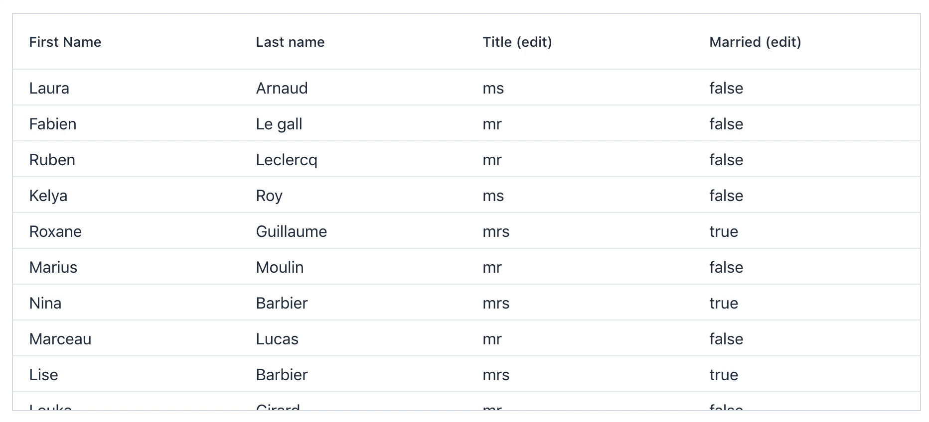
Grid Pro Pro
Grid Pro is a Grid extension with additional high level functionality. The first release brings in a new column type specialised for inline data editing. All the existing Grid features work with Grid Pro also.
![]()
-
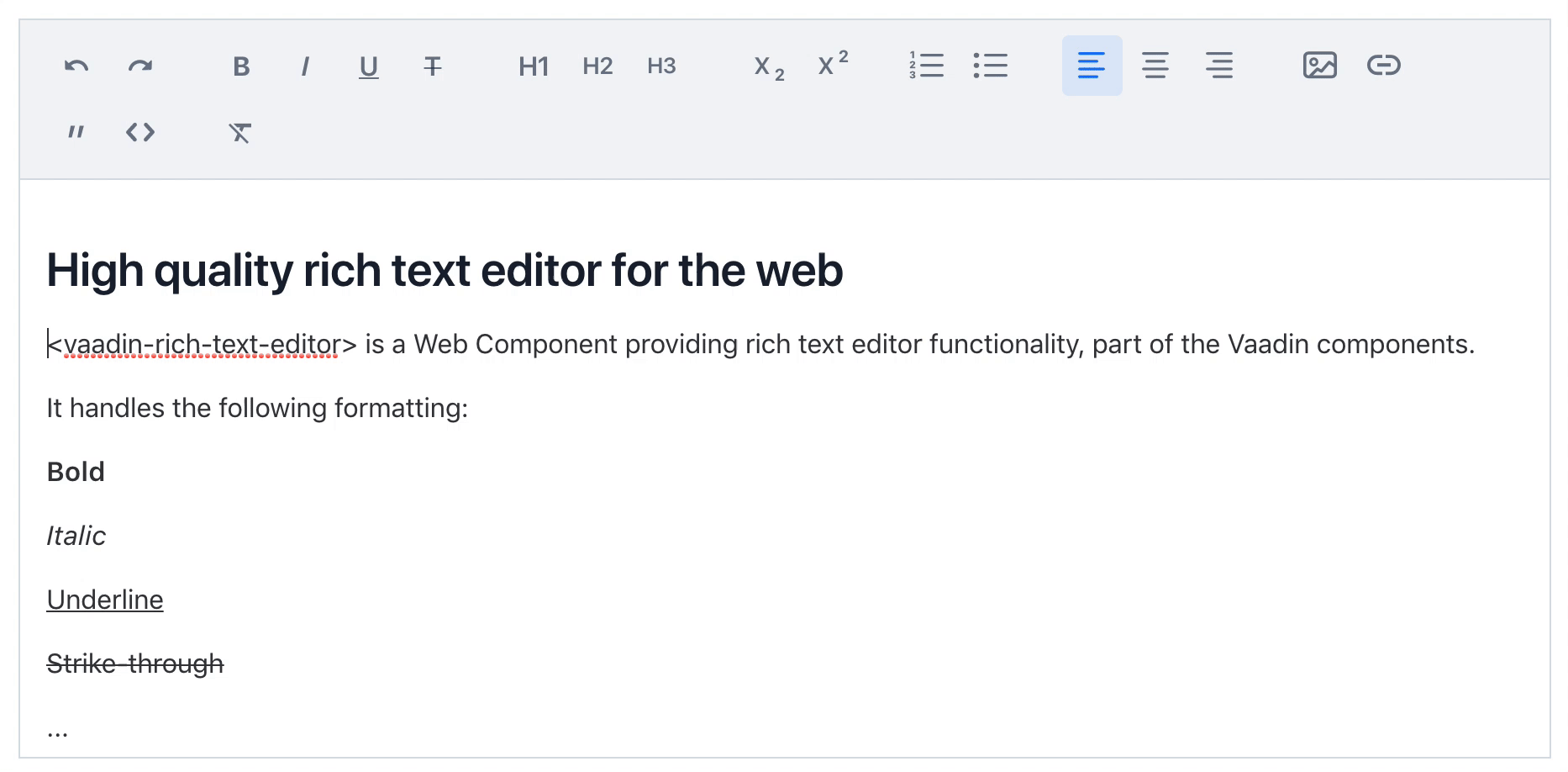
Rich Text Editor Pro
Rich Text Editor is a text input component that accepts formatted text as input / output and supports viewing and editing the text with specialized UI controls.
The component's value can be accessed either as Delta (read/write) or HTML (read).
![]()


Layout components
-
Accordion
Accordion is a component that wraps a vertically stacked set of panels that can be individually expanded.
![]()
-
Details
A component to show more content when the user requests it, usually by clicking the panel header to reveal more content below it.
![]()
-
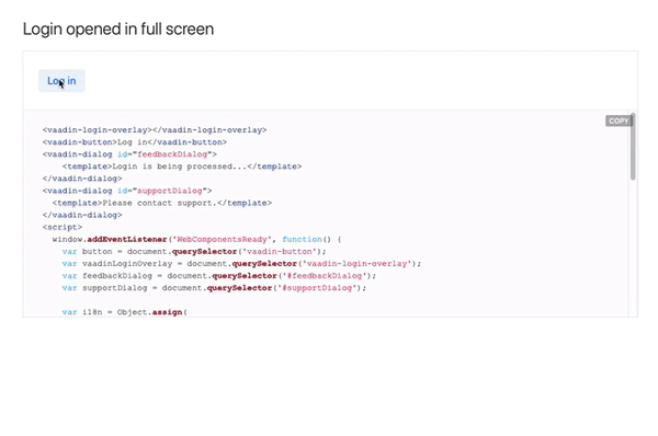
Login
A component to show a login screen having a username and a password field. You can either use the full page Login Overlay with minimal needed configuration or create a more customized experience with Login Form component. Login component works with password managers.
![]()


-
Grid event context API
This new client side API allows obtaining contextual information (such as the column or the item) about any type of an event that occurs inside the grid.
-
Nested context menu
Context menu now supports hierarchical/nested menu items that expand as sub-menus on mouseover or keyboard navigation. The menu items can be marked as checked or disabled and dividers can be added in between the items.
Java only features
-
Keyboard shortcuts API
New API in Flow allows you to easily assign keyboard shortcuts in Java for your application to improve the end user experience.
-
Dynamic registering of routes
Now it is possible to register routes dynamically while the Flow application is running. You can register routes for all users e.g. on application startup, or just for particular user e.g. based on access rights.
Themes and styling
-
Lumo compact preset
The compact theme/preset defines values for the sizing and spacing properties to reduce the visual space required by components to better fit a large amount of content on the screen. It’s a Lumo-only feature and can be enabled by importing the preset file to the application.
![]()
-
Grid class name generator
Grid's new class name generators allow generating CSS class names for grid cells based on their row and column. This feature together with the themable mixing API leverages styling grid cells to the next level.
-
Improved theme selector in Designer Pro
The theme switcher in Designer received some improvements. The dark palette variants for Lumo and Material are now available. You can disable auto-import of styles and the theme settings are now stored into the project.
Update Instructions
For users of Vaadin 10 or later, updating the version number in the vaadin-bom is enough. This release introduced a few breaking changes from Vaadin 12.
- Flow Spring integration (release notes)
- Context Menu Java API (release notes)
- Grid Java API (release notes)
Notice, that a few breaking changes were introduced in vaadin-combo-box in Vaadin 12.
Browser Compatibility
 IE11
IE11
 Edge
Edge
 Firefox
 Chrome
 Safari