
This article is intended for Java developers that aren’t too familiar with CSS. We’ll be writing a series of articles to try and help make your application a bit more responsive across different sized viewports. Let’s start with something simple: a responsive toolbar.
Toolbars typically house a lot of actions. On desktop we usually have more than enough room, but on mobile it’s a different story. A common solution is to use a so-called overflow menu.
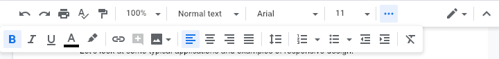
Let’s take the Google Docs toolbar as an example. Here’s what it looks like on a wide viewport:

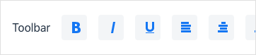
On narrower viewports, most of the actions are located in the overflow menu.

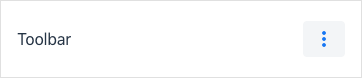
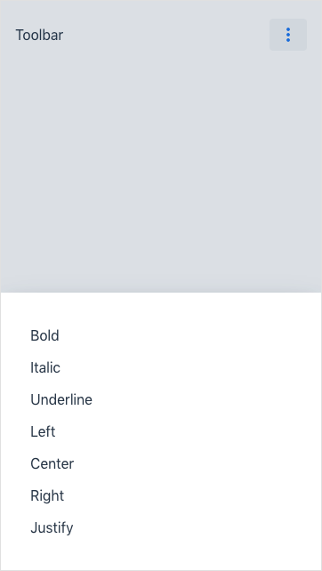
Here’s what it looks like when clicked:
So, how do we do something like this with Vaadin?
1. Creating a simple toolbar
There’re multiple ways of creating a component in Vaadin. For an example as basic as this, we’ll just be extending HorizontalLayout.
Toolbar.java
public class Toolbar extends HorizontalLayout {
  public Toolbar() {
    setAlignItems(Alignment.CENTER);
    setPadding(true);

    Span title = new Span("Toolbar");

    Button bold = new Button(new Icon(VaadinIcon.BOLD));
    Button italic = new Button(new Icon(VaadinIcon.ITALIC));
    Button underline = new Button(new Icon(VaadinIcon.UNDERLINE));
    Button left = new Button(new Icon(VaadinIcon.ALIGN_LEFT));
    Button center = new Button(new Icon(VaadinIcon.ALIGN_CENTER));
    Button right = new Button(new Icon(VaadinIcon.ALIGN_RIGHT));
    Button justify = new Button(new Icon(VaadinIcon.ALIGN_JUSTIFY));

    add(title, bold, italic, underline, left, center, right, justify);
    setFlexGrow(1, title);
  }
}
Here’s how the component above is rendered in Chrome on macOS:

On mobile it looks like this:
Naturally, this isn’t very user-friendly. The buttons are squeezed together and half of them aren’t reachable without scrolling horizontally.
Let’s get to fixing it.
2. Hiding buttons on small viewports
The first thing we need to do is to hide the buttons. We can do so with the following CSS:
toolbar.css
vaadin-button {
  display: none;
}
This would, however, affect all our buttons. We need some way of targetting only the buttons inside the toolbar.
To accomplish that we can either set a class or an ID for the toolbar or convert it into a web component. To keep things simple, we’ll be using the first approach (using the class attribute).
We make the following adjustments to our component:
Toolbar.java
public class Toolbar extends HorizontalLayout {

  private String CLASS_NAME = "toolbar";

  public Toolbar() {
    addClassName(CLASS_NAME); // (1)
    ...
}-
Add a class name to help target buttons inside the toolbar.
toolbar.css
.toolbar vaadin-button { # (1)
  display: none;
}-
Target buttons inside the toolbar.
Next, we’ll need to set a breakpoint, telling the browser when to hide the buttons. We do so by using a media query.
toolbar.css
@media (max-width: 479px) { // (1)
  .toolbar vaadin-button {
    display: none;
  }
}-
Hide the buttons on viewports narrower than 480 pixels.
As a result, we get the following on mobile:

|
Tip
|
If you’re unsure which breakpoints to use, you can use the Material Design breakpoint system as a guideline. |
3. Creating an overflow menu
The penultimate step is to create the overflow menu. We’ll use a Button and a ContextMenu to accomplish this task:
Toolbar.java
public class Toolbar extends HorizontalLayout {
  public Toolbar() {
    ...
    Button overflow = new Button(new Icon(VaadinIcon.ELLIPSIS_DOTS_V));

    ContextMenu menu = new ContextMenu();
    menu.setTarget(overflow); // (1)
    menu.setOpenOnClick(true);
    menu.addItem("Bold", null); // (2)
    menu.addItem("Italic", null);
    menu.addItem("Underline", null);
    menu.addItem("Left", null);
    menu.addItem("Center", null);
    menu.addItem("Right", null);
    menu.addItem("Justify", null);

    add(title, bold, italic, underline, left, center, right, justify, overflow);
    ...
  }
}-
The menu is set to open when the button is clicked.
-
A corresponding menu item is created for each button that we hide on mobile. In this example there are no click listeners set up for neither the buttons nor the menu items, so please disregard the null values in the code example above.
In the final step we’ll fix the following issues:
-
The overflow button is hidden on viewports narrower than 480 pixels.
-
The overflow button is shown on viewports wider than 479 pixels.
4. Showing & hiding the overflow menu
To fix the aforementioned issues we need to distinguish the overflow button from the other buttons. Again, we will resort to using a class name:
Toolbar.java
public class Toolbar extends HorizontalLayout {
  public Toolbar() {
    ...
    Button overflow = new Button(new Icon(VaadinIcon.ELLIPSIS_DOTS_V));
    overflow.addClassName("overflow"); // (1)
    ...
  }
}-
Add a class name to distinguish the overflow button from the rest of the buttons.
We amend our CSS by using the :not() pseudo-class to prevent the overflow button from being targeted:
toolbar.css
@media (max-width: 479px) {
  .toolbar vaadin-button:not(.overflow) { // (1)
    display: none;
  }
}-
Don’t target the overflow button.
Our toolbar is now fully functional on mobile:
However, we still need to hide the overflow button on desktop (see the last button):

Like before, we’ll use a media query to tell the browser not to show the overflow button on viewports with a minimum width of 480 pixels:
toolbar.css
@media (min-width: 480px) {
  .toolbar vaadin-button.overflow {
    display: none;
  }
}
Problem solved.
You can download the code sample here.
In the next article, we’ll discuss responsive navigation.