Updated on May 7th, 2021
NOTE: This article is outdated and the Sketch kit has since been replaced by the free Vaadin Figma Design Kit.
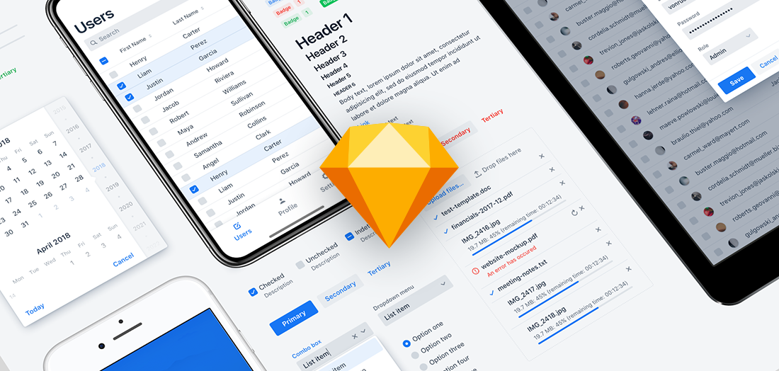
As the first small piece of a bigger effort, aimed squarely at helping us developers make applications that users ♡, we proudly give you the Lumo UI Kit for Sketch.
Lately, the concept of design systems has been trending in the UI/UX community. The trend is quite strongly rooted in the design community, but the underlying idea is to improve how UIs are built, improving the communication between designers and developers.
So exactly what is a design system?
A design system aims to allow the designers and developers to use common building blocks when building user experiences and UIs. The system unifies the look and feel of the parts used (colors, fonts, components, etc) as well as the UI/UX patterns used, and it makes it easy for the designers and developers to find, understand, and use the system.
Typically, a design system consists of a “UI Kit” (visual assets for the designers to use in tools like Sketch) with components and patterns, documentation explaining how components and patterns should be used, hopefully, complete with code snippets for developers to copy and paste.
Design systems can be seen as an evolutionary step in the visual design, with roots in print era brand guides and style guides. Component libraries and pattern libraries cover more aspects needed for UI/UX design, and atomic design emerged alongside design tools like Sketch, signifying that the design community is adopting component-based thinking, and a desire to stay DRY.
Google's Material Design pushed things further by packaging all the pieces into a coherent system.
All this is driven by one simple fact: UI/UX design is ultimately useful only when it reaches the user – and in order to reach the user, the design needs to be implemented without the point getting lost in translation.
Design systems allow the designers and developers to speak the same language – to cooperate, and ultimately, to deliver valuable applications that the users ♡.
For more information about design systems in general, take a look at InVisions Design Systems Handbook, or the book Design Systems by Smashing Magazine.
You can also have a look at design systems by IBM, Salesforce, Shopify, Microsoft, and many more.
What’s in it for me?
For me as a developer, this speeds up my work, minimizes guesswork, and allows me to stay DRY while focusing on the interesting stuff.
For me as a “hybrid” developer/designer, this allows me to stand on the shoulders of giants, quickly crafting consistent UI/UX with confidence.
For me as a user, I’m getting an application that is easy to use, with a more consistent and delightful user experience.
Today, design systems projects are quite often designer-driven projects, and the challenge most often mentioned is to get developers involved, to make the system easy to use for them.
We’re approaching this from the other direction – as developers, we already know the power of components and composition, and we know how to stay DRY.
As a first step, let’s make it possible to use the same basic building blocks when designing: the Lumo UI Kit for Sketch.
And this is just the beginning – we’re planning to continue down this path, to make it easier for designers and developers to cooperate. Let’s build an awesome developer-driven design system!
If you are interested in UI Kits and design systems, give us a ping – let’s start a conversation!
Also, if you would prefer to use some other tool, like Figma, be sure to let us know!
