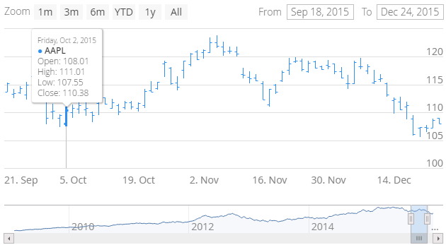
Vaadin Charts 3.0 Final is out now. It brings you OHLC and candlestick chart types for displaying financial data, a way to display event markers on a graph, a new improved timeline mode, and a lot of fixes and smaller improvements. It is also our first commercial add-on that is available for client-side developers. No matter if you are using Polymer, AngularJS, React, or other HTML5 library, we got you covered.
Let’s see how you can create an OHLC chart using Vaadin Charts 3.0. OHLC stands for Open-High-Low-Closed. It’s a way of displaying the volatility of a financial instrument. An OHLC bar displays the opening and closing prices, as well as the high and low of the prices for each data point.

First I’ll show you how to create an OHLC chart with the Java API and then with the declarative API.
OHLC Chart Using Java
Include the Vaadin Charts dependency in your Vaadin project. Here’s the snippet for Maven pom.xml. Compile the project Widgetset or use the Vaadin Widgetset CDN.
<dependency>
    <groupId>com.vaadin.addon</groupId>
    <artifactId>vaadin-charts</artifactId>
    <version>3.0.0</version>
</dependency>
First, let’s create a new chart and enable the timeline mode.
Chart chart = new Chart(ChartType.OHLC);
chart.setTimeline(true);
Chart is configured using a Configuration object. Get the current configuration and set the chart title.
Configuration configuration = chart.getConfiguration();
configuration.getTitle().setText("AAPL Stock Price");
The chart you just created looks quite dull without any data. You need to create a DataSeries and assign it to the current configuration. A DataSeries takes a list of OhlcItems, so assuming you have some kind of service that returns a list of price data objects, you need to map the objects first. Using Java 8 here we save a couple of lines of code.
ListdataPojos = StockPrices.fetchAaplOhlcPrice(); List items = dataPojos.stream().map(this::mapToOhlcItem) .collect(Collectors.toList()); DataSeries dataSeries = new DataSeries(items); configuration.setSeries(dataSeries);
The mapToOhlcItem method is simple.
private OhlcItem mapToOhlcItem(MyPriceData data) {
    return new OhlcItem(data.getDate(), data.getOpen(),
            data.getHigh(), data.getLow(), data.getClose());
}
To get the bars to be displayed more clearly, you can utilize data grouping. Data grouping samples the data to larger blocks improving readability and performance. With the following code the charts show day resolution by default, and then groups by week and month depending on how much data needs to be displayed.
PlotOptionsOhlc plotOptionsOhlc = new PlotOptionsOhlc();
DataGrouping grouping = new DataGrouping();
grouping.addUnit(new TimeUnitMultiples(TimeUnit.WEEK, 3));
grouping.addUnit(
        new TimeUnitMultiples(TimeUnit.MONTH, 1, 2, 3, 4, 6));
plotOptionsOhlc.setDataGrouping(grouping);
dataSeries.setPlotOptions(plotOptionsOhlc);
Finally we’ll draw the chart using the current configuration.
chart.drawChart();
And that’s it. Just remember that a chart is a Vaadin component so you need to add it to some layout. If you want to see more Java examples and source code, visit demo.vaadin.com/charts. Next, I’ll show you how to create the same chart in the Elements version of Vaadin Charts.
OHLC Chart Using HTML and JavaScript
Now let’s set aside the Java API for a while, and see how the previous example can be implemented using the declarative API available in the Vaadin Elements version of Charts. First you need the chart element. If you are using node, npm and Bower, just run:
bower install --save vaadin-charts#3.0.0
As an alternative, you can access the chart element using a CDN url.
https://cdn.vaadin.com/vaadin-charts/3.0.0/vaadin-ohlc-chart.html
Now in our web app, import the chart element using an HTML import.
<link rel=”import” href=”here goes url to bower_components or cdn”>
Define the chart element with a title and enable the timeline.
<vaadin-ohlc-chart id="ohlc-series" timeline>
    <chart-title>AAPL Stock Price</chart-title>
</vaadin-ohlc-chart>
Obviously you need some data. You can define the data statically, but to make this sample more real-life, let’s assume you have a rest service that provides stock price data. The data series needs to be a two-dimensional array in JSON format. You can use e.g. the iron-ajax element from Polymer to fetch the data. Polymer helps also with the data binding.
<iron-ajax auto id="dataFetcher" url="url-of-rest-service"
    handle-as="json" last-response=""></iron-ajax>
Declare the data-series inside the <vaadin-ohlc-chart>.
<data-series name="AAPL" data="[[seriesData]]">
</data-series>
And finally you can configure the data grouping inside the
<data-grouping>
    <units>
        <name>week</name>
        <multiples>[3]</multiples>
    </units>
    <units>
        <name>month</name>
        <multiples>[1, 2, 3, 4, 6]</multiples>
    </units>
</data-grouping>
You can configure chart options even more. See more samples and source code at demo.vaadin.com/vaadin-charts.

Try It Yourself
You can try the above examples yourself using the Vaadin Charts 3.0. It is available for both Vaadin Framework and Vaadin Elements developers.
