Vaadin Grid has been in progress for a very long time - much longer than anyone anticipated when we decided to start working on a replacement for our venerable Table component. The development team has been hard at work with adding features and resolving issues for over a year already. The last few weeks have been especially intensive, as we have fixed up to 15 issues every day in preparation for the beta 1 version that was released last week.
What this means in practice is that we feel Grid is ready for being tested in your projects. There are most likely still bugs that will cause you problems, and likewise missing functionality that would be critical in your case. What we would like to do is learn which cases are necessary for the way you would like to use Grid in your application.
To get started with Grid, you just need to update your project dependencies to use Vaadin 7.4.0.beta1, create a Grid instance hooked up to a data source and add it to a layout in your application. We will soon start adding code samples for various features to the mini tutorial page, so by the time you read this, there might already be a list of concrete examples of how Grid is used.

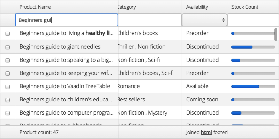
Here are some of the new features that you might be interested in. Looking at the screenshot from my sample Grid representing an inventory system for a bookshop, one of the first details you might notice is that the header section is made up of two rows. The first row shows the column captions, whereas the second row contains Vaadin components that I have configured to control how data is filtered.
Continuing down along the left edge, you see a special column containing checkboxes for easily selecting multiple rows for further manipulation by the application. In the lower right corner, there is also an example of a footer cell with HTML formatted text spanned over two columns. Headers and footers work in the same way, so you can also show components in footers and use HTML or spanning in the header section.
When looking at the actual body of the Grid, there are three new features that stand out visually. Starting from the left, the first thing you see is that the product name column has been configured to show data interpreted as HTML and that the first row contains some formatting. The next feature is that horizontal scrolling has not affected the product name column - it has been frozen in place so that you can see which product you're looking at even when looking at columns that didn't fit on the screen.
The final new feature shown in the screenshot is that the Stock Count data is displayed as a visual indicator instead of a textual representation of the data. What is not shown here is that the data visualisation is implemented in a very efficient way so that the browser just receives the numerical values from the server. This stands in contrast to the Table component, where the server would have to send long HTML snippets or even heavyweight Component instances for each row.
The difference in scrolling smoothness is really obvious when scrolling through the rows, although this is of course not conveyed through the screenshot. To see this yourself, you can try out Vaadin 7.4.0.beta1 yourself or check out some of the new samples.
Get Vaadin 7.4.0.beta1 today