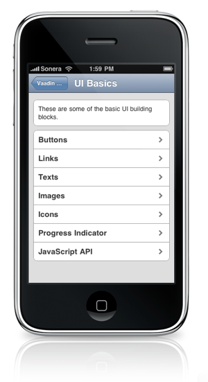
 This is the first post in a series of three posts on Vaadin TouchKit and mobile web application development. In this first post, I’ll give a bit of background about how I got involved with developing Vaadin TouchKit and discuss some thoughts I’ve had during the development phase. The following posts will then discuss future plans that we have for TouchKit, and mobile web application development in general.
I joined the Vaadin team fairly recently, last January. I had just finished my Master’s thesis and graduated a month earlier when I got offered a job at IT Mill.
Every new employee at IT Mill has a chance to familiarize themselves with Vaadin and other development tools while doing a small introductory project. As I had just majored in embedded systems design, I had a big interest in developing for mobile devices. I suggested that I’d take a look at how Vaadin works on mobile devices for my project. We decided that my project would be to develop a toolkit that would make creating mobile applications with Vaadin simpler. The focus of the project was on supporting modern, touch screen devices and try to deliver a user experience that feels like a native application. Quite early on in the development, we decided that the project would be expanded from a simple introductory project to an actual product. This brought in a few more people into the project to help me out.
There are several things that we as developers have to be more aware of when developing web applications for mobile devices than when developing for desktop clients. First, the amount of screen real-estate limits the use of many components that are commonly used in designing web applications. Second, the amount of processing power and memory is very limited when compared to desktop computers. Combined with the fact that most wireless communication technologies are much slower than the internet connections people use at home, the mobile web application needs to be as small and computationally lightweight as possible. Finally, as we are working with touch screen devices, it’s very important to make sure that all user interface elements are large enough and spaced sufficiently far apart to keep the interface finger-friendly.
Before starting to develop TouchKit, I went through all the existing components in Vaadin to get a sense of which components were working well in mobile browsers and which needed more work. To my relief, most of the components that didn’t work well in mobile browsers were components that didn’t fit the experience of mobile computing. The remaining components worked fairly well, although some of them needed some additional CSS styling to make them more suitable for touch screen use.
When I began developing Vaadin TouchKit, I tried to make sure to keep the client side as lightweight as possible. I did this by storing only one view at a time on the device, while the server takes care of navigation and history. This way, only the bare minimum of components are loaded in the limited memory on the device at any given time.
TouchKit 1.0 aims to produce good looking and intuitive web applications for most mobile web browsers. More advanced browsers like those on the iPhone and iPad take advantage of CSS animations to add some extra user feedback, but the basic user experience is the same for all users.
Taking a high-level look at what TouchKit comprises, you can see that there are two main components that are used to create the feel of native applications: a panel and a menu. The panel wraps the content and takes care of the header caption and back buttons. The panel is also responsible for handling animations for browsers that support them.
The menu component, in turn, is used to create navigation menus that work like menus on the iPhone. Both the panel and menu take advantage of WebKit events for detecting touches to deliver feedback of taps to users.
As a developer, you can use just about any existing Vaadin components inside TouchKit to build your application, just remember to make sure that the user interfaces you create are easy to access with a finger.
The following post in this series will continue from where we left of, taking a look at the future of TouchKit and what you can look forward to in TouchKit 2.0.
