Many application development teams struggle with UI inconsistencies, both in terms of UI design and UI implementation. According to the Enterprise UX Industry Report for 2017–2018, consistency is the number one challenge reported by enterprise UI designers.
Designer-developer collaboration is another common challenge, reported by 38% of UX professionals in the State of UX in the Enterprise survey from 2019. These problems ultimately result in delayed product launches, a poor end-user experience and higher support and maintenance costs.
Challenges in UI Development
We have encountered these same challenges in some projects at Vaadin, and we’ve concluded that the primary root cause of these challenges is a lack of awareness, amongst team members, of the UI features that have been designed and implemented: Designers are unaware of features that have been previously designed, and of the features available through the UI libraries (like Vaadin) that are used in the project; and developers are unaware of the custom UI features that have already been implemented. These problems tend to grow exponentially with team size and project length, and are exacerbated by team turnover and onboarding of new team members.
.png?width=637&name=UIChallenges%20(1).png)
In recent years, UI design systems have emerged as a solution to these challenges.
What is a Design System?
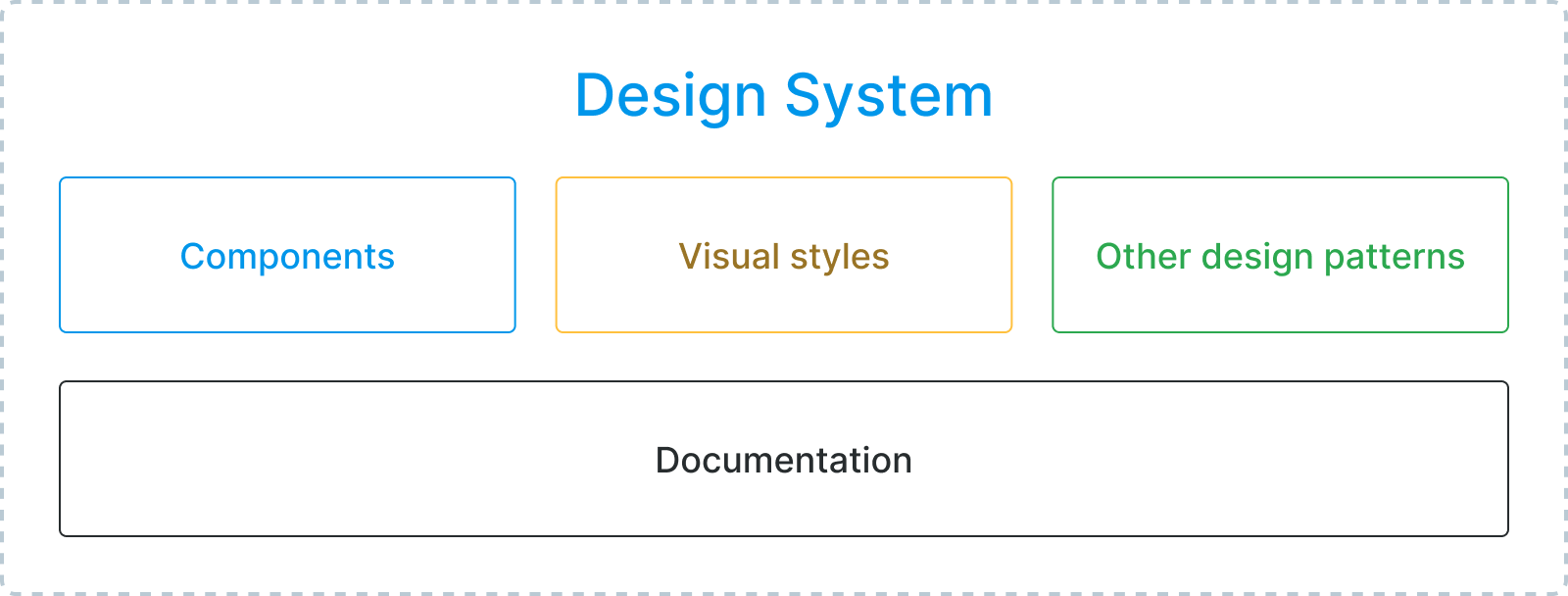
A design system is a standardized set of UI building blocks and design patterns that form the foundation for an application’s UI. It mainly consists of a set of components (like input fields and buttons) and visual styles (like colors and fonts), but can also include standardized layouts or compositions of multiple elements (like forms or toolbars), and even workflows (e.g. CRUD operations) that recur in different parts of the application.
The documentation for these features is an essential part of a design system, as it helps all team members keep track of the available building blocks and use them as a basis for all their design and implementation work. The documentation should also provide guidelines for the proper usage of the features, so that they are used in a consistent manner across the application.
In order to truly benefit from a design system, the team should adopt a UI development process that ensures that application features being designed and implemented are based on these standards and that any new building blocks that are needed are proactively added to the system’s codebase and documentation.
Design System Benefits
Having a well-documented, standardized set of UI building blocks makes it easy for all team members to maintain a high level of awareness of the foundations the UI is based on, and to cooperate efficiently to design and implement new application features.
By basing their designs on standardized building blocks and patterns, designers can streamline their work and ensure that their designs are consistent and easy to implement. As application features are mostly just compositions of these standardized building blocks, designers can also spend less time annotating their designs and writing detailed specifications for each application feature.
Handovers from designers to developers are less error-prone, as developers can easily identify the building blocks used in the designs and find the appropriate components and styles in the codebase. The standardization helps developers maximize code reuse and ensure that the resulting UI is consistent and in line with the designs. Improved reuse of existing implementations also means fewer bugs and cheaper refactorizations.
Onboarding new team members becomes less of a burden, as new hires can quickly become productive thanks to the documentation, allowing management to scale the team as needed, without worrying about the effort needed to get new members acquainted with the designs and the codebase.
The higher level of UI consistency and overall quality of the user experience can also reduce end-user training and support costs, and lower the risk of costly end-user errors caused by inconsistent and confusing UIs.
Overall, a design-system-based approach to UI development streamlines collaboration and communication, and helps teams deliver a high-quality user experience with a shorter time to market and a lower total cost of ownership. These benefits are tangible even for a single, moderately large application, and become virtually indispensable for any organization with multiple related applications to build and maintain.
Vaadin Provides a Good Starting Point
The 45+ Vaadin components and customizable Lumo theme, together with the new and improved documentation pages, already provide an excellent starting point for a design-system-based UI development workflow.
To further streamline UI design work, we’ve also released the Vaadin Figma Library – a set of high-fidelity graphical representations of all Vaadin components for use in the Figma UI design and prototyping tool, which makes it super easy to create great-looking, “pixel perfect” UI mock-ups and click-through prototypes of Vaadin-based UIs.
Creating a Custom Design System
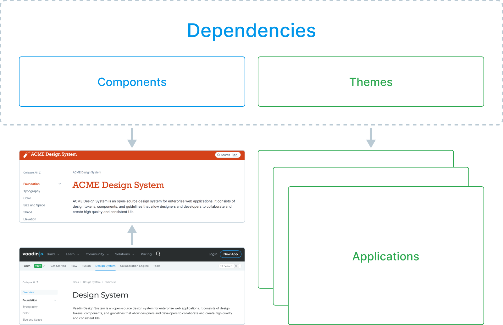
Although the Vaadin Design System is a great starting point, most applications inevitably need more than any UI library can provide out of the box: the theme needs to be adjusted to match the product’s branding, and custom UI building blocks are needed for the layouts and features specific to the application. In order to benefit from the design system approach, all of these features need to be somehow bundled, together with the standard Vaadin features used, into an easily reusable codebase and a convenient documentation repository.
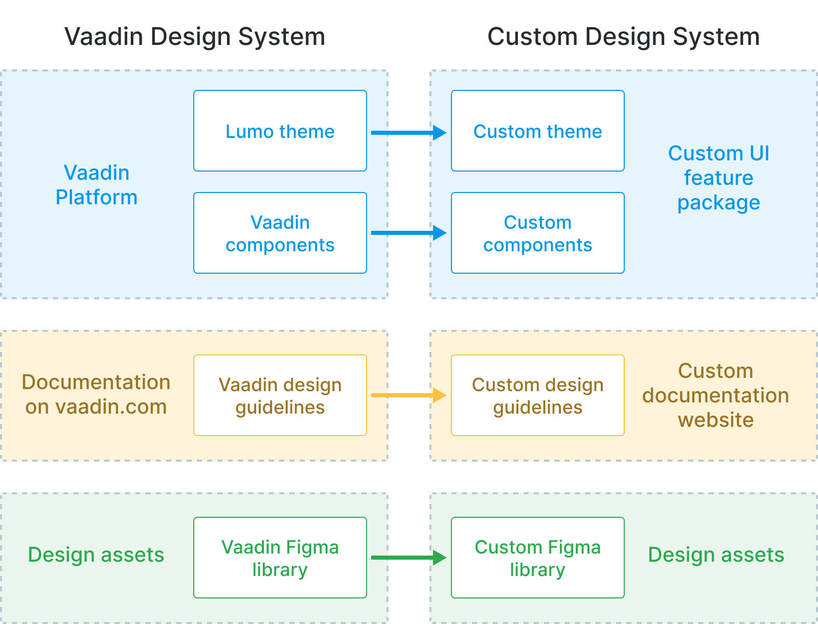
The bundling of components into a single, reusable codebase is nothing new. It has always been possible to package custom components into a reusable dependency, such as a JAR file. The new theme format introduced in V19 and V14.6 also makes it easy to define an application theme in a way that can easily be bundled into a JAR and applied to multiple applications.
The Figma library is also easy to copy and customize by adding representations of custom components and tweaking the colors and other styles to match a custom theme.
This leaves us with the most important part of the puzzle – the documentation – for which we are launching a brand new product called Design System Publisher.
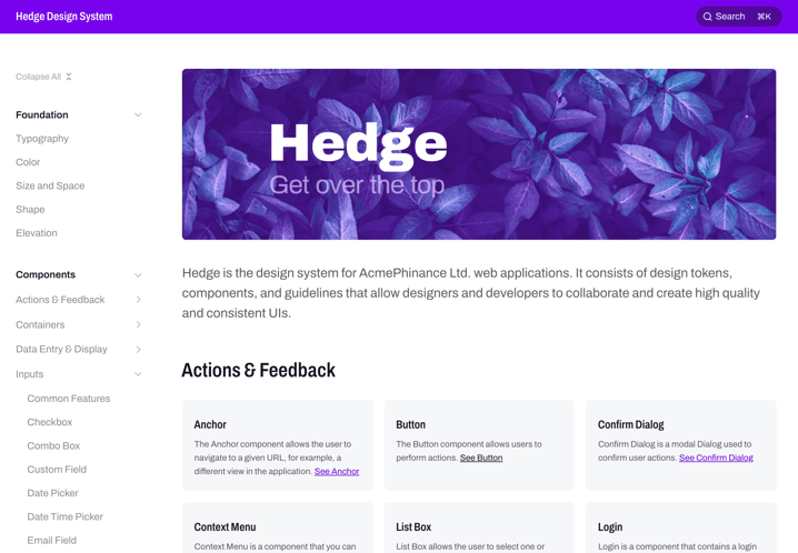
Design System Publisher – a UI Documentation Tool
Design System Publisher (DSP) is a tool that makes it easy to create your own design system documentation website for Vaadin-based UIs. Based on the same tooling that Vaadin uses internally to create the documentation section on vaadin.com, DSP is available as part of Prime and Enterprise subscriptions.
The tool allows you to write your documentation in the Asciidoc markup language, and embed Java- (Flow) and TypeScript-based UI samples into the pages – rendered as live, interactive UI samples and code snippets with highlighted syntax.
Design System Publisher comes bundled with the Vaadin Design System documentation as default content. The same theme and component packages used for your applications can be plugged into the tool to apply your custom theme to the existing UI samples, and make your custom components available for embedding.
Create a Design System in 8 Easy Steps
-
Create a Custom Theme
Create a new reusable theme project and add your style tokens and custom CSS into it, as described in the tutorial. -
Package and Deploy Your Theme and Components
Export the theme and your custom components either as separate packages or into a single JAR file, and deploy them into your local Maven repository. -
Initialize a Documentation Website Project
Install the vaadin-cli command-line tool, run the dsp-init command to initialize a new documentation website project, bundled with the Vaadin Design System documentation as a starting point. -
Add Theme and Component Dependencies
Add your theme and component dependencies to the documentation website project’spom.xml. -
Write Your Own Content
Add documentation pages and UI samples with code snippets for your custom components and tweak default Vaadin content to match your own UI standards. -
Brand the Website
Adjust the styling of the website itself to match your own brand by tweaking a few CSS variables. -
Start It Up!
Make a development build and run the website locally with the command npm run dspublisher:start. -
Deploy to Production
Finally, when you’re happy with the initial content, you can make a production build and deploy the website to your organization’s server and let your team start designing and developing based on your custom design system.
Interested in learning more? Visit the example website or read the documentation.