How to work with Designer?
 Vaadin Designer is a visual UI design tool where you can drag and drop - and configure - web components on a canvas.
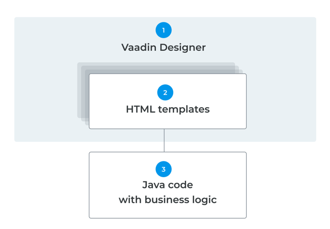
 The result is an HTML template. With Vaadin Designer, you have the end result in front of you at all times, and any change you do is instantly reflected in the end result.
 A Java class is created which refers to the HTML template. This class can be added to your application in Java. Components with defined IDs are available as Java references, and you can insert backend data into them. See the tutorial and start your trial.


Create your Java user interfaces faster
Building UI layouts in code involves a lot of trial and error. With Designer, you get to create the component tree and positioning visually in the design canvas and write the UI logic in your Java IDE. And because the layout is simply a Polymer 3 template, it lives as any code file in your version control system.
Get a quick overview of Designer

Drag & drop snippets and components
Build your UIs by dragging and dropping on a resizable design canvas to ensure responsiveness at all times. Use any Vaadin component or snippet component collections and you'll have a fully functional UI in no time.
Get a quick overview of DesignerPreview on devices and share with others
You can preview your designs live on an external device anytime, be it mobile or desktop. See your changes immediately on your device’s screen. Or, share the design with colleagues to set up a prototyping workshop.
Get a quick overview of Designer

WYSIWYG design canvas
Drag and drop web components. Updates when the design properties or styles are changed.

Quick layout editing
Control VerticalLayout, HorizontalLayout, and other flex containers quickly with flexbox controls.

Sizing and spacing panel
Set width, height, margin, padding, spacing properties with CSS values, or Lumo presets using a dropdown.

Viewport controls
Quickly check the responsiveness of the design.

Palette shows snippets and components
Pre-built snippets for Vaadin components. Use any web components from the project.

Outline to display component hierarchy
Modify component hierarchy using drag and drop. Easily connect components to the Java companion file.

Preview in browser or on your device
View design on a mobile device with one click. Share the preview link to others.

Work within your project
Work with designs directly in your Java project. Use a Java companion file to connect design to backend data.


Vaadin Designer has significantly improved our productivity by enabling us to directly produce a working prototype quickly, and have client's feedback very early on. I strongly recommend Vaadin Designer and suggest to try the templates, they are simply awesome!
Farrukh Ijaz CEOVaadin Designer, with its standard templates, plus the power of SCSS and the Lumo theme, gave me a huge running start when building a new web based front-end to replace our desktop product.
Greg Woolsey Director of Engineering