 Enterprise web applications have increased in prominence for companies across the board. In some sectors, well-established industry leaders face increasing competition from disrupters who only conduct business online. The days when your web assets become more valuable than your physical assets do not seem that far off.
Keeping up with technology trends on an enterprise level to maintain your company’s competitive advantage has never been more important. While technology advances very quickly in any event, the abruptness of the COVID-19 pandemic has drastically accelerated the pace.
In this post, we cover 3 megatrends shaping the future of enterprise web applications and the technologies employed to build them.
Megatrend 1: Shift from native to progressive web applications
Building enterprise web applications as progressive web applications (PWAs) is the most definitive current megatrend. It is also the trend with the most impact and benefit for everyone—your enterprise, employees and users.
The gap between new native applications and PWAs for enterprise business applications has been narrowing for some time. PWAs are set to overtake their native counterparts in the very near future.
PWAs transform the whole notion of building applications for business purposes. They also open up exciting new possibilities. While there are still a few use cases that are better suited to native applications, these are few and far between. Enterprise web applications, for the vast majority of business purposes, will be built as PWAs from now on.
PWAs make more business sense
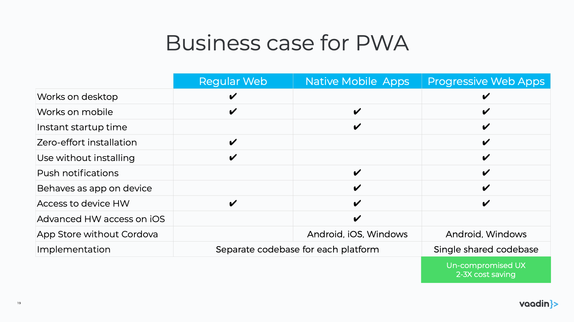
Today, the web has a perfect deployment model and past arguments for native applications are no longer valid. Here is a summary of the business benefits of PWAs, contrasted with their traditional alternatives.

While it was once true that web applications were slower and less engaging, with inferior UX and hardware/API access, this is no longer the case. In fact, in many respects, PWAs are today superior to native apps..
PWAs are:
- Progressive: Enhance functionality progressively on all devices and platforms.
- Performant: As fast (and faster) as an equivalent native app.
- Shareable: Able to retain (or reload) their state and can therefore be shared via a link.
- Responsive: Adapt gracefully to fit any device and screen resolution.
- Native-like: Look like native apps and use the application shell model with minimal page refreshes.
- Offline-capable: Work with or without a stable internet connection.
- Installable: Can be installed on all devices and accessed with standard tools, for example the start menu or taskbar.
- Up to date: The user is always served the most current app and content when connected to the internet.
- Engage users: Include features, such as push notifications, to promote user re-engagement.
- Discoverable: Can be optimized for organic search and indexed by search engines.
PWAs are simpler, cheaper and more profitable
Many leading companies are now building their customer-facing business applications as PWAs. There is no need to take our word for it, here’s a summary of the improvements the switch to PWAs brought to two big names on the web:
- Pinterest: Rebuilt their mobile web experience as a PWA and saw the following improvements in their core business metrics:
- Time spent > 5 min: +40%.
- User-generated ad revenue: +44%.
- Ad clickthroughs: +50%.
- Core engagements: +60%.
- Starbucks: Built a PWA that allowed website customers to browse the menu, customize their orders, and add items to their carts, even when offline. The final PWA is:
- Only 233KB in size—99.84% smaller than the mobile iOS app of 148MB.
- Much faster than the original iOS app.
- Favored by most users—Their DAU count doubled and downloads increased by 94%.
There are many similar PWA success stories out there, including Microsoft’s Office 365 and Spotify’s full desktop application.
A single code base reduces development costs
The fundamental Java value proposition—Write Once, Run Everywhere—is equally intrinsic to PWAs. You write your application on a single code base and run it across all platforms and devices. The reduced development costs, leave resources available for the bells and whistles today’s users demand, that upgraded internal platform your employees need, or simply to boost your bottom line.
Wrapping your code base with Cordova for all iOS and Android devices is already considered an outdated solution. In addition, PWAs do away with the costs and hassle of packaging your code for the App Stores, while your users benefit from not having to visit the stores to download updates.
Megatrend 2: Increased adoption of design systems
The second megatrend for enterprise web applications is that companies are starting to take advantage of design systems when building their business applications.
A design system is a single repository for all the elements used to design, realize and develop a web application. The system typically consists of:
- A modular set of building blocks for creating UIs. Example elements include UI components, visual styles, layouts, predefined compositions, patterns and the like.
- Standards for how the elements should be used and combined to create a UI.
A design system reverses the typical work flow: all aspects of a component, for example, are designed and developed up front. The elements are then reused, and possibly customized or extended, at the time of implementation. This ensures that the foundation you start from is a solid one from both a functional and aesthetic point of view.
Design systems boost your bottom line
If you are tempted to think that resources spent on improving your user experience and branding could be better spent elsewhere - think again! In the words of IBM CEO Thomas Watson Jr. “good design is good business.”
And this is backed up by research—way back in 2013, a Design Management Institute study found that design-centric companies outperform Standard & Poor-500 companies by 228%. A number of very well-respected companies were among those classified as design-driven, including Apple, Coca-Cola, Ford and IBM, to name only a few.
So, while the importance of design is not new, the use of design systems to facilitate good design is—and this trend is set to continue.
Design systems allow you to get it right—every time
Good design is not always obvious, but bad design speaks volumes. No matter how small or subtle the inconsistencies may be, they leave the user with an impression of unprofessionalism that can do a lot more damage than the cost of the cure.
A design system ensures that your enterprise web application is not only pleasing on the eye, but offers your users a great experience too. At a minimum, a design system provides:
- A professional look and feel, coupled with great UX.
- Consistency throughout your web application. This applies to all visual elements, as well as the way repeated elements function and interact.
- Efficiency in design and development resulting from the “design once, reuse everywhere” methodology.
- Easy collaboration between designers and developers.
An increase in efficiency is typically accompanied by a decrease in costs that is always very welcome in today’s highly competitive marketplace.
The unaffordable cost of inefficiency and inconsistency
Without the standards and cohesion imposed by a design system, each UI feature is designed from scratch. It’s like reinventing the wheel—over and over again.
This approach is inefficient and likely to leave you with many incompatible versions of the same solution. Because there are no controls or a foundation from which to start, there is no guarantee designers will find existing implementations, and when they do, they may not be based on best practices or designed for easy reuse or extension.
When across-the-board changes need to be implemented, the problem is exacerbated as the whole redesign process begins from scratch once again. Multiple implementations always means more code to maintain, more code to refactor, and probably more bugs.
Design inefficiency leads to the next problem—design inconsistency. Not even the most talented designer can remember all the nuances of last month’s design, let alone last year’s. As inconsistencies creep in, the extra touch of class that kept your app a cut above the rest begins to fade.
Inefficiency and inconsistency also tends to roll over into the development arena. Developers end up doing design-related tasks while implementing new functionality, because a designer may not be readily available or the design elements appear minor.
Design systems solve all of these problems. Wasted time and effort, in both design and in development, becomes a thing of the past.
Design systems help you meet user expectations
Inconsistencies and inefficiencies in your business UI is inherently bad for business. Today’s user has extremely high expectations and if you’re not meeting them, you may as well wave your users goodbye.

Good UI design is a lot more than something pretty to look at. You also need to provide exceptional usability or ease of use. In other words, your application needs to help the user achieve their objective as effortlessly as possible. This is a critical “must have” that could see your business sink or swim. Companies like Airbnb and Lyft that offer an amazing user experiences have set the bar very high.
Users also have a low learning threshold and a low tolerance for error. What they need to do should be obvious and what they receive in return, flawless. The days of expecting users to be patient while you get it right are long gone.
Consistency, whether within a single application or between multiple different applications, is one of the most important usability factors, because it reduces user error and lowers the learning curve. Users get to focus on what they need to do, rather than on how your app works.
Standards-based design systems foster longevity
A design system is a great starting point to upgrade the UX of your business app to expected standards, but a design system based on accepted and recognized standards is even better. In addition to internal uniformity throughout your enterprise web assets, your app becomes compatible with external solutions as well. This has many advantages and opens up a host of new opportunities. For example, you can integrate ready-made, third-party implementations, many of which are open-source and free to use.
The Web Components standard is the leading standard for UI components today. It originated at Google in about 2010-2011 and has evolved to keep pace with the latest technologies. Having regard to how fast things evolve on the web, it is fair to say that this standard has already stood the test of time. There is no reason for this not to continue and basing your design system on this standard gives you the best odds for longevity.
The standard is also well supported in the development community. Youtube and Apple Music are only two examples of huge apps built on web components.
Megatrend 3: Real-time collaboration
The third megatrend is not a technology trend as such, but rather a new paradigm for the way enterprises operate. Real-time collaboration is the way of the future and demand for technology that facilitates this, is set to boom. This is not a new trend, but the COVID-19 pandemic has made an extremely urgent one.
The pandemic brought home just how vital collaboration is. It caused an abrupt and gigantic shift from office to remote working for most enterprises. Many had to find secure and efficient collaborative solutions almost overnight. Participating in a Zoom meeting quickly became the norm, but as usual, hackers were not far behind, and new security measures became necessary. The Zoom adoption statistics are astounding: the number of daily meeting participants increased from 10 million in December 2019 to 300 million in April 2020. Microsoft Teams and Google Meet also saw huge increases in new adoptions and continue to compete for 2nd and 3rd place in the popularity stakes.
The trend towards real-time collaboration tools has its origins in the office suite market. Google first disrupted the market back in 2009 with the launch of Google Docs. This was probably the first real-time collaboration tool to prove that the ability to collaborate makes teams more productive.
Microsoft has since countered by offering its Office suite as a PWA, and there are many recent examples in related industries: Figma disrupted web-design tooling by offering simultaneous, multi-user editing and Visual Studio Live Share facilitates app-development collaboration.
Gartner has even coined a new term—Workstream Collaboration—to describe the use of real-time collaboration tools. They predict that this market will grow to $4.9 billion by 2021 and that 70% of teams will rely on these tools on a daily basis.
How Vaadin can help you integrate these megatrends
At Vaadin we strive to stay ahead of the curve. Our framework is built for enterprise-level web applications and includes everything necessary to keep your organization secure and effective on the web. We’re in it for the long term and the Vaadin framework will continue to evolve and take advantage of whatever the future may bring. We would be proud to partner with your enterprise as we navigate unchartered territory.
All 3 megatrends are entrenched in our future plans. You can find out more in our roadmap. An exciting, additional new product—the Vaadin Collaboration Engine—is also currently in development. You can watch a pre-release demo here.