
Business app workhorse
If a data table/grid is the most prominent and defining component of a UI framework, the combo box might be the most commonly used of the more complex widgets in business applications. It is very helpful for the users in situations where they have a very long list of options to choose from, as the users can easily narrow down the number of choices by filtering.
This seemingly simple component actually hides a lot of complexity under the hood, keyboard navigation and dropdown behavior (alignment, positioning) being the most prominent ones.
The <vaadin-combo-box> element uses Google Material Design inspired styling to fit in with all Polymer Paper Elements.
The Vaadin Framework ComboBox component has a slightly similar story to the original Table component, which is now being replaced by the newer Grid component. As with Table, years of development done for ComboBox have taken its toll, and the codebase has become less than ideal to maintain, making it hard to add new features. Together with the advent of Web Components, it was a great time to start reimplementing the component on top of the latest web technologies and fix the most glaring issues in the old component. The vaadin-combo-box> element offers the end user two ways of selecting an item from the options, either by mouse or by keyboard, and it also offers the user the possibility to filter the options by typing in the input. Especially the keyboard actions, and how the values typed into the field are handled, needed careful consideration. There are over a dozen different state transitions (triggered by different actions) in the component, and making the wrong implementation decision is easily very noticeable for the end user.
As well as filtering and selecting an item from a predefined set of options, vaadin-combo-box can also be allowed to accept custom input values, making it a very versatile component for user input.
On top of this, it works as expected on both desktop and mobile devices, using mouse, keyboard or touch. This might seem like a small thing as well, but underneath this requires some serious engineering effort to make it work nicely for the end user, no matter where the developer might choose to display the combo box.
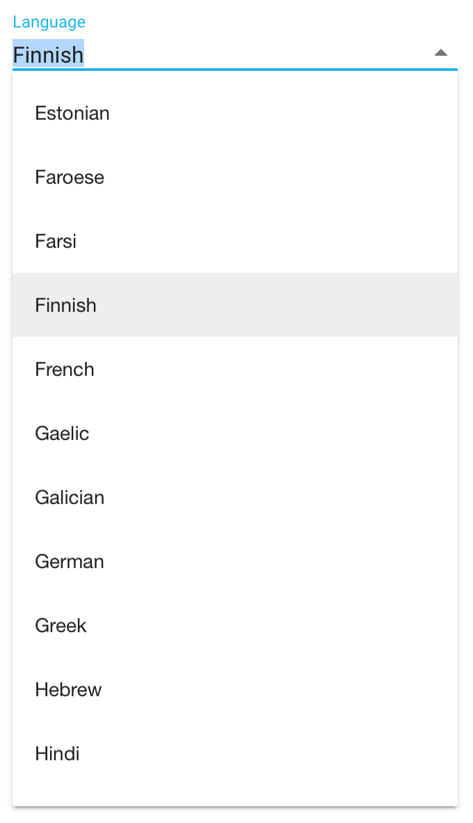
<vaadin-combo-box
  label="Language"
  items='["Afrikaans", "Albanian", "Amharic", "Arabic", "Armenian", ...]'
  value="Finnish">
</vaadin-combo-box>
Simple configuration of vaadin-combo-box using HTML.
All of the features have gone through multiple user testing sessions, to validate that they fulfill the requirements as end users and developers would expect. Roadmap for vaadin-combo-box The 1.0 release does not indicate that we would be done with the element. We have a list of features waiting in the backlog that we want to add, such as multi-select, customizable item representation and more. You can follow and participate in the development on GitHub. All comments, bug reports, feature requests and pull requests are more than welcome! Learn more Head over to the Vaadin Elements page and the dedicated page for vaadin-combo-box to see code examples and demos and learn how to start using it!
Learn more about vaadin-combo-boxVaadin Icons helper for Polymer released
We’re also happy to announce the 1.0 beta release of vaadin-icons, an iron-icon compatible icon set that can be used together with (or as a replacement for) the icons shipping with Polymer Iron Elements. In order to use vaadin-icons, simply import the icon set and use them the same way as you would an iron-icon.
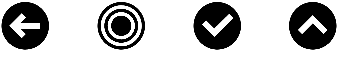
<link rel="import" href="bower_components/vaadin-icons/vaadin-icons.html">

<iron-icon icon="vaadin-icons:arrow-circle-left"></iron-icon>
<iron-icon icon="vaadin-icons:bullseye"></iron-icon>
<iron-icon icon="vaadin-icons:check-circle"></iron-icon>
<iron-icon icon="vaadin-icons:chevron-circle-up"></iron-icon>
Vaadin Icons
Vaadin Icons is a set of more than 500 free icons designed for web applications. The icons are modern, sharp and edgy, and they scale well to any size. In addition to the new Vaadin Elements compatible Polymer API, Vaadin Icons can be used standalone as font icons or SVG/PNG images. There is also an addon for using the icons through the Vaadin Framework Java API.
Try out vaadin-icons in your Polymer project today