The aim of this article is to give you the tools to make your Vaadin Charts look the way you want them to look. We Finns are not much for small talk so let’s get right to business.
There are two ways of theming your charts. You can either:
- theme each chart individually; or
- you can create a generic Theme which you can register to a specific UI so that each chart created in that UI will look the same.
The core concept behind theming a chart revolves around handing an Object with theme data to whatever part of the chart you are currently trying to theme. In most cases this will be a Style object but it could also simply be for example a Color or a String.
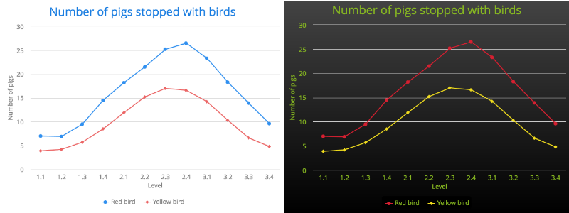
We will be working with a simple chart showing our spectacular run in the game Angry Birds. Our task is to take the default theme provided for us and replace it with some of the brand colors of Angry Birds. We will start by modifying a single chart, after which we will show you how you can set the UI specific theme. See before and after versions below.
The Plot of the Story
Probably the most common parts to the theme would be the plots of the charts. We can do this by taking the ListSeries object we use to add the data points to the chart and handing it a PlotOption object. In our case we are displaying our data using line charts which means that we need to create a PlotOptionsLine which contains the setColor method. This can then be passed to the ListSeries.
ListSeries redBirdList = new ListSeries();
redBirdList.setData(7.0, 6.9, 9.5, 14.5, 18.2, 21.5, 25.2, 26.5, 23.3, 18.3, 13.9, 9.6);
...
PlotOptionsLine redBirdOptions = new PlotOptionsLine();
redBirdOptions.setColor(new SolidColor("#d62031"));
redBirdList.setPlotOptions(redBirdOptions);
This has now set the color for the line containing our red bird data.
Doing a Background Check
Backgrounds are very easy to theme. The background is something that is tied specifically to the chart itself, which means we can figure out that in order to theme it, we simply need to get a hold of the ChartModel which contains general styling options for the chart and call the setBackgroundColor method. This can be done through the Configuration object.
To make it more interesting, we will be adding a gradient background color.
GradientColor color = GradientColor.createLinear(0, 0, 0, 1);
color.addColorStop(0, new SolidColor("#444444"));
color.addColorStop(1, new SolidColor("#000000"));
configuration.getChart().setBackgroundColor(color);
This will create a gradient with no color stops so it will smoothly transition from the first to the second color over the entire chart.
Unfortunately this leaves us with a problem. The legend shown at the bottom of the chart still has the original background, so we will modify this by making the entire legend background to be a solid color that merges into the background.
configuration.getLegend().setBackgroundColor(new SolidColor("#000000"));

The axes of awesome
The final step in this tutorial will be to theme the actual text being shown around the chart, so the Title, Legend text, and labels for the axes.
Again, our first step is to find the part of the chart we want to modify and then set the style for it. So we fetch the Y and the X axes from the configuration and target the labels (the text) and the titles with the Style objects containing the color we want. We do the same for both the chart title and the legend.
 Style greenTextStyle = new Style();
 greenTextStyle.setColor(new SolidColor("#88b922"));

 xAxis.getLabels().setStyle(greenTextStyle);
 xAxis.getTitle().setStyle(greenTextStyle);
 yAxis.getLabels().setStyle(greenTextStyle);
 yAxis.getTitle().setStyle(greenTextStyle);

 configuration.getTitle().setStyle(greenTextStyle);
 configuration.getLegend().setItemStyle(greenTextStyle);
We have now successfully themed all of the major parts of our chart, whether it be for better or worse (we will leave that up to the reader). Using the concepts we have learned here, we can now theme all of the parts of the chart; Plot, Tooltip, Title, Subtitle - All follow the same core concept of passing the correct part of the chart an object containing theming data.
Next up, we will focus on how we can apply this to create a default theme for all charts in our application, and doing it in a way that does not require us to duplicate our code.
One model to rule them all
The first thing that we need, to be able to create a generic theme for our application, is to create a class that extends the com.vaadin.addon.charts.model.style.Theme class.
public class ChartTheme extends Theme {
…
}
This class can then be set as the default theme for the UI by somewhere in the UI instance, i.e. the init method, calling
ChartOptions.get().setTheme(new ChartTheme());
Now that we have a theme that is being used for all charts, we can start to modify it. To do this we need to either override existing methods in the ChartTheme class or we need to set the properties we want to define. All of the following changes are done within the ChartTheme class.
We again start by modifying the colors of the plots. This is done by defining an array of colors for the theme which will then be used to set the colors in the order new plots are added to the graph. We can do this in the constructor of the ChartTheme class itself.
public ChartTheme() {
 Color[] colors = new Color[2];
 colors[0] = new SolidColor("#d62031");
 colors[1] = new SolidColor("#f0dc1e");
 setColors(colors);
…
}
The background of the charts can be set in the same way as previous, by accessing the legend and the background objects and calling setBackgroundColor. Only this time the same is done within the ChartTheme class.
GradientColor color = GradientColor.createLinear(0, 0, 0, 1);
color.addColorStop(0, new SolidColor("#444444"));
color.addColorStop(1, new SolidColor("#000000"));
getChart().setBackgroundColor(color);
getLegend().setBackgroundColor(new SolidColor("#000000"));
And finally the axes.
Style greenTextStyle = new Style();
greenTextStyle.setColor(new SolidColor("#88b922"));
getxAxis().setLabels(greenTextStyle);
getxAxis().setTitle(greenTextStyle);
getyAxis().setLabels(greenTextStyle);
getyAxis().setTitle(greenTextStyle);
setTitle(greenTextStyle);
getLegend().setItemStyle(greenTextStyle);
Now each new chart that you create will be themed according to your brand style and you can move on to other parts of the application knowing that all of your charts will have your personal touch added to them.
For more advanced configurations, you can access the PlotOptionsStyle object within the Theme to configure each different chart type.
The entire demo project created for this tutorial can be found at our GitHub repository. Happy styling!