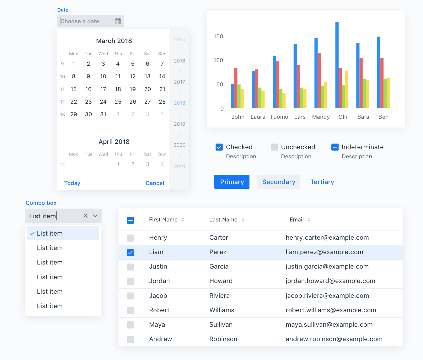
Vaadin separates the appearance of the user interface from its logic using themes. The built-in themes come with:
- Clean typographic hierarchy
- Carefully adjusted spacing of elements in all components
- Animations
- Hundreds of cohesive design decisions
- CSS variables for customizing fonts, colors, border radius, and spacing.
- Ability to override individual component styles

Vaadin theme benefits
For all screen sizes and pixel densities
Lumo uses CSS for all of the stylings, meaning there are no raster images used for any of the parts of the components. The built-in icon set uses resolution independent font icons.
Customizable and extensible
Both of the ready-made themes have a styling API you can use to easily customize aspects of the theme, such as fonts, colors, and rounded corners.
Light and dark themes
All ready-made themes include a dark version, in addition to the default light version. You can even use both variations at the same time, one section of your app being dark while the rest is light.

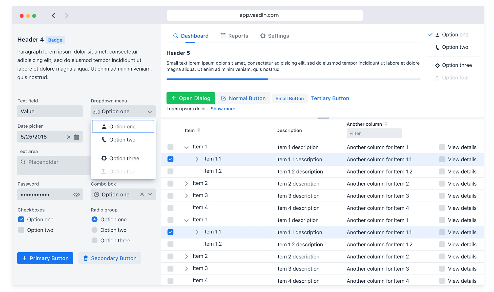
Lumo theme
All the Vaadin components implement the Lumo theme by default, which gives your application a coherent and polished look out-of-the-box. Lumo has a compact pre-set with reduced space between elements for when you have a lot of data on the display.
Read documentation
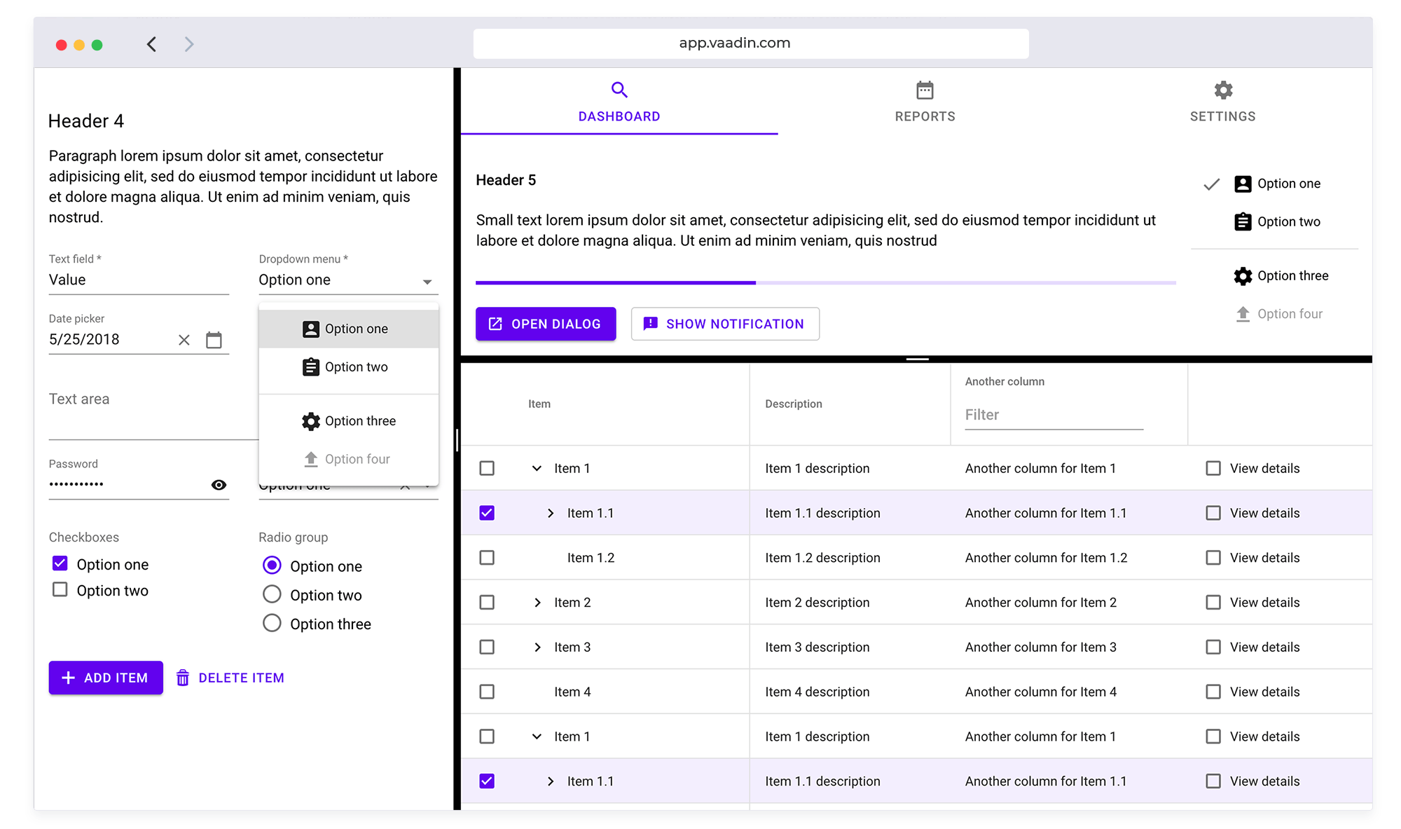
Material theme
The Material theme is an implementation of Google’s Material Design specs. The specs are followed whenever possible, and for features which are not described in the spec, we take inspiration from the guidelines in general and make them fit in seamlessly.
Read documentation