Why do you need CSS variables?
The purpose of CSS variables (CSS Custom Properties) is to enable using a CSS value across your whole application. Previously this has been possible by using a CSS preprocessor like Sass. Unlike SCSS or LESS, CSS variables are natively supported by most modern browsers (not IE11), and therefore there’s no need for separate compilation step. Because there’s no need for compilation, the values of CSS variables can be changed on-the-fly, and the browser can interpret the changes immediately.
|
Note
|
Read more about Lumo and browser compatibility from Lumo documentation |
Using variables for theming ensures consistency and reduces code repetition. The whole theme becomes easier to maintain as the values are defined once and referenced throughout the code. Additionally, the well-formatted variable names are much easier to interpret than hex-values for example.
How to use CSS variables?
CSS variables are defined with the following markup:
html {
  --green: #bada55;
}
Define variables in document root to make them accessible anywhere in the DOM. Values can be reset anywhere in the DOM which helps to scope the styles to specific parts.
Variables are accessed like this:
.button {
  background-color: var(--green);
}
The markup also supports setting default values in case the CSS variable isn’t defined:
.button {
background-color: var(--green, #88aa66);
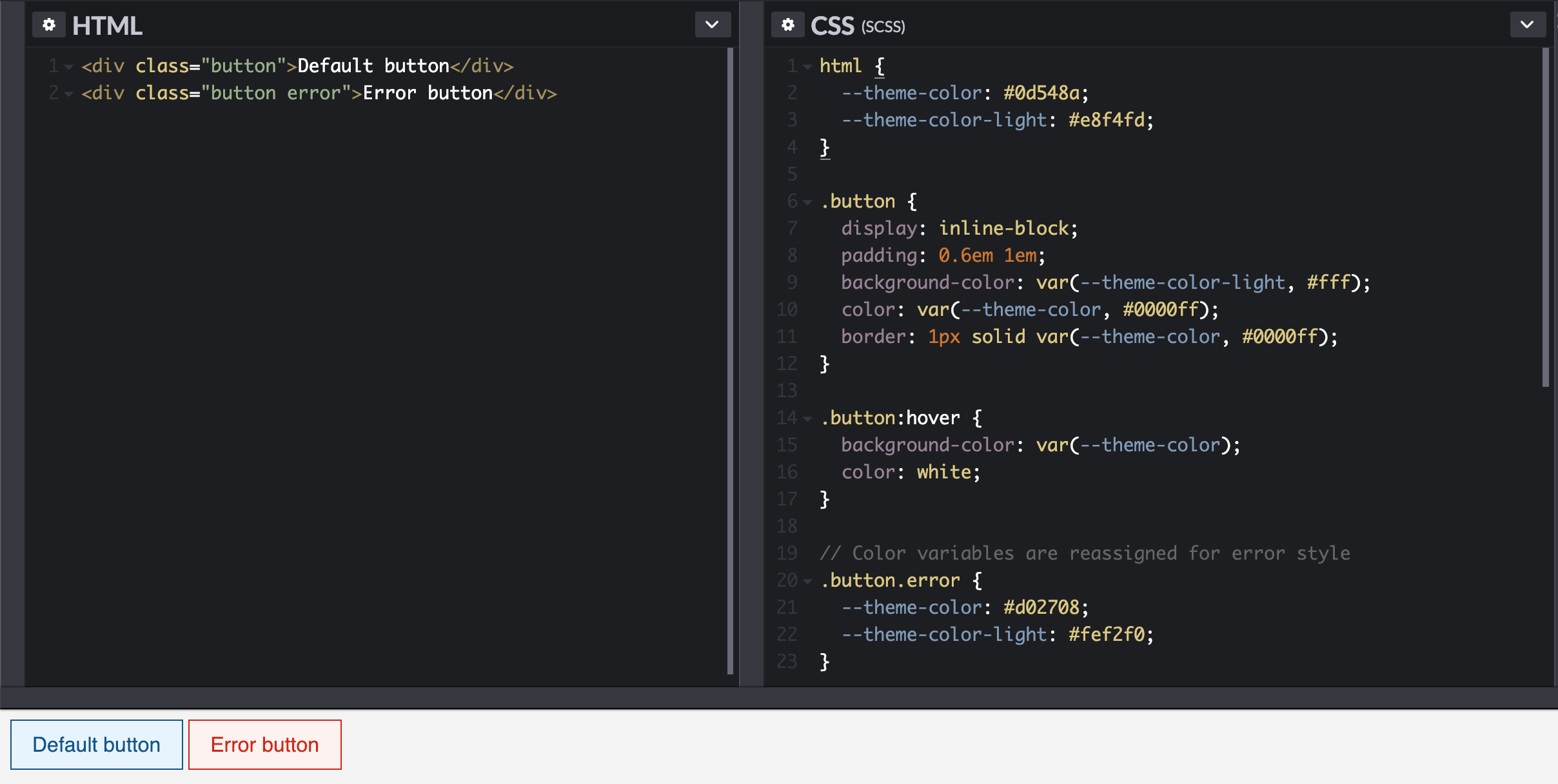
}Here’s a simple example of div elements styled as buttons that use variables to set the color for text, background, and border.
Usage in Vaadin Web Components
The Vaadin Lumo theme uses CSS variables to define the look and feel of web components, making it easy to alter the look and feel of the components by tweaking a set of basic variables. You can quickly discover the variables available in your project by opening up inspector tools and taking a look at the <html> element’s CSS properties.
|
Note
|
Lumo base variables are documented here. |
CSS variables are a good match for Web Components as the styles are inherited just like any other CSS properties, which helps to tame the added complexity that using ShadowDOM can lead to.
|
Note
|
More about global and local scope at ThemableMixin documentation. |
Example
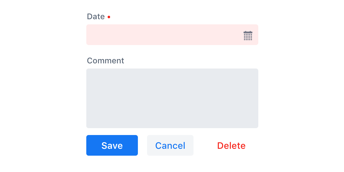
-
The starting point and default style.
-
Let’s start by making small tweaks to existing Lumo variables. The global styles are defined within
<custom-style>element insideshared-styles.html.
<custom-style>
  <style>
    html {
      --lumo-border-radius: 0px !important;
      --lumo-primary-color: #0d548a;
    }
  </style>
</custom-style>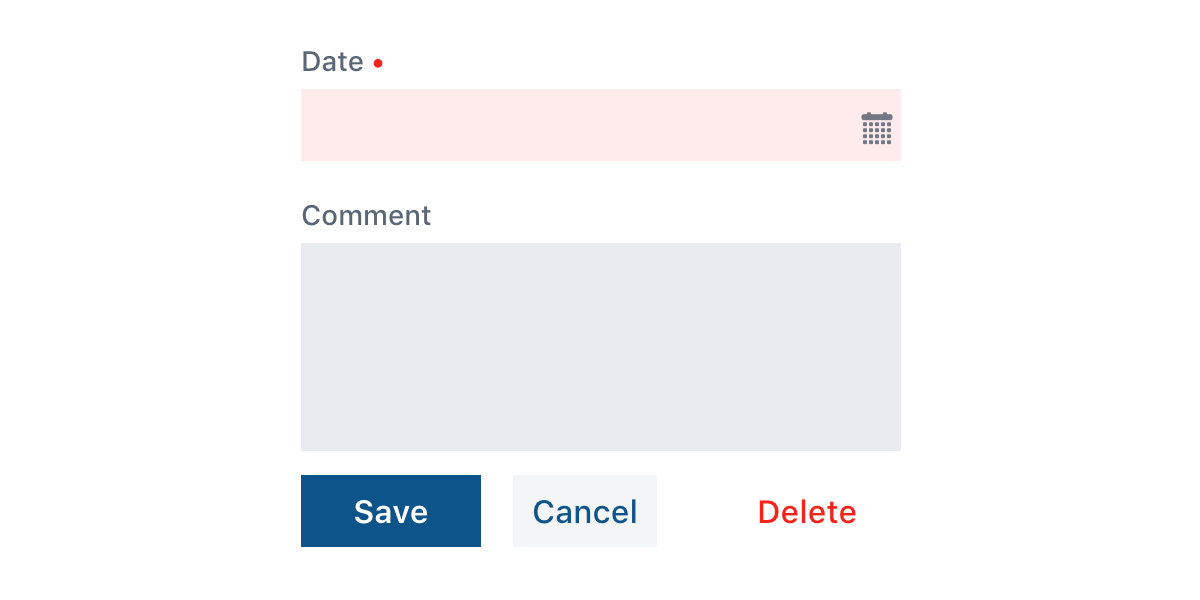
-
Next, we can introduce new variables for a custom color and custom gradient.
<custom-style>
  <style>
    html {
      --lumo-border-radius: 0px !important;
      --lumo-primary-color: #0d548a;
      --my-teal-color: #0d7f8c;
      --my-primary-gradient: linear-gradient(var(--my-teal-color), var(--lumo-primary-color));
    }
  </style>
</custom-style>-
To use those new variables only within the scope of
vaadin-button, a Theme Module forvaadin-buttonhas to be added. -
For
vaadin-buttonthe border-radius is set to be 6px. -
The primary buttons are targeted using an attribute selector, and gradient background is set.
<dom-module id="my-button-styles" theme-for="vaadin-button">
  <template>
    <style>
      :host {
        --lumo-border-radius: 6px;
      }
      :host([theme="primary"]) {
        background-image: var(--my-primary-gradient);
      }
    </style>
  </template>
</dom-module>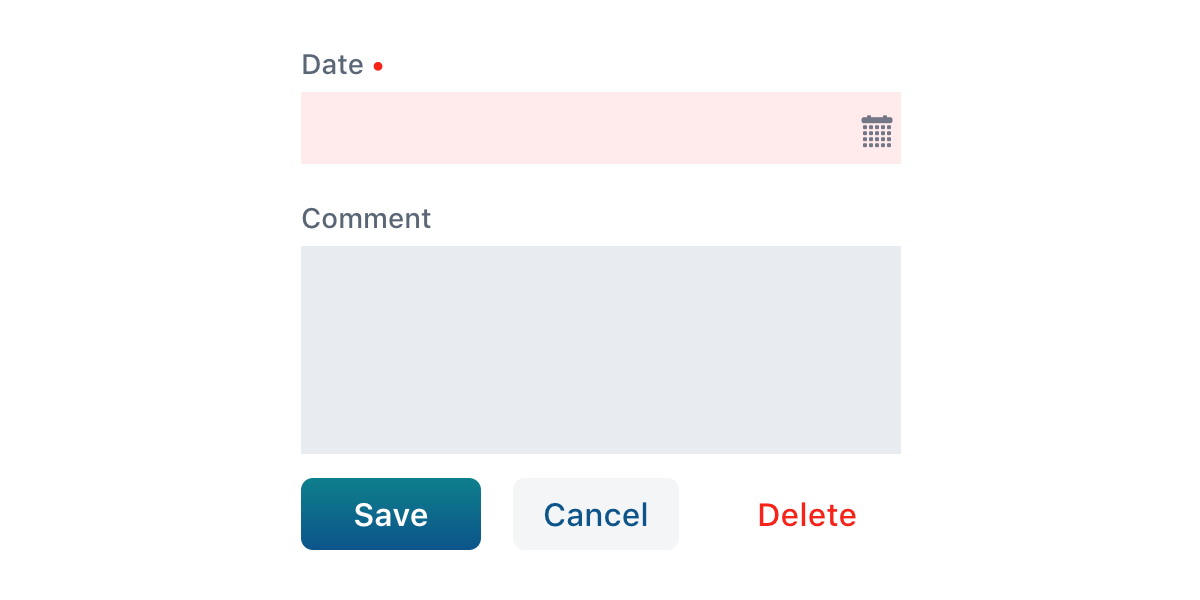
-
In the end, text-fields use the variable values defined in global scope and buttons use the values defined in vaadin-button scope.