
Vaadin 24 introduces a simplified approach to styling Vaadin components based on the ::part() selector. It removes the need for component-specific stylesheets, simplifies many common use cases, and is fully based on native CSS. New theming documentation, including CSS selector references for components, makes it easy to find the right selector for the component, part, or state you want to style. The best part? You can choose whether and when to migrate to it!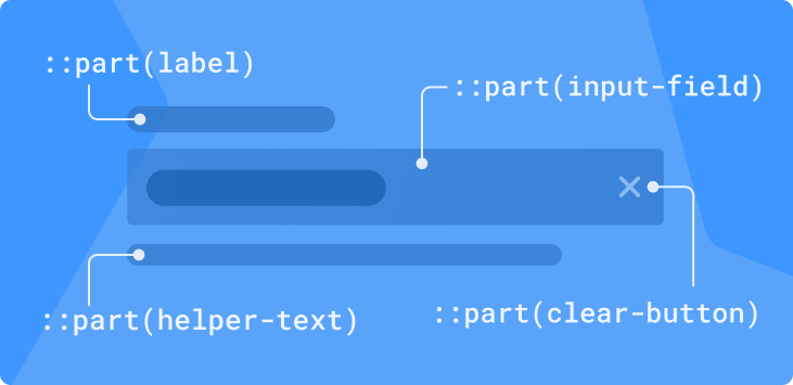
Background
Styling Vaadin components can be quite complicated that is largely due to their richness and complexity. Vaadin components have a lot of features; they’re made up of multiple internal elements; and support various modes and states like disabled, selected, and expanded.
All of these features add complexity to the task of determining what to target, how to write a CSS selector for it, and how to avoid breaking something in the process.
Furthermore, Vaadin components employ an HTML feature called Shadow DOM, which isolates the components’ internal CSS and scripting from the surrounding page to avoid conflicts and simplify their internal implementation. This has made it impossible to style most parts of Vaadin components with regular stylesheets. Instead, Vaadin has provided mechanisms for injecting custom CSS into components’ Shadow DOM.

The API for using the Shadow DOM CSS injection mechanism has varied quite a bit over the years:
- In Vaadin 10, component CSS had to be wrapped in a
<dom-module>element in an HTML file, and loaded with the@HtmlImportannotation. Atheme-forattribute on thedom-moduleelement specified which component the CSS would be injected into. - Vaadin 14 eliminated HTML-wrapping, making it possible to use actual CSS files for CSS. It also introduced the
@CssImportannotation, whosethemeForparameter was used to specify the injection target. - With Vaadin 19 came the new application theme folder, in which the name of the stylesheet file defined the target component. This made it possible to apply all CSS with a single
@Themeannotation on the Java side.
Thankfully, across all of these iterations, the actual CSS selectors used to target parts of components have stayed mostly the same. However, the documentation available for these selectors has been somewhat lacking, leading many developers to use the element inspector in their browser’s developer tools to determine what to target and how.
Problems with the Current Approach
Although the theming solution for Vaadin applications has improved over the years, freeing developers from awkward HTML-in-CSS and dozens of annotations, theming Vaadin 23 still presents developers with several challenges:
- Each component requires its own stylesheet;
- The “sub-components” contained in many components require their own separate stylesheets;
- The differences between Shadow DOM stylesheets and regular stylesheets can cause confusion;
- The Shadow DOM selectors
:host(),::slotted()and[part=””]are unfamiliar to most developers; - Styling parts of components based on one of the component’s parent elements is very difficult;
- Lack of component-specific styling documentation.
There's a New Selector in Town
The key to simplifying many of these complexities is the new(ish) native CSS shadow part selector, ::part(). It provides styling access to elements in a web component’s Shadow DOM that have a part attribute – that same attribute Vaadin components have had since Vaadin 10, that you’ve probably been targeting using the somewhat awkward [part=””] selector in your Shadow DOM stylesheets.
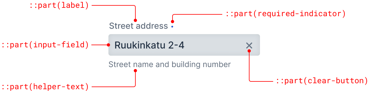
The part selector takes the shadow part name of an element as a parameter: ::part(name). As an example, the label in the Vaadin Text Field’s Shadow DOM has the part=”label” attribute and can be styled using the vaadin-text-field::part(label) selector as you see here:
vaadin-text-field::part(label) {
  color: green;
}
Typically, as in the above example, the part selector is prefixed with the component’s root element name – the same name that you’d give to your component stylesheet in the V23 theme folder or give as the themeFor parameter to the @CssImport annotation in V14.
The main difference is that you can place that CSS block in any stylesheet loaded into your application – no more need to split styles across stylesheets per component. You can have all your CSS in a single stylesheet or split it into any configuration of multiple stylesheets you desire. Whatever makes sense to you.
Another significant benefit is that you can scope that block to a particular parent element. So to apply the same styling only to text fields in a Grid, you can prefix the selector with the vaadin-grid root element like so:
vaadin-grid vaadin-text-field::part(label) {
  color: green;
}
You can even target the same part in multiple different component types in a single CSS block by using, for example, the :where() selector. To apply the same styling to Combo Boxes and Date Pickers as well, you could write this:
vaadin-grid :where(
  vaadin-text-field, vaadin-combo-box, vaadin-date-picker
)::part(label) {
  color: green;
}
Or, if you’re not too particular about the component type, and want to style all label parts in all components that have one – which for Vaadin components means all the various input field components – you can prefix it with the universal * selector instead:
vaadin-grid *::part(label) {
  text-transform: uppercase;
}
Using the V23 styling approach, the above would have required 14 separate stylesheets and a new custom CSS property scoped to the Grid. With the new approach, it’s only one style block.
Regular child elements, rendered into a slot in the component, can be targeted using normal CSS child selectors, instead of the more complex and limited ::slotted() selector:
vaadin-button > vaadin-icon {
  color: red;
}
While these selectors can get quite complex too, on the whole, things are much simpler: There’s no distinction between global and component-specific Shadow DOM styles, no more :host() or ::slotted(). Also, the syntax should be familiar to anyone with CSS experience – with the possible exception of ::part(), which has a very simple syntax.
Improved Theming Documentation
Thanks to this new, simpler approach to styling, it’s now easier to provide comprehensive lists of all of the selectors that can be used on Vaadin components.
Each Vaadin component documentation page now has a Styling tab that contains a list of all of the CSS selectors – parts, child elements, state attributes, and so on – that can be used to style them.
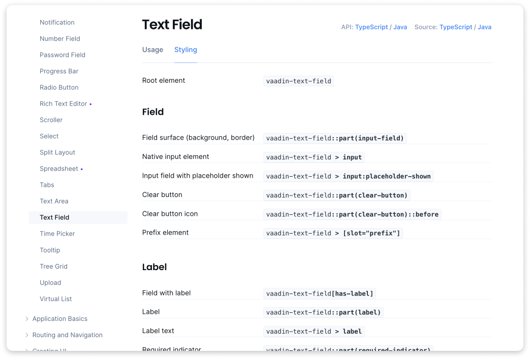
Many of these selectors can be combined with each other, and with parent and class name selectors to scope them to specific component instances. The various types of selectors, and common ways to combine them, are described in the new application theming documentation based on the new theming approach.
The Overview section in the new theming documentation should provide you with all of the basics of styling a Vaadin application. The other sections provide you with detailed information about various styling-related topics.
CSS Classnames Replace Custom Theme Attributes
Another unnecessary complication in V10–V23 has been the duality of CSS class names (applied with addClassName) and custom theme variant attributes (applied with addThemeName).
The key difference between the two is that CSS class names are not propagated to components’ overlays or sub-components, while theme attributes are. In practice, many developers have been uncertain about which to use, and have often resorted to using theme attributes just in case. While this works just fine, targeting theme attributes in CSS requires a more complicated and error prone [theme~=”name”] selector, instead of the much simpler .name class name selector.
In Vaadin 24, the need for custom theme attributes is being removed in two ways:
- Sub-components have been mostly eliminated by refactoring in favor of shadow parts (styleable using the
::part()selector) and regular child elements. - The new
setOverlayClassName(String)method makes applying CSS class names to components’ overlays easy and unambiguous.
Thus, to apply styles to a specific Combo Box instance and the dropdown overlay of a specific Combo Box instance, you can apply class names – either the same or different – to each:
ComboBox cb = new ComboBox("Example");
cb.addClassName("example1");
cb.setOverlayClassName("example2");
vaadin-combo-box.example1::part(label) {
  color: green;
}

vaadin-combo-box-overlay.example2::part(overlay) {
  background: lightgray;
}
In Vaadin 24.0, some components still require you to use theme attributes to style their items. – such as individual menu items in Menu Bar and Context Menu. However, these are also getting their own class name APIs in 24.1.
There is one exception to this new class-names-everywhere method: Grid cells are still inside the Shadow DOM of the Grid component and must be styled using the ::part() selector. Since this doesn’t work well with the ClassNameGenerator API used to apply class names to cells, a new PartNameGenerator has been introduced to make it possible to apply shadow part names to them, instead.
Summary of Advantages
This is plenty to take in, so here’s a list of the advantages:
- All of your CSS can be regular, non-Shadow-DOM CSS.
- Styling is now fully based on regular, native CSS – no Vaadin-specific things to learn.
- You have the freedom to structure your stylesheets how you like – no need to split them per component.
- It’s easier to style components based on their parent elements.
- It’s easier to apply the same styling to multiple component types.
- No more error-prone
:host(),::slotted()or[part=””]selectors – just plain CSS including the new, simpler ::part() selector. - No more class vs. theme: just use class names for everything.
- Component-specific CSS selector reference lists, and all-new theming documentation for Vaadin applications, based on the new approach.
Migrating Existing Themes
At this point, you’re probably wondering how much effort it will take to refactor all of your CSS to this new model in order to migrate your application to Vaadin 24. Well, there is good news and bad news on this.
The good news is that you don’t have to jump over the new styling approach in V24. The old ways of applying CSS to components still work – both the theme folder / components subfolder method and @CssImport / themeFor. There are currently no plans to remove support for those in upcoming versions, although it may happen in the long term.
In fact, nothing prevents you from using the V14, V23, and V24 approaches in parallel and gradually migrating your CSS to the V24 system at your convenience. The only caveat is that you need either to keep your V24-style stylesheets out of the theme’s components folder – lest they be injected, V23-style, into the Shadow DOM – or disable the V23-style injection with a flag in your theme’s theme.json configuration file.
The only thing you lose by sticking with the old method is that you can’t rely on the CSS selector reference documentation added to the component pages for V24. Many of the selectors listed there do work in V23 – including many of the ::part() based selectors – but some don’t.
The bad news is that the internal structure of some components has been modified to support the new approach, which may break some custom styling applied in earlier versions. The breaking changes are listed in the V23-to-V24 Upgrade Guide and guidance on how to refactor affected CSS to work in V24.
Further Improvements Coming Soon
One additional improvement coming later in 2023 is a set of new CSS properties that will make it easy to customize the styling of UI features common to many different Vaadin components without writing any CSS.
For example, the background color of text input fields will be represented by a property called something like --vaadin-input-field-background, and will enable you to change the background of all input field components simply by assigning a value to it:
html {
  --vaadin-input-field-background: lightgray;
}
Another property will control the color of the focus ring on focusable elements:
html {
  --vaadin-focus-ring-color: green;
}
Although similar to the existing Lumo-style properties (such as, --lumo-primary-color and --lumo-font-size-m), these new properties will be specific to certain UI features, giving you more granular control over styling than the more abstract style properties we now have.
Go to V24 styling documentation -->