
This document is meant for developers who are new to Vaadin and want to get up to speed quickly. It gives you a quick overview of the core concepts and provides links to relevant documentation for further reading. It can also be used as a quick reference while developing Vaadin apps.
If you don’t have Vaadin app set up yet, you can download one on the starter page.
Core concepts
Hello world
Here is a small but complete Vaadin application.
MainView.java
@Route("")
public class MainView extends VerticalLayout {
 public MainView() {
   add(new H1("Hello World!"));
 }
}
Vaadin uses a component-based programming model. In this example, our application is a component that extends from one of Vaadin’s basic layouts, VerticalLayout. In the constructor, we add an H1 component (corresponds to a <h1> HTML tag) to the layout to say hello to the entire world.
Finally, we map the application to the context root with the @Route("") annotation. The empty string here means that it should match the empty route.
Components
Vaadin has a component-based programming model. It comes with a large library of UI components and layouts that you can extend with your own components to build applications.
You can find a list of all the components here.
|
Note
|
If you are using one of the starters, you have access to all the components without any additional installation steps. The installation instructions on the component pages are for those who are setting up a custom project setup from scratch. |
Using components
Let’s begin by instantiating a new component:
Button button = new Button("Click me");
button.setIcon(VaadinIcon.VAADIN_V.create());
In Vaadin, each component is represented by a Java object. To use a component, create a new instance and configure it. The easiest way to explore the functionality of components is through the autocomplete menu in your IDE.
Having a component all by itself is not that useful. To build something more meaningful, we’ll want to create composites of several components that interact with each other. To do that, we need layouts.
Layouts
Layouts are special components that hold other components and determine how the components get shown in the browser. Because layouts are components themselves, they can be nested to create more complex layouts.
The most common layouts you will encounter in Vaadin applications are:
VerticalLayout and HorizontalLayout
VerticalLayout and HorizontalLayout are the workhorses of most Vaadin applications. As their name suggests, they place child components either vertically on top of each other or horizontally next to each other.
By default, the layouts are only as big as their contents and will add spacing between components to make the layout more natural to read and use. The spacing can be turned on or off with setPadding(false) for the spacing around the layout or setSpacing(false) for the spacing between components.
A common requirement is to have one component expand to use up all the space not needed by other components. This can be achieved with the expand(component) method on the layout.
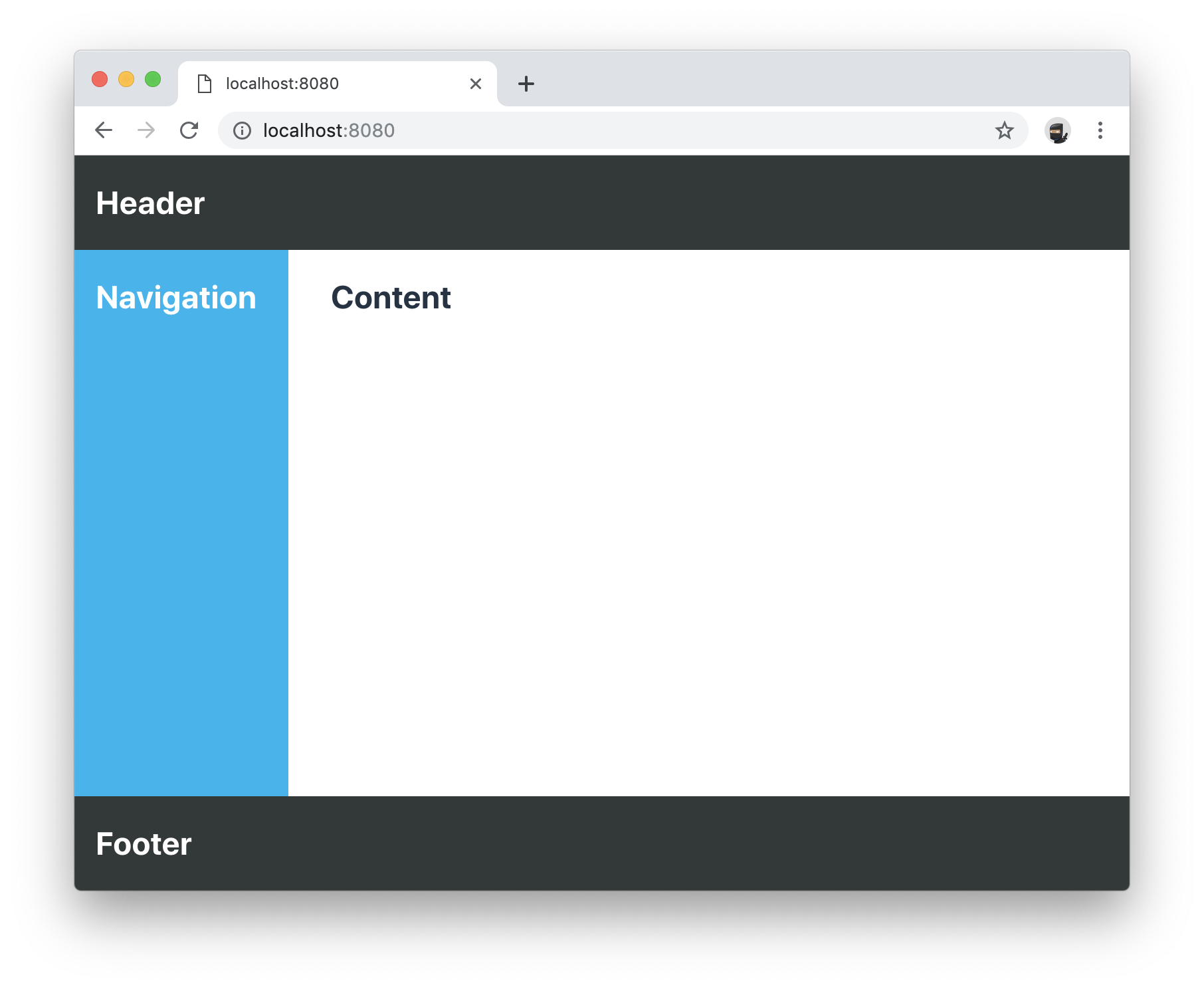
Here is an example of the concepts in action to build a common app layout. In this example, we are setting widths and heights programmatically through Java. You can also do this via CSS, which we will cover later in this guide.
BasicLayoutView.java
@Route("")
public class BasicLayoutView extends VerticalLayout {

 public BasicLayoutView() {
   // Instantiate layouts
   HorizontalLayout header = new HorizontalLayout();
   VerticalLayout navBar = new VerticalLayout();
   VerticalLayout content = new VerticalLayout();
   HorizontalLayout center = new HorizontalLayout();
   HorizontalLayout footer = new HorizontalLayout();

   // Configure layouts
   setSizeFull();
   setPadding(false);
   setSpacing(false);
   header.setWidth("100%");
   header.setPadding(true);
   center.setWidth("100%");
   navBar.setWidth("200px");
   content.setWidth("100%");
   footer.setWidth("100%");
   footer.setPadding(true);

   // Compose layout
   center.add(navBar, content);
   center.setFlexGrow(1, navBar);
   add(header, center, footer);
   expand(center);
 }
}
|
Note
|
HorizontalLayout and VerticalLayout are not well suited for responsive layouts. They will not wrap their content if the viewport gets too narrow. For that, we’ll need to use some CSS. |
Div
The Div is the most flexible of all the layouts, but it also requires you to handle all positioning yourself through CSS. We can use the CSS flexbox layout to achieve a smooth responsive layout that adapts to different viewport sizes.
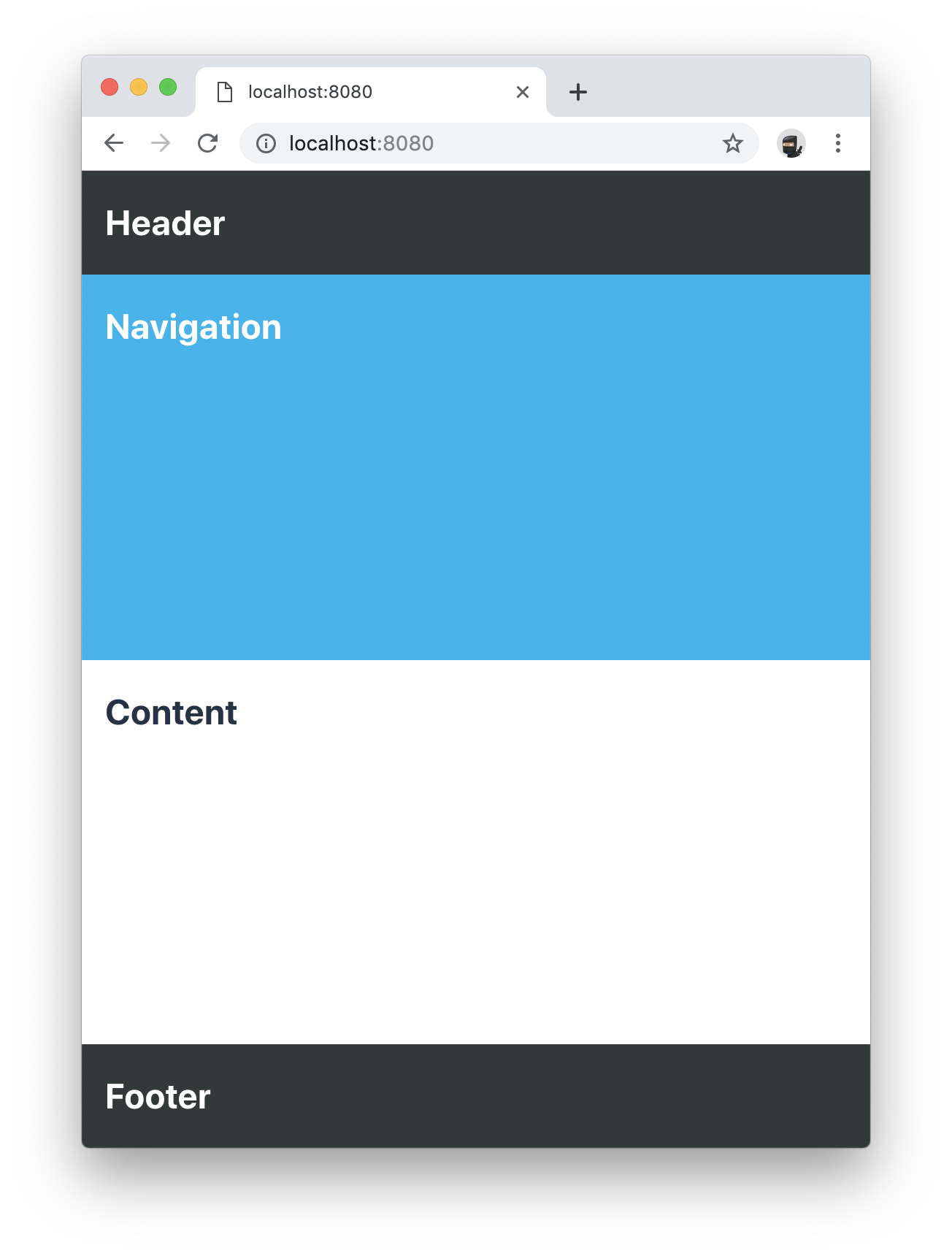
When we are using CSS to layout components, we need to define CSS classnames for all the components. We also need to add a @StyleSheet annotation to load a CSS file.
DivLayoutView.java
@Route("div")
@StyleSheet("frontend://styles/div-layout-styles.css")
public class DivLayoutView extends Div {

  public DivLayoutView() {
    // Instantiate layouts
    HorizontalLayout header = new HorizontalLayout();
    VerticalLayout navBar = new VerticalLayout();
    VerticalLayout content = new VerticalLayout();
    Div center = new Div();
    HorizontalLayout footer = new HorizontalLayout();

    // Configure layouts
    setSizeFull();
    header.setPadding(true);
    footer.setPadding(true);
    addClassName("main-view");
    header.addClassName("header");
    navBar.addClassName("navbar");
    center.addClassName("center");
    content.addClassName("content");
    footer.addClassName("footer");

    // Compose layout
    center.add(navBar, content);
    add(header, center, footer);
  }
}
Create the CSS file in the frontend/src/styles directory. This may either be webapp/frontend/src/styles/ or META_INF/resources/frontend/src/styles/ depending on the starter you are using.
div-layout-styles.css
.main-view {
  display: flex;
  flex-direction: column;
}

.center {
  flex: 1;
  display: flex;
  flex-wrap: wrap;
}

.navbar {
  flex: 1;
  min-width: 200px;
}

.content {
  flex: 4;
  min-width: 500px;
}
Depending on your previous development background, you may find this approach cleaner than the earlier programmatic way. If you are working with designers as a part of your team, the CSS based view is going to be easier for them to configure without having to touch Java code.
|
Tip
|
Vaadin has a Java wrapper for the CSS flexbox layout, FlexLayout. It allows you to set the same flex attributes from Java instead of having a separate CSS file. |
Declarative layouts
Sometimes you may find it more convenient to define a layout declaratively in HTML. Vaadin supports this through the Template API.
Declarative layouts and Templates are considered a more advanced topic. You can learn more about creating declarative layouts in the documentation.
Listening to events
Vaadin is an event-driven framework. Any component that a user can interact with will emit events that you can listen to. A typical event you will listen to is the click event emitted by a Button.
Button button = new Button("Click me");
button.addClickListener(click -> {
  Notification.show("Thanks for clicking!");
});In this example, we show a popup notification to the user when they click the button.
|
Tip
|
You can explore the different listeners that are available in components by looking at the add*Listener methods available in the autocomplete menu on the component you are using. |
Creating components
So far, we have only looked at using existing components.
When you are developing your own Vaadin applications, you will often create your own components to encapsulate complex parts of the system into reusable components. This forms the base of the component-based programming model that Vaadin and most other modern UI frameworks use.
Creating components through composition
The most commonly used way of creating a new component is to create a composition of existing components with an appropriate API for what you are building.
Let’s look at a simple example of a component that displays a business card.
BusinessCard.java
public class BusinessCard extends VerticalLayout {
  private Span name = new Span();
  private Span title = new Span();

  public BusinessCard() {
    add(name, title);
  }

  public void setName(String n) {
    name.setText(n);
  }

  public void setTitle(String t) {
    title.setText(t);
  }
}
Once we have created this component, we can now import it and use it in our application:
ComponentView.java
@Route("component")
public class ComponentView extends VerticalLayout {

  public ComponentView() {
    BusinessCard businessCard = new BusinessCard();
    businessCard.setName("Marcus");
    businessCard.setTitle("Computer code maker");

    add(businessCard);
  }
}|
Note
|
While creating composite components by extending from an existing layout is common, it has one drawback: you are exposing all of the API of the component you are extending. This may not be an issue in your project, but if you are creating a component that will be reused widely and you don’t want people to mess around with the internals, you can enforce a stronger encapsulation with Composite. |
BusinessCard.java
public class BusinessCard extends Composite<VerticalLayout> {
  private Span name = new Span();
  private Span title = new Span();

  public BusinessCard() {
    getContent().add(name, title);
  }

  public void setName(String n) {
    name.setText(n);
  }

  public void setTitle(String t) {
    title.setText(t);
  }
}
In this second version, we are hiding the fact that we are internally using VerticalLayout, only exposing the setName and setTitle methods as public API. Vaadin will internally create the VerticalLayout, that we can get using getContent(). Components used as composites need to have a no-arg constructor so Vaadin can instantiate them.
Creating components with Vaadin Designer
The Vaadin Designer visual builder is a tool that allows you to build components and views with a drag-and-drop interface instead of code. It can be a powerful tool when you need to create many views or big forms.
You can use components created by Designer in your code like any other component. You can also use the components you have hand-coded in Designer.
Interacting with JavaScript events and DOM nodes
In some cases, you need to build a component that cannot be built by just composing existing components.
Vaadin is built to be easily extendable to help in situations like this. By using the Element API, you can get access to DOM-level events and attributes/properties.
As an example, let’s listen for a mouseover event on a component and log it to the console:
businessCard.getElement().addEventListener("mouseover", e -> {
  System.out.println("'mouseover' event happened");
});
You can read more about listening to JavaScript events and working with HTML element attributes and properties in the docs.
Creating custom JavaScript components
You can also write or integrate completely custom UI components in Vaadin. These are more advanced topics, and are covered in more detail in the documentation:
Read more about integrating Web Components into Vaadin.
Read more about loading JavaScript files and creating components with the Element API.
Forms and data binding
Binding data from data objects to inputs is one of the most central functions of most applications. Vaadin has a powerful data binding API that allows you to create any kind of form you can imagine.
The Vaadin Binder API supports validating both individual fields and cross-field validation of the entire form. You can also define conversions between the value you show to the user and the value you save to the object.
Setting up data binding
Binder works with standard Java objects as the data model. It allows you to bind any property (getter/setter) to a UI field.
Binder supports both one-way data binding (readBean(model)) or two-way data binding (setBean(model)). Read the section on saving to learn how to get the value out of Binder if you are using one-way data binding.
FormView.java
@Route("forms")
public class FormView extends FormLayout {

  public FormView() {
    Person model = new Person();

    TextField firstNameField = new TextField("First Name");
    Binder<Person> binder = new Binder<>(Person.class);

    binder.forField(firstNameField).bind(Person::getFirstName, Person::setFirstName);

    // One-way data binding
    // binder.readBean(model);

    // Two-way data binding
    binder.setBean(model);
  }
}Validating input fields
Most of the time when building forms, we need to validate that the input we receive is correct. In Vaadin, this is done by adding a Validator to the field binding.
binder.forField(firstNameField)
  .asRequired()
  .withValidator(name -> name.equals("Marcus"), "Your name should be Marcus")
  .bind(Person::getFirstName, Person::setFirstName);
Here, we make the input field mandatory and require the input value to equal "Marcus." You can add as many validators as you want, they will get run in the order you define them.
Converting between presentation and model values
If your underlying data type does not match the data type of the UI component, you need to add a converter to the binding. In the following example, we want to bind a TextField (String) to an underlying int data field, so we need to add a StringToIntegerConverter.
binder.forField(ageField)
  .asRequired()
  .withConverter(new StringToIntegerConverter("Age must be a number"))
  .withValidator(age -> age > 2, "How are you using a computer?")
.bind(Person::getAge, Person::setAge);|
Tip
|
There are several built-in converters for common conversions. Look for *Converter in your IDE autocomplete menu. |
Validating forms (cross-field validation)
The same way you can add validations to individual fields, you can also add validators on the binder to validate fields against each other. Binder-level validation will only run if field level validation has passed.
We also need to define a layout in which we want error messages to be displayed.
Div statusLabel = new Div();
binder.setStatusLabel(statusLabel);
binder.withValidator(person ->
  person.getFirstName().equals("Marcus")
  && person.getLastName().equals("Hellberg"),
  "Ha! You have the correct first name, but wrong last name. Better luck next life!");
Saving
Two-way data binding
If you used two-way data binding (setBean()), the bound object would contain the updated values, provided that all field and form level validations passed.
One-way data binding
If you used one-way data binding (readBean()), you need to read the form manually.
try {
  Person saved = new Person();
  binder.writeBean(saved);
  // Persist saved bean
} catch (ValidationException e){
  //show errors to user
}
You need to pass Binder an instance to write the values to. If you are using one-way data binding, you usually do not want to pass in the original object, as this would mutate it.
Displaying and lazy loading lists of data
Especially in business applications, it’s common to deal with lists of data. In Vaadin, this is commonly done with the Grid or ComboBox components.
In-memory list
If you have a small number of items, say a few hundred, the easiest way to deal with these is to just pass a java Collection to the setItems method.
|
Note
|
Vaadin runs the UI code on the server. One of the most common reasons for performance issues is that developers keep references to large collections in their components. If you need to display more extensive collections, or are memory conscious, look at using the alternative DataProvider API below. |
GridView.java
@Route("grid")
public class GridView extends VerticalLayout {

  public GridView(AddressBook addressBook) {
    Grid<Person> grid = new Grid<>();
    grid.addColumn(Person::getFirstName).setHeader("First Name");
    grid.addColumn(Person::getLastName).setHeader("Last Name");
    grid.addColumn(Person::getAge).setHeader("Age");

    List<Person> everyone = addressBook.findAll();
    grid.setItems(everyone);

    add(grid);
  }
}|
Note
|
The example above uses dependency injection to inject AddressBook in the constructor. Read more about using Vaadin with Spring, or using Vaadin with CDI. You can also download pre-configured starters on the starter page. |
Lazy-loading with DataProvider
In cases where you have much data, it makes sense to only load what’s needed at a given moment. Vaadin components like Grid and ComboBox do this automatically if you define a DataProvider.
Instead of calling setItems() as we did in the previous snippet, use setDataProvider().
GridView.java
grid.setDataProvider(DataProvider.fromCallbacks(
    findQuery -> addressBook.find(
      findQuery.getOffset(),
      findQuery.getLimit()),
    countQuery -> addressBook.count()));
The data provider takes two callback functions. The first query should return a stream of objects with a given offset and limit, the next page of data. The second query returns the total count of objects in your data set. This is used to display appropriate scrollbars and info in the UI.
The end user experience is the same whether you use setItems() or setDataProvider(). In both cases, the user can scroll freely through the entire data set. The only difference is that when using DataProvider, you are using fewer resources on the server.
Views and navigation
Vaadin comes with a simple, yet powerful navigation system. Any component can be made a navigation target, and you can easily capture URL parameters.
Defining routes
To define a route, annotate your class with @Route.
SampleView
@Route
public class SampleView extends VerticalLayout {

  public SampleView() {
    add(new H1("I am a sample view"));
  }
}
By default, Vaadin will determine the route path based on the class name, without the -View ending. In this case, the view would get mapped to /sample.
In many cases, it’s better to be explicit about the naming and define the path explicitly. For this, it’s recommended to use a constant to support refactoring later on.
SampleView
@Route(SampleView.NAME)
public class SampleView extends VerticalLayout {
  public static final String NAME = "sample";

  public SampleView() {
    add(new H1("I am a sample view"));
  }
}
Navigating between views
Once you have a view defined, you can navigate to it in two ways. Using a router link, or programmatically.
To use a router link, add a RouterLink component to a layout.
add(new RouterLink("Go to the sample view!", SampleView.class));The advantage of router links is that they will continue to work even if the server session has expired.
In some cases, you will need to navigate to another view programmatically. For instance, take the user to another view after filling a form. To do this, use ui.navigate().
Button saveButton = new Button("Save");
saveButton.addClickListener(click -> {
  // (Save form logic omitted)

  // On success, navigate to another view
  saveButton.getUI().ifPresent(ui -> ui.navigate(SampleView.NAME));
});|
Note
|
The UI is the invisible "root" of a Vaadin application. There is one UI per browser tab. The UI is mostly used for navigating, or synchronizing access when updating the UI state from an external thread. |
Nested routes, parameters, error pages
You can do much more sophisticated navigation systems than above. Please refer to the documentation to learn more about nested routes, URL parameters, and handling navigation exceptions.
Testing
Testing is a vital part of developing reliable applications. There are typically three types of tests that you will write for your application: unit tests, integration tests, and end-to-end system tests.
Let’s look at an example. Here is the component we are testing:
ExampleComponent.java
@Route
public class ExampleComponent  extends VerticalLayout {
  private final Binder<Person> binder;
  private BackendService service;

  TextField firstName = new TextField("First Name");
  TextField lastName = new TextField("Last Name");
  Button saveButton = new Button("Save");

  public ExampleComponent(BackendService service) {
    this.service = service;
    add(firstName, lastName, saveButton);
    binder = new Binder<>(Person.class);
    // Bind fields to bean by name
    binder.bindInstanceFields(this);
    saveButton.addClickListener(click -> save());
  }

  public void save() {
    try{
      Person person = new Person();
      binder.writeBean(person);
      service.save(person);
      saveButton.setText("Saved");
    } catch (ValidationException e) {
      e.printStackTrace();
    }
  }
}
It is a form with text fields for first and last name, bound to a Person object through a Binder. See the section above on forms if you are not familiar with Binder.
When the form is saved, the resulting Person object should be saved to BackendService.
Unit and integration testing
Unit and integration tests usually make up the bulk of the tests for your application. The tests do not require launching a server or a browser, so they are fast to run.
Unit tests and integration tests are very similar in their implementation. The main difference is that in a unit test, you test a single piece of code in isolation (for instance a component), whereas in an integration test you test several interconnected pieces of content together.
To write a unit test for the component above, we need a testing library to run the code and a mocking library to stub out dependencies to functionality that is not being tested.
ExampleComponentTest.java
class ExampleComponentTest {

  private ExampleComponent component;
  private BackendService serviceMock;

  @BeforeEach
  void setUp() {
    serviceMock = Mockito.mock(BackendService.class);
    component = new ExampleComponent(serviceMock);
  }

  @Test
  void save() {
    component.firstName.setValue("Marcus");
    component.lastName.setValue("Hellberg");

    component.save();

    // Person.equals is based on names in this example
    Mockito.verify(serviceMock).save(new Person("Marcus", "Hellberg"));
  }
}
In the test, we set up a mock version of BackendService as we are focusing our test on ExampleComponent. All we need is to verify that it will get called with the right input.
In the test, we set up the UI state by entering values into the text fields. We then call save() and verify that the backend service would have been called with a Person object with the correct first and last names.
We could also have made this into an integration test by using a real implementation of BackendService instead of stubbing it out.
End-to-end testing (in-browser testing)
In end-to-end testing, we ensure that the complete application works as a whole. To do this, we need to set up a server to deploy the application and set up a browser testing environment.
Vaadin has an official browser testing tool called TestBench. It takes care of launching browsers and has Vaadin-specific selectors for finding UI components in the browser.
To test the component in its real environment through a browser, we could write the following TestBench test case.
ExampleComponentIT.java
public class ExampleComponentIT extends TestBenchTestCase {

  @Before
  public void setup() throws Exception {
    setDriver(new ChromeDriver());
    getDriver().get("http://localhost:8080/example");
  }

  @Test
  public void clickButton() {
    ButtonElement button = $(ButtonElement.class).first();
    button.click();
    Assert.assertEquals("Saved", button.getText());
  }

  @After
  public void tearDown() throws Exception {
    getDriver().quit();
  }
}
Before running the test, we set up a new Chrome browser driver and open the route to the component.
We then find the button, click on it, and assert that the caption got updated correctly.
|
Note
|
Vaadin TestBench tests are by convention named with an -IT ending (TestNameIT) that stands for integration test, even though they are technically system tests. |
As you can see, this test is very coarse-grained. It can only tell us if everything worked, or if something failed. It won’t give us much information on what went wrong. Because of this, it’s good to have a comprehensive suite of fine-grained unit and integration tests to pinpoint issues. TestBench is better used for high-level, last line of defense, tests that can catch errors even if they are missed by other tests.
Styling with CSS
All Vaadin components ship with a configurable theme called Lumo. Lumo allows you to configure things like colors, fonts, sizing, roundness, and spacing to make the component set look the way you want. The configuration is based on CSS custom properties (variables), which ensures all components look consistent.
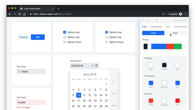
The easiest way to explore the options and configure values for the CSS variables is to use the Lumo theme editor.
Vaadin apps can further be customized with CSS. Read more about styling Vaadin applications.
Production
When you are ready to take your application into production, run:
mvn clean package -PproductionThis will build a minified bundle and create an ES5 version that is needed for IE11 support.
|
Note
|
This assumes you are using an app based on a Vaadin starter. If not, you need to add the Vaadin Maven plugin manually, see instructions here. |
Next steps
Now that you know the basics, you can start building your own app.
If you want to learn how to build a complete app with data binding and a database, start with the basic Vaadin tutorial.
If you prefer watching videos, we have a free online video course on Vaadin basics (requires vaadin.com account).
If you want to browse all tutorials and the learning material, head over to the Vaadin Learning Center.
If you just want to tinker around, check out the code snippets for components or head over to the full documentation for a more in-depth explanation of how Vaadin works.