Build the Main View
- Getting Familiar with the UI
- Creating the Main Layout
- Adding the Components
- Configuring the Main Layout
- Configuring the Toolbar
- Making the Grid Fill the Available Space
Now that you have IntelliJ IDEA or Eclipse running and a project available, we can start building our first view with Designer.
To do this:
-
In the Project tree, right click the
frontendfolder, and select New > Directory. Name the new foldersrc/views. -
Right click the newly-created
viewsfolder and select New > Vaadin 10+ Design. -
In the Name field, type
main-view. -
Ensure
Litis selected as the Template type. -
Ensure the Create Java companion file checkbox is checked. This allows us to bind data and add listeners to our view in Java.
-
In the Java package field, click the folder selection button and navigate to
com.example.application.
The New Vaadin 10+ design dialog should now look like this.
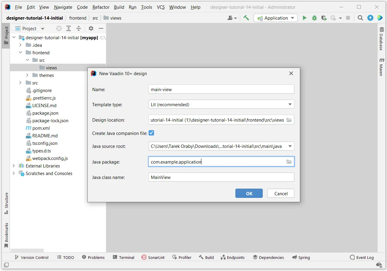
Click OK to generate the files.
Vaadin Designer will open inside your IDE.
|
Important
|
Eclipse on macOS will open designs in Google Chrome
If you are using Eclipse on macOS, the visual editor of the Designer can only open up in the Chrome browser.
Install Google Chrome if you have not done so already.
|
Getting Familiar with the UI
Designer consists of four main parts:
-
Paper is where the UI you are building renders. It shows you what your view will look like. Before you add components to your view, the paper proposes a set of starting points for your newly created view.
-
Palette is a list of components that are available for use. The list is divided into multiple sections:
-
HTML elements are the built-in elements of the HTML language, like
<p>,<h1>and<div>. -
Parts is a list of all available web components in your project. These are scanned automatically from the
node_modulesfolder in your project. When you add new 3rd-party web components to your project, they show up in the list and are available for use. -
Components are snippets for Vaadin’s components that give you handy, commonly used configurations, like having a button with an icon and caption.
-
Project components are the other designs in your project. You can include them in your current view.
-
-
Outline shows you what components are in use in the view and their hierarchy.
-
Properties is where you modify how a single component looks and behaves.
Creating the Main Layout
This is the layout which we will build.
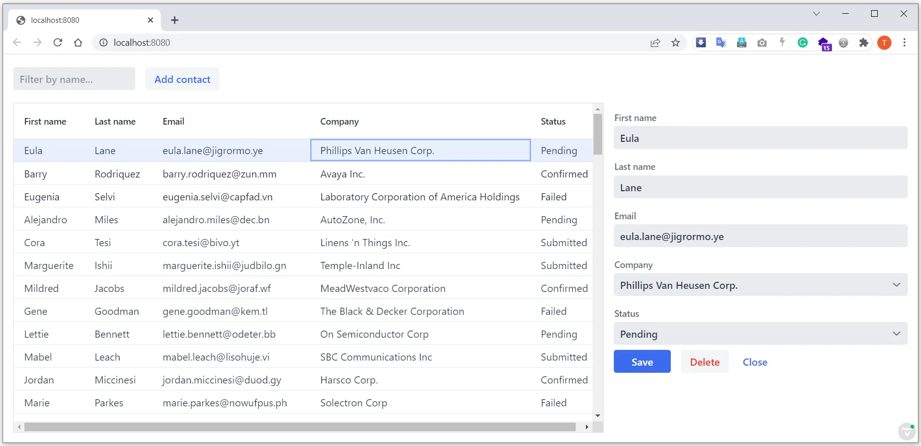
From the image, you can see we need:
-
A vertical layout at the root of the view.
-
A horizontal layout with a text field for filtering, as well as a button to add new entries, at the top.
-
A horizontal layout for a grid of data entries and a form below.
We’ll disregard the form for now, as we build it separately after adding the other components to the view.
Adding the Components
-
On the paper, click Vertical to get a vertical layout as your starting point. Your view now consists of an empty layout.
-
Find Horizontal layout in the palette and drag it onto the
vaadin-vertical-layouton the paper twice. You can use the search field at the top to find components easily. -
Find Vaadin Text Field in the palette and drag it onto the first
vaadin-horizontal-layout. -
Find Button in the palette and drag it onto the first
vaadin-horizontal-layout. -
Find vaadin-grid in the palette and drag it onto the second
vaadin-horizontal-layout.
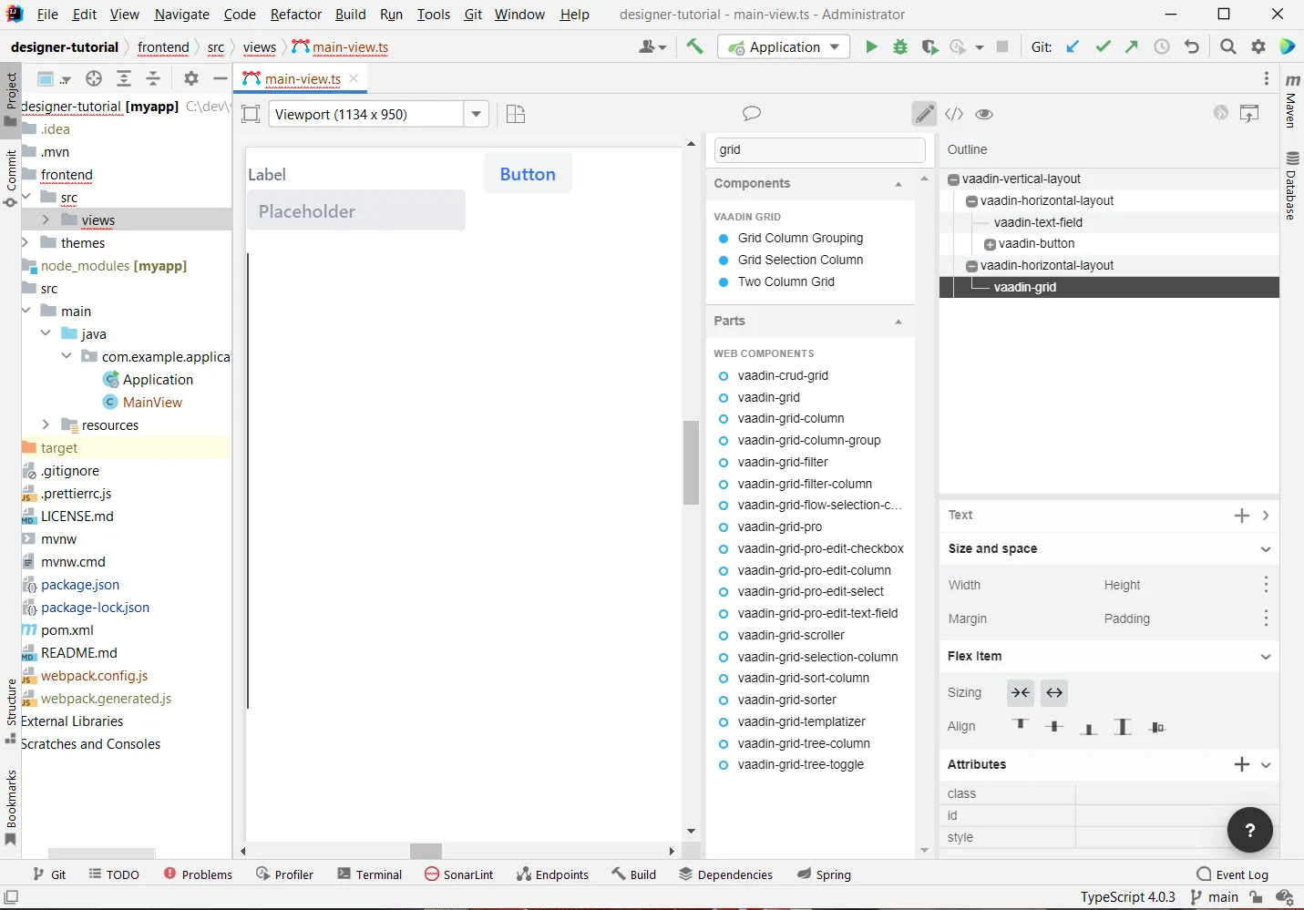
Our view does not look as planned yet, but it does have the components we need. We’ll now continue to configure the components to get it to look like we want.
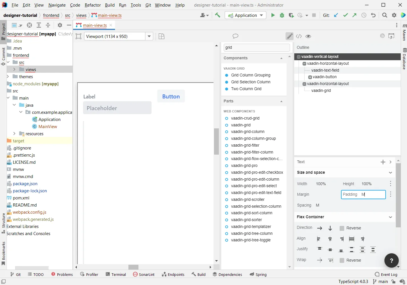
Configuring the Main Layout
In the main layout, we need to add a bit of space between the components, as well as around the layout, to make it look better:
-
Select the top-level layout, by clicking anywhere in the empty space of the vertical layout.
-
In the properties view, in the Size and space panel, open the Padding selector and select M. This adds some space around the main layout, giving the design room to "breathe".
Configuring the Toolbar
For the toolbar, we need to configure a text field:
-
Select the text field.
-
In the properties view, under attributes, find the label attribute and remove the value from it. We do not need a separate label as we have the description as the placeholder value for the field.
-
In the properties view, under attributes, find the placeholder attribute and replace "Placeholder" with "Filter by name…".
-
In the properties view, under attributes, find the clear-button-visible attribute and enable the checkbox. This gives the user an easy way to clear the filter.
-
Select the button.
-
In the properties view, find the text panel at the top and replace the default "Button" text with "Add contact".
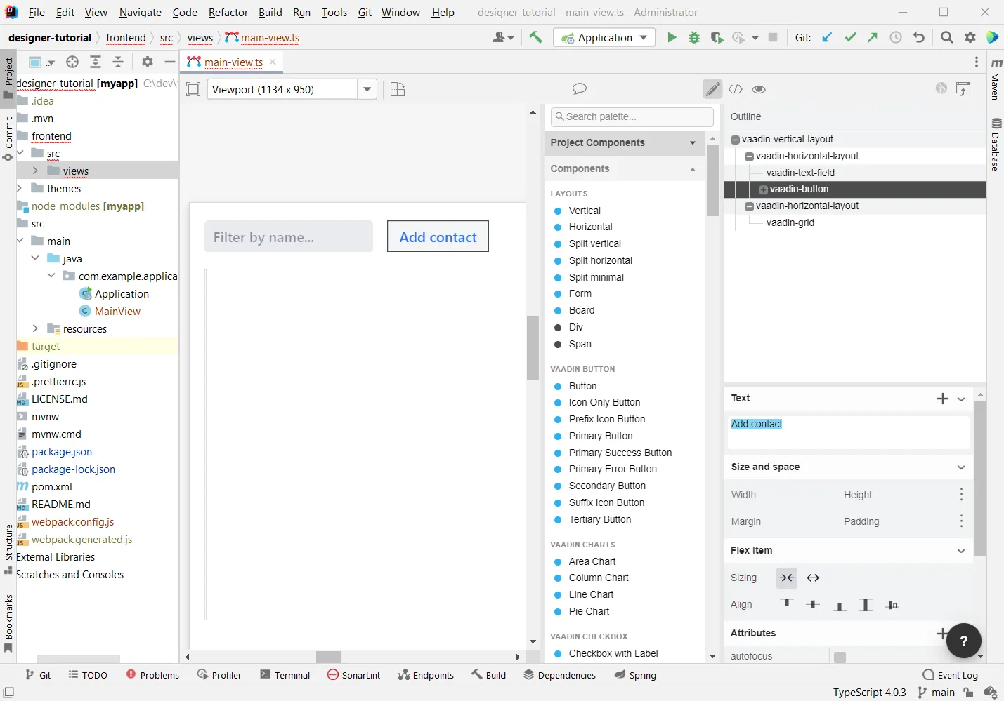
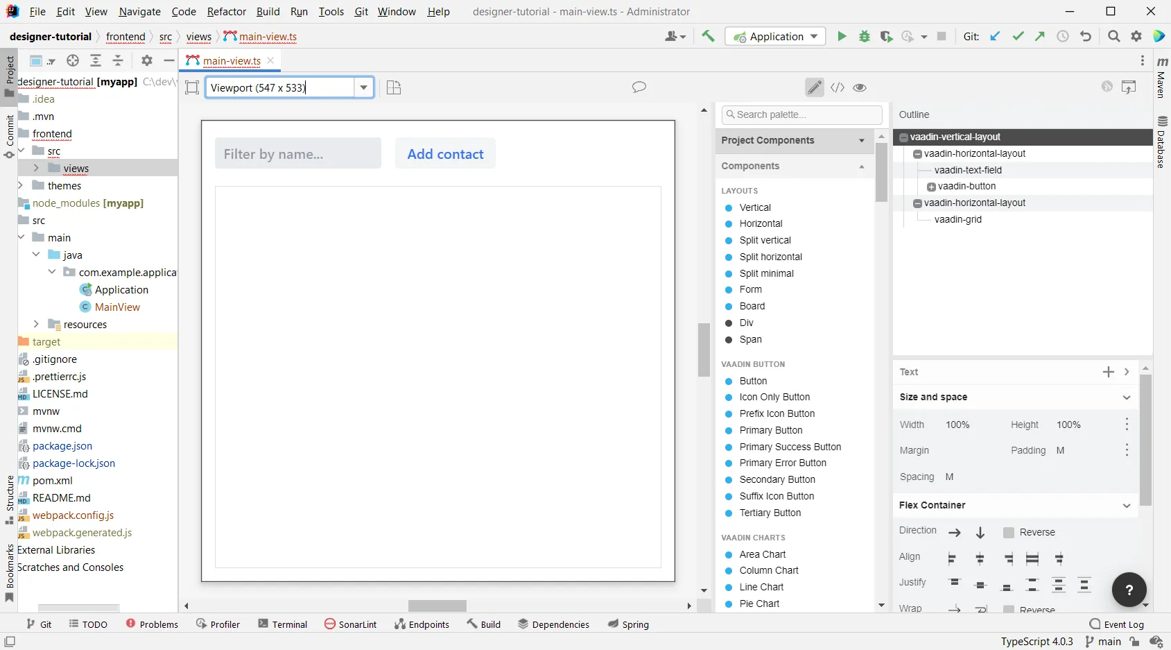
Making the Grid Fill the Available Space
To show as much data as possible, we want to give the Grid the rest of the screen space:
-
Select the lower horizontal layout,
vaadin-horizontal-layout. -
In the properties view, in the Size and space panel find the width and height fields and choose "100%" in both. This expands the layout to take up all the available space.
-
Select the Grid,
vaadin-grid. -
In the properties view, in the Size and space panel set the width and height fields to "100%". This gives all the space in the layout to the grid.
Our main layout is now looking great, but it is still missing the form. Proceed to the next chapter to add one: Build your contact form
FDC70156-42A8-4BA2-9B00-3C7EDFEB04D7