Laying Out Views
Layout is defined as the particular way components are arranged in your view.
To arrange the components in Vaadin Designer, you can use the layout components provided by Vaadin. You can combine and nest special purpose layouts and the more general-purpose Vertical and Horizontal layouts.
Additionally, you can define the sizes of the components as well as the empty space between them.
Layout Components
Vaadin supports many pre-built layout components for you to quickly start constructing a view.
| Layout component | Description |
|---|---|
Provides a quick and easy way to get a common application layout structure done. Allows setting the logo, menu and page content. | |
Provides a configurable responsive layout for form elements, making sure your form content stays easily readable on all devices. | |
Allows you to partition a layout into resizable areas. | |
Ordered Layout (Vertical layout, Horizontal layout) | Provides Horizontal and Vertical layouts to horizontally or vertically align your HTML elements. The most flexible way to create a layout is by nesting these two layouts. |
Vertical and Horizontal Layouts
These are the most essential layouts, which can be nested under each other, or different layouts to construct more complex ones. For these layouts, Designer supports Flexbox editor to position their child elements.
|
Note
| Flexbox editor uses CSS flexbox layout. To learn about Flexbox, check out this flexbox guide. |
Flex Container
Vertical and Horizontal layouts are flex containers.
You can also use native HTML elements (e.g. div element) as flexbox containers
by setting their display CSS property to flex or inline-flex.
When selecting a flex container in Designer, the Flex Container panel appears near the bottom-right corner.
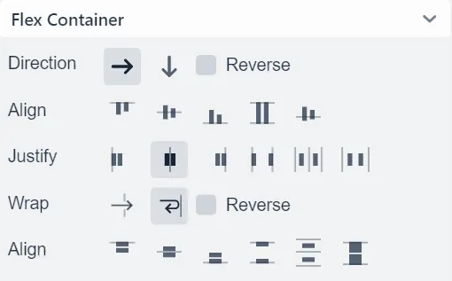
Direction
Represents flex-direction CSS property,
defining the main-axis for child items. X-axis or Y-axis enables
row (horizontal) or column (vertical) direction, respectively.
To reverse the current direction, enable Reverse checkbox.
Align
Represents align-items CSS property,
defining how child items are laid out along the cross axis which runs perpendicular to the current main-axis.
Justify
Represents justify-content CSS property,
defining how child items are aligned along the main-axis and how free spaces between them are distributed.
Wrap
Represents flex-wrap CSS property,
allowing child items to be wrapped onto multiple lines when they can’t be fitted in one line. To wrap items from bottom to top, enable Reverse checkbox.
Align
Represents align-content CSS property,
this property appears only when child items can be wrapped.
Since wrapped items can occupy multiple lines, this property aligns those lines when there is an extra space.
Flex Item
Elements inside a flex container are flex items. The Flex Item panel appears when selecting a flex item. In case the selected item is also a flex container, both panels will be shown.
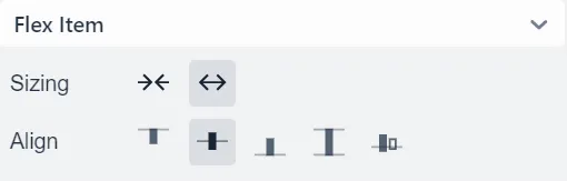
Sizing
Represents flex-grow
and flex-shrink CSS properties,
allowing a flex item to take more or less space than other elements.
Align
Represents align-self CSS property,
allowing a specific flex item to override the Align setting of its parent container.
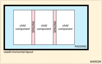
Sizing and spacing
To give a component a specific size and define the empty space around and inside it, you can use the size and space panel located in the properties panel.
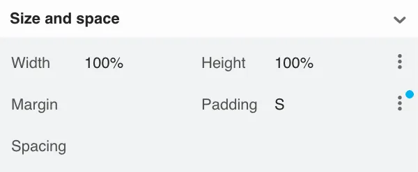
Set
-
width and height to set and constrain the size of the component
-
margin to define the empty space around the component
-
padding to define the empty space between the component and its content
-
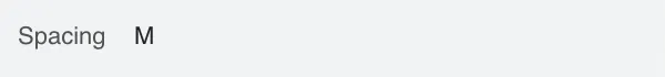
spacing to define the empty space between the component’s children (only for VL and HL)
See the following figure for illustration.
|
Note
|
When Lumo theme is in use, the margin, padding and spacing properties accept t-shirt sizes which translate to the corresponding --lumo-space-* variables. Otherwise, the property values map directly to the corresponding CSS properties.
|
Width and height
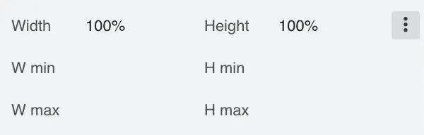
Set width and height, as well as constrain their minimum and maximum values.
These properties map directly to the CSS properties
width,
min-width,
max-width,
height,
min-height and
max-height.
Margin and padding
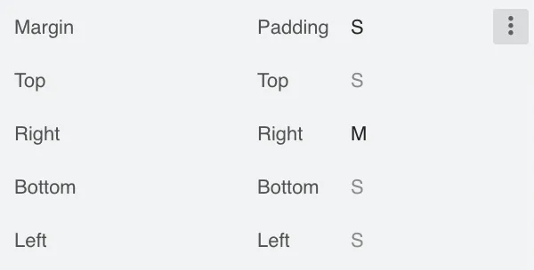
Set margin and padding. Setting Margin or Padding will set the same value to all edges. Individual edges can be set or overridden by setting values to the Left, Top, Right and Bottom properties.
These properties map directly to the CSS properties
margin,
margin-left,
margin-right,
margin-top,
margin-bottom,
padding,
padding-left,
padding-right,
padding-top and
padding-bottom. If Lumo theme is in use, then, additionally, t-shirt sizes are translated to --lumo-space-* variables.