Designing
To add a component to your design, drag it from the Palette view and drop it in the desired location - either in the viewport area or in the hierarchical Outline view. Dropping in the desired location on the viewport is a common approach, but in many situations (especially with complex, deeply nested hierarchies) dropping on the Outline view gives more control.
Adding Components
Components can be added by dragging from the Palette view, either to the canvas or to the Outline view. You can also double-click an component in the Palette to add a sibling to the currently selected component.
The component you add will be selected in the editor view, and you can immediately edit its properties.
Editing Properties
You can edit component properties in the Properties view. It is a
good idea to give components at least an id, if they are to be used
from Java code to add logic (such as click listeners for buttons). Generally,
this is needed for most controls, but not for most layouts.
Vaadin Designer will discover the defined properties of the selected web component. Public properties (name does not start with an underscore '_') and non-readonly properties will be populated to the properties table. You can also add a new property by clicking the plus button () on the Attributes panel header.

|
Tip
|
Some boolean properties might not have a checkbox in the Properties view editor.
Vaadin Designer cannot guess the type of the properties without a predefined default value.
A workaround for this issue is to add the boolean attribute into the declarative using in Source mode, then switch back to the Edit mode.
For example: <vaadin-text-field disabled></vaadin-text-field>
|
Text Panel
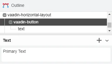
The Text Panel is shown for all components. You can add text to a component by clicking the plus button () on the panel header.

When the selected component has exactly one text, you can edit the text directly in the Text panel.

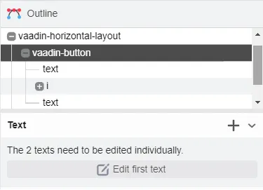
If the component has multiple texts, the panel informs that they need to be edited individually. You can click button to start editing the first one.

Theme Property
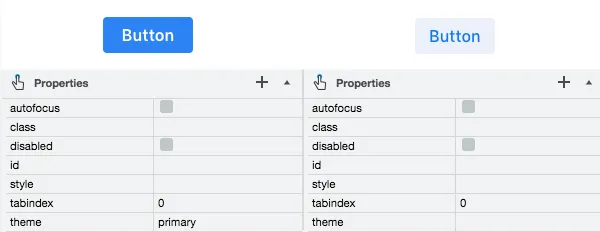
When editing a Vaadin element, theme property is always available in properties table,
and you can easily apply styles from Vaadin Themes.
For example, to change the visual appearance of a Vaadin Button you can apply the primary style.

8EF801AA-46D5-4FFB-B134-DA653CED1A5F