Theming
Vaadin Designer supports theming the same way as Flow. When a design is opened, Vaadin Designer:
-
Loads the selected component theme.
-
Automatically loads the application theme, i.e.
shared-styles.html. -
Loads all CSS files in
@CssImportannotations. Check out Theming Web Components for more details.
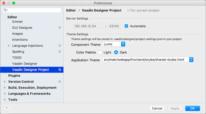
You can change component theme used by Designer from the project settings. Component themes have different look and feel as well as styles declarations. Changing Designer component theme setting will not affect your Flow project. Likewise, your Flow project theme setting will not be reflected in Designer.
Designer component theme setting only affects how designs are rendered by Designer. Typically, you will match this with your application’s component theme.
The default component theme is Lumo. Material component theme is also available. Both themes have
"light" and "dark" color variants.
User should provide all styling through the application theme, if None component theme was selected.
The None component theme will be used as a fallback if project is missing necessary dependencies for the selected theme,
for example if vaadin-material-styles JAR is not available in the classpath.
Theme settings will be stored in your project’s root folder under .vaadin/designer/project-settings.json so that the
settings can be preserved and thereby shared with everyone who works with Designer on the project.
A15A7BCC-37BC-4C63-BF93-4A2D8C9C2B58