vcf-tooltip
Web Component providing an easy way to display tooltips for any html element
<vcf-tooltip>
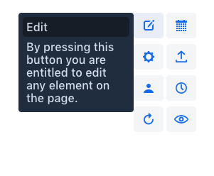
Web Component providing an easy way to display tooltips for any html element.
Live demo ↗ | API documentation ↗
Installation
Install vcf-tooltip:
npm i @vaadin-component-factory/vcf-tooltip --save
Usage
Once installed, import it in your application:
import '@vaadin-component-factory/vcf-tooltip';
Add <vcf-tooltip> element with attribute for which will contain id of target element, to the page. Now after hovering on target element, toltip will be displayed.
<button id="element-id">Hover me</button>
<vcf-tooltip for="element-id" position="top">
  A short text describing the element.
</vcf-tooltip>
Running demo
Fork the
vcf-tooltiprepository and clone it locally.Make sure you have npm installed.
When in the
vcf-tooltipdirectory, runnpm installto install dependencies.Run
npm startto open the demo.
Server-side API
This is the client-side (Polymer 3) web component. If you are looking for the server-side (Java) API for the Vaadin Platform, it can be found here: Tooltip
License
Apache License 2.0
Links
Compatibility
Was this helpful? Need more help?
Leave a comment or a question below. You can also join
the chat on Discord or
ask questions on StackOverflow.
Version
Dependencies
- @polymer/polymer#^3.2.0
- @vaadin/vaadin-element-mixin#^2.1.3
- @vaadin/vaadin-license-checker#^2.1.2
- @vaadin/vaadin-lumo-styles#^1.5.0
- @vaadin/vaadin-themable-mixin#^1.5.1
- Released
- 2021-08-10
- Maturity
- IMPORTED
- License
- Other
Compatibility
- Framework
- Polymer 3.0+
- Polymer 2.0+ in 1.2.1
- Browser
- Browser Independent
Vaadin Add-on Directory
Find open-source widgets, add-ons, themes, and integrations for your Vaadin application.