# morph-list-view-item
[](https://opensource.org/licenses/Apache-2.0) [](https://www.webcomponents.org/element/PolymerElements/paper-progress)
A lightning fast list view item web component using LitElement base class.
`morph-list-view-item` changes its look automatically and will native native based on when it is either IOS device or Android device.
## Getting Started
For the information about how to clone the desired repository, running the local server and testing, please refer to Polymorph elements getting started docs at the end of this repository.
## Demo
```html
Android
Android List Item
Android Version
Android list item with href becomes a link with ripple effect by default
Android Version
Expandable Link - Click to close or expand
Android Version
Lorem ipsum dolor sit amet, consectetur adipiscing elit. Aenean elementum id neque nec commodo. Sed vel justo at turpis laoreet pellentesque quis sed lorem. Integer semper arcu nibh, non mollis arcu tempor vel. Sed pharetra tortor vitae est rhoncus, vel congue dui sollicitudin. Donec eu arcu dignissim felis viverra blandit suscipit eget ipsum.
IOS
IOS List Item
IOS Version
IOS list item with no-chevron attribute
IOS Version
Expandable Link - Click to close or expand
IOS Version
Lorem ipsum dolor sit amet, consectetur adipiscing elit. Aenean elementum id neque nec commodo. Sed vel justo at turpis laoreet pellentesque quis sed lorem. Integer semper arcu nibh, non mollis arcu tempor vel. Sed pharetra tortor vitae est rhoncus, vel congue dui sollicitudin. Donec eu arcu dignissim felis viverra blandit suscipit eget ipsum.
```
- Here is a quick demo of the morph-list-view-item element for IOS platform.
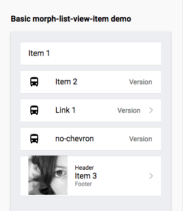
- Here is a quick demo of the morph-list-view-item element for Android platform.
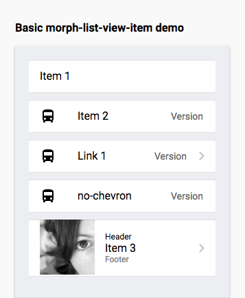
- Both IOS and Android demo are using the HTML markup.
```html
Item 1
Item 2
Version
Link 1
Version
no-chevron
Version
 Header
Item 3
Footer
Header
Item 3
Footer
```
- Demo when morph-list-view-item is inside morph-list-view for IOS platform
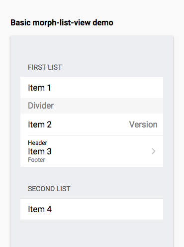
- Demo when morph-list-view-item is inside morph-list-view for IOS platform
- Here's the HTML markup when morph-list-view-item is inside morph-list-view for both IOS and Android platform
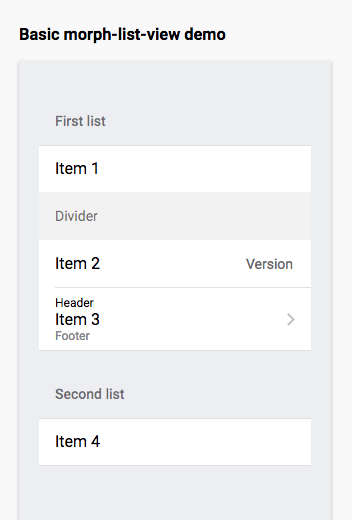
```html
First list
Item 1
Divider
Item 2
Version
Header
Item 3
Footer
Second list
Item 4
```
- Demo showing ripple effect when morph-list-view-item is a link on Android platform

- Sample HTML markup for expandable item
```html
Link 1
Version
Lorem ipsum dolor sit amet, consectetur adipiscing elit. Aenean elementum id neque nec commodo. Sed vel justo at turpis laoreet pellentesque quis sed lorem. Integer semper arcu nibh, non mollis arcu tempor vel. Sed pharetra tortor vitae est rhoncus, vel congue dui sollicitudin. Donec eu arcu dignissim felis viverra blandit suscipit eget ipsum.
```
- Demo showing expandable item

### Attributes
| Custom Attribute | Type | Description | Default |
|:-----------------------:|:-------:|-----------------------------------------------------------------------------------------------|----------------|
| **`href`** | String | Takes the value of the url. When **`href`** is present, the item becomes a link | **no default** |
| **`containsMedia`** | Boolean | This is an option for items to take in media/images instead of just icons | **`false`** |
| **`noRipple`** | Boolean | To have a list item with no ripple assign **`true`** or just set this on the the html markup | **`false`** |
| **`noChevron`** | Boolean | To have a list item with no chevron assign **`true`** or just set this on the the html markup | **`false`** |
| **`expandable`** | Boolean | Option to have expandable list item with expandable content just assign **`true`** | **`false`** |
| **`expanded`** | Boolean | Option to expand list item just assign **`true`** or just set this on the the html markup | **`false`** |
### Styling
- Custom CSS property
Custom property | Description | Default |
-----------------------------------|----------------------------------------------------------------------------------|------------|
`--display-top-line` | Display property for item top line use to configure when on a list view | block |
`--display-inner-item-bottom-line` | Display property for item inner bottom line use to configure when on a list view | none |
## Further help
For more information on how to install and run test please go here - [Polymorph elements getting started]
[Polymorph elements getting started]: https://github.com/moduware/polymorph-components/blob/master/INFO.md