l2t-paper-rating - Vaadin Add-on Directory
Polymer element to display "star" ratings in a paper style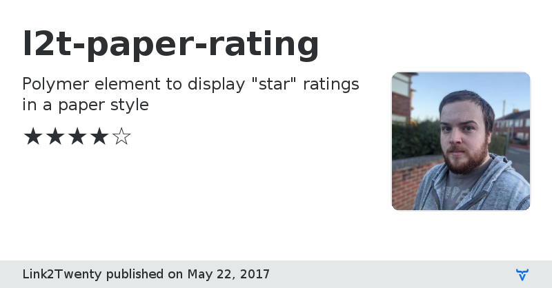
GitHub Homepage
Issue tracker
Documentation
Online Demo
l2t-paper-rating version 1.0.1
### Dependencies
* polymer#Polymer/polymer#^2.0.0
l2t-paper-rating version 1.0.2
### Dependencies
* polymer#Polymer/polymer#^2.0.0
l2t-paper-rating version 1.0.3
### Dependencies
* polymer#Polymer/polymer#^2.0.0
* paper-icon-button#PolymerElements/paper-icon-button#^2.0.0
* iron-icons#PolymerElements/iron-icons#^2.0.0
l2t-paper-rating version 1.0.4
### Dependencies
* polymer#Polymer/polymer#^2.0.0
* paper-icon-button#PolymerElements/paper-icon-button#^2.0.0
* iron-icons#PolymerElements/iron-icons#^2.0.0
l2t-paper-rating version 1.1.0
### Dependencies
* polymer#Polymer/polymer#^2.0.0
* paper-icon-button#PolymerElements/paper-icon-button#^2.0.0
* iron-icons#PolymerElements/iron-icons#^2.0.0
l2t-paper-rating version 1.1.1
### Dependencies
* polymer#Polymer/polymer#^2.0.0
* paper-icon-button#PolymerElements/paper-icon-button#^2.0.0
* iron-icons#PolymerElements/iron-icons#^2.0.0
l2t-paper-rating version 1.1.2
### Dependencies
* polymer#Polymer/polymer#^2.0.0
* paper-icon-button#PolymerElements/paper-icon-button#^2.0.0
* iron-icons#PolymerElements/iron-icons#^2.0.0
l2t-paper-rating version 1.2.0
### Dependencies
* polymer#Polymer/polymer#^2.0.0
* paper-icon-button#PolymerElements/paper-icon-button#^2.0.0
* iron-icons#PolymerElements/iron-icons#^2.0.0
l2t-paper-rating version 2.0.0
### Dependencies
* polymer#Polymer/polymer#^2.0.0
* paper-icon-button#PolymerElements/paper-icon-button#^2.0.0
* iron-a11y-keys-behavior#PolymerElements/iron-a11y-keys-behavior#^2.0.0
* iron-icons#PolymerElements/iron-icons#^2.0.0
l2t-paper-rating version 2.0.1
### Dependencies
* polymer#Polymer/polymer#^2.0.0
* paper-icon-button#PolymerElements/paper-icon-button#^2.0.0
* iron-a11y-keys-behavior#PolymerElements/iron-a11y-keys-behavior#^2.0.0
* iron-icons#PolymerElements/iron-icons#^2.0.0
l2t-paper-rating version 2.0.2
### Dependencies
* polymer#Polymer/polymer#^2.0.0
* paper-icon-button#PolymerElements/paper-icon-button#^2.0.0
* iron-a11y-keys-behavior#PolymerElements/iron-a11y-keys-behavior#^2.0.0
* iron-icons#PolymerElements/iron-icons#^2.0.0
l2t-paper-rating version V2.0.3
### Dependencies
* polymer#Polymer/polymer#^2.0.0
* paper-icon-button#PolymerElements/paper-icon-button#^2.0.0
* iron-a11y-keys-behavior#PolymerElements/iron-a11y-keys-behavior#^2.0.0
* iron-icons#PolymerElements/iron-icons#^2.0.0
l2t-paper-rating version 2.0.3
### Dependencies
* polymer#Polymer/polymer#^2.0.0
* paper-icon-button#PolymerElements/paper-icon-button#^2.0.0
* iron-a11y-keys-behavior#PolymerElements/iron-a11y-keys-behavior#^2.0.0
* iron-icons#PolymerElements/iron-icons#^2.0.0
l2t-paper-rating version 2.0.4
### Dependencies
* polymer#Polymer/polymer#^2.0.0
* paper-icon-button#PolymerElements/paper-icon-button#^2.0.0
* iron-a11y-keys-behavior#PolymerElements/iron-a11y-keys-behavior#^2.0.0
* iron-icons#PolymerElements/iron-icons#^2.0.0