Add-on Directory

← Back

paper-slider

A Material Design slider

Author

Contributors

Rating

Popularity

<100

Published on NPM Build status Published on webcomponents.org

<paper-slider>

Material design: Sliders

paper-slider allows user to select a value from a range of values by moving the slider thumb. The interactive nature of the slider makes it a great choice for settings that reflect intensity levels, such as volume, brightness, or color saturation.

See: Documentation, Demo.

Usage

Installation

npm install --save @polymer/paper-slider

In an html file

<html>
  <head>
    <script type="module">
      import '@polymer/paper-slider/paper-slider.js';
    </script>
  </head>
  <body>
    <paper-slider
        value="183"
        max="255"
        secondary-progress="200"
        editable>
    </paper-slider>
  </body>
</html>

In a Polymer 3 element

import {PolymerElement, html} from '@polymer/polymer';
import '@polymer/paper-slider/paper-slider.js';

class SampleElement extends PolymerElement {
  static get template() {
    return html`
      <paper-slider
        value="183"
        max="255"
        secondary-progress="200"
        editable>
    </paper-slider>
    `;
  }
}
customElements.define('sample-element', SampleElement);

Contributing

If you want to send a PR to this element, here are the instructions for running the tests and demo locally:

Installation

git clone https://github.com/PolymerElements/paper-slider
cd paper-slider
npm install
npm install -g polymer-cli

Running the demo locally

polymer serve --npm
open http://127.0.0.1:<port>/demo/

Running the tests

polymer test --npm

Compatibility

(Loading compatibility data...)

Was this helpful? Need more help?
Leave a comment or a question below. You can also join the chat on Discord or ask questions on StackOverflow.

Version

Dependencies

Released
2018-11-26
Maturity
IMPORTED
License
Other

Compatibility

Framework
Polymer 1.0+
Polymer 2.0+ in 2.0.9
Polymer 3.0+ in 3.0.1
Browser
Browser Independent

Grid SparklineRenderer Flow - Vaadin Add-on Directory

SprarklineRenderer is an add-on renderer for Grid (Flow). Grid SparklineRenderer Flow - Vaadin Add-on Directory
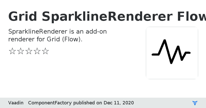
This add-on can be used to add a column with spark lines to Flow Grid. See [demo](https://incubator.app.fi/sparkline-renderer-demo/sparkline-renderer) for examples of the features. #### Basic use ```java public class SparklineRendererDemoView extends DemoView { private void basicDemo() { //... Grid grid = new Grid<>(); grid.addColumn(Song::getName).setHeader("Name").setSortable(true); grid.addColumn(Song::getArtist).setHeader("Artist").setSortable(true); grid.setItems(createListOfOneSongs()); // add a column with SparklineRenderer to Grid grid.addColumn(new SparklineRenderer<>(this::createSparklineValues, song -> new SparklineConfiguration())).setHeader("Daily listeners"); //... } private SparklineValues createSparklineValues(Song song) { // convert existing time series data to a SparklineValues object return new SparklineValues(song.getDailyListeners().getMeasurements().stream().map(measurement -> new SparklineValues.SparklineValue(measurement.getInstant(), measurement.getValue())).collect(Collectors.toList())); } } ``` ## License & Author This Add-on is distributed under Apache 2.0 Component Factory Sparkline Renderer is written by Vaadin Ltd. ### Sponsored development Major pieces of development of this add-on has been sponsored by multiple customers of Vaadin. Read more about Expert on Demand at: [Support](https://vaadin.com/support) and [Pricing](https://vaadin.com/pricing)
Online Demo

Grid SparklineRenderer Flow version 1.0.0
Initial release

Grid SparklineRenderer Flow version 1.0.2
New rendering mode PNG, you can now choose whether the resulting sparkline is rendered as PNG or SVG.

Grid SparklineRenderer Flow version 1.0.5
Better fix to y-axis range issue

Grid SparklineRenderer Flow version 2.0.0
* Update the component to Vaadin 14. * Change the license to Apache 2.0 * [Breaking change] Change the package to com.vaadin.componentfactory

Online