Chart Types
- Line and Spline Charts
- Area Charts
- Column and Bar Charts
- Error Bars
- Box Plot Charts
- Scatter Charts
- Bubble Charts
- Pie Charts
- Gauges
- Solid Gauges
- Area and Column Range Charts
- Polar, Wind Rose, and Spiderweb Charts
- Funnel and Pyramid Charts
- Waterfall Charts
- Heat Maps
- Tree Maps
- Polygons
- Flags
- OHLC and Candlestick Charts
- Data Labels
- Data Point Markers
- 3D Charts
Vaadin Charts comes with over a dozen different chart types.
You normally specify the chart type in the constructor of the Chart object.
The available chart types are defined in the ChartType enum.
You can later read or set the chart type with the chartType property of the chart model, which you can get with getConfiguration().getChart().
The supported chart types are:
Each chart type has its specific plot options and support its specific collection of chart features. They also have specific requirements for the data series. Configuring Data Labels is common to all chart types. Configuring Markers is available for all chart types displaying point data.
The basic chart types and their variants are covered in the following subsections.
Line and Spline Charts
Line charts connect the series of data points with lines. In the basic line charts the lines are straight, while in spline charts the lines are smooth polynomial interpolations between the data points.
| ChartType | Plot Options Class |
|---|---|
LINE |
|
SPLINE |
|
Area Charts
Area charts are like line charts, except that they fill the area between the line and some threshold value on Y axis. The threshold depends on the chart type. In addition to the base type, chart type combinations for spline interpolation and ranges are supported.
| ChartType | Plot Options Class |
|---|---|
AREA |
|
AREASPLINE |
|
AREARANGE |
|
AREASPLINERANGE |
|
In area range charts, the area between a lower and upper value is painted with a
transparent color. The data series must specify the minimum and maximum values
for the Y coordinates, defined either with RangeSeries, as
described in "Range
Series", or with DataSeries, described in
"Generic Data Series".
Plot Options
Area charts support stacking, so that multiple series are piled on top of
each other. You enable stacking from the plot options with
setStacking(). The Stacking.NORMAL stacking mode does
a normal summative stacking, while the Stacking.PERCENT handles
them as proportions.
See Data Point Markers for plot options regarding markers.
Column and Bar Charts
Column and bar charts illustrate values as vertical or horizontal bars, respectively. The two chart types are essentially equivalent, just as if the orientation of the axes was inverted.
Multiple data series, that is, two-dimensional data, are shown with thinner bars
or columns grouped by their category, as described in
"Displaying
Multiple Series". Enabling stacking with setStacking() in plot
options stacks the columns or bars of different series on top of each other.
You can also have COLUMNRANGE charts that illustrate a range
between a lower and an upper value, as described in
Area and Column Range Charts. They require the use of
RangeSeries for defining the lower and upper values.
| ChartType | Plot Options Class |
|---|---|
COLUMN |
|
COLUMNRANGE |
|
BAR |
|
See the API documentation for details regarding the plot options.
Error Bars
An error bars visualize errors, or high and low values, in statistical data. They typically represent high and low values in data or a multitude of standard deviation, a percentile, or a quantile. The high and low values are represented as horizontal lines, or "whiskers", connected by a vertical stem.
While error bars technically are a chart type ( ChartType.ERRORBAR), you normally use them together with some primary chart type, such as a scatter or column chart.
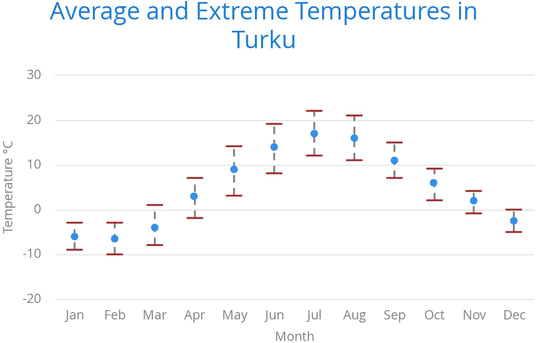
To display the error bars for data points, you need to have a separate data
series for the low and high values. The data series needs to use the
PlotOptionsErrorBar plot options type.
Source code
Java
// Create a chart of some primary type
Chart chart = new Chart(ChartType.SCATTER);

// Modify the default configuration a bit
Configuration conf = chart.getConfiguration();
conf.setTitle("Average Temperatures in Turku");
conf.getLegend().setEnabled(false);

// The primary data series
ListSeries averages = new ListSeries(
    -6, -6.5, -4, 3, 9, 14, 17, 16, 11, 6, 2, -2.5);

// Error bar data series with low and high values
DataSeries errors = new DataSeries();
errors.add(new DataSeriesItem(0,  -9, -3));
errors.add(new DataSeriesItem(1, -10, -3));
errors.add(new DataSeriesItem(2,  -8,  1));
...

// Need to be used for series to be recognized as error bar
PlotOptionsErrorbar barOptions = new PlotOptionsErrorbar();
errors.setPlotOptions(barOptions);

// The errors should be drawn lower
conf.addSeries(errors);
conf.addSeries(averages);
Note that you should add the error bar series first, to have it rendered lower in the chart.
Plot Options
Plot options for error bar charts have type PlotOptionsErrorBar. See the API documentation for details regarding the plot options.
|
Note
| Although most visual styles are defined in CSS, some options like whiskerLength are set through Java API. |
Box Plot Charts
Box plot charts display the distribution of statistical variables. A data point has a median, represented with a horizontal line, upper and lower quartiles, represented by a box, and a low and high value, represented with T-shaped "whiskers". The exact semantics of the box symbols are up to you.
Box plot chart is closely related to the error bar chart described in Error Bars, sharing the box and whisker elements.
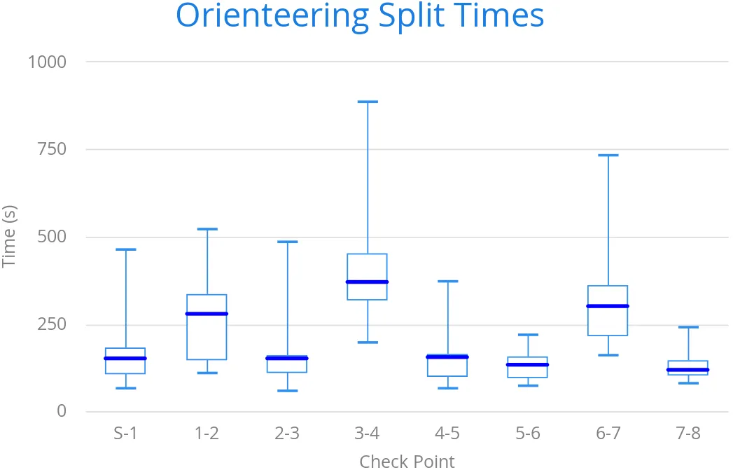
The chart type for box plot charts is ChartType.BOXPLOT. You normally have just one data series, so it is meaningful to disable the legend.
Source code
Java
Chart chart = new Chart(ChartType.BOXPLOT);

// Modify the default configuration a bit
Configuration conf = chart.getConfiguration();
conf.setTitle("Orienteering Split Times");
conf.getLegend().setEnabled(false);
Plot Options
The plot options for box plots have type PlotOptionsBoxPlot, which
extends the slightly more generic PlotOptionsErrorBar.
For example:
Source code
Java
// Set median line color and thickness
PlotOptionsBoxplot plotOptions = new PlotOptionsBoxplot();
plotOptions.setWhiskerLength("80%");
conf.setPlotOptions(plotOptions);
Data Model
As the data points in box plots have five different values instead of the usual
one, they require using a special BoxPlotItem. You can give the
different values with the setters, or all at once in the constructor.
Source code
Java
// Orienteering control point times for runners
double data[][] = orienteeringdata();

DataSeries series = new DataSeries();
for (double cpointtimes[]: data) {
    StatAnalysis analysis = new StatAnalysis(cpointtimes);
    series.add(new BoxPlotItem(analysis.low(),
                               analysis.firstQuartile(),
                               analysis.median(),
                               analysis.thirdQuartile(),
                               analysis.high()));
}
conf.setSeries(series);
Scatter Charts
Scatter charts display a set of unconnected data points. The name refers to
freely given X and Y coordinates, so the DataSeries or
DataProviderSeries are usually the most meaningful data series types
for scatter charts.
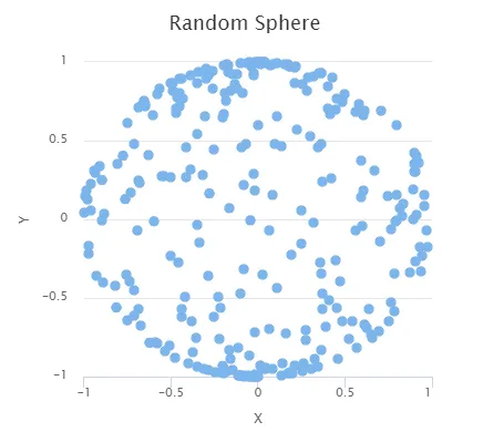
The chart type of a scatter chart is ChartType.SCATTER. Its options
can be configured in a PlotOptionsScatter object, although it does
not have any chart-type specific options.
Source code
Java
Chart chart = new Chart(ChartType.SCATTER);

// Modify the default configuration a bit
Configuration conf = chart.getConfiguration();
conf.setTitle("Random Sphere");
conf.getLegend().setEnabled(false); // Disable legend
conf.getxAxis().setTitle("X");
conf.getyAxis().setTitle("Y");
conf.getxAxis().setMax(1);
conf.getxAxis().setMin(-1);
conf.getyAxis().setMax(1);
conf.getyAxis().setMin(-1);

PlotOptionsScatter options = new PlotOptionsScatter();
// ... Give overall plot options here ...
conf.setPlotOptions(options);

DataSeries series = new DataSeries();
for (int i=0; i<300; i++) {
    double lng = Math.random() * 2 * Math.PI;
    double lat = Math.random() * Math.PI - Math.PI/2;
    double x   = Math.cos(lat) * Math.sin(lng);
    double y   = Math.sin(lat);

    DataSeriesItem point = new DataSeriesItem(x,y);
    series.add(point);
}
conf.addSeries(series);
The result was shown in Scatter Chart.
Bubble Charts
Bubble charts are a special type of scatter charts for representing three-dimensional data points with different point sizes. We demonstrated the same possibility with scatter charts in Scatter Charts, but the bubble charts make it easier to define the size of a point by its third (Z) dimension, instead of the radius property. The bubble size is scaled automatically, just like for other dimensions. The default point style is also more bubbly.
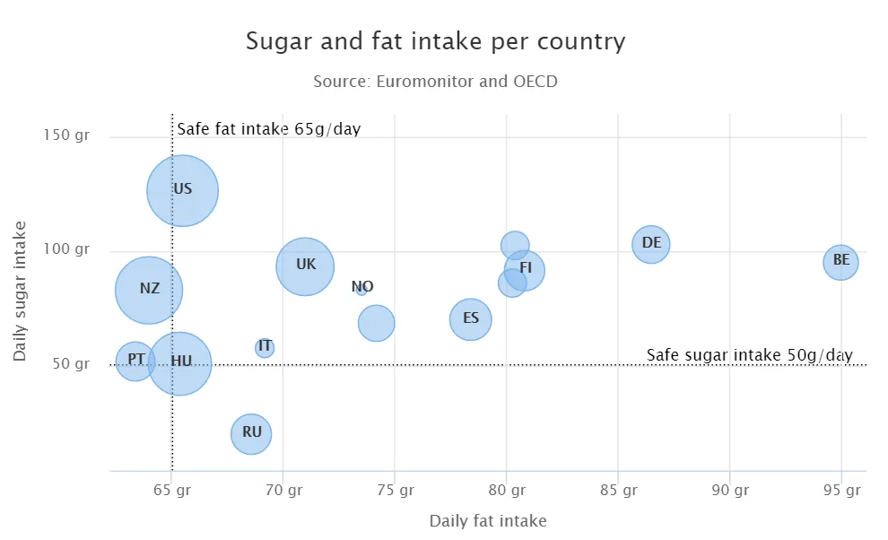
The chart type of a bubble chart is ChartType.BUBBLE. Its options
can be configured in a PlotOptionsBubble object, which has a single
chart-specific property, displayNegative, which controls whether
bubbles with negative values are displayed at all. More typically, you want to
configure the bubble marker. The bubble tooltip is configured in
the basic configuration. The Z coordinate value is available in the formatter
JavaScript with this.point.z reference.
The bubble radius is scaled linearly between a minimum and maximum radius. If you would rather scale by the area of the bubble, you can approximate that by taking square root of the Z values.
Source code
Java
// Create a bubble chart
Chart chart = new Chart(ChartType.BUBBLE);
// Modify the default configuration a bit
Configuration conf = chart.getConfiguration();
conf.setTitle("Sugar and fat intake per country");
conf.setSubTitle("Source: <a href=\"https://www.euromonitor.com/\">Euromonitor</a> and <a href=\"https://data.oecd.org/\">OECD</a>");
conf.getLegend().setEnabled(false); // Disable legend
conf.getTooltip().setHeaderFormat("{point.country}");
conf.getTooltip().setPointFormat("Obesity (adults): {point.z}%");
PlotOptionsBubble plotOptions = new PlotOptionsBubble();
DataLabels chartLabels = new DataLabels();
chartLabels.setEnabled(true);
chartLabels.setFormat("{point.name}");
plotOptions.setDataLabels(chartLabels);
conf.setPlotOptions(plotOptions);
public static class MyDataSeriesItem extends DataSeriesItem3d {
private String country;
public MyDataSeriesItem(Number x, Number y, Number z, String name, String country) {
super(x, y, z);
setName(name);
this.country = country;
}
public String getCountry() {
return country;
}
}
DataSeries series = new DataSeries("Countries");
series.add(new MyDataSeriesItem(95.0, 95.0, 13.8, "BE", "Belgium"));
series.add(new MyDataSeriesItem(86.5, 102.9, 14.7, "DE", "Germany"));
series.add(new MyDataSeriesItem(80.8, 91.5, 15.8, "FI", "Finland"));
...
conf.addSeries(series);
// Set the category labels on the axis correspondingly
XAxis xaxis = new XAxis();
xaxis.setTitle("Daily fat intake");
xaxis.getLabels().setFormat("{value} gr");
PlotLine xPlotLine = new PlotLine();
xPlotLine.setValue(65);
Label xLabel = new Label("Safe fat intake 65g/day");
xLabel.setRotation(0);
xLabel.setY(15);
xPlotLine.setLabel(xLabel);
xaxis.setPlotLines(xPlotLine);
conf.addxAxis(xaxis);
// Set the Y axis title
YAxis yaxis = new YAxis();
yaxis.setMax(160);
yaxis.setTitle("Daily sugar intake");
yaxis.getLabels().setFormat("{value} gr");
yaxis.setStartOnTick(false);
yaxis.setEndOnTick(false);
PlotLine yPlotLine = new PlotLine();
yPlotLine.setValue(50);
Label yLabel = new Label("Safe sugar intake 50g/day");
yLabel.setX(-10);
yLabel.setAlign(HorizontalAlign.RIGHT);
yPlotLine.setLabel(yLabel);
yaxis.setPlotLines(yPlotLine);
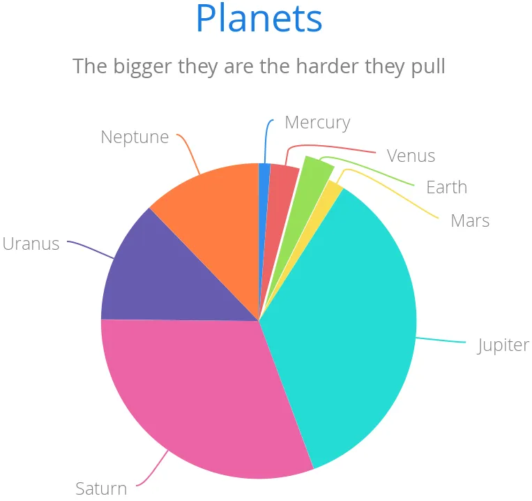
conf.addyAxis(yaxis);Pie Charts
A pie chart illustrates data values as sectors of size proportionate to the sum
of all values. The pie chart is enabled with ChartType.PIE and you
can make type-specific settings in the PlotOptionsPie object as
described later.
Source code
Java
Chart chart = new Chart(ChartType.PIE);
Configuration conf = chart.getConfiguration();
...
A ready pie chart is shown in Pie Chart.
Plot Options
The chart-specific options of a pie chart are configured with a
PlotOptionsPie.
Source code
Java
PlotOptionsPie options = new PlotOptionsPie();
options.setInnerSize("0");
options.setSize("75%");  // Default
options.setCenter("50%", "50%"); // Default
conf.setPlotOptions(options);- innerSize
-
A pie with inner size greater than zero is a "donut". The inner size can be expressed either as number of pixels or as a relative percentage of the chart area with a string (such as "60%") See the section later on donuts.
- size
-
The size of the pie can be expressed either as number of pixels or as a relative percentage of the chart area with a string (such as "80%"). The default size is 75%, to leave space for the labels.
- center
-
The X and Y coordinates of the center of the pie can be expressed either as numbers of pixels or as a relative percentage of the chart sizes with a string. The default is "50%", "50%".
Data Model
The labels for the pie sectors are determined from the labels of the data
points. The DataSeries or ContainerSeries, which allow
labeling the data points, should be used for pie charts.
Source code
Java
DataSeries series = new DataSeries();
series.add(new DataSeriesItem("Mercury", 4900));
series.add(new DataSeriesItem("Venus", 12100));
...
conf.addSeries(series);
If a data point, as defined as a DataSeriesItem in a
DataSeries, has the sliced property enabled, it is shown as
slightly cut away from the pie.
Source code
Java
// Slice one sector out
DataSeriesItem earth = new DataSeriesItem("Earth", 12800);
earth.setSliced(true);
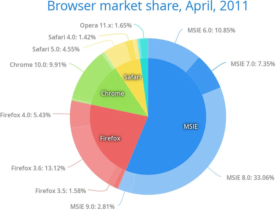
series.add(earth);Donut Charts
Setting the innerSize of the plot options of a pie chart to a larger than zero value results in an empty hole at the center of the pie.
Source code
Java
PlotOptionsPie options = new PlotOptionsPie();
options.setInnerSize("60%");
conf.setPlotOptions(options);
As you can set the plot options also for each data series, you can put two pie charts on top of each other, with a smaller one fitted in the "hole" of the donut. This way, you can make pie charts with more details on the outer rim, as done in the example below:
Source code
Java
// The inner pie
DataSeries innerSeries = new DataSeries();
innerSeries.setName("Browsers");
PlotOptionsPie innerPieOptions = new PlotOptionsPie();
innerPieOptions.setSize("60%");
innerSeries.setPlotOptions(innerPieOptions);
...

DataSeries outerSeries = new DataSeries();
outerSeries.setName("Versions");
PlotOptionsPie outerSeriesOptions = new PlotOptionsPie();
outerSeriesOptions.setInnerSize("60%");
outerSeries.setPlotOptions(outerSeriesOptions);
...
The result is illustrated in Overlaid Pie and Donut Chart.
Gauges
A gauge is an one-dimensional chart with a circular Y-axis, where a rotating pointer points to a value on the axis. A gauge can, in fact, have multiple Y-axes to display multiple scales.
A solid gauge is otherwise like a regular gauge, except that a solid color arc is used to indicate current value instead of a pointer. The color of the indicator arc can be configured to change according to color stops.
|
Note
| Gauge and solid gauge series should not be combined with series of other types. |
|
Note
| A bar series inverts the entire chart, combine with care. |
Let us consider the following gauge:
Source code
Java
Chart chart = new Chart(ChartType.GAUGE);After the settings done in the subsequent sections, it will show as in A Gauge.
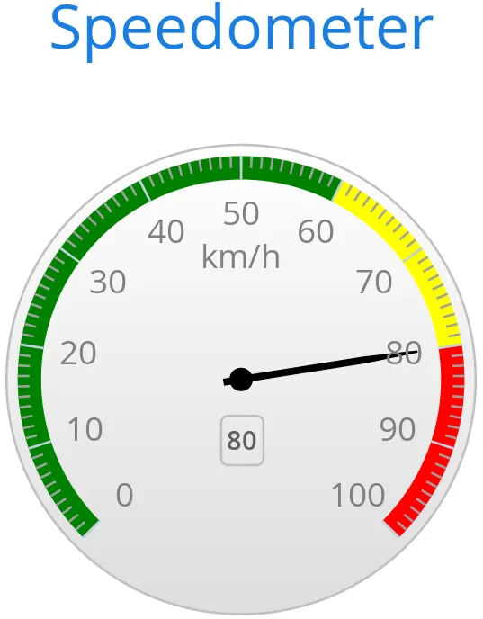
Gauge Configuration
The start and end angles of the gauge can be configured in the Pane
object of the chart configuration. The angles can be given as -360 to 360
degrees, with 0 at the top of the circle.
Source code
Java
Configuration conf = chart.getConfiguration();
conf.setTitle("Speedometer");
conf.getPane().setStartAngle(-135);
conf.getPane().setEndAngle(135);
Axis Configuration
A gauge has only an Y-axis. You need to provide both a minimum and maximum value for it.
Source code
Java
YAxis yaxis = new YAxis();
yaxis.setTitle("km/h");

// The limits are mandatory
yaxis.setMin(0);
yaxis.setMax(100);

// Other configuration
yaxis.getLabels().setStep(1);
yaxis.setTickInterval(10);
yaxis.setTickLength(10);
yaxis.setTickWidth(1);
yaxis.setMinorTickInterval("1");
yaxis.setMinorTickLength(5);
yaxis.setMinorTickWidth(1);

PlotBand green = new PlotBand(0, 60, null);
green.setClassName("green");

PlotBand yellow = new PlotBand(60, 80, null);
yellow.setClassName("yellow");

PlotBand red = new PlotBand(80, 100, null);
red.setClassName("red");

yaxis.setPlotBands(green, yellow, red);

conf.addyAxis(yaxis);
You can do all kinds of other configuration to the axis - please see the API documentation for all the available parameters.
Setting and Updating Gauge Data
A gauge only displays a single value, which you can define as a data series of length one, such as as follows:
Source code
Java
ListSeries series = new ListSeries("Speed", 80);
conf.addSeries(series);
Gauges are especially meaningful for displaying changing values. You can use the
updatePoint() method in the data series to update the single
value.
Source code
Java
final TextField tf = new TextField("Enter a new value");
layout.add(tf);

Button update = new Button("Update", (e) -> {
    Integer newValue = new Integer(tf.getValue());
    series.updatePoint(0, newValue);
});
layout.add(update);
Solid Gauges
A solid gauge is much like a regular gauge described previously; a one-dimensional chart with a circular Y-axis. However, instead of a rotating pointer, the value is indicated by a rotating arc with solid color. The color of the indicator arc can be configured to change according to the value using color stops.
Let us consider the following gauge:
Source code
Java
Chart chart = new Chart(ChartType.SOLIDGAUGE);After the settings done in the subsequent sections, it will show as in A Solid Gauge.
While solid gauge is much like a regular gauge, the configuration differs
Configuration
The solid gauge must be configured in the drawing Pane of the chart
configuration. The gauge arc spans an angle, which is specified as -360 to 360
degrees, with 0 degrees at the top of the arc. Typically, a semi-arc is used,
where you use -90 and 90 for the angles, and move the center lower than you
would have with a full circle. You can also adjust the size of the gauge pane;
enlargening it allows positioning tick labels better.
Source code
Java
Configuration conf = chart.getConfiguration();
conf.setTitle("Solid Gauge");

Pane pane = conf.getPane();
pane.setSize("125%");           // For positioning tick labels
pane.setCenter("50%", "70%"); // Move center lower
pane.setStartAngle(-90);        // Make semi-circle
pane.setEndAngle(90);           // Make semi-circle
The shape of the gauge display is defined as the background of the pane. You at least need to set the shape as either " arc" or " solid". You typically also want to set background color and inner and outer radius.
Source code
Java
Background bkg = new Background();
bkg.setInnerRadius("60%");  // To make it an arc and not circle
bkg.setOuterRadius("100%"); // Default - not necessary
bkg.setShape(BackgroundShape.ARC);        // solid or arc
pane.setBackground(bkg);
Axis Configuration
A gauge only has an Y-axis. You must define the value range ( min and max).
Source code
Java
YAxis yaxis = new YAxis();
yaxis.setTitle("Pressure GPa");
yaxis.getTitle().setY(-80); // Move 70 px upwards from center

// The limits are mandatory
yaxis.setMin(0);
yaxis.setMax(200);

// Configure ticks and labels
yaxis.setTickInterval(100);  // At 0, 100, and 200
yaxis.getLabels().setY(-16); // Move 16 px upwards
yaxis.setGridLineWidth(0); // Disable grid
Setting yaxis.getLabels().setRotationPerpendicular() makes gauge
labels rotate perpendicular to the center.
You can do all kinds of other configuration to the axis - please see the API documentation for all the available parameters.
Plot Options
Solid gauges do not currently have any chart type specific plot options. See "Plot Options" for common options.
Source code
Java
PlotOptionsSolidgauge options = new PlotOptionsSolidgauge();

// Move the value display box at the center a bit higher
Labels dataLabels = new Labels();
dataLabels.setY(-20);
options.setDataLabels(dataLabels);

conf.setPlotOptions(options);
Setting and Updating Gauge Data
A gauge only displays a single value, which you can define as a data series of length one, such as as follows:
Source code
Java
ListSeries series = new ListSeries("Pressure MPa", 80);
conf.addSeries(series);
Gauges are especially meaningful for displaying changing values. You can use the
updatePoint() method in the data series to update the single
value.
Source code
Java
final TextField tf = new TextField("Enter a new value");
layout.add(tf);
Button update = new Button("Update", (e) -> {
Integer newValue = new Integer(tf.getValue());
series.updatePoint(0, newValue);
});
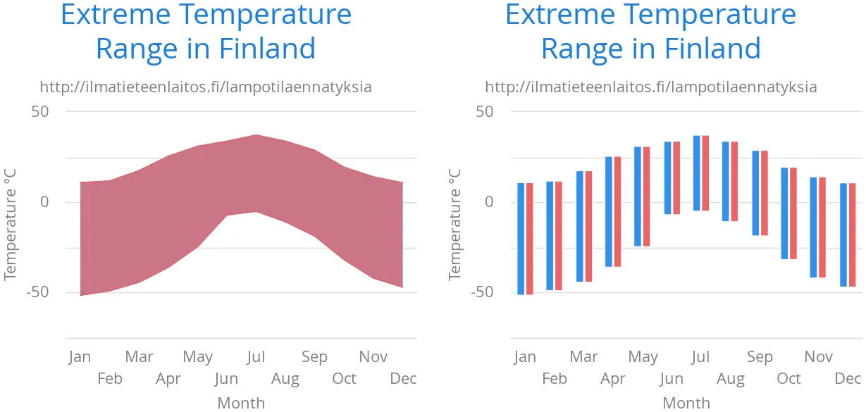
layout.add(update);Area and Column Range Charts
Ranged charts display an area or column between a minimum and maximum value,
instead of a singular data point. They require the use of
RangeSeries, as described in
"Range Series". An
area range is created with AREARANGE chart type, and a column range
with COLUMNRANGE chart type.
Consider the following example:
Source code
Java
Chart chart = new Chart(ChartType.AREARANGE);

// Modify the default configuration a bit
Configuration conf = chart.getConfiguration();
conf.setTitle("Extreme Temperature Range in Finland");
...

// Create the range series
// Source: https://ilmatieteenlaitos.fi/lampotilaennatyksia
RangeSeries series = new RangeSeries("Temperature Extremes",
    new Double[]{-51.5,10.9},
    new Double[]{-49.0,11.8},
    ...
    new Double[]{-47.0,10.8});//
conf.addSeries(series);
The resulting chart, as well as the same chart with a column range, is shown in Area and Column Range Chart.
Polar, Wind Rose, and Spiderweb Charts
Most chart types having two axes can be displayed in polar coordinates,
where the X axis is curved on a circle and Y axis from the center of the circle
to its rim. Polar chart is not a chart type in itself, but can be enabled for
most chart types with setPolar(true) in the chart model
parameters. Therefore all chart type specific features are usable with polar
charts.
Vaadin Charts allows many sorts of typical polar chart types, such as wind rose, a polar column graph, or spiderweb, a polar chart with categorical data and a more polygonal visual style.
Source code
Java
// Create a chart of some type
Chart chart = new Chart(ChartType.LINE);

// Enable the polar projection
Configuration conf = chart.getConfiguration();
conf.getChart().setPolar(true);
You need to define the sector of the polar projection with a Pane
object in the configuration. The sector is defined as degrees from the north
direction. You also need to define the value range for the X axis with
setMin() and setMax().
Source code
Java
// Define the sector of the polar projection
Pane pane = new Pane(0, 360); // Full circle
conf.addPane(pane);

// Define the X axis and set its value range
XAxis axis = new XAxis();
axis.setMin(0);
axis.setMax(360);
The polar and spiderweb charts are illustrated in Wind Rose and Spiderweb Charts.
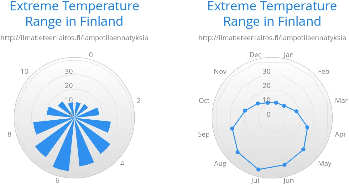
Spiderweb Charts
A spiderweb chart is a commonly used visual style of a polar chart with a polygonal shape rather than a circle. The data and the X axis should be categorical to make the polygonal interpolation meaningful. The sector is assumed to be full circle, so no angles for the pane need to be specified.
Note the style settings done in the axis in the example below:
Source code
Java
Chart chart = new Chart(ChartType.LINE);
...

// Modify the default configuration a bit
Configuration conf = chart.getConfiguration();
conf.getChart().setPolar(true);
...

// Create the range series
// Source: https://ilmatieteenlaitos.fi/lampotilaennatyksia
ListSeries series = new ListSeries("Temperature Extremes",
    10.9, 11.8, 17.5, 25.5, 31.0, 33.8,
    37.2, 33.8, 28.8, 19.4, 14.1, 10.8);
conf.addSeries(series);

// Set the category labels on the X axis correspondingly
XAxis xaxis = new XAxis();
xaxis.setCategories("Jan", "Feb", "Mar",
    "Apr", "May", "Jun", "Jul", "Aug", "Sep",
    "Oct", "Nov", "Dec");
xaxis.setTickmarkPlacement(TickmarkPlacement.ON);
xaxis.setLineWidth(0);
conf.addxAxis(xaxis);

// Configure the Y axis
YAxis yaxis = new YAxis();
yaxis.setGridLineInterpolation("polygon"); // Webby look
yaxis.setMin(0);
yaxis.setTickInterval(10);
yaxis.getLabels().setStep(1);
conf.addyAxis(yaxis);
Funnel and Pyramid Charts
Funnel and pyramid charts are typically used to visualize stages in a sales processes, and for other purposes to visualize subsets of diminishing size. A funnel or pyramid chart has layers much like a stacked column: in funnel from top-to-bottom and in pyramid from bottom-to-top. The top of the funnel has width of the drawing area of the chart, and dinimishes in size down to a funnel "neck" that continues as a column to the bottom. A pyramid diminishes from bottom to top and does not have a neck.
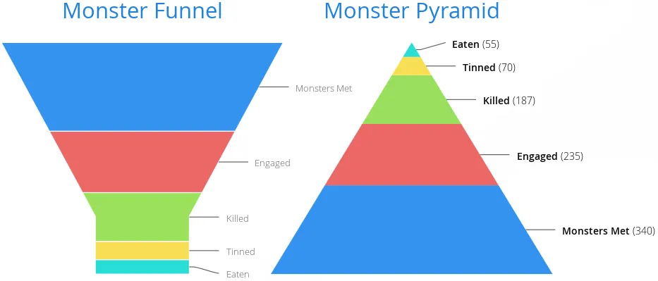
Funnels have chart type FUNNEL, pyramids have PYRAMID.
The labels of the funnel blocks are by default placed on the right side of the blocks, together with a connector. See the following example.
Source code
Java
Chart chart = new Chart(ChartType.FUNNEL);
chart.setWidth("500px");
chart.setHeight("350px");

// Modify the default configuration a bit
Configuration conf = chart.getConfiguration();
conf.setTitle("Monster Utilization");
conf.getLegend().setEnabled(false);

// Give more room for the labels
conf.getChart().setSpacingRight(120);

// Configure the funnel neck shape
PlotOptionsFunnel options = new PlotOptionsFunnel();
options.setNeckHeight(20, Sizeable.Unit.PERCENTAGE);
options.setNeckWidth(20, Sizeable.Unit.PERCENTAGE);

// Style the data labels
DataLabelsFunnel dataLabels = new DataLabelsFunnel();
dataLabels.setFormat("<b>{point.name}</b> ({point.y:,.0f})");
dataLabels.setSoftConnector(false);
dataLabels.setColor(SolidColor.BLACK);
options.setDataLabels(dataLabels);

conf.setPlotOptions(options);

// Create the range series
DataSeries series = new DataSeries();
series.add(new DataSeriesItem("Monsters Met", 340));
series.add(new DataSeriesItem("Engaged", 235));
series.add(new DataSeriesItem("Killed", 187));
series.add(new DataSeriesItem("Tinned", 70));
series.add(new DataSeriesItem("Eaten", 55));
conf.addSeries(series);
Plot Options
The funnel and pyramid options are configured with
PlotOptionsFunnel or PlotOptionsFunnel, respectively.
In addition to common chart options, the chart types support the following shared options: width, height, depth, allowPointSelect, borderColor, borderWidth, center, slicedOffset, and visible. See "Plot Options" for detailed descriptions.
They have the following chart type specific properties:
- neckHeight#or[parameter]#neckHeightPercentage (only funnel)
-
Height of the neck part of the funnel either as pixels or as percentage of the entire funnel height.
- neckWidth#or[parameter]#neckWidthPercentage (only funnel)
-
Width of the neck part of the funnel either as pixels or as percentage of the top of the funnel.
- reversed
-
Whether the chart is reversed upside down from the normal direction from diminishing from the top to bottom. The default is false for funnel and true for pyramid.
Waterfall Charts
Waterfall charts are used for visualizing level changes from an initial level to a final level through a number of changes in the level. The changes are given as delta values, and you can have a number of intermediate totals, which are calculated automatically.
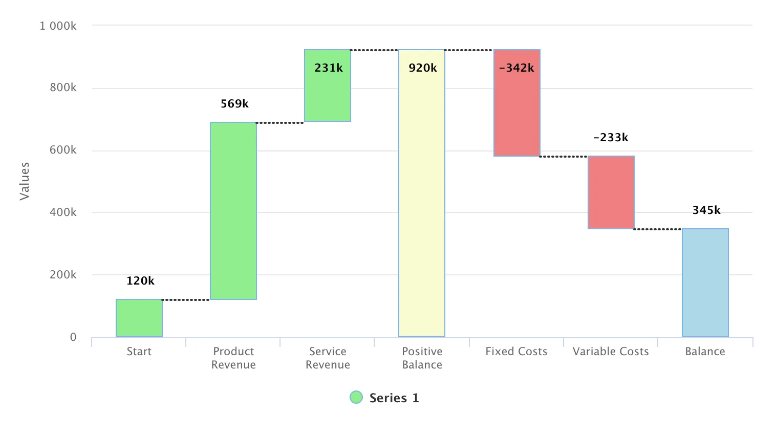
Waterfall charts have chart type WATERFALL.
For example:
Source code
Java
Chart chart = new Chart(ChartType.WATERFALL);

DataSeries dataSeries = new DataSeries();

dataSeries.add(new DataSeriesItem("Start", 120000));
dataSeries.add(new DataSeriesItem("Product Revenue", 569000));
dataSeries.add(new DataSeriesItem("Service Revenue", 231000));
WaterFallSum positiveBalance = new WaterFallSum("Positive Balance");
positiveBalance.setIntermediate(true);
dataSeries.add(positiveBalance);

dataSeries.add(new DataSeriesItem("Fixed Costs", -342000));
dataSeries.add(new DataSeriesItem("Variable Costs", -233000));
WaterFallSum balance = new WaterFallSum("Balance");
dataSeries.add(balance);

PlotOptionsWaterfall opts = new PlotOptionsWaterfall();
DataLabels dataLabels = new DataLabels(true);
dataLabels.setVerticalAlign(VerticalAlign.TOP);
dataLabels.setY(-30);
dataLabels.setFormatter("function() { return this.y / 1000 + 'k'; }");
opts.setDataLabels(dataLabels);

dataSeries.setPlotOptions(opts);

Configuration configuration = chart.getConfiguration();
configuration.addSeries(dataSeries);
configuration.getxAxis().setType(AxisType.CATEGORY);
...
Waterfall charts can be styled by CSS using the following classes: .highcharts-waterfall-series, .highcharts-point, .highcharts-negative, .highcharts-sum, .highcharts-intermediate-sum.
The example continues in the following subsections.
Plot Options
Waterfall charts have plot options type PlotOptionsWaterfall, which
extends the more general options defined in PlotOptionsColumn. It
has the following chart type specific properties:
- upColor
-
Color for the positive values.
- color
-
Default color for all the points. If
upColoris defined,coloris used only for the negative values.
In the following, we define the colors, as well as the style and placement of the labels for the columns:
Source code
Java
// Define the colors
final Color balanceColor = SolidColor.BLACK;
final Color positiveColor = SolidColor.BLUE;
final Color negativeColor = SolidColor.RED;

// Configure the colors
PlotOptionsWaterfall options = new PlotOptionsWaterfall();
options.setUpColor(positiveColor);
options.setColor(negativeColor);

// Configure the labels
Labels labels = new Labels(true);
labels.setVerticalAlign(VerticalAlign.TOP);
labels.setY(-20);
labels.setFormatter("Math.floor(this.y/1000) + 'k'");
Style style = new Style();
style.setColor(SolidColor.BLACK);
style.setFontWeight(FontWeight.BOLD);
labels.setStyle(style);
options.setDataLabels(labels);
options.setPointPadding(0);
conf.setPlotOptions(options);
Data Series
The data series for waterfall charts consists of changes (deltas) starting from
an initial value and one or more cumulative sums. There should be at least a
final sum, and optionally intermediate sums. The sums are represented as
WaterFallSum data items, and no value is needed for them as they
are calculated automatically. For intermediate sums, you should set the
intermediate property to true.
Source code
Java
// The data
DataSeries series = new DataSeries();

// The beginning balance
DataSeriesItem start = new DataSeriesItem("Start", 306503);
start.setColor(balanceColor);
series.add(start);

// Deltas
series.add(new DataSeriesItem("Predators", -3330));
series.add(new DataSeriesItem("Slaughter", -103332));
series.add(new DataSeriesItem("Reproduction", +104052));

WaterFallSum end = new WaterFallSum("End");
end.setColor(balanceColor);
end.setIntermediate(false); // Not intermediate (default)
series.add(end);

conf.addSeries(series);
Heat Maps
A heat map is a two-dimensional grid, where the color of a grid cell indicates a value.
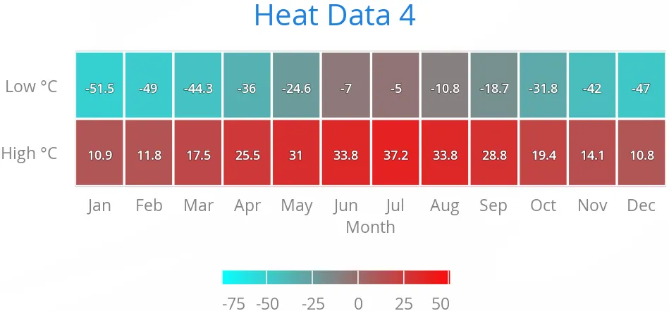
Heat maps have chart type HEATMAP.
For example:
Source code
Java
Chart chart = new Chart(ChartType.HEATMAP);
chart.setWidth("600px");
chart.setHeight("300px");

Configuration conf = chart.getConfiguration();
conf.setTitle("Heat Data");

// Set colors for the extremes
conf.getColorAxis().setMinColor(SolidColor.AQUA);
conf.getColorAxis().setMaxColor(SolidColor.RED);

// Set up border and data labels
PlotOptionsHeatmap plotOptions = new PlotOptionsHeatmap();
plotOptions.setBorderColor(SolidColor.WHITE);
plotOptions.setBorderWidth(2);
plotOptions.setDataLabels(new DataLabels(true));
conf.setPlotOptions(plotOptions);

// Create some data
HeatSeries series = new HeatSeries();
series.addHeatPoint( 0, 0,  10.9); // Jan High
series.addHeatPoint( 0, 1, -51.5); // Jan Low
series.addHeatPoint( 1, 0,  11.8); // Feb High
...
series.addHeatPoint(11, 1, -47.0); // Dec Low
conf.addSeries(series);

// Set the category labels on the X axis
XAxis xaxis = new XAxis();
xaxis.setTitle("Month");
xaxis.setCategories("Jan", "Feb", "Mar",
    "Apr", "May", "Jun", "Jul", "Aug", "Sep",
    "Oct", "Nov", "Dec");
conf.addxAxis(xaxis);

// Set the category labels on the Y axis
YAxis yaxis = new YAxis();
yaxis.setTitle("");
yaxis.setCategories("High C", "Low C");
conf.addyAxis(yaxis);
Heat Map Data Series
Heat maps require two-dimensional tabular data. The easiest way is to use
HeatSeries, as was done in the example earlier. You can add data
points with the addHeatPoint() method, or give all the data at
once in an array with setData() or in the constructor.
If you need to use other data series type for a heat map, notice that the
semantics of the heat map data points are currently not supported by the
general-purpose series types, such as DataSeries. You can work
around this semantic limitation by specifying the X (column),
Y (row), and heatScore by using the respective
X, low, and high properties of the
general-purpose data series.
Also note that while some other data series types allow updating the values one
by one, updating all the values in a heat map is very inefficient; it is faster
to simply replace the data series and then call chart.drawChart().
Tree Maps
A tree map is used to display hierarchical data. It consists of a group of rectangles that contains other rectangles, where the size of a rectangle indicates the item value.
Tree maps have chart type TREEMAP.
In order to create a Tree Map chart,you need to create a class that extends
TreeSeriesItem and add an colorIndex property:
Source code
Java
public static class MapTreeSeriesItem extends TreeSeriesItem {
    private Number colorIndex;

    public Number getColorIndex() {
        return colorIndex;
    }

    public void setColorIndex(Number colorIndex) {
        this.colorIndex = colorIndex;
    }
}
Then, you need to specify a color index for each of the top levels series items:
Source code
Java
TreeSeries series = new TreeSeries();

MapTreeSeriesItem apples = new MapTreeSeriesItem();
apples.setId("A");
apples.setName("Apples");
apples.setColorIndex(0);

...

TreeSeriesItem anneA = new TreeSeriesItem("Anne", apples, 5);
TreeSeriesItem rickA = new TreeSeriesItem("Rick", apples, 3);
TreeSeriesItem peterA = new TreeSeriesItem("Peter", apples, 4);

...

series.addAll(apples, anneA, rickA, peterA);
For example:
Source code
Java
Chart chart = new Chart();

PlotOptionsTreemap plotOptions = new PlotOptionsTreemap();
plotOptions.setLayoutAlgorithm(TreeMapLayoutAlgorithm.STRIPES);
plotOptions.setAlternateStartingDirection(true);

Level level = new Level();
level.setLevel(1);
level.setLayoutAlgorithm(TreeMapLayoutAlgorithm.SLICEANDDICE);

DataLabels dataLabels = new DataLabels();
dataLabels.setEnabled(true);
dataLabels.setAlign(HorizontalAlign.LEFT);
dataLabels.setVerticalAlign(VerticalAlign.TOP);

Style style = new Style();
style.setFontSize("15px");
style.setFontWeight(FontWeight.BOLD);

dataLabels.setStyle(style);
level.setDataLabels(dataLabels);
plotOptions.setLevels(level);

TreeSeries series = new TreeSeries();

TreeSeriesItem apples = new TreeSeriesItem("A", "Apples");
apples.setColor(new SolidColor("#EC2500"));

TreeSeriesItem bananas = new TreeSeriesItem("B", "Bananas");
bananas.setColor(new SolidColor("#ECE100"));

TreeSeriesItem oranges = new TreeSeriesItem("O", "Oranges");
oranges.setColor(new SolidColor("#EC9800"));

TreeSeriesItem anneA = new TreeSeriesItem("Anne", apples, 5);
TreeSeriesItem rickA = new TreeSeriesItem("Rick", apples, 3);
TreeSeriesItem paulA = new TreeSeriesItem("Paul", apples, 4);

TreeSeriesItem anneB = new TreeSeriesItem("Anne", bananas, 4);
TreeSeriesItem rickB = new TreeSeriesItem("Rick", bananas, 10);
TreeSeriesItem paulB = new TreeSeriesItem("Paul", bananas, 1);

TreeSeriesItem anneO = new TreeSeriesItem("Anne", oranges, 1);
TreeSeriesItem rickO = new TreeSeriesItem("Rick", oranges, 3);
TreeSeriesItem paulO = new TreeSeriesItem("Paul", oranges, 3);

TreeSeriesItem susanne = new TreeSeriesItem("Susanne", 2);
susanne.setParent("Kiwi");
susanne.setColor(new SolidColor("#9EDE00"));

series.addAll(apples, bananas, oranges, anneA, rickA, paulA,
        anneB, rickB, paulB, anneO, rickO, paulO, susanne);

series.setPlotOptions(plotOptions);

chart.getConfiguration().addSeries(series);

chart.getConfiguration().setTitle("Fruit consumption");
Plot Options
Tree map charts have plot options type PlotOptionsTreeMap, which
extends the more general options defined in
AbstractCommonOptionsColumn. It has the following chart type
specific properties:
- allowDrillToNode
-
When enabled the user can click on a point which is a parent and zoom in on its children. Defaults to false.
- alternateStartingDirection
-
Enabling this option will make the treemap alternate the drawing direction between vertical and horizontal. The next levels starting direction will always be the opposite of the previous. Defaults value is false.
- layoutAlgorithm
-
This option decides which algorithm is used for setting position and dimensions of the points. Available algorithms are defined in [classname]``TreeMapLayoutAlgorithm## enum: SLICEANDDICE, STRIPES, SQUARIFIED and STRIP. Default value is SLICEANDDICE.
- layoutStartingDirection
-
Defines which direction the layout algorithm will start drawing. Possible values are defined in [classname]``TreeMapLayoutStartingDirection## enum: HORIZONTAL and VERTICAL. Default value is VERTICAL.
- levelIsConstant
-
Used together with the
setLevels()andsetAllowDrillToNode()options. When set to false the first level visible when drilling is considered to be level one. Otherwise the level will be the same as the tree structure. Defaults value is true. - levels
-
Set options on specific levels. Takes precedence over series options, but not point options.
Tree Map Data Series
Tree maps require hierarchical data. The easiest way is to use
TreeSeries and TreeSeriesItem, as was done in the
example earlier. You can add data points with the add() method, or
give all the data at once in a Collection with
setData() or in the constructor.
The item hierarchy is defined with the setParent() method in the
TreeSeriesItem instance or in the constructor. Parent argument can
be either a String identifier or a TreeSeriesItem with
a non-null ID. If no TreeSeriesItem with matching ID is found or if
value is null then the parent will be rendered as a root item.
Polygons
A polygon can be used to draw any freeform filled or stroked shape in the Cartesian plane.
Polygons consist of connected data points. The DataSeries or
ContainerSeries are usually the most meaningful data series types
for polygon charts. In both cases, the x and y
properties should be set.
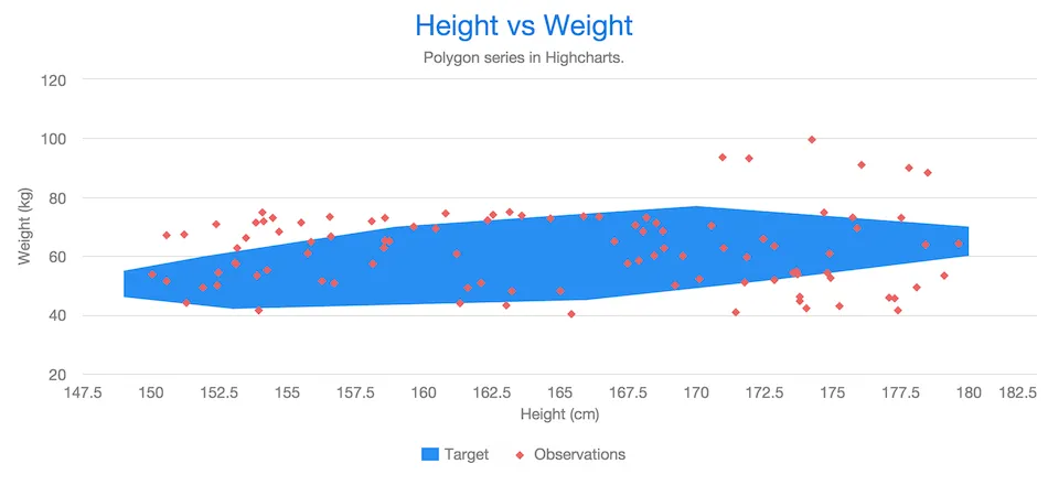
Polygons have chart type POLYGON.
For example:
Source code
Java
Chart chart = new Chart();
Configuration conf = chart.getConfiguration();
conf.setTitle("Height vs Weight");

XAxis xAxis = conf.getxAxis();
xAxis.setStartOnTick(true);
xAxis.setEndOnTick(true);
xAxis.setShowLastLabel(true);
xAxis.setTitle("Height (cm)");

YAxis yAxis = conf.getyAxis();
yAxis.setTitle("Weight (kg)");

PlotOptionsScatter optionsScatter = new PlotOptionsScatter();
DataSeries scatter = new DataSeries();
scatter.setPlotOptions(optionsScatter);
scatter.setName("Observations");

scatter.add(new DataSeriesItem(160, 67));
...
scatter.add(new DataSeriesItem(180, 75));
conf.addSeries(scatter);

DataSeries polygon = new DataSeries();
PlotOptionsPolygon optionsPolygon = new PlotOptionsPolygon();
optionsPolygon.setEnableMouseTracking(false);
polygon.setPlotOptions(optionsPolygon);
polygon.setName("Target");

polygon.add(new DataSeriesItem(153, 42));
polygon.add(new DataSeriesItem(149, 46));
...
polygon.add(new DataSeriesItem(173, 52));
polygon.add(new DataSeriesItem(166, 45));
conf.addSeries(polygon);Flags
Flags is a special chart type for annotating a series or the X axis with callout labels. Flags indicate interesting points or events on the series or axis. The flags are defined as items in a data series separate from the annotated series or axis.
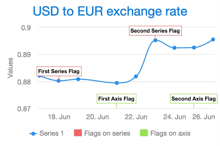
Flags are normally used in a chart that has one or more normal data series.
Plot Options
The flags are defined in a series that has its chart type specified by setting its plot options as PlotOptionsFlags. In addition to the common plot options properties, flag charts also have the following properties:
- shape
-
defines the shape of the marker. It can be one of
FLAG,CIRCLEPIN,SQUAREPIN, orCALLOUT. - stackDistance
-
defines the vertical offset between flags on the same value in the same series. Defaults to 12.
- onSeries
-
defines the ID of the series where the flags should be drawn on. If no ID is given, the flags are drawn on the X axis.
- onKey
-
in chart types that have multiple keys (Y values) for a data point, the property defines on which key the flag is placed. Line and column series have only one key,
y. In range, OHLC, and candlestick series, the flag can be placed on theopen,high,low, orclosekey. Defaults toy.
Data
The data for flags series require x and title properties, but can also have text property indicating the tooltip text.
The easiest way to set these properties is to use FlagItem.
Example
In the following, we annotate a time series as well as the axis with flags:
Source code
Java
Chart chart = new Chart(ChartType.SPLINE);

Configuration configuration = chart.getConfiguration();
configuration.getTitle().setText("USD to EUR exchange rate");
configuration.getxAxis().setType(AxisType.DATETIME);

// A data series to annotate with flags
DataSeries dataSeries = new DataSeries();
dataSeries.setId("dataseries");
dataSeries.addData(new Number[][] { { 1434499200000l, 0.8821 },
        { 1434585600000l, 0.8802 }, { 1434672000000l, 0.8808 },
        { 1434844800000l, 0.8794 }, { 1434931200000l, 0.8818 },
        { 1435017600000l, 0.8952 }, { 1435104000000l, 0.8924 },
        { 1435190400000l, 0.8925 }, { 1435276800000l, 0.8955 } });

// Flags on the data series
DataSeries flagsOnSeries = new DataSeries();
flagsOnSeries.setName("Flags on series");
PlotOptionsFlags plotOptionsFlags = new PlotOptionsFlags();
plotOptionsFlags.setShape(FlagShape.SQUAREPIN);
plotOptionsFlags.setOnSeries("dataseries");
flagsOnSeries.setPlotOptions(plotOptionsFlags);
flagsOnSeries.add(new FlagItem(1434585600000l, "First Series Flag",
        "First Series Flag Tooltip Text"));
flagsOnSeries.add(new FlagItem(1435017600000l, "Second Series Flag"));

// Flags on the X axis
DataSeries flagsOnAxis = new DataSeries();
flagsOnAxis.setPlotOptions(new PlotOptionsFlags());
flagsOnAxis.setName("Flags on axis");
flagsOnAxis.add(new FlagItem(1434844800000l, "First Axis Flag",
        "First Axis Flag Tooltip Text"));
flagsOnAxis.add(new FlagItem(1435190400000l, "Second Axis Flag"));

configuration.setSeries(dataSeries, flagsOnSeries, flagsOnAxis);
OHLC and Candlestick Charts
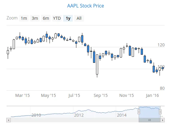
An Open-High-Low-Close (OHLC) chart displays the change in price over a period of time. The OHLC charts have chart type OHLC. An OHLC chart consist of vertical lines, each having a horizontal tickmark both on the left and the right side. The top and bottom ends of the vertical line indicate the highest and lowest prices during the time period. The tickmark on the left side of the vertical line shows the opening price and the tickmark on the right side the closing price.
A candlestick chart is another way to visualize OHLC data. A candlestick has a body and two vertical lines, called wicks. The body represents the opening and closing prices. If the body is filled, the top edge of the body shows the opening price and the bottom edge shows the closing price. If the body is unfilled, the top edge shows the closing price and the bottom edge the opening price. In other words, if the body is filled, the opening price is higher than the closing price, and if not, lower. The upper wick represents the highest price during the time period and the lower wick represents the lowest price. A candlestick chart has chart type CANDLESTICK.
To attach data to an OHLC or a candlestick chart, you need to use a
DataSeries or a ContainerSeries. See
"Chart Data" for more details. A data
series for an OHLC chart must contain OhlcItem objects. An
OhlcItem contains a date and the open, highest, lowest,
and close price on that date.
Source code
Java
Chart chart = new Chart(ChartType.OHLC);
chart.setTimeline(true);

Configuration configuration = chart.getConfiguration();
configuration.getTitle().setText("AAPL Stock Price");
DataSeries dataSeries = new DataSeries();
for (StockPrices.OhlcData data : StockPrices.fetchAaplOhlcPrice()) {
    OhlcItem item = new OhlcItem();
    item.setX(data.getDate());
    item.setLow(data.getLow());
    item.setHigh(data.getHigh());
    item.setClose(data.getClose());
    item.setOpen(data.getOpen());
    dataSeries.add(item);
}
configuration.setSeries(dataSeries);
chart.drawChart();
When using DataProviderSeries, you need to specify the functions used for retrieving OHLC properties:
setX(), setOpen(),
setHigh() setLow(), and
setClose().
Source code
Java
Chart chart = new Chart(ChartType.OHLC);
Configuration configuration = chart.getConfiguration();

// Create a DataProvider filled with stock price data
DataProvider<OhlcData, ?> dataProvider = initDataProvider();
// Wrap the container in a data series
DataProviderSeries<OhlcData> dataSeries = new DataProviderSeries<>(dataProvider);
dataSeries.setX(OhlcData::getDate);
dataSeries.setLow(OhlcData::getLow);
dataSeries.setHigh(OhlcData::getHigh);
dataSeries.setClose(OhlcData::getClose);
dataSeries.setOpen(OhlcData::getOpen);

PlotOptionsOhlc plotOptionsOhlc = new PlotOptionsOhlc();
plotOptionsOhlc.setTurboThreshold(0);
dataSeries.setPlotOptions(plotOptionsOhlc);

configuration.setSeries(dataSeries);
Typically the OHLC and candlestick charts contain a lot of data, so it is useful to use them with the timeline feature enabled. The timeline feature is described in "Timeline".
Plot Options
You can use a DataGrouping object to configure data grouping
properties. You set it in the plot options with setDataGrouping().
If the data points in a series are so dense that the spacing between two or
more points is less than value of the groupPixelWidth
property in the DataGrouping, the points will be grouped into
appropriate groups so that each group is more or less two pixels wide.
The approximation property in DataGrouping
specifies which data point value should represent the group. The
possible values are: average, open,
high, low, close, and
sum.
Using setUpColor() and setUpLineColor() allow
setting the fill and border colors of the candlestick that indicate rise in
the values. The default colors are white.
Data Labels
You can change how labels that appears next to data points are displayed for some series types (it’s not available for BOXPLOT and ERRORBAR).
The data labels properties in the DataLabels class are
summarized in the following:
-
align:HorizontalAlign(left, center, right) -
allowOverlap:Booleanwhether to allow data labels to Wrap -
borderRadius:Numberwith the border radius in pixels -
className:Stringa class name for the data label to be added to the node to allow custom styles by CSS -
enabled:Booleanwhether the data label is enabled or disabled -
format:Stringa format string for the label (see more at "Using Format Strings") -
formatter:Stringa format string containing a JavaScript function for the label (see more at "Using a JavaScript Formatter")
Also, data label can be styled by CSS with .highcharts-data-label-box and .highcharts-data-label class names.
Data Point Markers
Lines charts and other charts that display data points, such as scatter and spline charts, visualize the points with markers.
The markers can be configured with the Marker property objects available from the plot options of the relevant chart types, as well as at the level of each data point, in the DataSeriesItem.
You need to create the marker and apply it with the setMarker() method in the plot options or the data series item.
For example, to set the marker for an individual data point:
Source code
Java
DataSeriesItem point = new DataSeriesItem(x,y);
Marker marker = new Marker();
// ... Make any settings ...
point.setMarker(marker);
series.add(point);
Marker Shape Properties
A marker has a stroke and a fill colors, which are
set using a CSS selector .highcharts-markers .highcharts-point.
Source code
Java
// Set radius and symbol
marker.setRadius(10);
marker.setSymbol(MarkerSymbolEnum.DIAMOND);

point.setMarker(marker);
series.add(point);
Marker size is determined by the radius parameter, which is given in pixels.
Source code
Java
marker.setRadius((z+1)*5);Marker Symbols
Markers are visualized either with a shape or an image symbol. You can choose
the shape from a number of built-in shapes defined in the
MarkerSymbolEnum enum ( CIRCLE, SQUARE,
DIAMOND, TRIANGLE, or TRIANGLE_DOWN).
These shapes are drawn with a line and fill, which you can set as described
above.
Source code
Java
marker.setSymbol(MarkerSymbolEnum.DIAMOND);You can also use any image accessible by a URL by using a
MarkerSymbolUrl symbol. If the image is deployed with your
application, such as in a frontend folder, you can determine its URL as follows:
Source code
Java
String url = "frontend/img/smiley.png";
marker.setSymbol(new MarkerSymbolUrl(url));
You can use width and height to resize the marker. The radius property are not applicable to image symbols.
3D Charts
Most chart types can be made 3-dimensional by adding 3D options to the chart. You can rotate the charts, set up the view distance, and define the thickness of the chart features, among other things. You can also set up a 3D axis frame around a chart.
3D Options
3D view has to be enabled in the Options3d configuration, along
with other parameters. Minimally, to have some 3D effect, you need to rotate the
chart according to the alpha and beta parameters.
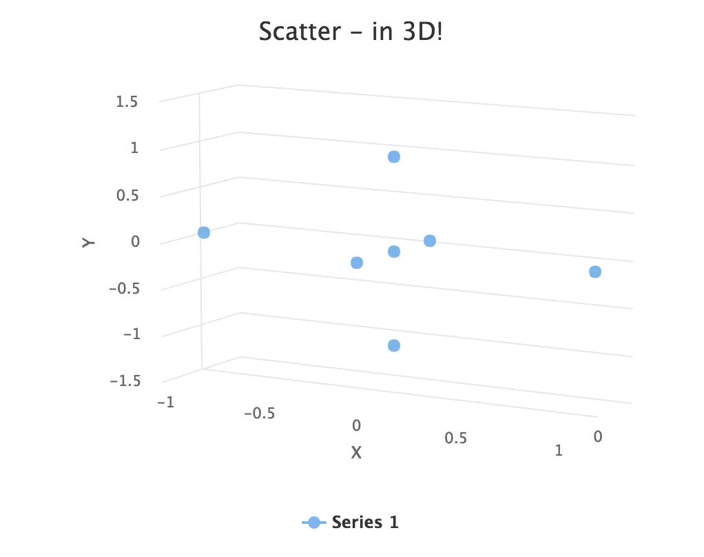
Let us consider a basic scatter chart for an example. The basic configuration for scatter charts is described elsewhere, but let us look how to make it 3D.
Source code
Java
Chart chart = new Chart(ChartType.SCATTER);
Configuration conf = chart.getConfiguration();
... other chart configuration ...

// In 3D!
Options3d options3d = new Options3d();
options3d.setEnabled(true);
options3d.setAlpha(10);
options3d.setBeta(30);
options3d.setDepth(135); // Default is 100
options3d.setViewDistance(100); // Default
conf.getChart().setOptions3d(options3d);
The 3D options are as follows:
- alpha
-
The vertical tilt (pitch) in degrees.
- beta
-
The horizontal tilt (yaw) in degrees.
- depth
-
Depth of the third (Z) axis in pixel units.
- enabled
-
Whether 3D plot is enabled. Default is false.
- frame
-
Defines the 3D frame, which consists of a back, bottom, and side panels that display the chart grid.
Source code
Java
Frame frame = new Frame();
Back back=new Back();
back.setColor(SolidColor.BEIGE);
back.setSize(1);
frame.setBack(back);
options3d.setFrame(frame);- viewDistance
-
View distance for creating perspective distortion. Default is 100.
3D Plot Options
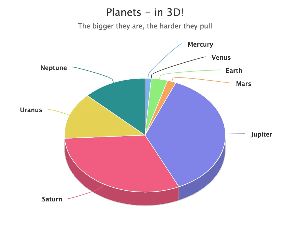
The above sets up the general 3D view, but you also need to configure the 3D properties of the actual chart type. The 3D plot options are chart type specific. For example, a pie has depth (or thickness), which you can configure as follows:
Source code
Java
// Set some plot options
PlotOptionsPie options = new PlotOptionsPie();
... Other plot options for the chart ...

options.setDepth(45); // Our pie is quite thick

conf.setPlotOptions(options);
3D Data
For some chart types, such as pies and columns, the 3D view is merely a visual
representation for one- or two-dimensional data. Some chart types, such as
scatter charts, also feature a third, depth axis, for data points. Such data
points can be given as DataSeriesItem3d objects.
The Z parameter is depth and is not scaled; there is no configuration for the depth or Z axis. Therefore, you need to handle scaling yourself as is done in the following.
Source code
Java
// Orthogonal data points in 2x2x2 cube
double[][] points = { {0.0, 0.0, 0.0}, // x, y, z
{1.0, 0.0, 0.0},
{0.0, 1.0, 0.0},
{0.0, 0.0, 1.0},
{-1.0, 0.0, 0.0},
{0.0, -1.0, 0.0},
{0.0, 0.0, -1.0}};
DataSeries series = new DataSeries();
for (int i=0; i<points.length; i++) {
double x = points[i][0];
double y = points[i][1];
double z = points[i][2];
// Scale the depth coordinate, as the depth axis is
// not scaled automatically
DataSeriesItem3d item = new DataSeriesItem3d(x, y,
z * options3d.getDepth().doubleValue());
series.add(item);
}
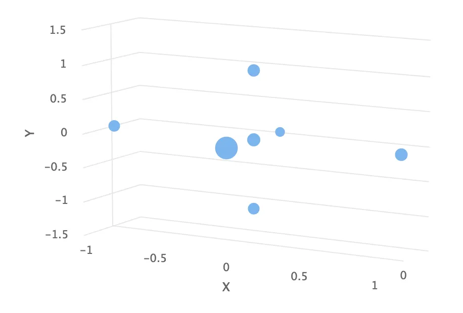
conf.addSeries(series);Above, we defined 7 orthogonal data points in the 2x2x2 cube centered at the origin. The 3D depth was set to 135 earlier. The result is illustrated in 3D Scatter Chart.
Distance Fade
To add a bit more 3D effect, you can do some tricks, such as calculate the distance of the data points from a viewpoint and set the marker size and color according to the distance.
Source code
Java
public double distanceTo(double[] point, double alpha,
                         double beta, double viewDist) {
    final double theta = alpha * Math.PI / 180;
    final double phi   = beta * Math.PI / 180;
    double x = viewDist * Math.sin(theta) * Math.cos(phi);
    double y = viewDist * Math.sin(theta) * Math.sin(phi);
    double z = - viewDist * Math.cos(theta);
    return Math.sqrt(Math.pow(x - point[0], 2) +
                     Math.pow(y - point[1], 2) +
                     Math.pow(z - point[2], 2));
}
Using the distance requires some assumptions about the scaling and such, but for the data points (as defined earlier) in range -1.0 to +1.0 we could do as follows:
Source code
Java
...
DataSeriesItem3d item = new DataSeriesItem3d(x, y,
    z * options3d.getDepth().doubleValue());

double distance = distanceTo(new double[]{x,y,z},
                             alpha, beta, 2);

Marker marker = new Marker(true);
marker.setRadius(1 + 10 / distance);
item.setMarker(marker);

series.add(item);
Note that here the view distance is in the scale of the data coordinates, while the distance defined in the 3D options has different definition and scaling. With the above settings, which are somewhat exaggerated to illustrate the effect, the result is shown in 3D Distance Fade.
3136F303-6376-4B67-B94C-451EF9F0A013