Style Scopes
With the addition of shadow DOM, styles on a webpage can be divided into two groups, also known as style scopes: global and local.
Global Style Scope
The global style scope is the “classic” way of styling web pages.
Styles defined in a global style sheet – either <link rel="stylesheet"> or <style> elements – apply to all elements/components in the main HTML document.
All elements which are not inside a shadow root (the parts of the DOM which are referred to as “shadow DOM”), are in the global style scope.
Styles in a global style sheet do not apply to component internals, like the label inside the Text Field component or drag handle inside the Split Layout component. Template-based components and views (built using PolymerElement or LitElement) are also protected from global styles. This means you can write global CSS without worrying about breaking component styling and/or behavior.
Inherited properties, including CSS Custom Properties, which are defined in the global scope do cascade into shadow roots.
As an example, let’s look at the Text Field component.
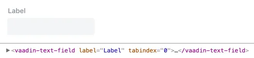
The only thing we can style using global styles is the whole <vaadin-text-field> element, which contains both the label and the input field parts.
The label and input field parts are inside the Text Field component’s shadow DOM, and global styles won’t affect them (excluding inherited properties).
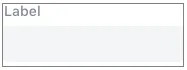
Assuming we could have the following styles in an imported stylesheet:
Source code
CSS
vaadin-text-field {
  border: 1px solid gray;
}
It would produce the following result:
Local Style Scope
Styling web components, which use shadow DOM, require a new perspective on using CSS.
When a web component has its own shadow root, the browser creates a new style scope for the elements that are placed inside the shadow DOM hierarchy. CSS selectors in a global stylesheet can’t affect those elements.
The only CSS selectors that can affect the elements inside shadow DOM need to be in a <style> element which is somewhere inside the same shadow DOM hierarchy.
At the same time, the styles inside shadow DOM can’t affect elements outside the shadow DOM.
The styles are placed in the “local style scope” of the shadow DOM.
Inherited properties, including CSS Custom Properties, which are defined in the global scope do cascade into shadow roots. They offer a way to customize styles in local scopes – assuming a local style scope is using those properties – without the need to add style sheets into the local scope. As an example, the Color properties can be defined in the global scope and they affect the styles of all components.
|
Note
| Constructable and adopted style sheets are upcoming additions to web standards (implemented in Chrome/Edge/Opera, March 2020) that allow developers to add style sheets to shadow roots. |
As an example, let’s look at the same Text Field component again, but this time inside its shadow DOM.
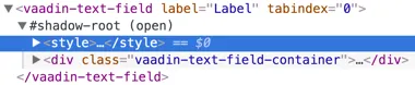
Only the <style> element highlighted in the inspector can affect the elements inside the <vaadin-text-field> element’s shadow DOM.
If we move the same styles from the previous example inside the <style> element inside the shadow root, the result is the same as without the style rules:
Source code
HTML
<vaadin-text-field>
  #shadow-root (open)
    <style>
      vaadin-text-field {
        border: 1px solid gray;
      }
    </style>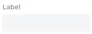
That is because there are no <vaadin-text-field> elements inside the shadow DOM.
If we want the same result as with the global stylesheet, we need to use the :host selector to match the element which is the “host” for this shadow DOM or style scope:
Source code
HTML
<vaadin-text-field>
  #shadow-root (open)
    <style>
      :host {
        border: 1px solid gray;
      }
    </style>
Then we get the same result as with the global stylesheet:
If we wanted to move the border to the actual text input element, we would need to inspect the shadow DOM hierarchy and see which selector would match that particular element.
For <vaadin-text-field>, the correct selector would be [part="input-field"]:
Source code
HTML
<vaadin-text-field>
  #shadow-root
    <style>
      [part="input-field"] {
        border: 1px solid gray;
      }
    </style>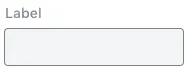
See the documentation for Supported CSS Selectors to learn more about what selectors you can use in the local scope of components.