Timeline
The timeline is a chart feature that allows selecting different time ranges for which to display the chart data,
as well as navigating between such ranges. It is especially useful when working with large time series, see
Chart Data Series for more details.
Adding a timeline to your chart is very easy - just add the timeline attribute to your chart.
Source code
HTML
<vaadin-line-chart timeline>
</vaadin-line-chart>
You can enable the timeline in a chart that displays one or more time series.
Most of the chart types support the timeline.
There are few exceptions which are listed here:
pie,
gauge,
solidgauge,
pyramid, and
funnel.
Enabling the timeline in these chart types will raise a runtime exception.
The user can change the time range by using the navigator at the bottom of the chart. To use the navigator, the X values of the corresponding data series should be given in milliseconds since January 1st 1970 at 00:00:00 GMT. If you have multiple series, the first one is presented in the navigator.
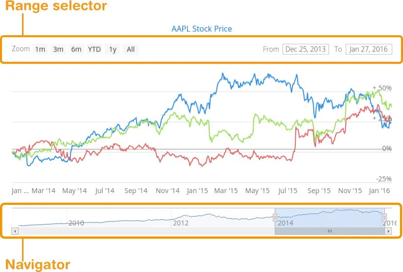
Another way to change the time range is to use the range selector. The selector includes a set of predefined time ranges for easier navigation, for example, 1 months, 3 months, 6 month, etc. To specify a custom time range, you can use range selector text fields for setting start and end of the time interval.
You can configure the range navigator and selector in the chart configuration.
You can use navigator and series to change the appearance of the navigator.
To show or hide the navigator, use enabled attribute.
Source code
HTML
<vaadin-line-chart>
    <navigator enabled="true" margin="75">
        <series color="#A52A2A" line-width="3">
        </series>
    </navigator>
</vaadin-line-chart>
You can change the style of the range selector buttons with the
button-theme tag and specify the index
of the button to appear pre-selected with the selected attribute of the range-selector element.
Source code
HTML
<vaadin-line-chart timeline>
    <chart-title>AAPL Stock Price!</chart-title>
    <range-selector selected="4">
        <button-theme fill="#7DADB2" stroke="#121212" stroke-width="1">
            <chart-style color="#2282e2"></chart-style>
        </button-theme>
    </range-selector>
</vaadin-line-chart>
You can customize the date format for the time range input fields by specifying formatter strings for displaying and editing the dates. After changing the format you need to specify a callback parser function to parse the edited values properly:
Source code
HTML
<vaadin-line-chart timeline>
<range-selector selected="4"
    input-date-format="%Y-%m"
    input-edit-date-format="%Y-%m"

    input-date-parser= "function(value)
    {value = value.split(/[\\-]/);
    return Date.UTC(parseInt(value[0], 10),
    parseInt(value[1], 10));
    }">
</vaadin-line-chart>
Timeline charts allow comparing the charts series against each other.
Setting the compare attribute to either percent or value will show the difference between
charts data series in percentage or absolute values, respectively.
Source code
HTML
<plot-options>
    <series compare="percent"></series>
</plot-options>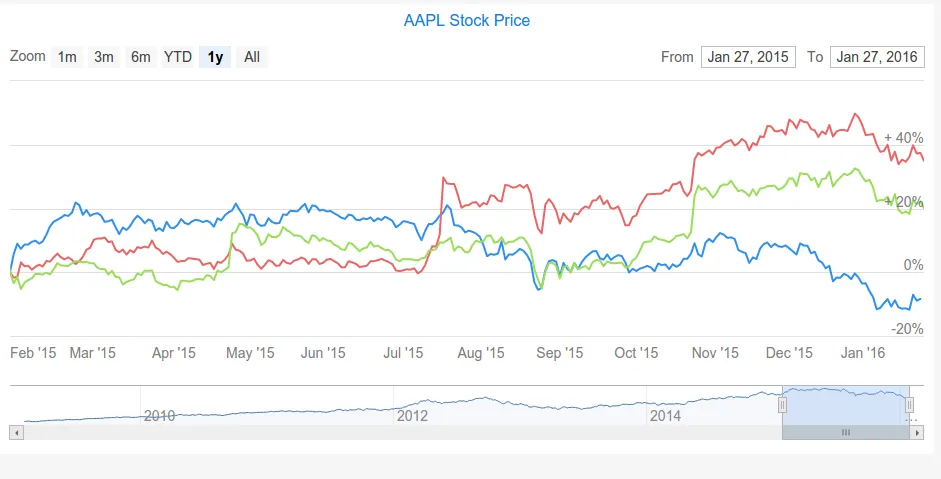
You can find more examples in the Timeline section of Vaadin Charts Demo.