Chart Configuration
All the chart content configuration of charts can be defined inside the
vaadin-<type>-chart element.
The configuration properties in a chart element are summarized in the following:
-
data-series: the data for the chart -
chart: general options -
credits: credits label (text, position, href, enabled) -
data: inteface for adding data from sources like CSV and HTML table -
drilldown: options for drilldown -
exporting: options for exporting module -
labels: HTML labels -
legend: a box containing a symbol and name fore each series item (see Legend) -
loading: options to control the appearance of the loading screen -
navigation: options for buttons and menus appearing in the exporting module -
no-data: options for displaying a message like "No data to display" -
pane: general options for combined X and Y axes set (only polar charts and angular gauges) -
plot-options: wrapper object for config objects for each series type (see Plot Options) -
subtitle: the charts subtitle -
chart-title: the charts main title -
tooltip: options for the tooltip -
x-axis: the X axis or category axis (see Axes) -
y-axis: the Y axis or value axis (see Axes)
Please, see more details about these in the API. For data configuration, see "Chart Data".
Plot Options
The plot options are set under the vaadin-<type>-chart element.
The options are chart type specific, defined in type-spesific
element inside the plot-options.
For example, the following enables stacking in column charts:
Source code
HTML
<plot-options>
  <column>
    <stacking>normal</stacking>
  </column>
</plot-options>
See the API documentation of plot-options and each chart type under it for more
information about the chart-specific options.
Other Options
The following options are supported by some chart types.
width-
Defines the width of the chart either by pixels or as a percentual proportion of the drawing area.
height-
Defines the height of the chart either by pixels or as a percentual proportion of the drawing area.
depth-
Specifies the thickness of the chart in 3D mode.
allow-point-select-
Specifies whether data points, in whatever way they are visualized in the particular chart type, can be selected by clicking on them. Defaults to false.
border-color-
Defines the border color of the chart elements.
border-width-
Defines the width of the border in pixels.
center-
Defines the center of the chart within the chart area by left and top coordinates, which can be specified either as pixels or as a percentage (as string) of the drawing area. The default is top 50% and left 50%.
sliced-offset-
In chart types that support slices, such as pie and pyramid charts, specifies the offset for how far a slice is detached from other items. The amount is given in pixels and defaults to 10 pixels.
visible-
Specifies whether or not a chart is visible. Defaults to true.
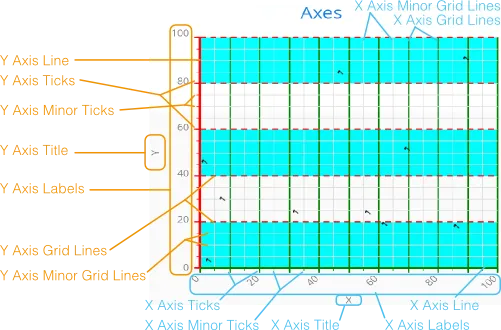
Axes
Different chart types may have one, two, or three axes; in addition to X and Y
axes, some chart types may have a Z axis. These are represented by
x-axis, y-axis, and z-axis,
respectively. The X axis is usually horizontal, representing the iteration over
the data series, and Y vertical, representing the values in the data series.
Some chart types invert the axes and they can be explicitly inverted with
getChart().setInverted() in the chart configuration. An axis has a
caption and tick marks at intervals indicating either numeric values or symbolic
categories. Some chart types, such as gauge, have only Y-axis, which is circular
in the gauge, and some such as a pie chart have none.
The basic elements of X and Y axes are illustrated in Chart Axis Elements.
Axis elements are added under the chart element.
Source code
HTML
<vaadin-pie-chart>
  ...
  <x-axis>
    <chart-title>Title</chart-title>
  </x-axis>
  ...
</vaadin-pie-chart>
A chart can have more than one Y-axis, usually when different series displayed
in a graph have different units or scales. The association of a data series with
an axis is done in the data-series using a property y-axis.
Source code
HTML
<vaadin-line-chart>
  ...
  <y-axis id="humidity">
    ...
  </y-axis>
  <data-series name="Humidity" y-axis = "humidity">
    ...
  </data-series>
  ...
</vaadin-line-chart>
For a complete reference of the many configuration parameters for the axes, please refer to the API of Vaadin Charts.
Axis Type
Axes can be one of the following types, which you can set with
type property.
- LINEAR (default)
-
For numeric values in linear scale.
- LOGARITHMIC
-
For numerical values, as in the linear axis, but the axis will be scaled in the logarithmic scale. The minimum for the axis must be a positive non-zero value ( log(0) is not defined, as it has limit at negative infinity when the parameter approaches zero).
- DATETIME
-
Enables date/time mode in the axis. The date/time values are expected to be given in milliseconds since January 1st 1970 at 00:00:00 GMT. You can get the millisecond representation of a JavaScript Date object with the UTC() method.
- CATEGORY
-
Enables using categorical data for the axis, as described in more detail later. With this axis type, the category labels are determined from the labels of the data points in the data series, without need to set them explicitly with setCategories().
Categories
The axes display, in most chart types, tick marks and labels at some numeric
interval by default. If the items in a data series have a symbolic meaning
rather than numeric, you can associate categories with the data items. The
category label is displayed between two axis tick marks and aligned with the
data point. In certain charts, such as column chart, where the corresponding
values in different data series are grouped under the same category. You can set
the category labels with categories property. The list should
match the items in the data series.
Source code
HTML
<x-axis>
  <categories>Mercury, Venus, Earth, Mars,
              Jupiter, Saturn, Uranus, Neptune</categories>
</x-axis>
You can only set the category labels from the data point labels by setting the axis type to CATEGORY, as described earlier.
Labels
The axes display, in most chart types, tick marks and labels at some numeric
interval by default. You can modify the labels options with labels element
inside the axis.
Source code
HTML
<x-axis>
  <labels>
    <align>center</align>
    <style color="green"></style>
    <rotation>-45</rotation>
    <step>2</step>
  </labels>
</x-axis>
Axis labels have the following configuration properties:
align-
Defines the alignment of the labels relative to the centers of the ticks. On left alignment, the left edges of labels are aligned at the tickmarks, and correspondingly the right side on right alignment. The default is determined automatically based on the direction of the axis and rotation of the labels.
distance(only in polar charts)-
Distance of labels from the perimeter of the plot area, in pixels.
enabled-
Whether labels are enabled or not. Defaults to 'true'.
format-
Formatting string for labels, as described in Formatting Labels. Defaults to '{value}'.
formatter-
A JavaScript formatter for the labels, as described in Formatting Labels. The value is available in the
this.valueproperty. Thethisobject also hasaxis,chart,isFirst, andisLastproperties.
Defaults to:
Source code
JavaScript
function() {return this.value;}max-stagger-lines(only horizontal axis)-
When labels on the horizontal (usually X) axis are displayed so densely that they would overlap, they are automatically placed on alternating lines in "staggered" fashion. When number of lines is not set manually with staggerLines, this parameter defines the maximum number of such lines; value 1 disables automatic staggering. Default is 5 lines.
rotation-
Defines rotation of labels in degrees. A positive value indicates rotation in clockwise direction. Labels are rotated at their alignment point. Defaults to 0.
stagger-lines-
Defines number of lines for placing the labels to avoid overlapping. By default 'undefined', and the number of lines is automatically determined up to
max-stagger-lines. step-
Defines tick interval for showing labels, so that labels are shown at every nth tick. The default step is automatically determined, along with staggering, to avoid overlap.
style-
Defines style for labels.
use-html-
Allows using HTML in custom label formats. Otherwise, HTML is quoted. Defaults to false.
x,y-
Offsets for the label’s position, relative to the tick position. X offset defaults to '0', but Y to 'null', which enables automatic positioning based on font size.
Gauge, pie, and polar charts allow additional properties.
For a complete reference of the many configuration parameters for the labels, please refer to the API of Vaadin Charts.
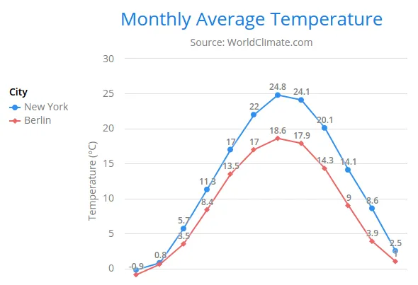
Legend
The legend is a box that describes the data series shown in the chart. It is enabled by default and is automatically populated with the names of the data series as defined in the series objects, and the corresponding color symbol of the series.
- alignment
-
Specifies the horizontal alignment of the legend box within the chart area. Possible values are
right,center, andleft. Defaults tocenter. - enabled
-
Enables or disables the legend. Possible values are
trueandfalse. Defaults totrue. - layout
-
Specifies the layout direction of the legend items. Possible values are
verticalandhorizontal. Defaults tohorizontal. - title
-
Specifies the title of the legend.
- vertical-align
-
Specifies the vertical alignment of the legend box within the chart area. Possible values are
bottom,low,middle,high, andtop. Defaults tobottom.
Source code
HTML
<vaadin-line-chart id="basic-line">
  <legend layout="vertical" align="left" vertical-align="top">
    <chart-title>
        City
    </chart-title>
  </legend>
</vaadin-line-chart>
The result can be seen in Legend example.
Formatting Labels
Data point values, tooltips, and tick labels are formatted according to formatting configuration for the elements, with configuration properties described earlier for each element. Formatting can be set up for a data series or for individual data points. The format can be defined either by a 'format' string or by JavaScript function 'formatter', which are described in the following.
Using Format Strings
A formatting string contain free-form text mixed with variables. Variables are
enclosed in brackets, such as "Here {point.y} is a value at
{point.x}". In different contexts, you have at least the following variables
available:
-
valuein axis labels -
point.x,point.yin data points and tooltips -
series.namein data points and tooltips -
series.colorin data points and tooltips
Values can be formatted according to a formatting string, separated from the variable name by a colon.
For numeric values, a subset of C printf formatting specifiers is supported. For
example, "{point.y:%02.2f}" would display a floating-point value
with two decimals and two leading zeroes, such as 02.30.
For dates, you can use a subset of PHP strftime() formatting
specifiers. For example, "{value:%Y-%m-%d %H:%M:%S}" would
format a date and time in the ISO 8601 format.
Using a JavaScript Formatter
A JavaScript formatter is given in a string that defines a JavaScript function
that returns the formatted string. The value to be formatted is available in
this.value for axis labels, or this.x,
this.y for data points.
For example, to format tick labels on a chart axis, you could have:
Source code
<y-axis>
  <labels formatter = "function () { return this.value / 1000 + 'Mm';}">
  </labels>
</y-axis>