Chart Data
- Adding series as a one-dimensional array
- Adding series as a multi-dimensional array
- Adding series as an array of objects
- Drill-Down
Chart data is stored in a data series model, which contains visual representation information about the data points in addition to their values. Data can be attached to a chart either by using a tag or an attribute. Using data tag is useful in simple cases when data is ready beforehand.
Source code
HTML
<vaadin-line-chart>
  <data-series name="Total Reindeer Population">
    <data>181091, 201485, 188105,188135</data>
  </data-series>

  <plot-options>
    <series point-interval="1" point-start="1959">
    </series>
  </plot-options>
</vaadin-line-chart>
You can also specify plot options for each point specifically using <point> tag.
Source code
HTML
<vaadin-line-chart>
  <data-series name="Total Reindeer Population">
       <data>
         <point>
           <y>181091</y>
           <color>red</color>
           <name>bar</name>
         </point>
         <point>
           <y>201485</y>
           <name>foo</name>
           <color>blue</color>
         </point>
         <point>
           <y>211485</y>
           <color>green</color>
         </point>
       </data>
       <color>red</color>
  </data-series>
</vaadin-line-chart>
Using data attribute allows to change an array of data points dynamically. The points can be added to a series in three ways: as a one-dimensional array, as a multi-dimensional array or as array of objects.
Adding series as a one-dimensional array
In case of using one-dimensional array, the data points are assumed to be at a constant interval on the X axis, starting from the value specified with the 'point-start' property (default value is '0') at intervals specified with the 'point-interval' property (default value is '1.0'). You can also add new points to a chart, by adding new items to a Data object. Data attribute should be bound to a element property by using either one-way binding or automatic binding. Please, see more details about these in the Polymer Data binding documentation.
Source code
HTML
<body>
  <button id="add" onclick="addSeries()">Add point</button>
  <dom-bind id="t">
    <template>
      <vaadin-line-chart id="mainchart">
        <data-series name="Total Reindeer Population" data="[[mySeriesData]]">
          <color>red</color>
        </data-series>

        <plot-options>
          <series point-interval="1" point-start="1959"> </series>
        </plot-options>
      </vaadin-line-chart>
    </template>
  </dom-bind>

  <script>
    var t = document.querySelector('#t');
    t.mySeriesData= [181091, 201485, 188105, 188136];

    function addSeries() {
        var y = Math.floor((Math.random() * 100000));
        t.$.mainchart.chart.series[0].addPoint(y);
    };

  </script>
</body>
Adding series as a multi-dimensional array
In case of using two-dimensional array, the first value is x value and the second value is y value. If the first value is a string, it is applied as the name of the point, and the x value is incremented following the above rules. For vaadin-arearange-chart the arrays will be interpreted as [x, low, high]. In this cases, the X value can be skipped altogether to make use of 'point-start' and 'point-interval' properties.
Source code
JavaScript
mySeriesData: {
  type: Array,
  value: [
    [1, 1.1, 4.7],
    [2, 1.8, 6.4],
    [3, 1.7, 6.9],
    [4, 2.6, 7.4],
    [6, 3.3, 9.3],
    [10, 3.0, 7.9],
    [12, 3.9, 6.0],
    [16, 3.9, 5.5]
  ]
}
Adding series as an array of objects
In case of using an array of objects, these objects stores point configurations.
Data points are associated with some visual representation parameters: marker style, selected state, legend index, and dial style (for gauges). Most of them can be configured at the level of individual data series items, the series, or in the overall plot options for the chart. The configuration options are described in "Chart Configuration". Some parameters, such as the sliced option for pie charts is only meaningful to configure at item level.
Source code
JavaScript
  static get properties() {
   return {
    mySeriesData: {
      type: Array,
      value:
        [
        181091,
        {y:188105,
          marker: {
            symbol: 'square',
            fillColor: "green",
            radius: 10
          }
        },
        201485,
        188136
        ]
    }
   };
  }
Adding and Removing Data Items
As shown above to add new points you should add new elements to the bound property, which contains an array of points. All changes (add,update,remove) of the bound property affect the chart data series.
Source code
JavaScript
<script>
  class Example1Chart extends Polymer.Element {
    static get is() { return 'example1-chart'; }

    static get properties() {
      return {
        'mySeriesData': {
          type: Array,
          value: [181091, 201485, 188105, 188136]
        }
      };
    }

    _addSeriesPoint() {
      const y = Math.floor((Math.random() * 100000));
      this.push('mySeriesData', y);
    }
  }

  customElements.define(Example1Chart.is, Example1Chart);
</script>
You can also change the chart data series using JavaScript API of the underlying library. New Point items are added to a series with the addPoint() method of a Series class. To remove an item from a series use remove() of a Point class.
Source code
HTML
<dom-module id="add-update-example">
  <template>
    <button id="add" on-click="_addSeries">
      Add point
    </button>

    <vaadin-line-chart id="mainchart" on-point-click="pointClickListener">
      <data-series data="[[mySeriesData]]">
        <color>red</color>
      </data-series>
    </vaadin-line-chart>
  </template>
  <script>
    class AddUpdateExample extends Polymer.Element {
      static get is() { return 'add-update-example'; }

      static get properties() {
        return {
          mySeriesData: {
            type: Array,
            value: [181091, 201485, 188105, 188136]
          }
        };
      }

      pointClickListener (e) {
        if (e.detail.point.series.data.length > 1) {
          e.detail.point.remove();
          // Use udpate method instead of remove to update
          //e.detail.point.update(400000);
        }
      }

      _addSeries () {
        const y = Math.floor((Math.random() * 100000));
        this.$.mainchart.chart.series[0].addPoint(y);
      }
    }

    customElements.define(AddUpdateExample.is, AddUpdateExample);
  </script>
</dom-module>
The addPoint() method takes the data item and three optional rendering parameters.
If the redraw parameter is 'false' , the chart is not updated immediately. This is useful if you are adding many points and do not want the chart to be redrawn every time a new point is added. After adding all the points you need to call redraw() method.
The shift parameter, when 'true' , causes removal of the first data point in the series in an optimized manner, thereby allowing an animated chart that moves to left as new points are added. This is most meaningful with data with even intervals.
The animation parameter, when 'true', the series updating will be animated with default animation options. The animation can also be a configuration object with properties duration and easing.
HTML table as a data source
An HTML table can be used a data source. You need to create a html-table, where a table rows specify data series points and cells in the row specify x and y coordinates. Afterwards you need to assign the table id as an attribute to a data tag.
Source code
HTML
<dom-module id="html-table">
  <template>
    <vaadin-line-chart id="html-table-data">
      <data>
        <table>
            <thead>
            <tr>
                <th></th>
                <th>Ford Avg price</th>
            </tr>
            </thead>
            <tbody>
            <tr>
                <th>19551</th>
                <td>2272</td>
            </tr>
            <tr>
                <th>1956</th>
                <td>2450</td>
            </tr>
            </tbody>
        </table>
      </data>
      <y-axis allow-decimals="false">
          <chart-title>Units</chart-title>
      </y-axis>
  </vaadin-line-chart>

  </template>

  <script>
    class HtmlTable extends Polymer.Element {
      static get is() { return 'html-table'; }
    }

    customElements.define(HtmlTable.is, HtmlTable);
  </script>
</dom-module>
Drill-Down
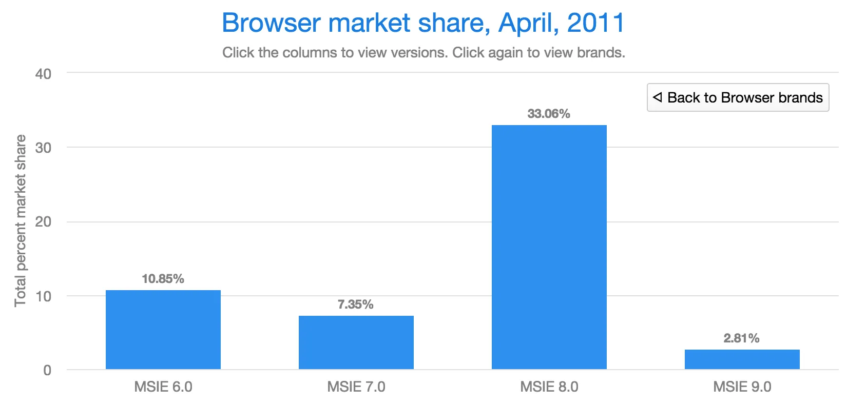
Vaadin Charts allows drilling down from a chart to a more detailed view by clicking an item in the top-level view. To enable this feature, you need to provide a separate data series for each of the detailed views by adding the 'drilldown' tag. When the user clicks on a drill-down item, the current series is animated into the the linked drill-down series.
Source code
HTML
<data-series>
  <name>MSIE</name>
    <data>
      <point>
        <name>MSIE</name>
        <y>60</y>
        <drilldown>MSIE Versions</drilldown>
      </point>
    </data>
</data-series>
  <data-series id="MSIE Versions" drilldown="true">
    <name>MSIE Versions</name>
      <data>
        <point>
          <name>MSIE 6.0</name>
            <y>64</y>
        </point>
        <point>
          <name>MSIE 7.0</name>
            <y>7.35</y>
        </point>
        ...
    </data>
  </data-series>
</dom-module>
A customizable back button is provided to navigate back to the main series, as shown in "Detailed series after a drill-down".