Chart Types
- Line and Spline Charts
- Area Charts
- Column and Bar Charts
- Error Bars
- Box Plot Charts
- Scatter Charts
- Bubble Charts
- Pie Charts
- Gauges
- Solid Gauges
- Area and Column Range Charts
- Polar, Wind Rose, and Spiderweb Charts
- Funnel and Pyramid Charts
- Waterfall Charts
- Heat Maps
- Tree Maps
- Polygons
- Flags
- OHLC and Candlestick Charts
Vaadin Charts comes with over a dozen different chart types.
The type is specified when the chart element v-<type>-chart is added to the HTML page.
The '<type>' should be replaced with the wanted type.
For example, v-line-chart would show a chart where data is presented by lines.
The supported chart types are:
|
Each chart type has its specific plot options and supports its specific
collection of chart features.
They also have specific requirements for the data series.
The type-specific plot options can be specified under the <plot-options> element with a type specific 'type' element, where the type should be replaced with the wanted type.
In addition, the polar option enables polar coordinate system for many of the chart types, enabling charts such as "Polar, Wind Rose, and Spiderweb Charts".
In the following, is an example of a pie chart:
Source code
HTML
<plot-options>
  <pie>
    ...
  </pie>
</plot-options>
The basic chart types and their variants are covered in the following subsections.
Line and Spline Charts
Line charts connect the series of data points with lines.
In the basic line charts the lines are straight, while in spline charts, the lines are smooth polynomial interpolations between the data points.
Source code
HTML
<vaadin-line-chart></vaadin-line-chart>
<vaadin-spline-chart></vaadin-spline-chart>
Plot Options
The color property in the line plot options defines the line color, line-width the line width, and dash-style the dash pattern for the lines.
See Scatter Charts for plot options regarding markers and other data point properties. The markers can also be configured for each data point.
Area Charts
Area charts are like line charts, except that they fill the area between the line and some threshold value on Y axis. The threshold depends on the chart type. In addition to the base type, chart type combinations for spline interpolation and ranges are supported.
Source code
HTML
<vaadin-area-chart></vaadin-area-chart>
<vaadin-arearange-chart></vaadin-arearange-chart>
<vaadin-areaspline-chart></vaadin-areaspline-chart>
<vaadin-areasplinerange-chart></vaadin-areasplinerange-chart>
In area range charts, the area between a lower and upper value is painted with a transparent color. The data series must specify the minimum and maximum values for the Y coordinates.
Here is an example of a data series for area range chart.
Source code
HTML
<data-series>
    <data>
        /* [date, min, max] */
        [1388538000000, 1.1, 4.7],
        [1388624400000, 1.8, 6.4],
        ...
        [1419987600000, 1.6, 4.2]
    </data>
</data-series>
Plot Options
Area charts support stacking, so that multiple series are piled on top of each other. The 'normal' stacking mode does a normal summative stacking, while the 'percent' handles them as proportions.
Source code
HTML
<plot-options>
  <chart-area>
    <stacking>normal</stacking>
  </chart-area>
</plot-options>
Note! The plot options for area chart are exceptionally specified in an element called
chart-area. By convention, the area should be used but that is reserved
tag name in
html specification.
The fill color for the area is defined with the fill-color element
and its transparency with fill-opacity (the opposite of
transparency) with a value between '0.0' and '1.0'.
The color property in the line plot options defines the line color,
line-width the line width, and dash-style the dash
pattern for the lines.
See Scatter Charts for plot options regarding markers and other data point properties. The markers can also be configured for each data point.
Column and Bar Charts
Column and bar charts illustrate values as vertical or horizontal bars, respectively. The two chart types are essentially equivalent, just as if the orientation of the axes was inverted.
Source code
HTML
<vaadin-column-chart></vaadin-column-chart>
<vaadin-bar-chart></vaadin-bar-chart>
<vaadin-columnrange-chart></vaadin-columnrange-chart>
Multiple data series, that is, two-dimensional data, are shown with thinner bars or columns grouped by their category.
See "Displaying Multiple Series".
Enabling stacking with a stacking element in the plot options stacks the columns or bars of different series on top of each other.
You can also have column range charts that illustrate a range between a lower and an upper value, as described in Area and Column Range Charts. They require the use of data series where lower and upper values are defined.
See the API documentation for details regarding the plot options.
Error Bars
An error bars visualize errors, or high and low values, in statistical data. They typically represent high and low values in data or a multitude of standard deviation, a percentile, or a quantile. The high and low values are represented as horizontal lines, or "whiskers", connected by a vertical stem.
While error bars technically are a chart type
vaadin-errorbar-chart, you normally use them together with some
primary chart type, such as a scatter or column chart.
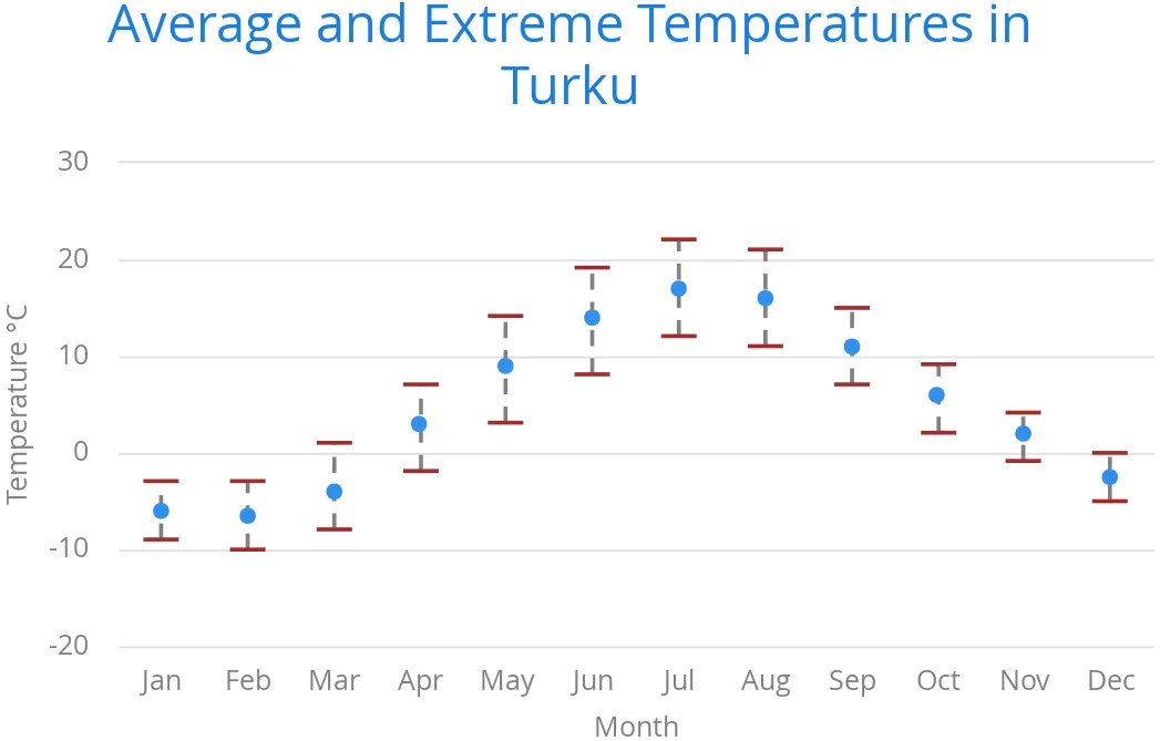
To display the error bars for data points, you need to have a separate data series for the low and high values. The type of the data series needs to be 'errorbar'.
Source code
HTML
<vaadin-scatter-chart>
  <legend>
    <enabled>false</enabled>
  </legend>
  <chart-title>Average and Extreme Tempetures in Turku</chart-title>
  <x-axis>
    <chart-title>Month</chart-title>
    <categories>Jan, Feb, Mar, Apr, May, Jun, Jul, Aug, Sep, Oct, Nov, Dec</categories>
  </x-axis>
  <y-axis>
    <chart-title>Temperature °C</chart-title>
  </y-axis>
  <plot-options>
    <errorbar>
      <stem-color>#808080</stem-color>
      <stem-width>2</stem-width>
      <stem-dash-style>Dash</stem-dash-style>
      <whisker-color>#A52A2A</whisker-color>
      <whisker-length>80%</whisker-length>
      <whisker-width>2</whisker-width>
    </errorbar>
  </plot-options>
  <data-series type=errorbar>
    <data>
      [-9, -3], [-10, -3], [-8, 1], [-2, 7], [3, 14], [8, 19], [12, 22],
      [11, 21], [7, 15], [2, 9], [-1, 4], [-5, 0]
    </data>
  </data-series>
  <data-series>
    <data>
      -6, -6.5, -4, 3, 9, 14, 17, 16, 11, 6, 2, -2.5
    </data>
  </data-series>
</vaadin-scatter-chart>
Note that you should add the error bar series first, to have it rendered lower in the chart.
Plot Options
whisker-color,whisker-width,whisker-length-
The color, width (vertical thickness), and length of the horizontal "whiskers" that indicate high and low values.
stem-color,stem-width,stem-dash-style-
The color, width (thickness), and line style of the vertical "stems" that connect the whiskers. In box plot charts, which also have stems, they extend from the quadrintile box.
Box Plot Charts
Box plot charts display the distribution of statistical variables. A data point has a median, represented with a horizontal line, upper and lower quartiles, represented by a box, and a low and high value, represented with T-shaped "whiskers". The exact semantics of the box symbols are up to you.
Box plot chart is closely related to the error bar chart described in Error Bars, sharing the box and whisker elements.
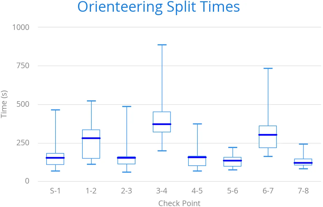
The chart element for box plot charts is vaadin-bloxplot-chart. You
normally have just one data series, so it is meaningful to disable the legend.
Source code
HTML
<vaadin-boxplot-chart>
  <legend>
    <enabled>false</enabled>
  </legend>
  <chart-title>Orienteering Split Times</chart-title>
  ...
</vaadin-boxplot-chart>
Plot Options
The plot options for box plot have the same properties as the plot options of error bar but it also adds a couple of more for median indicator line:
median-color,median-width-
Color and width (vertical thickness) of the horizontal median indicator line.
For example:
Source code
HTML
<!-- Set median line color and thickness -->
<plot-options>
  <boxplot>
    <median-color>#0000FF</median-color>
    <median-width>3</median-width>
  </boxplot>
</plot-options>
Data Model
The data points in box plots have five different values of one sample: the mininum value ('low'), first quartile ('q1'), median ('median'), third quartile ('q3') and maximum ('high').
Source code
HTML
<data-series>
  <data>
    <!-- Orienteering control point times for runners
        [low, q1, median, q3, high]   -->
    [63.0,108.25,154.0,180.5,463.0],
    [107.0,149.0,281.5,333.25,520.0],
    [56.0,112.0,151.5,157.75,483.0],
    [194.0,319.75,371.0,451.0,885.0],
    [63.0,101.5,155.5,162.25,371.0],
    [72.0,95.25,136.5,155.75,217.0],
    [158.0,217.25,304.0,359.75,733.0],
    [80.0,105.5,120.0,144.25,240.0]
  </data>
</data-series>
The data points can be also be defined as objects with the properties 'low', 'q1', 'medium', 'q2' and 'high'.
Source code
HTML
<data-series>
  <data>
    <!-- Orienteering control point times for runners -->
    { low: 63.0, q1: 108.25, median: 154.0, q3: 180.5, high: 463.0 },
    { low: 107.0, q1: 149.0, median: 281.5, q3: 333.25, high: 520.0 },
    ...
    { low: 80.0, q1: 105.5, median: 120.0, q3: 144.25, high: 240.0 }
  </data>
</data-series>
If the minimum and maximum attributes represent an even smaller quantile, or a larger multiple of standard deviation, you can have outliers. You can plot them with a separate data series, with
Scatter Charts
Scatter charts display a set of unconnected data points. The name refers to freely given X and Y coordinates. Also Z coordinate can be given if "3D is enabled".
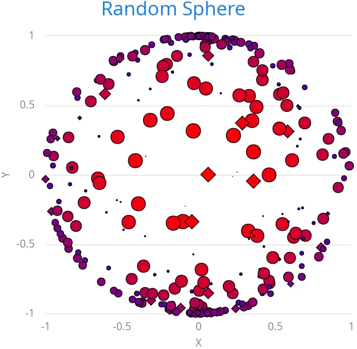
The chart element of a scatter chart is vaadin-scatter-chart.
Here is an example of a scatter chart where 300 random points in the unit circle is shown.
Source code
HTML
<dom-bind id="scatterExample">
  <template>
    <div style="width:450px;height:400px">
      <vaadin-scatter-chart>
        <chart-title>Random Sphere</chart-title>
        <legend>
          <enabled>false</enabled>
        </legend>
        <y-axis>
          <chart-title>Y</chart-title>
          <min>-1</min>
          <max>1</max>
        </y-axis>
        <x-axis>
          <grid-line-width>1</grid-line-width>
          <chart-title>X</chart-title>
          <min>-1</min>
          <max>1</max>
        </x-axis>
        <data-series name="Data" data="[[sphereData]]">
        </data-series>
      </vaadin-scatter-chart>
    </div>
  </template>
</dom-bind>
<script>
  (function () {

    const scatter = document.querySelector('#scatterExample');

    let data = [];
    for (i = 0; i < 300; i++) {
      data.push(createRandomPoint());
    }
    scatter.sphereData = data;

    function createRandomPoint() {
      const lng = Math.random() * 2 * Math.PI;
      const lat = Math.random() * Math.PI - Math.PI / 2;
      const z = Math.cos(lng) * Math.cos(lat);
      const colorLevel = parseInt(Math.round((1 - z) * 127));

      return {
        x: Math.cos(lat) * Math.sin(lng),
        y: Math.sin(lat),
        marker: {
          fillColor: "rgb(" + (255 - colorLevel) + ",0," + colorLevel + ")",
          radius: (z + 1) * 5,
          lineWidth: 1,
          lineColor: "black",
          symbol: Math.random() > 0.9 ? "diamond" : "circle"
        }
      };
    }
  })();
</script>
The result was shown in Scatter Chart.
Data Point Markers
Scatter charts and other charts that display data points, such as line and spline charts, visualize the points with markers. The markers can be configured with the Marker property objects available from the plot options of the relevant chart types, as well as at the level of each data point.
For example, to set the marker for an individual data point:
Source code
JavaScript
{ x: 1, y: 1, marker: { ... } }Marker Shape Properties
The colors of the marker can be specified with lineColor (border) and fillColor (content) elements.
Marker size is determined by the radius element, which is given
in pixels. The actual visual radius includes also the line width.
Source code
JavaScript
marker: {
  fillColor: "rgb("+(255-colorLevel)+",0,"+colorLevel+")",
  radius: (z+1)*5,
  lineWidth: 1,
  lineColor: "black"
}
Marker Symbols
Markers are visualized either with a shape or an image symbol. You can choose the shape from a number of built-in shapes ('circle', 'square', 'diamond', 'triangle' or 'triangle_down'). These shapes are drawn with a line and fill, which you can set as described above.
Source code
JavaScript
marker: {
  symbol: Math.random() > 0.9 ? "diamond" : "circle"
}
You can also use any image accessible by a URL as a marker. Anyway, the line, radius, and color properties are not applicable to image symbols.
Source code
JavaScript
symbol: "url(img/vaadin-logo.png)"
Bubble Charts
Bubble charts are a special type of scatter charts for representing three-dimensional data points with different point sizes. We demonstrated the same possibility with scatter charts in Scatter Charts, but the bubble charts make it easier to define the size of a point by its third (Z) dimension, instead of the radius property. The bubble size is scaled automatically, just like for other dimensions. The default point style is also more bubbly.
The chart element of a bubble chart is vaadin-bubble-chart. Its has a single
chart-specific property, display-negative, which controls whether
bubbles with negative values are displayed at all. More typically, you want to
configure the bubble marker. The Z coordinate value is available in the formatter
JavaScript with this.point.z reference.
The bubble radius is scaled linearly between a minimum and maximum radius. If you would rather scale by the area of the bubble, you can approximate that by taking square root of the Z values.
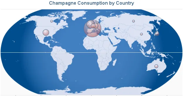
In the following example, we overlay a bubble chart over a world map background. We customize the bubbles to be more round with spherical color gradient.
Source code
HTML
<vaadin-bubble-chart>
  <legend>
    <enabled>false</enabled>
  </legend>
  <chart-title>Champagne Consumption by Country</chart-title>
  <tooltip formatter= "function () { return this.point.name + ': ' +
                                      Math.round(100*(this.point.z * this.point.z))/100.0 +
                                      ' M bottles'; }">
  </tooltip>
  <chart>
    <plot-background-image>
      img/neocreo_Blue_World_Map_640x.png
    </plot-background-image>
  </chart>
  <x-axis>
    <chart-title></chart-title>
    <min>-180</min>
    <max>180</max>
    <labels enabled="false"></labels>
  </x-axis>
  <y-axis>
    <chart-title></chart-title>
    <min>-90</min>
    <max>90</max>
    <labels enabled="false"></labels>
    <tick-amount>0</tick-amount>
  </y-axis>
  <plot-options>
    <bubble>
      <marker>
        <fill-color>
          <radial-gradient cx="0.5" cy="0.3" r="0.7"></radial-gradient>
          <stops>
            <position>0</position>
            <color>rgba(255, 255, 255, 0.5)</color>
          </stops>
          <stops>
            <position>1</position>
            <color>rgba(170, 70, 67, 0.5)</color>
          </stops>
        </fill-color>
      </marker>
    </bubble>
  </plot-options>
  <data-series>
    <data>
      { x: 1.799, y: 55.200, z: 13.476, name: "France"},
      { x: -1.725, y: 64.800, z: 5.876, name: "United Kingdom"},
      { x: -90.328, y: 45.600, z: 4.401, name: "United States"},
      { x: 7.895, y: 61.200, z: 3.768, name: "Germany"},
      { x: 3.512, y: 60.996, z: 3.092, name: "Belgium"},
      { x: 129.470, y: 43.200, z: 2.811, name: "Japan"},
      { x: 128.355, y: -32.400, z: 2.207, name: "Australia"},
      { x: -78.990, y: 72.000, z: 1.261, name: "Canada"},
      { x: 83.147, y: 72.000, z: 1.158, name: "Russia"},
      { x: 98.862, y: 42.000, z: 1.149, name: "China"}
    </data>
  </data-series>
</vaadin-bubble-chart>
Pie Charts
A pie chart illustrates data values as sectors of size proportionate to the sum
of all values. The pie chart element is vaadin-pie-chart and
type-specific settings can be done under plot-options element as
described later.
A ready pie chart is shown in Pie Chart.
Plot Options
The chart-specific options of a pie chart are configured with a PlotOptionsPie.
Source code
HTML
<plot-options>
  <pie>
    <inner-size>0</inner-size> <!-- Non-0 results in a donut -->
    <size>75%</size> <!-- Default -->
    <center>50%, 50%</center> <!-- Default -->
  </pie>
</plot-options>inner-size-
A pie with inner size greater than zero is a "donut". The inner size can be expressed either as number of pixels or as a relative percentage of the chart area with a string (such as "60%") See the section later on donuts.
size-
The size of the pie can be expressed either as number of pixels or as a relative percentage of the chart area with a string (such as "80%"). The default size is 75%, to leave space for the labels.
center-
The X and Y coordinates of the center of the pie can be expressed either as numbers of pixels or as a relative percentage of the chart sizes with a string. The default is "50%", "50%".
Data Model
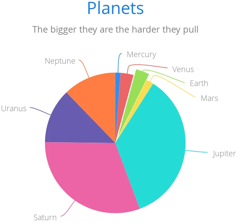
The labels for the pie slices are determined from the labels of the data points.
Source code
HTML
<data-series name="Diameter">
  <data>
    ["Mercury", 4900],
    ["Venus", 12100],
    ["Earth", 12800],
    ["Mars", 6800],
    ["Jupiter", 143000],
    ["Saturn", 125000],
    ["Uranus", 51100],
    ["Neptune", 49500]
  </data>
</data-series>
If a data point has the 'sliced' property enabled, it is shown as slightly cut away from the pie.
Source code
JavaScript
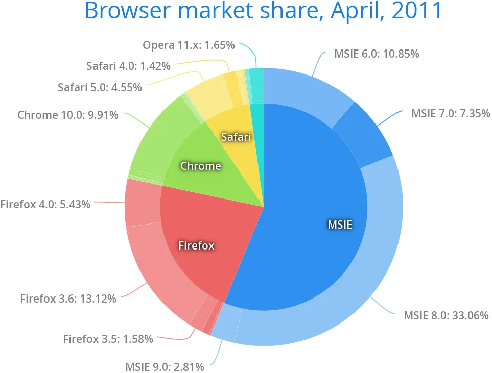
{name: "Earth", y: 12800, sliced: true}Donut Charts
Setting the inner-size of the plot options of a pie chart to a
larger than zero value results in an empty hole at the center of the pie.
Source code
HTML
<plot-options>
  <pie>
    <inner-size>60%</inner-size>
  </pie>
</plot-options>
As you can set the plot options also for each data series, you can put two pie charts on top of each other, with a smaller one fitted in the "hole" of the donut. This way, you can make pie charts with more details on the outer rim, as done in the example below:
Source code
HTML
<data-series name="Browsers" size="60%">
  <data-labels distance="-30" formatter="function() {
                            return this.y > 5 ? this.point.name : null;
                          }">
      <color>rgb(255,255,255)</color>
  </data-labels>
  <data>
      ...
  </data>
</data-series>

<data-series name="Versions" inner-size="60%">
  <data-labels formatter="function() {
            return this.y > 1 ? ''+ this.point.name +': '+ this.y +'%' : null;
          }">
  </data-labels>
  <data>
      ...
  </data>
<data-series>
The result is illustrated in Overlaid Pie and Donut Chart.
Gauges
A vaadin-gauge-chart is an one-dimensional chart with a circular Y-axis, where a rotating pointer points to a value on the axis. A gauge can, in fact, have multiple Y-axes to display multiple scales.
A vaadin-solidgauge-chart is otherwise like a regular gauge, except that a solid color arc is used to indicate current value instead of a pointer. The color of the indicator arc can be configured to change according to color stops.
Let us first consider vaadin-gauge-chart the following gauge. After the settings done in the subsequent sections, it will show as in A Gauge.
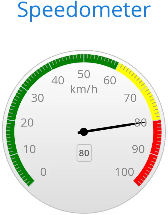
Gauge Configuration
The start and end angles of the gauge can be configured in the pane element.
The angles can be given as -360 to 360 degrees, with 0 at the top of the circle.
Source code
HTML
<vaadin-gauge-chart>
  <chart-title>Speedometer</chart-title>
  <pane start-angle="-150" end-angle="150">
  </pane>
  ...
</vaadin-gauge-chart>
Axis Configuration
A gauge has only an Y-axis. You need to provide both a minimum and maximum value for it.
Source code
HTML
<y-axis min="0" max="200"
        tick-interval="10" tick-width="2" tick-length="10" tick-color="#666"
        minor-tick-interval="1" minor-tick-width="1" minor-tick-length="5">
    <chart-title>km/h</chart-title>
    <labels step="2" rotation="auto"></labels>
    <plot-bands from="0" to="120" color="#55BF3B"></plot-bands>
    <plot-bands from="120" to="160" color="#DDDF0D"></plot-bands>
    <plot-bands from="160" to="200" color="#DF5353"></plot-bands>
</y-axis>
You can do all kinds of other configuration to the axis - please see the API documentation for all the available parameters.
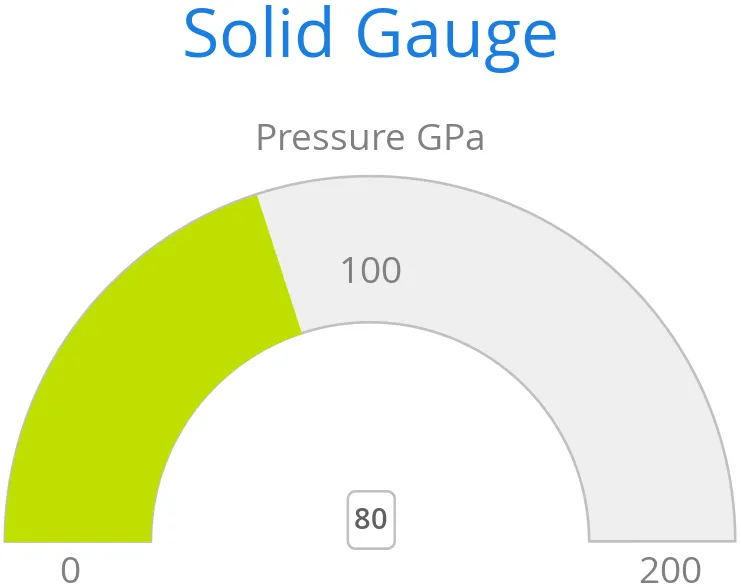
Solid Gauges
A solid gauge is much like a regular gauge described previously; a one-dimensional chart with a circular Y-axis. However, instead of a rotating pointer, the value is indicated by a rotating arc with solid color. The color of the indicator arc can be configured to change according to the value using color stops.
Let us consider the following solid gauge:
Source code
HTML
<vaadin-solidgauge-chart id=solidgauge>
    <chart-title>Speed</chart-title>
    <legend enabled="false"></legend>
    <tooltip enabled="false"></tooltip>
    ...
</vaadin-solidgauge-chart>
After the settings done in the subsequent sections, it will show as in A Solid Gauge.
While solid gauge is much like a regular gauge, the configuration differs
Configuration
The solid gauge must be configured in the pane element of the chart. The gauge arc spans an angle, which is specified as -360 to 360 degrees, with 0 degrees at the top of the arc. Typically, a semi-arc is used, where you use -90 and 90 for the angles, and move the center lower than you would have with a full circle. You can also adjust the size of the gauge pane; enlargening it allows positioning tick labels better.
The shape of the gauge display is defined as the background of the pane. You at least need to set the shape as either 'arc' or 'solid'. You typically also want to set background color and inner and outer radius.
Source code
HTML
<pane start-angle="-90" end-angle="90" size="125%" center='["50%", "70%"]'>
    <background background-color="#EEE" inner-radius="60%"
                outer-radius="100%" shape="arc">
    </background>
</pane>
Axis Configuration
A gauge only has an Y-axis. You must define the value range ('min' and 'max').
You can configure color stops for the indicator arc. The stops are defined with stops elements having the stop points from 0.0 to 1.0 and color values.
Source code
HTML
<y-axis min="0" max="200" line-width="0" minor-tick-width="0" tick-width="0">
    <stops>0.1, #55BF3B</stops>
    <stops>0.5, #DDDF0D</stops>
    <stops>0.9, #DF5353</stops>
    <labels enabled="false" ></labels>
</y-axis>
Setting rotation to 'auto' makes gauge labels rotate perpendicular to the center.
Source code
HTML
<y-axis min="0" max="200" line-width="0" minor-tick-width="0" tick-width="0">
    ...
    <labels enabled="true" rotation="auto">
    </labels>
</y-axis>
You can do all kinds of other configuration to the axis - please see the API documentation for all the available parameters.
Plot Options
Solid gauges do not currently have any chart type specific plot options. See "Plot Options" for common options.
Source code
HTML
<plot-options>
    <solidgauge>
        <data-labels y="5" border-width="0"></data-labels>
    </solidgauge>
</plot-options>
Setting and Updating Gauge Data
A gauge only displays a single value, which you can define as a data series of length one, such as as follows:
Source code
HTML
<data-series name="Speed">
    <data>80</data>
</data-series>
Gauges are especially meaningful for displaying changing values. Here is an example how to update the value from JavaScript.
Source code
HTML
<vaadin-solidgauge-chart id=solidgauge>
...
</vaadin-solidgauge-chart>
<button onclick="updateSolidGauge()">Update</button>
<script>
function updateSolidGauge() {
var chart = document.querySelector("#solidgauge").chart;
var point = chart.series[0].data[0];
point.update(Math.round(Math.random()*chart.yAxis[0].max));
}
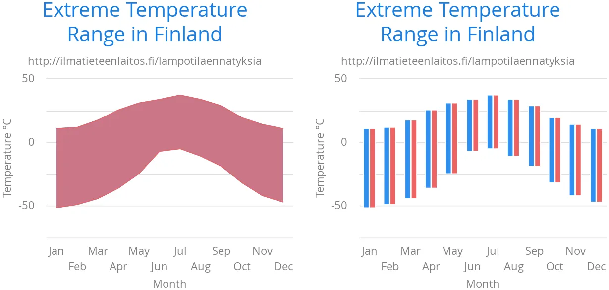
</script>Area and Column Range Charts
Ranged charts display an area or column between a minimum and maximum value, instead of a singular data point. An area range is created with vaadin-arearange-chart element, and a column range with vaadin-columnrange-chart.
Consider the following example:
Source code
HTML
<vaadin-arearange-chart>
    <chart-title>Extreme Temperature Range in Finland</chart-title>
    <subtitle>https://ilmatieteenlaitos.fi/lampotilaennatyksia</subtitle>
    <legend enabled="false"></legend>
    <y-axis>
        <chart-title>Temperature °C</chart-title>
        <labels step=2></labels>
    </y-axis>
    <x-axis>
      <chart-title>Month</chart-title>
      <categories>
        "Jan", "Feb", "Mar", "Apr", "May", "Jun",
        "Jul", "Aug", "Sep", "Oct", "Nov", "Dec"
      </categories>
    </x-axis>
    <data-series name="Temperature">
        <data>
           <!-- Kittilä, Pokka 28.1.1999 / Maarianhamina 6.1.1973 -->
           [-51.5,10.9],
           [-49.0,11.8],
           [-44.3,17.5],
           [-36.0,25.5],
           [-24.6,31.0],
           [-7.0,33.8],
           [-5.0,37.2],
           [-10.8,33.8],
           [-18.7,28.8],
           [-31.8,19.4],
           [-42.0,14.1],
           [-47.0,10.8]
        </data>
    </data-series>
</vaadin-arearange-chart>
The resulting chart, as well as the same chart with a column range, is shown in Area and Column Range Chart.
Polar, Wind Rose, and Spiderweb Charts
Most chart types having two axes can be displayed in polar coordinates,
where the X axis is curved on a circle and Y axis from the center of the circle
to its rim. Polar chart is not a chart type in itself, but can be enabled for
most chart types with <polar>true</polar> in the chart options.
Therefore all chart type specific features are usable with polar
charts.
Source code
HTML
<vaadin-line-chart >
    <chart>
      <polar>true</polar>
    </chart>
    ...
</vaadin-line-chart>
Vaadin Charts allows many sorts of typical polar chart types, such as 'wind rose', a polar column graph, or 'spiderweb', a polar chart with categorical data and a more polygonal visual style.
You need to define the sector of the polar projection with a pane element. The sector is defined as degrees from the north direction.
Source code
HTML
<pane start-angle="0" end-angle="360"> <!-- Full Circle -->
</pane>
The polar and spiderweb charts are illustrated in Wind Rose and Spiderweb Charts.
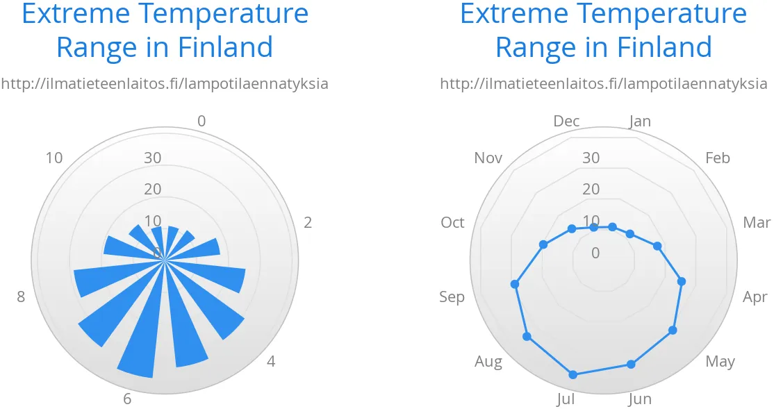
Spiderweb Charts
A spiderweb chart is a commonly used visual style of a polar chart with a polygonal shape rather than a circle. The data and the X axis should be categorical to make the polygonal interpolation meaningful. The sector is assumed to be full circle, so no angles for the pane need to be specified.
Note the style settings done in the axis in the example below:
Source code
HTML
<vaadin-line-chart >
    <chart-title>Extreme Temperature Range in Finland</chart-title>
    <subtitle>https://ilmatieteenlaitos.fi/lampotilaennatyksia</subtitle>
    <legend enabled="false"></legend>
    <credit enabled="false"></credit>
    <chart>
      <polar>true</polar>
    </chart>
    <y-axis tick-interval=10>
        <labels>
          <step>1</step>
        </labels>
        <grid-line-interpolation>polygon</grid-line-interpolation>
    </y-axis>
    <x-axis>
      <tickmark-placement>on</tickmark-placement>
      <line-width>0</line-width>
      <grid-line-width>0</grid-line-width>
      <categories>"Jan", "Feb", "Mar", "Apr", "May", "Jun",
                  "Jul", "Aug", "Sep", "Oct", "Nov", "Dec"</categories>
    </x-axis>
    <data-series name="Speed">
        <data>
            10.9, 11.8, 17.5, 25.5, 31.0, 33.8,
            37.2, 33.8, 28.8, 19.4, 14.1, 10.8
        </data>
    </data-series>
</vaadin-line-chart>
Funnel and Pyramid Charts
Funnel and pyramid charts are typically used to visualize stages in a sales processes, and for other purposes to visualize subsets of diminishing size. A funnel or pyramid chart has layers much like a stacked column: in funnel from top-to-bottom and in pyramid from bottom-to-top. The top of the funnel has width of the drawing area of the chart, and dinimishes in size down to a funnel "neck" that continues as a column to the bottom. A pyramid diminishes from bottom to top and does not have a neck.
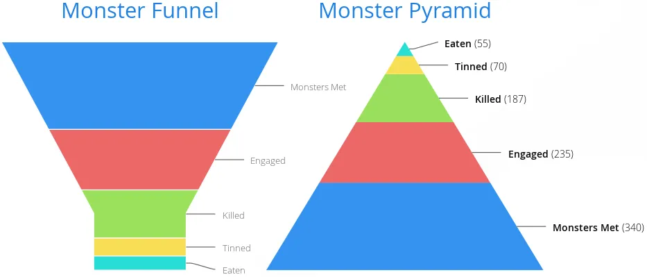
Funnels have chart element vaadin-funnel-chart, and pyramids have vaadin-pyramid-chart.
The labels of the funnel blocks are by default placed on the right side of the blocks, together with a connector. You can configure their style in the plot options.
Here is an example.
Source code
HTML
<vaadin-funnel-chart>
  <chart-title>Monster Funnel</chart-title>
  <chart spacing-right=120>
  </chart>
  <plot-options>
      <funnel>
        <neck-height>20%</neck-height>
        <neck-width>20%</neck-width>
      </funnel>
      <series>
          <data-labels format="<b>{point.name}</b> ({point.y:.0f})" color="black">
          </data-labels>
      </series>
  </plot-options>
  <legend enabled="false"></legend>
  <data-series name="Unique users">
      <data>
          ['Monsters Met',   340],
          ['Engaged', 235],
          ['Killed', 187],
          ['Tinned', 70],
          ['Eaten', 50]
      </data>
  </data-series>
</vaadin-funnel-chart>
Plot Options
In addition to common chart options, the funnel and pyramid charts support the following
shared options: width, height, depth,
allow-point-select, border-color,
border-width, center, sliced-offset, and
visible. See
"Plot
Options" for detailed descriptions.
They have the following chart type specific properties:
neck-height(only funnel)-
Height of the neck part of the funnel either as pixels or as percentage of the entire funnel height.
neck-width(only funnel)-
Width of the neck part of the funnel either as pixels or as percentage of the top of the funnel.
reversed-
Whether the chart is reversed upside down from the normal direction from diminishing from the top to bottom. The default is false for funnel and true for pyramid.
Waterfall Charts
Waterfall charts are used for visualizing level changes from an initial level to a final level through a number of changes in the level. The changes are given as delta values, and you can have a number of intermediate totals, which are calculated automatically.
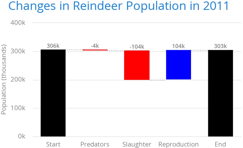
Waterfall charts are defined with an element vaadin-waterfall-chart.
For example:
Source code
HTML
<vaadin-waterfall-chart>
  <chart-title>Changes in Reindeer Population in 2011</chart-title>
  <legend enabled="false"></legend>
  <chart align-ticks=true></chart>
  <x-axis type="category"></x-axis>
  <y-axis>
    <chart-title>Population (thousands)</chart-title>
    <max>330000</max>
  </y-axis>
  ...
</vaadin-waterfall-chart>
The example continues in the following subsections.
Plot Options
Waterfall charts have the following chart type specific properties:
up-color-
Color for the positive values.
color-
Default color for all the points. If
up-coloris defined,coloris used only for the negative values.
In the following, we define the colors, as well as the style and placement of the labels for the columns:
Source code
HTML
<plot-options>
  <waterfall>
    <up-color>#0000FF</up-color>
    <color>#FF0000</color>
    <point-padding>0</point-padding>
    <data-labels enabled="true"
                 formatter="function() { return Math.floor(this.y/1000) + 'k'; }"
                 y = -20
                 vertical-align="top"
                 color="black">
    </data-labels>
  </waterfall>
</plot-options>
Data Series
The data series for waterfall charts consists of changes (deltas) starting from
an initial value and one or more cumulative sums. There should be at least a
final sum, and optionally intermediate sums. No value is needed for the sums as they
are calculated automatically. For intermediate sums, you should set the
isIntermediateSum property to 'true'.
Source code
HTML
<data-series name="reindeer">
  <data>
    {x: 0, y: 306503, name: "Start", color: "#000000"},
    {x: 1, y: -3330, name: "Predators"},
    {x: 2, y: -103332, name: "Slaughter"},
    {x: 3, y: 104052, name: "Reproduction"},
    {x: 4, name: "End", isSum: true, color: "#000000"}
  </data>
</data-series>
Heat Maps
A heat map is a two-dimensional grid, where the color of a grid cell indicates a value.
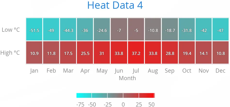
Heat maps are defined with a chart element vaadin-heatmap-chart.
For example:
Source code
HTML
<vaadin-heatmap-chart>
  <chart-title>Heat Data</chart-title>
  <chart align-ticks=true></chart>
  <plot-options>
    <heatmap>
      <border-color>white</border-color>
      <border-width>2</border-width>
      <data-labels enabled="true">
      </data-labels>
    </heatmap>
  </plot-options>
  <color-axis>
    <min>-51.5</min>
    <max>37.2</max>
    <min-color>#00FFFF</min-color>
    <max-color>#FF0000</max-color>
  </color-axis>
  <x-axis>
    <chart-title>Month</chart-title>
    <categories>"Jan", "Feb", "Mar", "Apr", "May", "Jun",
                "Jul", "Aug", "Sep", "Oct", "Nov", "Dec"</categories>
  </x-axis>
  <y-axis>
    <chart-title text=""></chart-title>
    <categories>"High °C", "Low °C"</categories>
  </y-axis>
  <data-series name="heat">
    <data>
      [0, 0, 10.9],
      [0, 1, -51.5],
      [1, 0, 11.8],
      ...
      [11, 1, -47]
    </data>
  </data-series>
</vaadin-heatmap-chart>
Tree Maps
A tree map is used to display hierarchical data. It consists of a group of rectangles that contains other rectangles, where the size of a rectangle indicates the item value.
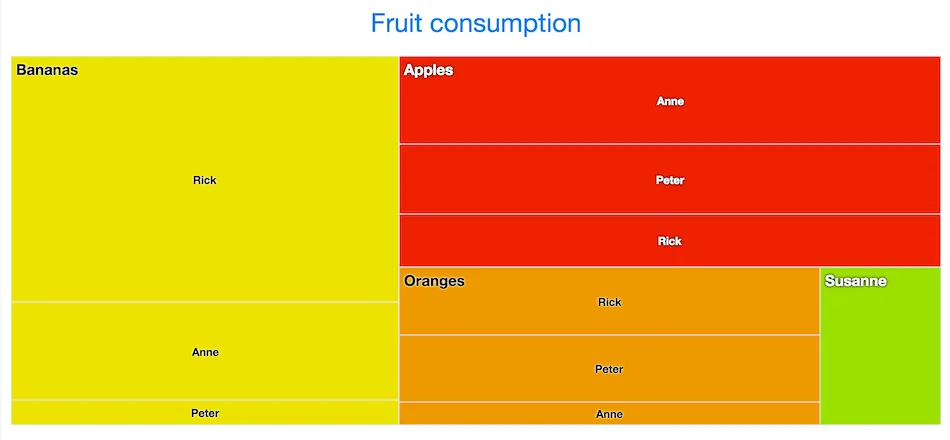
Tree maps are defined with a chart element vaadin-treemap-chart.
For example:
Source code
HTML
<vaadin-treemap-chart id="treemap-with-levels">
  <chart-title>Fruit consumption</chart-title>
  <plot-options>
      <treemap layout-algorithm="stripes" alternate-starting-direction="true">
          <levels level="1" layout-algorithm="sliceAndDice">
              <data-labels enabled="true" align="left" vertical-align="top">
                  <style font-size="15px" font-weight="bold"></style>
              </data-labels>
          </levels>
      </treemap>
  </plot-options>
  <data-series>
      <data>
          <point>
              <id>A</id>
              <name>Apples</name>
              <color>#EC2500</color>
          </point>
          <point>
              <id>B</id>
              <name>Bananas</name>
              <color>#ECE100</color>
          </point>
          <point>
              <id>O</id>
              <name>Oranges</name>
              <color>#EC9800</color>
          </point>

          <point>
              <name>Anne</name>
              <parent>A</parent>
              <value>5</value>
          </point>
          <point>
              <name>Rick</name>
              <parent>A</parent>
              <value>3</value>
          </point>
          <point>
              <name>Peter</name>
              <parent>A</parent>
              <value>4</value>
          </point>

          <point>
              <name>Anne</name>
              <parent>B</parent>
              <value>4</value>
          </point>
          <point>
              <name>Rick</name>
              <parent>B</parent>
              <value>10</value>
          </point>
          <point>
              <name>Peter</name>
              <parent>B</parent>
              <value>1</value>
          </point>

          <point>
              <name>Anne</name>
              <parent>O</parent>
              <value>1</value>
          </point>
          <point>
              <name>Rick</name>
              <parent>O</parent>
              <value>3</value>
          </point>
          <point>
              <name>Peter</name>
              <parent>O</parent>
              <value>3</value>
          </point>

          <point>
              <name>Susanne</name>
              <parent>Kiwi</parent>
              <value>2</value>
              <color>#9EDE00</color>
          </point>
      </data>
  </data-series>
</vaadin-treemap-chart>
Plot Options
Tree map charts have following chart type specific properties:
allow-drill-to-node-
When enabled the user can click on a point which is a parent and zoom in on its children. Defaults to false.
alternate-starting-direction-
Enabling this option will make the treemap alternate the drawing direction between vertical and horizontal. The next levels starting direction will always be the opposite of the previous. Defaults value is false.
layout-algorithm-
This option decides which algorithm is used for setting position and dimensions of the points. Available algorithms are 'sliceAndDice', 'stripes', 'squarified' or 'strip'. Default value is 'sliceAndDice'.
layout-starting-direction-
Defines which direction the layout algorithm will start drawing. Possible values are 'horizontal' and 'vertical'. Default value is 'vertical'.
level-is-constant-
Used together with the
levelsandallow-drill-to-nodeoptions. When set to false the first level visible when drilling is considered to be level one. Otherwise the level will be the same as the tree structure. Defaults value is true. levels-
Set options on specific levels. Takes precedence over series options, but not point options.
Tree Map Data Series
Tree maps require hierarchical data.
The item hierarchy is defined with the parent property in the
data point. Parent argument is the id value of the parent.
If no matching id is found or if
value is null then the parent will be rendered as a root item.
Source code
HTML
<point>
    <id>A</id>
    <name>Apples</name>
    <color>#EC2500</color>
</point>
<point>
    <name>Anne</name>
    <parent>A</parent>
    <value>5</value>
</point>
Polygons
A polygon can be used to draw any freeform filled or stroked shape in the Cartesian plane.
Polygons consist of connected data points where the both x and y properties should be set.
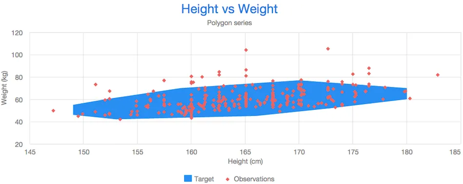
Polygons are defined with a chart element vaadin-polygon-chart.
For example:
Source code
HTML
<vaadin-polygon-chart id="scatter-and-polygon">
  <chart-title>Height vs Weight</chart-title>
  <subtitle>Polygon series</subtitle>
  <x-axis grid-line-width="1" start-on-tick="true"
          end-on-tick="true" show-last-label="true">
      <chart-title>Height (cm)</chart-title>
  </x-axis>
  <y-axis >
      <chart-title>Weight (kg)</chart-title>
  </y-axis>
  <tooltip header-format="<b>{series.name}</b><br>"
           point-format="{point.x} cm; {point.y} kg">
  </tooltip>
  <data-series name="Target">
      <data>[153, 42], [149, 46], [149, 55], [152, 60], [159, 70], [170, 77], [180, 70],
          [180, 60], [173, 52], [166, 45]</data>
  </data-series>
  <data-series name="Observations" type="scatter">
      <data>
          [161.2, 51.6], [167.5, 59.0], [159.5, 49.2], [157.0, 63.0], [155.8, 53.6],
          ...
          [176.5, 71.8], [164.4, 55.5], [160.7, 48.6], [174.0, 66.4], [163.8, 67.3]
        </data>
  </data-series>
</vaadin-polygon-chart>
Flags
Flags is a special chart type for annotating a series or the X axis with callout labels. Flags indicate interesting points or events on the series or axis. The flags are defined as items in a data series separate from the annotated series or axis.
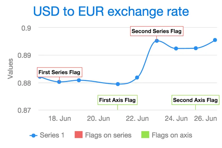
Flags are normally used in a chart that has one or more normal data series.
Plot Options
The flags are defined in a series that has its type set to flags. In addition to the common plot options properties, flag charts also have the following properties:
- shape
-
defines the shape of the marker. It can be one of
FLAG,CIRCLEPIN,SQUAREPIN, orCALLOUT. - stack-distance
-
defines the vertical offset between flags on the same value in the same series. Defaults to 12.
- draw-on-series
-
defines the ID of the series where the flags should be drawn on. If no ID is given, the flags are drawn on the X axis.
- draw-on-key
-
in chart types that have multiple keys (Y values) for a data point, the property defines on which key the flag is placed. Line and column series have only one key,
y. In range, OHLC, and candlestick series, the flag can be placed on theopen,high,low, orclosekey. Defaults toy.
Data
The data points for flags series require x and title properties, but can also have text property indicating the tooltip text.
Example
In the following, we annotate a time series as well as the axis with flags:
Source code
HTML
<vaadin-spline-chart id="flags-placement">
    <chart-title>USD to EUR exchange rate</chart-title>

    <x-axis type="datetime"></x-axis>
    <plot-options>
        <flags show-in-legend="false" shape="squarepin">
        </flags>
    </plot-options>

    <data-series name="USD to EUR" id="dataseries">
        <tooltip value-decimals="4">
        </tooltip>
        <data>
            [1434499200000,0.8821],
            [1434585600000,0.8802],
            [1434672000000,0.8808],
            [1434844800000,0.8794],
            [1434931200000,0.8818],
            [1435017600000,0.8952],
            [1435104000000,0.8924],
            [1435190400000,0.8925],
            [1435276800000,0.8955]
        </data>
    </data-series>
    <data-series type="flags" name="Flags on series" on-series="dataseries">
        <data>
            <point>
                <x>1434585600000</x>
                <chart-title>First Series Flag</chart-title>
                <text>First Series Flag Tooltip Text</text>
            </point>
            <point>
                <x>1435017600000</x>
                <chart-title>Second Series Flag</chart-title>
            </point>
        </data>
    </data-series>
    <data-series type="flags" name="Flags on axis">
        <data>
            <point>
                <x>1434844800000</x>
                <chart-title>First Axis Flag</chart-title>
                <text>First Axis Flag Tooltip Text</text>
            </point>
            <point>
                <x>1435190400000</x>
                <chart-title>Second Axis Flag</chart-title>
            </point>
        </data>
    </data-series>

</vaadin-spline-chart>
OHLC and Candlestick Charts
An Open-High-Low-Close (OHLC) chart displays the change in price over a period of time. An OHLC chart consist of vertical lines, each having a horizontal tickmark both on the left and the right side. The top and bottom ends of the vertical line indicate the highest and lowest prices during the time period. The tickmark on the left side of the vertical line shows the opening price and the tickmark on the right side the closing price. OHLC charts are defined with a vaadin-ohlc-chart element.
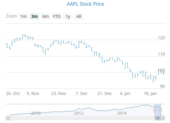
A candlestick chart is another way to visualize OHLC data. A candlestick has a body and two vertical lines, called wicks. The body represents the opening and closing prices. If the body is filled, the top edge of the body shows the opening price and the bottom edge shows the closing price. If the body is unfilled, the top edge shows the closing price and the bottom edge the opening price. In other words, if the body is filled, the opening price is higher than the closing price, and if not, lower. The upper wick represents the highest price during the time period and the lower wick represents the lowest price during. A candlestick chart is defined with a vaadin-candlestick-chart element.
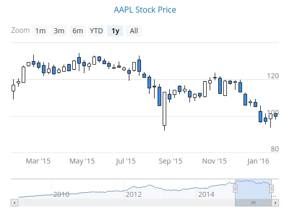
To attach data to a OHLC or a candlestick chart you need to use a data-series. See "Chart Data" for more details. An OHLC data series contains an array of objects with a date and the open, highest, lowest, and close price on that date.
Source code
HTML
<dom-module id="ohlc-example">
    <template>
        <iron-ajax auto id="dataFetcher"
                url="ohlc_data"
                handle-as="json"
                last-response="{{seriesData}}"></iron-ajax>

        <vaadin-ohlc-chart id="ohlc-series" timeline>
            <chart-title>AAPL Stock Price</chart-title>
            <data-series name="AAPL" data="[[seriesData]]">
            </data-series>
        </vaadin-ohlc-chart>
    </template>
    <script>
      class OhlcExample extends Polymer.Element {
        static get is() { return 'ohlc-example'; }
      }
      customElements.define(OhlcExample.is, OhlcExample);
    </script>
</dom-module>
<ohlc-example></ohlc-example>
Typically the OHLC and candlestick charts contain a lot of data, so it is useful to use them with the timeline feature enabled. The timeline feature is described in "Timeline".
Plot Options
You can use a data-grouping tag to configure data grouping properties. If the data points in a series are so dense that the spacing between two or more points is less than value of the group-pixel-width, the points will be grouped into appropriate groups so that each is more or less two pixels wide. The approximation attribute specifies which data point value should represent the group. The possible values are: average, open, high, low, close, and sum.
Using up-color and line-color allow setting the fill and border colors of the candlestick that indicate rise in the values. The default colors are white.