Basic Use
- Basic Chart Configuration
- Plot Options
- Chart Data Series
- Axis Configuration
- Displaying Multiple Series
- Mixed Type Charts
- 3D Charts
- Internet Explorer 11 & Safari 9 support
- Known Issues
The vaadin-<type>-chart is a regular web component, which you can add to a web page.
You can load the chart in 'header' and then use it in the 'body'. A chart has a height of 400 pixels and takes full width by default. Anyway the chart will adapt its size to its container element size if that has the size specified.
Web Components:
Source code
HTML
<!DOCTYPE html>
<html>
<head>
<link rel="import" href="bower_components/vaadin-charts/vaadin-bar-chart.html">
</head>
<body>
<div style="width:400px;height:300px">
<vaadin-bar-chart>
...
</vaadin-bar-chart>
</div>
</body>
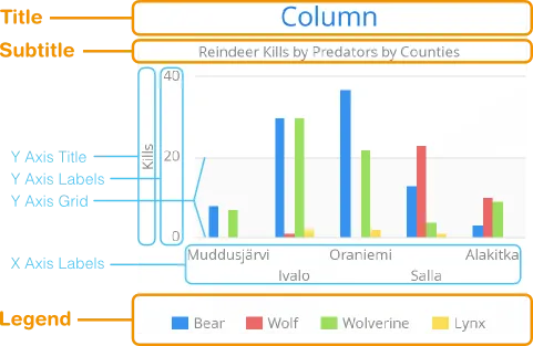
</html>The chart types are described in "Chart Types". The main parts of a chart are illustrated in Chart Elements.
To actually display something in a chart, you typically need to configure the following aspects:
-
Basic chart configuration
-
Configure plot options for the chart type
-
Configure one or more data series to display
-
Configure axes
The plot options can be configured for each data series individually, or for different chart types in mixed-type charts.
Basic Chart Configuration
After adding a chart web component to your html page, you need to configure it further. At the very least, you need to specify the data series to be displayed in the configuration.
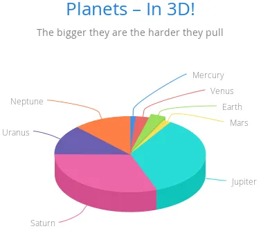
The chart-specific properties can be changed by adding <property-name> tags into the chart. Here we add
title and subtitle to the chart. By convention, title should be used, but it is a reserved
tag name in HTML and does not allow child elements. In Vaadin Charts, a chart- prefix is added to fix this
kind of issues. So, instead of using reserved tags, area,
frame, style, and title,
use the following elements: chart-area, chart-frame, chart-style,
and chart-title.
Source code
HTML
<vaadin-bar-chart>
  <chart-title>Planets</chart-title>
  <subtitle>The bigger they are the harder they pull</subtitle>
  ...
</vaadin-bar-chart>
The configuration properties are described in more detail in "Chart Configuration".
Plot Options
Many chart settings can be configured in the plot options of the chart or data series. Some of the options are chart type specific, as described later for each chart type, while many are shared.
For example, for line charts, you could disable the point markers as follows:
Source code
HTML
<plot-options>
  <line>
    <marker enabled="false"></marker>
  </line>
</plot-options>
You can set the plot options for the entire chart or for each data series separately, allowing also mixed-type charts, as described in Mixed Type Charts.
The shared plot options are described in "Plot Options".
Chart Data Series
The data displayed in a chart is stored as data-series elements.
Source code
HTML
<data-series name="Diameter">
  <data>
    4900, 12100, 12800, 6800,
    143000, 125000, 51100, 49500
  </data>
</data-series>
Data point features, such as color and size, can be defined inside the data-series
element. The data series configuration is described in more detail in
"Chart Data".
Axis Configuration
One of the most common tasks for charts is customizing its axes. At the least, you usually want to set the axis titles. Usually you also want to specify labels for data values in the axes.
When an axis is categorical rather than numeric, you can define category labels for the items. They must be in the same order and the same number as you have values in your data series.
Source code
HTML
<x-axis>
  <chart-title>Planet</chart-title>
  <categories>Mercury, Venus, Earth, Mars,
              Jupiter, Saturn, Uranus, Neptune</categories>
</x-axis>
Formatting of numeric labels can be done with format attribute which is a string
where '{value}' will be replaced by the actual y-label value.
Source code
HTML
<y-axis>
  <chart-title>Diameter</chart-title>
  <labels format = "{value} Mm">
    <step>2</step>
  </labels>
</y-axis>
More complex formatting, needs to be done using formatter which is a
JavaScript function to format the label.
Source code
HTML
<y-axis>
  <chart-title>Diameter</chart-title>
  <labels formatter = "function () { return this.value / 1000 + 'Mm';}">
    <step>2</step>
  </labels>
</y-axis>
Displaying Multiple Series
The simplest data, which we saw in the examples earlier in this chapter, is one-dimensional and can be represented with a single data series. Most chart types support multiple data series, which are used for representing two-dimensional data. For example, in line charts, you can have multiple lines and in column charts the columns for different series are grouped by category. Different chart types can offer alternative display modes, such as stacked columns. The legend displays the symbols for each series.
Source code
HTML
<!-- The data Source:
V. Maijala, H. Norberg, J. Kumpula, M. Nieminen
Calf production and mortality in the Finnish
reindeer herding area. 2002. -->
<data-series name="Bear">
  <data>8, 30, 37, 13, 3</data>
</data-series>
<data-series name="Wolf">
  <data>0, 1, 0, 23, 10</data>
</data-series>
<data-series name="Wolverine">
  <data>7, 30, 22, 4, 9</data>
</data-series>
<data-series name="Lynx">
  <data>0, 2, 2, 1, 0</data>
</data-series>
The result for both regular and stacked column chart is shown in
Multiple Series in a Chart. Stacking is enabled with the
columns plot-options property stacking.
Source code
HTML
<plot-options>
  <column>
    <stacking>normal</stacking>
  </column>
</plot-options>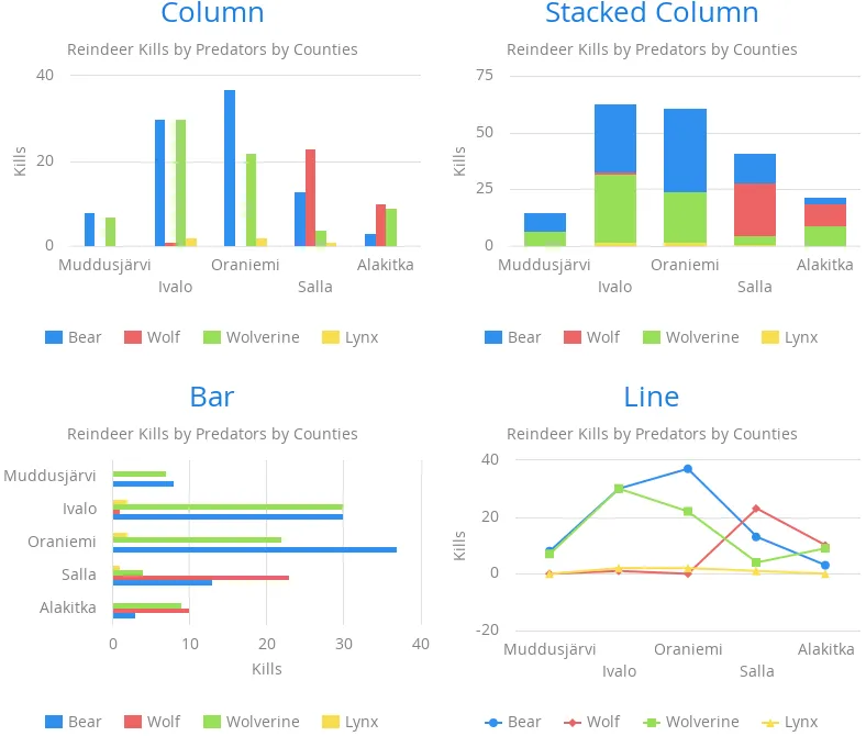
Mixed Type Charts
You can enable mixed charts by setting the chart type in the
'data-series' element, which overrides the default
chart type of vaadin-<type>-chart element. You can also make color and
other settings for the series in the plot options.
For example, to get a line chart, you need to use type line.
Source code
HTML
<data-series name="Bear">
  <type>column</type>
  <color>blue</color>
  <data>8, 30, 37, 13, 3</data>
</data-series>
<data-series name="Wolf">
  <type>line</type>
  <color>red</color>
  <data>0, 1, 0, 23, 10</data>
</data-series>
In the above case, where we set the chart type for each series, the overall chart type is irrelevant. As long as, it does not change the order of the axis like 'bar' chart would do.
3D Charts
Most chart types can be made 3-dimensional by adding 3D options to the chart. You can rotate the charts, set up the view distance, and define the thickness of the chart features, among other things. You can also set up a 3D axis frame around a chart.
3D Options
3D view has to be enabled in the options3d configuration, along
with other parameters. Minimally, to have some 3D effect, you need to rotate the
chart according to the alpha and beta parameters.
Let us consider a basic scatter chart for an example. The basic configuration for scatter charts is described elsewhere, but let us look how to make it 3D.
Source code
HTML
<vaadin-scatter-chart>
  ...
  <chart>
    <options3d enabled="true"
               alpha=10
               beta=30
               depth=300
               view-distance=100>
  </chart>
  ...
</vaadin-scatter-chart>
The 3D options are as follows:
enabled-
Whether 3D plot is enabled. Default is
false. alpha-
The vertical tilt (pitch) in degrees.
beta-
The horizontal tilt (yaw) in degrees.
depth-
Depth of the third (Z) axis in pixel units. Default is 100.
chart-frame-
Defines the 3D frame, which consists of a back, bottom, and side panels that display the chart grid.
Source code
HTML
<chart-frame>
  <back size="1" color="#F5F5DC"></back>
</chart-frame>view-distance-
View distance for creating perspective distortion. Default is 100.
3D Plot Options
The above sets up the general 3D view, but you also need to configure the 3D properties of the actual chart type. The 3D plot options are chart type specific. For example, a pie has 'depth' (or thickness), which you can configure as follows:
Source code
HTML
<plot-options>
  <pie>
    <depth>45</depth> <!-- Our pie is quite thick -->
  </pie>
</plot-options>
3D Data
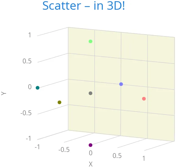
For some chart types, such as pies and columns, the 3D view is merely a visual representation for one- or two-dimensional data. Some chart types, such as scatter charts, also feature a third, 'depth axis' for data points. That third axis is called a Z axis.
Such data points can be given as arrays of three elements.
Source code
HTML
<data-series name="3D data">
  <color-by-point>true</color-by-point>
  <data>
    [0.0, 0.0, 0.0],
    [1.0, 0.0, 0.0],
    [0.0, 1.0, 0.0],
    [0.0, 0.0, 1.0],
    [-1.0, 0.0, 0.0],
    [0.0, -1.0, 0.0],
    [0.0, 0.0, -1.0]
  </data>
</data-series>
Alternatively, the data points can be given as objects which have 'x', 'y' and 'z' properties.
Source code
HTML
<data-series name="3D data">
  <color-by-point>true</color-by-point>
  <data>
    {x: 0.0, y: 0.0, z:0.0},
    {x:1.0, y:0.0, z:0.0},
    {x:0.0, y:1.0, z:0.0},
    {x:0.0, y:0.0, z:1.0},
    {x:-1.0, y:0.0, z:0.0},
    {x:0.0, y:-1.0, z:0.0},
    {x:0.0, y:0.0, z:-1.0}
  </data>
</data-series>
Above, we defined 7 orthogonal data points in the 2x2x2 cube centerd in origo. The result is illustrated in 3D Scatter Chart.
Distance Fade
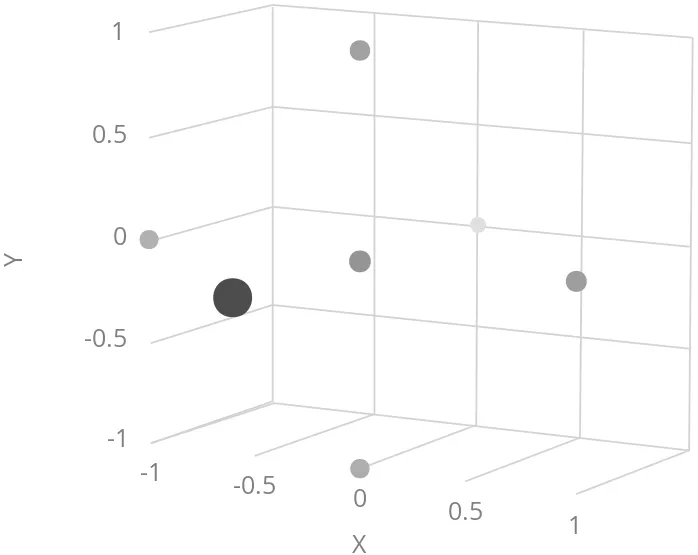
To add a bit more 3D effect, you can do some tricks, such as calculate the distance of the data points from a viewpoint and set the marker size and color according to the distance. To add custom JavaScript to do this, dom-bind element can be used. More information about binding data to a chart can be found "here".
Source code
HTML
<dom-bind id="fade">
  <template>
    ...
    <vaadin-scatter-chart id="fadeChart">
      ...
      <data-series name="Data" data="[[distanceFadeData]]">
      </data-series>
    </vaadin-scatter-chart>
  </template>
</dom-bind>
<script>
  (function () {
    var fade = document.querySelector('#fade');
    var viewX = 0; var viewY = 0; var viewZ = 0;

    calculateViewPoint();

    fade.distanceFadeData =  [createPoint(0.0, 0.0, 0.0),
                                createPoint(1.0, 0.0, 0.0),
                                createPoint(0.0, 1.0, 0.0),
                                createPoint(0.0, 0.0, 1.0),
                                createPoint(-1.0, 0.0, 0.0),
                                createPoint(0.0, -1.0, 0.0),
                                createPoint(0.0, 0.0, -1.0)];

    function calculateViewPoint() {
      var viewDist = 2;
      var fadeChart = fade.$.fadeChart;
      var alpha = fadeChart.chart.options.chart.options3d.alpha;
      var beta = fadeChart.chart.options.chart.options3d.beta;
      var theta = alpha * Math.PI / 180;
      var phi = beta * Math.PI / 180;
      viewX = viewDist * Math.sin(theta) * Math.cos(phi);
      viewY = viewDist * Math.sin(theta) * Math.sin(phi);
      viewZ = - viewDist * Math.cos(theta);
    }

    function createPoint(x, y, z) {
      var distance = calculateDistance(x, y, z);
      var grayness = parseInt(distance * 75);
      return {
        x: x, y: y, z: z,
        radius: 1 + 10 / distance,
        color: createColor(grayness)
      };
    }

    function createColor(color) {
      return "rgb(" + color + "," + color + "," + color + ")";
    }

    function calculateDistance(x, y, z) {
      return Math.sqrt(Math.pow(viewX - x, 2) +
        Math.pow(viewY - y, 2) +
        Math.pow(viewZ - z, 2));
    }
  })();
</script>
Note that here the view distance is in the scale of the data coordinates, while the distance defined in the 3D options has different definition and scaling. With the above settings, which are somewhat exaggerated to illustrate the effect, the result is shown in 3D Distance Fade.
Internet Explorer 11 & Safari 9 support
Vaadin Charts is using Polymer 2 and ES6. To support IE11 and Safari 9 you need to transpile ES6 to ES5. The easiest way to do that, is using Polymer CLI. Add a build configuration to your polymer.json:
Source code
HTML
  "builds": [{
    "name": "my-app",
    "js": {"minify": true, "compile": true},
    "css": {"minify": true},
    "html": {"minify": true}
  }]
Running polymer build in you application folder will create a transpiled version of your application.
Your application will be transpiled and saved in build folder.
Another option to transpile ES6 to ES5 is to use Babel.
Known Issues
-
Because non-chrome browsers need to load a polyfill, you can see flickering, before definition of the web component comes in. You can suspend rendering the component before it is ready by adding the
unresolvedattribute in body:
Source code
HTML
  <body unresolved>
   //Your code here
</body>-
There is a memory leak problem with Internet Explorer 11 and Polymer 2, see details here.