Aura Color
Aura defines its own color system, which it then maps to the base style color properties. Unless you need absolute control of the exact color values defined for text, borders, or backgrounds, you only need to override a few Aura color properties to get a customized color palette.
|
Caution
|
Safari 17 Support
If you need to support Safari 17, avoid using the light-dark() function when overriding color properties, as the CSS relative color syntax – which Aura and base styles use – doesn’t work together with the light-dark() function in Safari 17. This is why Aura defines color-scheme-specific light and dark properties.
|
|
Note
|
Read-Only Properties
Properties which are marked “read-only” aren’t technically read-only. While you can override their values, the intention is to use them only to set values of other properties.
|
Color Scheme
You can choose between a light or a dark color scheme (i.e., light or dark mode), or configure the app to follow the user’s operating system preference. The light color scheme is used by default.
The color properties you can customize in Aura have both a light and dark variant, suffixed with -light and -dark. If you support both color schemes, remember to redefine both color properties if those are available.
Use the native color-scheme property to control the app’s global color scheme. See Color Schemes for more information about the related Java API.
Source code
CSS
html {
  /* Follow the user's operating system preference, also known as "auto" or "system" */
  color-scheme: light dark;
}
In addition to the global color scheme, you can configure the Notification and App Layout content area color schemes separately. This allows, for example, to always use the dark color scheme for the main navigation area while allowing the content/view area to follow the user’s preference.
--aura-content-color-scheme-
Defines the color scheme of the content area of the App Layout component, and is only effective when the App Layout component is used. Follows the global color scheme by default.
--aura-notification-color-scheme-
Defines the color scheme of all notifications. Follows the global color scheme by default.
Source code
CSS
html {
  /* Use the dark color scheme for the global navigation areas */
  color-scheme: dark;
  /* Follow the user's OS preference in the content area */
  --aura-content-color-scheme: light dark;
}
Background Color
--aura-background-colorRead-only-
The base background color. Adapts to the color scheme. Don’t override this property directly. Use the color-scheme-specific
--aura-background-color-lightand--aura-background-color-darkproperties instead. --aura-background-color-light-
The base background color for the light color scheme.
--aura-background-color-dark-
The base background color for the dark color scheme.
--aura-app-background-
The main app background, used for the
<html>element and the App Layout content area. By default this is a computed gradient, based on the--aura-background-colorproperty, which becomes more prominent with more saturated background colors. You can set it to a solid color if you want to, for example, tovar(--aura-background-color).
You can also use the base style background color properties.
Source code
CSS
html {
  --aura-background-color-light: #ffd06b;
  --aura-background-color-dark: #1b0f38;
}
Text & Border Colors
Aura redefines the base style text color and border color properties. These colors are computed based on the background color properties, and automatically adapt to the color scheme.
Text & Border Color Contrast
--aura-contrast-level-
Increase or decrease the contrast of the computed text border colors with this property.
If you explicitly override any text or border color properties, the --aura-contrast-level property no longer affects them unless you use ìt in your own computed colors.
Source code
CSS
html {
  --aura-contrast-level: 10;
}
Palette
Aura offers a palette of seven colors: neutral, red, orange, yellow, green, blue, and purple. The palette doesn’t offer traditional color scales that many design systems include, where you have 10 to 12 colors per hue ranging from almost white to almost black, commonly named from 50/100 to 900.
The palette consists of single color values, from which all necessary variations of that color are computed automatically (the text, border and surface/background variants). If you need more than what Aura and the base styles offer out of the box, you can use the native CSS color-mix() and relative color functions.
Source code
Example: Create a semi-transparent version of the --aura-red color
--aura-red colorhtml {
--aura-red-200: color-mix(in srgb, var(--aura-red) 20%, transparent);
}Neutral Color (Grayscale)
The neutral color forms the basis of your theme, as it’s used for text and border colors by default. It has light and dark variants, where the light version is a dark gray and the dark version is off-white by default.
--aura-neutral-light, --aura-neutral-dark.
Saturated Colors
The other colors are meant to be used as accent colors. You can override the palette with custom colors, for example, from your brand guidelines.
--aura-red,
--aura-orange,
--aura-yellow,
--aura-green,
--aura-blue,
--aura-purple.
Text Colors
Each palette color (excluding neutral, use the base style text colors) has a corresponding text color property which has more contrast against the background color, making it suitable to be used for colored text.
--aura-red-text,
--aura-orange-text,
--aura-yellow-text,
--aura-green-text,
--aura-blue-text,
--aura-purple-text.
Accent Color
--aura-accent-colorRead-only-
The accent color, used to highlight certain parts of the UI, like some interactive elements and selection states. Adapts to the color scheme. Don’t override this property directly. Use the color-scheme-specific
--aura-accent-color-lightand--aura-accent-color-darkproperties instead. --aura-accent-color-light-
The accent color for the light color scheme.
--aura-accent-color-dark-
The accent color for the dark color scheme.
--aura-accent-text-colorRead-only-
A text color derived from the accent color, providing more contrast against the background. Adapts to the color scheme. Don’t override this property directly. Use the color-scheme-specific
--aura-accent-text-color-lightand--aura-accent-text-color-darkproperties instead. --aura-accent-text-color-light-
The accent text color for the light color scheme.
--aura-accent-text-color-dark-
The accent text color for the dark color scheme.
|
Caution
|
Provide Enough Contrast
Choose a color that has at least 3:1 contrast ratio with the background color in your application. The accent color is used as is for the focus outline color, which needs to be visible for all users.
|
Source code
CSS
/* If you want, you can apply different colors for light and dark color schemes */
html {
  --aura--accent-color-light: var(--aura-orange);
  --aura--accent-color-dark: var(--aura-purple);
}
Accent Color Class Names
Use any of the following class names on the <html> element to set the accent color to the whole UI, or any component to set the accent color to only that part of the UI.
.aura-accent-neutral,
.aura-accent-red,
.aura-accent-orange,
.aura-accent-yellow,
.aura-accent-green,
.aura-accent-blue,
.aura-accent-purple.
Source code
HTML
<html class="aura-accent-purple">Surface Color
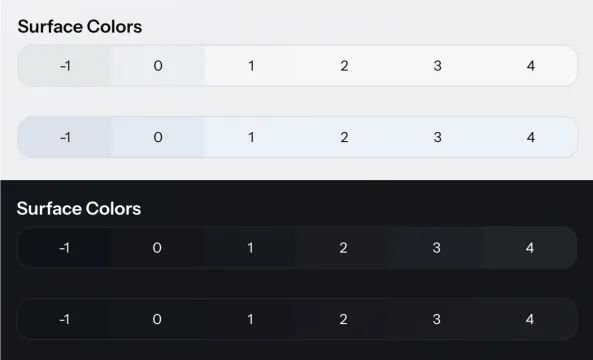
The surface color, used as backgrounds, is used to create visual hierarchies in the UI. In general, a lighter color implies more “elevation” – being closer to the user. Aura provides a system for applying surface colors of varying elevation on the built-in components and layouts in your application.
|
Note
|
If you need a background color that is darker than the base background color in the light color scheme and lighter in the dark color scheme, use the --vaadin-background-container and --vaadin-background-container-strong colors from the base styles.
|
--aura-surface-colorRead-only-
A computed color that you can apply to an element to give it elevation. The color is computed based on the
--aura-background-colorproperty, and adapts to the color scheme. The final value of the computed color depends on the effective values of the--aura-surface-leveland--aura-surface-opacityproperties. --aura-surface-level-
The “elevation level” of the computed surface color. Can be any fractional number, positive, or negative. Default is 1. In light mode, level 3–4 usually results in a white color in the light color scheme. In the dark color scheme, level 8 starts to be an upper limit, after which text colors are likely to not have enough contrast (depending on the surface opacity).
--aura-surface-opacity-
The transparency of the computed surface color. Defaults to 0.5. Transparency allows you to nest the same surface color on top of each other to create more sense of elevation.
--aura-overlay-surface-opacity-
Surface opacity specifically for overlay elements. You can set this to 1 if you don’t like the default semi-transparent overlays.
--aura-surface-color-solidRead-only-
An opaque version of the effective surface color. Essentially the same as if
--aura-surface-opacitywas 1. Useful for situations when you need an opaque color. --aura-accent-surfaceRead-only-
A surface color that is tinted with the effective accent color.
Customizing Surface Level & Opacity
The surface level and opacity can only change on a predefined set of elements.
While you might expect to be able to set the --aura-surface-level and --aura-surface-opacity property values at any level of the DOM hierarchy, that doesn’t work. You can only change the level and opacity on elements that match the hard-coded list of selectors in Aura (see full list).
The input-field part of the Text Field component is one of the supported elements where you can adjust the surface color.
First, apply a unique class name on the Text Field to be able to target it with CSS.
Source code
Java
var searchField = new TextField();
searchField.addClassNames("search-field");
Then, adjust the surface level with CSS, targeting the input-field part in the shadow DOM of the Text Field component.
Source code
CSS
.search-field::part(input-field) {
  --aura-surface-level: -1;
}
Surface Color Class Names
This list of supported selectors (see the earlier section), that allow you to customize the surface color level and opacity, include the general-purpose .aura-surface and .aura-surface-solid class names. You can apply these class names to any element and then adjust the level and opacity on that element.
As a side effect, these class names apply the corresponding semi-transparent or opaque surface color as the background of the element your apply them to. You can override the background to transparent, if you only want to use the newly computed surface color in some nested level of the element, for example, its shadow DOM.
You can only have one computed surface color inside the style scope of the .aura-surface and .aura-surface-solid class names. A new color can be computed for a nested element if it matches the supported list of selectors.
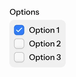
To apply a custom surface color level on the internal group-field part of the Checkbox Group component, apply the .aura-surface class name on the component. Add another, unique class name to target this component instance specifically.
Source code
Java
var checkboxGroup = new CheckboxGroup("Options");
checkboxGroup.addClassNames("aura-surface", "my-checkbox-group");
Then, adjust the surface level and opacity on the component element, and reset its background to transparent. Finally, apply the recomputed surface color, which is inherited, to the part in the shadow DOM (and a couple more visual adjustments).
Source code
CSS
.my-checkbox-group {
  --aura-surface-level: -1;
  --aura-surface-opacity: 0.4;
  background: transparent;
}

.my-checkbox-group::part(group-field) {
  background: var(--aura-surface-color);
  padding: var(--vaadin-padding-s);
  border-radius: var(--vaadin-radius-m);
}