Designing
To add a component to your design, drag it from the component Palette view and drop it in the desired location - either in the canvas area or in the hierarchical Outline view. Dropping in the desired location on the canvas is the most common approach, but in some situations (especially with complex, deeply nested component hierarchies) dropping on the Outline view gives more control.
About Layouts
Your designs should usually start with some sort of layout as the root component, or otherwise you are limited to a one-component design. You can also use a component that is not strictly a layout, but can still contain one (or several) components (or layouts) - this includes TabSheet, Accordion, Panel, etc.
There are three main types of layouts: ordered, absolute, and CSS.
- Ordered layouts
-
Ordered layouts arrange the contained components in some ordered fashion, for instance vertically or horizontally with uniform spacing. This makes it easy to align components, and achieve a consistent look.
VerticalLayout, HorizontalLayout, and FormLayout fall into this category.
When you drop a component on a ordered layout, it will end up in a position determined by the layout, not exactly where you dropped it. Drop indicators help you estimate where the component will end up.
- AbsoluteLayout
-
AbsoluteLayout allows free positioning of components, and supports anchoring freely in all directions. It is a powerful layout, but can be more challenging to use. You can use rulers, grids, guides, and snapping to aid your work.
AbsoluteLayout allows you to position components freely - a component is placed where you drop it. However, if you anchor the component elsewhere than to top/left, or use relative positioning, it might move when you change the size of the layout.
- CssLayout
-
As the name indicates, CssLayout uses CSS to position components. It is very flexible, and with appropriate CSS, it can be used to achieve responsive layouts and a consistent look and feel. However, it requires CSS – either pre-made and copied to your theme, or hand-crafted by you.
Starting from Blank
When you add the first layout to your blank canvas, it will be sized 100% x 100%, filling the whole viewport. Whether or not this is a good idea depends on your design. For many UIs having a VerticalLayout as root, it makes sense to have the layout 100% wide, but auto high. This will make the layout grow vertically as you add components, instead of splitting the available vertical space evenly between components.
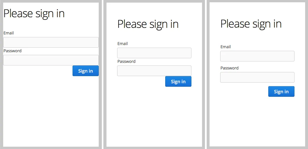
Most UIs will not look good without margin and spacing. You can enable them for ordered layouts in the Properties view. Effects of Margin and Spacing illustrates the same layout without margin or spacing, with margin, and with spacing.
The info bar, illustrated in Info Bar for Quick Adjustments, lets you quickly toggle between auto sizing and 100%. You can try out the effect of these changes by grabbing just outside the viewport (canvas) corner and resizing it (add a few components to your layout first).
Using Templates
Templates provide a starting-point for your design - add, remove, and modify the created design as you see fit. You can pick the template for your design when you create the design using the New Design wizard of your IDE. See Creating a Design.
To learn how to create templates of your own or how to import templates others have made, see Templates.
Adding Components
Components can be added by dragging from the Palette view, either to the canvas or to the Outline view.
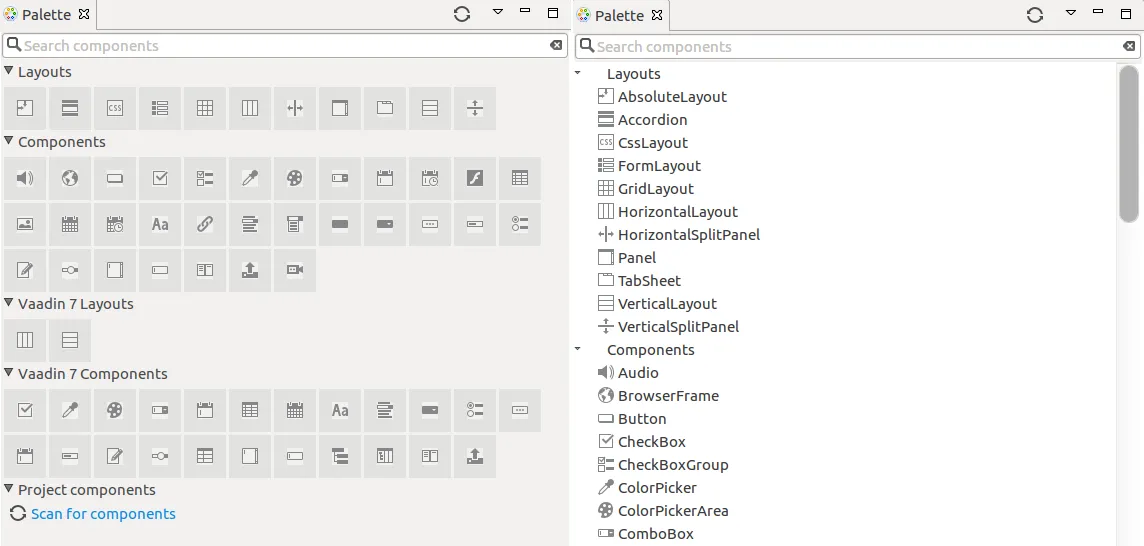
The component Palette view has a search field, and also two modes: list and tile. In the list mode, you can see the component name next to the icon, which is convenient at first. The tile mode lets you see all components at once, which will speed up your work quite a bit. It requires a little patience, but is really worth your while in the long run. The component name can also be seen when hovering on the icon.
The component you add will be selected in the editor view, and you can immediately edit its properties, such as the caption.
Editing Properties
You can edit component properties in the Properties view. It is a good idea to give components at least a name if they are to be used from Java code to add logic (such as click listeners for buttons). Generally, this is needed for most controls, but not for most layouts.
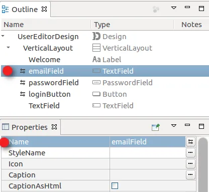
In addition to exporting the named components to Java, you will end up with things like saveButton and emailField in your Outline view, which will help you keep track of your components.
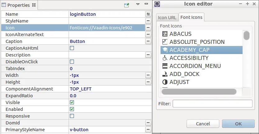
Note the ellipsis () button next to most properties - in many cases a more helpful editor is presented when you click it.
Using Resources
Some properties refer to a resource object that should be loaded. This includes the icon property, and the source property for some components. In Vaadin there are multiple types of resources, as described in "Images and Other Resources". They are represented by a URI in the Designer UI and in the declarative format used by Designer.
| Resource Name | URI Format | Description |
|---|---|---|
ExternalResource | http[s]:// ftp[s]:// | Browser loads the resource from the given address. |
ThemeResource | theme:// | The resource is loaded from the application theme folder. |
FileResource | file:// | The resource is loaded from the server filesystem. |
FontIcon | fonticon:// | Font icon path. Only for the Icon component. |
ClassResource | N/A | Not supported by the declarative format. |
StreamResource | N/A | Not supported by the declarative format. |
Components that have a source property include Audio, Flash, Image, Link and Video.
Wrapping a Component
Once in a while, you may need to wrap a component with a layout, in order to achieve the desired result (quite often injecting a HorizontalLayout into a VerticalLayout, or vice versa). You can achieve this by right-clicking the component in the Outline view, and choosing in the context menu.
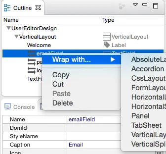
Replacing a Layout
In many cases a change in orientation or other rearrangement of components is required. Replacing the layout that contains those components is a convenient way to achieve that. To replace a layout with another, click on the layout to be replaced in the Outline view, choose in the context menu and select a layout to replace the current one with from the list of layouts that appears.
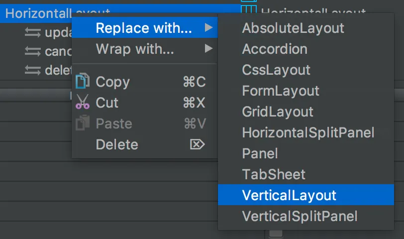
Note that usual layout restrictions apply. For example if you replace a VerticalLayout with a Panel the leftover components will be dropped. Undo and redo work as usual, so you never lose your work.
Previewing
While creating a design, it is convenient to preview how the UI will behave in different sizes and on different devices. There are a number of features geared for this.
Resizing Viewport and Presets
The WYSIWYG canvas area also doubles as viewport. By resizing it, you can preview how your design will behave in different sizes, just as if it was displayed in a browser window that is being resized, or dropped in a Panel of a specific size.
You can manually resize the viewport by grabbing just outside of an edge or corner of the viewport, and dragging to the desired size. When you resize the viewport, you can see that the viewport control on the toolbar changes to indicate the current size.
By typing in the viewport control, you can also input a specific size (such as " 200 x 200"), or open it up to reveal size presets. Choose a preset, such as Phone to instantly preview the design on that size.
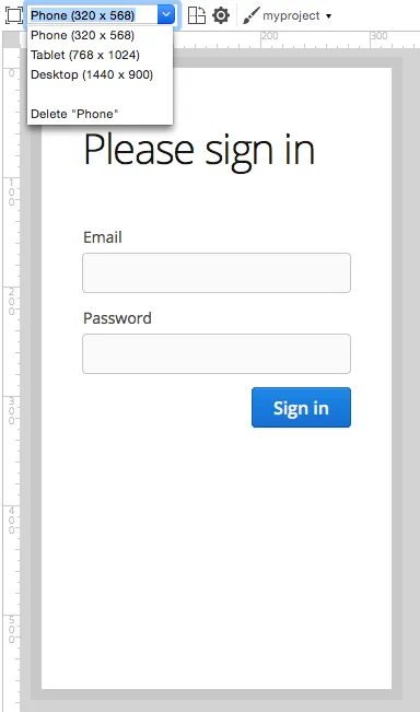
You can also add your own presets - for instance known portlet or dashboard tile sizes, or other specific sizes you want to target.
To preview the design in the other orientation (portrait vs. landscape), press the icon right of the viewport size control.
Quick preview
The Quick preview is one of the edit-modes available to the right in the toolbar (the other modes being Design and Code). In this mode, all designing tools and indicators are removed from the UI, and you can interact with components - type text, open dropdowns, check boxes, tab between fields, and so on. It allows you to quickly get a feel for (for instance) how a form will work when filling it in. Logic is still not run (hence "quick"), so no real data is shown and, for example, buttons do nothing.
External Preview
The external preview popup shows a QR code and its associated URL. By browsing to the URL with and browser or device that can access your computer (that is, on the same LAN), you can instantly see the design and interact with it. This view has no extra designer-specific controls or viewports added, instead it just shows the design as-is; the browser is the viewport.
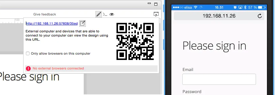
External preview allows multiple browsers and devices to be connected at once, and they are all updated live as you change the design in Eclipse. There is an indicator in the toolbar when the design is viewed externally.

This is an awesome way to instantly preview results on multiple devices and browsers, or to show off a design and collaborate on it - for instance in a meeting setting.