I’m able to change the color by looking here https://stackoverflow.com/questions/76463577/how-to-use-a-different-color-for-the-required-indicator-in-vaadin-23. Now how to change this to a STAR instead of a circle and increase the size?
Gor this from chatGPT but no luck /* Customize the required indicator */ .v-required-field-indicator { content: "*"; color: red; /* or any other color you prefer */ }
This should work from global CSS:
vaadin-text-field::part(required-indicator)::after {
  content: '*';
}
thanks. this one worked
FYI, ChatGPT often doesn’t know the difference between very old Vaadin 7 or 8 answers vs anwers that are correct for V24. The one you got is for V7/8.
It looks a bug. When I set this, I see all the text fields are getting * regardless of the required setting in the binder
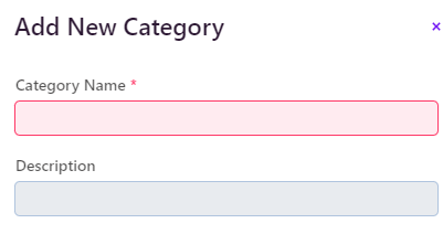
as you see here, only the Category Name is required but Description is also getting *
It’s not a bug, it’s exactly as described because the part is always present
vaadin-text-field::part(required-indicator) { content: '*'; }
This is correct. There shouldn’t be ::after
I just figoured out after looking https://vaadin.com/docs/latest/components/text-field/styling
Just define --lumo-required-field-indicator and you are done
but I need it as *
–lumo-required-field-indicator: ‘*’;
Yes, I used this --lumo-required-field-indicator-color: var(--lumo-error-color); but this is how I set
color 
Actually I needed both color and *. The default color is not looking great
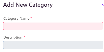
This one is working