We’ve been working on a refresh of our main front page and I wanted to get your take on it before we make any final decisions. As developers who actually build with Vaadin, your perspective matters more than any marketing theory.
First impression - Does it quickly communicate what Vaadin is and why you’d use it? Or do we need to get to the point faster?
Code examples - Are they helpful or just noise? Do they show real-world enough scenarios?
Technical accuracy - Does anything feel dumbed down or off-base from your actual experience building with Vaadin?
What’s missing - If you were evaluating Vaadin for a project, what information would you expect to see on the frontpage that isn’t there?
Signal vs. noise - Too much marketing fluff? Not enough substance? Let me know if anything makes you roll your eyes.
Don’t worry about being diplomatic - I’d rather hear “this completely misses the mark” now than after we launch it. We’re developers too, we can handle direct feedback.
Also, if you have 30 seconds, it’d help to know: how long have you been using Vaadin, and what do you mainly build with it? Just for context on where feedback is coming from.
I’m getting old… I was exposed to Vaadin 15 years ago… building applications for internal usage, government applications available in intranets and end-users exposed applications over the internet.
My first impression would be, I’m missing a catchy slogan like “Gets shit done” - that’s exactly why we use Vaadin. It gets shit done quickly, secure and good-looking while costing us no fortune.
I would show a single code example and if applicable, swap between “how it looks” and “how to code” like within the docs
3/5)
Integrated binding, validation, theming, layout, and responsive behavior
You might wanna replace theming with customizable styling… the wording theme is deprecated with 25+ - everything is a style (looking back at Rolf’s presentation)
Real-time by default
While technically true… this feels really like marketing fluff
Visual Editing In Dev Mode
That requires a license, right? Not sure if this already counts as false advertising if no money icon is present… but I’m no legal guy…
might be a bit stupid… most of the times I get questions like “can Vaadin be used with X” where X is… REST, GraphQL or any other Data Service… and the answer is always YES, Vaadin does not care how you feed data into it. Everything you can connect via Java can be integrated as data provider or consumer.
I’m with Simon, Grid the must have example. Nothing beats the Grid in business application. (Forms too… but that might be a bit too much code)
The current selection of components to “highlight” feels weird - numberfield on the front page? That’s a huge downgrade compared to the all-mighty combo box (just as example… icons and other as well…)
About Simon’s comment with the logos: Spring should still apply (if I remember correctly) - Vaadin (Flow) should still work on plain-old Spring without Boot. But I’m also missing a Java Logo :)
I have been using Vaadin on and off for the last 20 years, keep returning to it for some reason ;-) Always gov related, intranet as well as public facing.
Some feedback:
Love the live coding example, but it could be more catchy than just a card. Perhaps an AppLayout where you add nav entries, nice looking components (grid, map, forms) in the content area etc
CTRL-F “AI” did not return any results
Visually the current frontpage feels better structured and has nicer layout, i am not sure what the new layout improves upon except for the live coding example.
1 → good first impression overall
2 → can be more catchy
3 → on target
4 → good
5 → Saying there’s 2000+ add-ons is not realistic nor appealing to newcomers. 200 working and properly maintained add-ons would already be fantastic.
Dear Roman,
I am working with Vaadin over 5 years now and created software with V8, V14 and V20+ and ongoing. While helping with a client for our ERP system for my employer, I created also some (long forgotten) hobby projects. Currently we are working on an internal AI platform. I’ve read the docs so often, that I only have to type in docs into chrome and it opens the latest.
As a side hustle, I am creating some website in Vue.js.
Let’s get to the direct feedback. This were my thoughts on the first sight:
The buttons are having uppercase text, what is consistent in this page, but not other Vaadin pages (which also will be refreshed?).
Secondary texts does not always have the same grey color and size (17px and 19px), I would take the brighter color. It feels too dark/hard to read on the first couple of sections.
Sections (caption and subtext) are not aligned the same, some are centered and some are left. I personally like it centered. See on smaller browser width like below 800px.
I like the live code section at the top, but it feels a bit slow.
The section “The web framework for Java developers” feels empty on the left side while having a lot of text is on the right.
The component overview does not feel alive and on first sight, does not show that the components can be used. Also, maybe you can find a balance between the card_content height and its components, Dialog and Date Picker are looking a bit empty. When looking at this section I would increase the border-color on the cards and also on all the buttons on this page.
“More than a framework” section: I like it and would also use such icons in the “The web framework for Java developers” section.
In general it has a good content to “call to cation” ratio.
I now that this page is not final and maybe some point are maybe already on a todo list.
Coming to your other points,
The texts feel more focused and less marketing fluff, but the current page does present it better.
I would love to see the “Optimize Java Web App Development with Built-in UI Components” section from the current page
I have been doing UI (Swing, J2ME(!), Android, iOs, GWT) for the last 25 years. Also my DB skills suck.
For for some reason, I never liked html/css/js.
I got attracted to Vaadin a couple of years ago, because I realised, I could do full stack in pure Java! Right now I am working on building a custom CRM+ERP.
First impression
The evolving code is distracting. Before I could read the One framework from… part, suddenly the code started to appear and I had to follow it, thinking I might miss out something important. (I noticed the “Reload code” button much later). Maybe make it the first section with some title like “Rich UI with just a few lines” or “As simple as A B C”?
The shipment media gives a wrong impression of a live tracker map with a few lines of code. Maybe switch to a product image?
The “See Components” gave an impression it’s already selected, and if I scroll down I expected to see the component gallery immediately. This visual confusion is probably due to the adjacent “Browse Docs” button. Maybe present them differently?
The See Components and Browse Docs open in the same window. Maybe default it to new tab?
Which Docs? Developer? API? Maybe provide a concise name?
PWA finds mention only once. In today’s mobile world, that could be a big attraction: Write once, use on web and mobile too! Maybe make it more prominent?
See Components and Browse Docs is repeated down the page again, just above the component preview. The Browse Docs there looks odd. Also maybe rename See Components to See All Components or Component Gallery?
Maybe addon directory deserves a special mention along with components?
Maybe “Forum” deserves a more prominent mention on this page? Forums are a lifeline for every new developer.
The pic of the gentlemen looks like they are attending some meeting which could have been an email. Maybe a more enthusiastic pic?
So my question is how to develop exactly like the Card animation? Code on the left, clean live visual on the right? I’m sure it can be done with IDE plus browser views, but not as clean as the animation? New people may assume the animation is how Vaadin development works.
I believe changes are necessary. What you propose is better than the grid currently used as an example on the main page.
The only thing I would immediately add as an important feature is the showcase of different design options for the finished component. And text, which tells that yo can simplify styling and visual customization.
Most developers are afraid that customization will be difficult and that the entire Vadin is limited to only a standard set of components.
Thank you again for all the great feedback on this thread - it’s been incredibly valuable. We’ve been iterating on the new homepage based on your input and have made a number of improvements.
I’d love to get a fresh round of feedback now that changes are in place. If you have a couple of minutes, please compare:
A few things I’d especially like your thoughts on:
Overall impression - Which page does a better job of explaining what Vaadin is and why you’d want to use it? What do you like, what don’t you like, and what would you improve?
Hero section: Grid vs Card component example - The current homepage leads with a Grid/ContactsView example, while the new page uses a Card (ShipmentCard) example with code on the left and the rendered result on the right. Which one resonates more with you as a Java developer? Does the Card example feel relevant enough for business apps, or is the Grid still the must-have showcase component?
“Run the demo project locally” - The new page has a one-liner git clone && ./mvnw spring-boot:run section right below the hero. Is this something that would get you to try Vaadin faster? Does having a copy-paste command to get a running app in seconds make a difference in your evaluation?
As always, it would help to know how long you’ve been using Vaadin and what you mainly build with it - just for context on where the feedback is coming from.
I like the new homepage.
What I would also highlight is accessible and UI Unit Testing as the first is very important and the second is an outstanding feature.
Cards are very modern and I see them all over currently
This command probably doesn’t run on Windows in the cmd.exe, and in enterprise environments, the devs must usually use this OS.
I go to the homepage frequently to check if there is a new build (which maybe should be announced in the forum?) and I think the current centered “Latest: xx.xx.xx” is much better than the anonymous “xx.xx.xx” you have in the new one.
Looking at the content, I think it is one big jumbled mess; It is hard to visually distinguish between what is information and what is examples, and where a new section begins. The old one does a better job, both because the headings are centered, and because of the animation (which I didn’t like, but without it the page has lost some structural hints)
Specifically for the hero section, my eyes are immediately drawn to the bright image, and I have to use a few brain cycles to understand that it is not information, but part of an example.
The almost-black-on-black “mac window” frame around the hero section is almost completely invisible.
Suggestion: The hero section should maybe be a carousel? You have the " UI components for real business applications" further down, but I like the code + result format
As a side note, did you know that you can get those from GitHub as well? In the platform repo, click the arrow next to the Watch button, select Custom and then pick Releases from the dialog.
But, speaking about release note; It isn’t very good is it, except for the main releases.
Changelogs

    Flow (25.1.5) and Hilla (25.1.4)
    Design System
        Web Components (25.1.2)
        Flow Components (25.1.5)
    TestBench (10.1.1)
    Browserless Test(1.0.0)
    Feature Pack(25.0.0)
...
This is more a Bill of Material than a release note, and I can never be sure what has actually changed.
The Compare function works, but it gives a low-level result, and it is focused on the platform project.
Surely it should be possible to vibe-code up something that looped over the subprojects and gave one list of actual list of issues fixed?
Claude says so, so it must be true
● GitHub doesn’t have a built-in feature for combining release notes across multiple repositories. Here are the practical options:
If sub-projects are in one repository (monorepo)
GitHub’s auto-generated release notes will cover all changes in that repo, so you get combined notes natively via the “Generate release notes” button.
If sub-projects are separate repositories
You’d need to aggregate manually or automate it:
GitHub Actions — Write a workflow that calls the GitHub API to fetch releases from each sub-repo, then creates a combined release in a “parent” repo. The GitHub Releases API
(REST API endpoints for releases and release assets - GitHub Docs) supports this well.
release-drafter — A popular GitHub Action that drafts release notes from PRs. You’d run it per-repo and then stitch results together in a parent-repo workflow.
Third-party tools — Tools like git-cliff, conventional-changelog, or semantic-release can be configured to pull from multiple sources.
Manual aggregation — Just paste the individual repos’ release notes into a top-level “release” repo entry.
Most common pattern in practice: a dedicated “release” or “umbrella” repository that contains a GitHub Actions workflow triggered when any sub-repo publishes a release, which then generates a combined
notes entry.
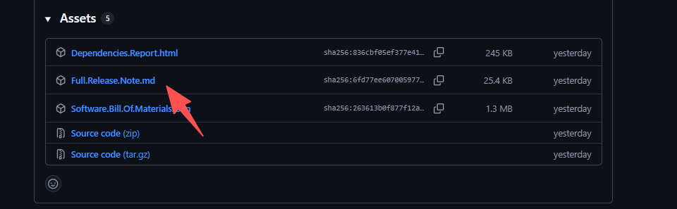
We used to collect all release notes from all sub projects but people complained that it was too verbose. We are still collecting it though and putting it as an Asset for the release:
It is embarrassing that I’ve never noticed the Assets section at the bottom
Just what I asked for, but I see the point of those that thought it was too verbose.
One minor comment; Looks like the sub-project headers lack a leading “#”:
 Keep 'em coming