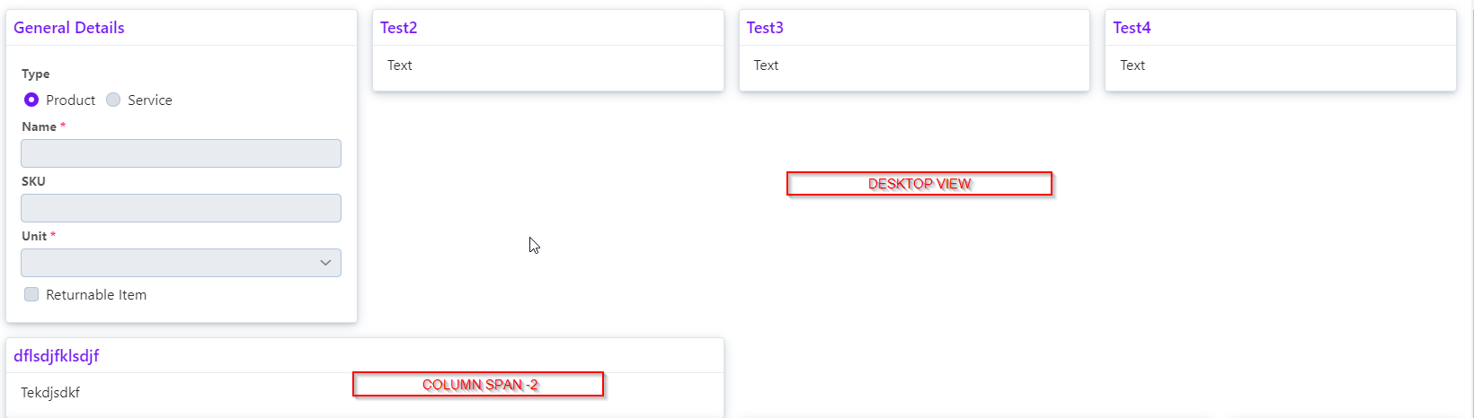
I’m exploring this https://vaadin.com/docs/latest/styling/lumo/utility-classes#spanning-columns. I created a grid in which one component should take 2 column span and rest of them should take as per the other column value set. It looks good in desktop view but in mobile view I see two columns though I set 1 column for small screens.
and this is the mobile view
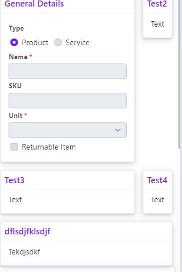
where you can see the problem
and this is the code
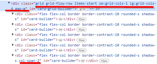
small : 1, large : 4, one div should take 2 column span. What am I missing here ?
can I get some help on this ?
to the best of my knowledge, this is not possible. It’s major shortcoming in the css grid layout model.
Or, in other words, you can’t prevent the span from creating new columns. You need to define a breakpoint (using a media query) below which that span is 1 instead of 2. And the Lumo utilities don’t have a way to do that, so you’ll have to write css for it.
I see Bootstrap has this feature. May be LumoUtility can adopt something from that
Just add bootstrap.
yeah, that works too
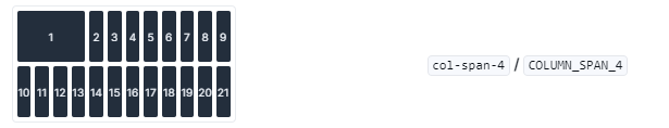
how to create this scenario ? as per the picture one div takes 4 columns and rest of them takes 1