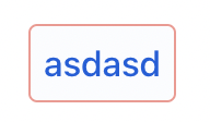
I created a button like this <vaadin-button class="border-error-50 border" theme="tertiary" tabindex="0" role="button">Cancel</vaadin-button> and this is how it looks

. What is the right way to create a button with border?
That looks correct to me. Make sure you have the utility classes loaded in your project.
There’s a specific CSS custom property you can set, --vaadin-button-border, but usually I just set the border property on vaadin-button.
It looks to me it is a bug. Button button = new Button("Test"); button.getStyle().setBorder("1px solid"); button.addClassName(LumoUtility.BorderColor.ERROR_50);. This is always showing like this

regardless of the class value I set. In Dev tools I see this .border-primary-50 { --lumo-utility-border-color: var(--lumo-primary-color-50pct); } always.
The border color is not set to --lumo-utility-border-color.
You can do this:
        Button button = new Button("Test");
        button.getStyle().setBorder("1px solid green"); // or any css variable like var(--lumo-utility-border-color)
or
        Button button = new Button("Test");
        button.addClassName(LumoUtility.Border.ALL);
        button.addClassName(LumoUtility.BorderColor.ERROR_50);
This code snippet will override your settings
        Button button = new Button("Test");
        button.getStyle().setBorder("1px solid"); // set the border color to the color of the button
In my opinion, it’s not a good idea to mix LumoUtility and getStyle(). (or to use getStyle() at all)
Button button = new Button("Test");
        button.addClassName(LumoUtility.Border.ALL);
        button.addClassName(LumoUtility.BorderColor.ERROR_50);
Also producing the same result. It never gets any other color other than primary though you pass different colors.
Seems to work as expected for me.

I noticed you have some custom colors in your app though. Is it possible that you have some CSS that conflicts with the utility classes?
You also mentioned that in devtools you see
.border-primary-50 { --lumo-utility-border-color: var(--lumo-primary-color-50pct); }
That is as it should be. The primary 50% border utility class maps to the primary 50% color.
But in your code samples you’re not using border-primary-50, but border-error-50, so I’m a bit confused about that.
Also note that, as the documentation says:
The Lumo utility classes are designed primarily to be used with native HTML elements, Vaadin layout components, and custom UI structures. Although some of them do work as expected on some Vaadin components, this is not their intended use.
So I would definitely recommend using the style property intended for the purpose instead of utility classes: --vaadin-button-border.