6.12. Layout Formatting
While the formatting of layouts is mainly done with style sheets, just as with
other components, style sheets are not ideal or even possible to use in some
situations. For example, CSS does not allow defining the spacing of table
cells, which is done with the cellspacing attribute in
HTML.
Moreover, as many layout sizes are calculated dynamically in the Client-Side Engine of Vaadin, some CSS settings can fail altogether.
The size of a layout component can be specified with the
setWidth() and
setHeight() methods defined in the
Sizeable interface, just like for any component. It
can also be undefined, in which case the layout shrinks to fit the
component(s) inside it. Section 5.3.9, “Sizing Components”
gives details on the interface.
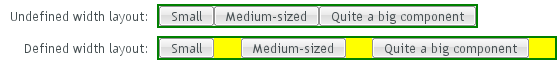
Many layout components take 100% width by default, while they have the height undefined.
The sizes of components inside a layout can also be defined as a
percentage of the space available in the layout, for example with
setWidth("100%"); or with the (most commonly used
method) setFullSize() that sets 100% size in both
directions. If you use a percentage in a
HorizontalLayout,
VerticalLayout, or
GridLayout, you will also have to set the component
as expanding, as noted below.
Warning
A layout that contains components with percentual size must have a defined size!
If a layout has undefined size and a contained component has, say, 100% size, the component will try to fill the space given by the layout, while the layout will shrink to fit the space taken by the component, which is a paradox. This requirement holds for height and width separately. The debug mode allows detecting such invalid cases; see Section 12.4.1, “Debug Mode”.
For example:
// This takes 100% width but has undefined height.
VerticalLayout layout = new VerticalLayout();

// A button that takes all the space available in the layout.
Button button = new Button("100%x100% button");
button.setSizeFull();
layout.addComponent(button);

// We must set the layout to a defined height vertically, in
// this case 100% of its parent layout, which also must
// not have undefined size.
layout.setHeight("100%");
The default layout of Window and
Panel is VerticalLayout with
undefined height. If you insert enough components in such a layout, it
will grow outside the bottom of the view area and scrollbars will appear
in the browser. If you want your application to use all the
browser view, nothing more or less, you should use
setFullSize() for the root layout.
// Create the main window.
Window main = new Window("Main Window");
setMainWindow(main);

// Use full size.
main.getLayout().setSizeFull();
If you set a HorizontalLayout to a defined size
horizontally or a VerticalLayout vertically,
and there is space left over from the contained components, the extra
space is distributed equally between the component cells. The
components are aligned within these cells, according to their
alignment setting, top left by default, as in the example below.

Often, you don't want such empty space, but want one or more
components to take all the leftover space. You need to set such a
component to 100% size and use
setExpandRatio(). If there is just one
such expanding component in the layout, the ratio parameter is irrelevant.

If you set multiple components as expanding, the expand ratio dictates how large proportion of the available space (overall or excess depending on whether the components are sized as a percentage or not) each component takes. In the example below, the buttons have 1:2:3 ratio for the expansion.

GridLayout has corresponding method for both of
its directions, setRowExpandRatio() and
setColumnExpandRatio().
Expansion is dealt in detail in the documentation of the layout
components that support it. See Section 6.3, “VerticalLayout and HorizontalLayout” and Section 6.4, “GridLayout” for details on components
with relative sizes.
You can set the alignment of the component inside a specific layout cell
with the setComponentAlignment() method. The
method takes as its parameters the component contained in the cell to be
formatted, and the horizontal and vertical alignment.
Figure 6.22, “Cell Alignments” illustrates the
alignment of components within a GridLayout.
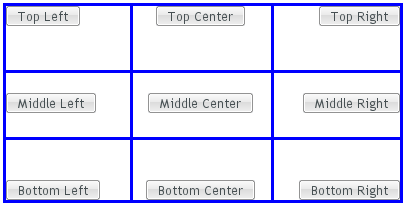
The easiest way to set alignments is to use the constants defined in the
Alignment class. Let us look how the buttons in the
top row of the above GridLayout are aligned with
constants:
// Create a grid layout
final GridLayout grid = new GridLayout(3, 3);

grid.setWidth(400, Sizeable.UNITS_PIXELS);
grid.setHeight(200, Sizeable.UNITS_PIXELS);

Button topleft = new Button("Top Left");
grid.addComponent(topleft, 0, 0);
grid.setComponentAlignment(topleft, Alignment.TOP_LEFT);

Button topcenter = new Button("Top Center");
grid.addComponent(topcenter, 1, 0);
grid.setComponentAlignment(topcenter, Alignment.TOP_CENTER);

Button topright = new Button("Top Right");
grid.addComponent(topright, 2, 0);
grid.setComponentAlignment(topright, Alignment.TOP_RIGHT);
...
The following table lists all the Alignment
constants by their respective locations:
Table 6.1. Alignment Constants
TOP_LEFT | TOP_CENTER | TOP_RIGHT |
MIDDLE_LEFT | MIDDLE_CENTER | MIDDLE_RIGHT |
BOTTOM_LEFT | BOTTOM_CENTER | BOTTOM_RIGHT |
Another way to specify the alignments is to create an
Alignment object and specify the horizontal and
vertical alignment with separate constants. You can specify either of the
directions, in which case the other alignment direction is not modified,
or both with a bitmask operation between the two directions.
Button middleleft = new Button("Middle Left");
grid.addComponent(middleleft, 0, 1);
grid.setComponentAlignment(middleleft,
          new Alignment(Bits.ALIGNMENT_VERTICAL_CENTER |
                        Bits.ALIGNMENT_LEFT));

Button middlecenter = new Button("Middle Center");
grid.addComponent(middlecenter, 1, 1);
grid.setComponentAlignment(middlecenter,
          new Alignment(Bits.ALIGNMENT_VERTICAL_CENTER |
                        Bits.ALIGNMENT_HORIZONTAL_CENTER));

Button middleright = new Button("Middle Right");
grid.addComponent(middleright, 2, 1);
grid.setComponentAlignment(middleright,
          new Alignment(Bits.ALIGNMENT_VERTICAL_CENTER |
                        Bits.ALIGNMENT_RIGHT));
Obviously, you may combine only one vertical bitmask with one horizontal bitmask, though you may leave either one out. The following table lists the available alignment bitmask constants:
Table 6.2. Alignment Bitmasks
| Horizontal | Bits.ALIGNMENT_LEFT |
Bits.ALIGNMENT_HORIZONTAL_CENTER | |
Bits.ALIGNMENT_RIGHT | |
| Vertical | Bits.ALIGNMENT_TOP |
Bits.ALIGNMENT_VERTICAL_CENTER | |
Bits.ALIGNMENT_BOTTOM |
You can determine the current alignment of a component with
getComponentAlignment(), which returns an
Alignment object. The class provides a number of
getter methods for decoding the alignment, which you can also get as a
bitmask value.
You can only align a component that is smaller than its containing
cell in the direction of alignment. If a component has 100% width, as
many components have by default, horizontal alignment does not have
any effect. For example, Label is 100% wide by
default and can not therefore be horizontally aligned as such. The
problem can be hard to notice, as the text inside a
Label is left-aligned.
You usually need to set either a fixed size, undefined size, or less than a 100% relative size for the component to be aligned - a size that is smaller than the containing layout has.
For example, assuming that a Label has short
content that is less wide than the containing
VerticalLayout, you could center it as follows:
VerticalLayout layout = new VerticalLayout(); // 100% default width
Label label = new Label("Hello"); // 100% default width
label.setSizeUndefined();
layout.addComponent(label);
layout.setComponentAlignment(label, Alignment.MIDDLE_CENTER);
If you set the size as undefined and the component itself contains
components, make sure that the contained components also have either
undefined or fixed size. For example, if you set the size of a
Form as undefined, its containing layout
FormLayout has 100% default width, which you
also need to set as undefined. But then, any components inside the
FormLayout must have either undefined or fixed
size.
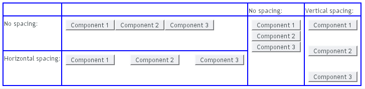
The VerticalLayout,
HorizontalLayout, and
GridLayout layouts offer a
setSpacing() method for enabling space between
the cells in the layout. Enabling the spacing adds a spacing style for all
cells except the first so that, by setting the left or top padding, you
can specify the amount of spacing.
To enable spacing, simply call setSpacing(true)
for the layout as follows:
HorizontalLayout layout2 = new HorizontalLayout();
layout2.addStyleName("spacingexample");
layout2.setSpacing(true);
layout2.addComponent(new Button("Component 1"));
layout2.addComponent(new Button("Component 2"));
layout2.addComponent(new Button("Component 3"));

VerticalLayout layout4 = new VerticalLayout();
layout4.addStyleName("spacingexample");
layout4.setSpacing(true);
layout4.addComponent(new Button("Component 1"));
layout4.addComponent(new Button("Component 2"));
layout4.addComponent(new Button("Component 3"));
In practise, the setSpacing() method toggles
between the "v-COMPONENTCLASSNAME-spacing-on" and
"-off" CSS class names in the cell elements. Elements
having those class names can be used to define the spacing metrics in a
theme.
The layouts have a spacing style name to define spacing also when spacing is off. This allows you to define a small default spacing between components by default and a larger one when the spacing is actually enabled.
Spacing can be horizontal (for HorizontalLayout),
vertical (for VerticalLayout), or both (for
GridLayout). The name of the spacing style for
horizontal and vertical spacing is the base name of the component style
name plus the "-spacing-on" suffix, as shown in the
following table:
Table 6.3. Spacing Style Names
VerticalLayout | v-verticallayout-spacing-on |
HorizontalLayout | v-horizontallayout-spacing-on |
GridLayout | v-gridlayout-spacing-on |
In the CSS example below, we specify the exact amount of spacing for the
code example given above, for the layouts with the custom
"spacingexample" style:
/* Set the amount of horizontal cell spacing in a
 * specific element with the "-spacingexample" style. */
.v-horizontallayout-spacingexample .v-horizontallayout-spacing-on {
    padding-left: 30px;
}

/* Set the amount of vertical cell spacing in a
 * specific element with the "-spacingexample" style. */
.v-verticallayout-spacingexample .v-verticallayout-spacing-on {
    padding-top: 30px;
}

/* Set the amount of both vertical and horizontal cell spacing
 * in a specific element with the "-spacingexample" style. */
.v-gridlayout-spacingexample .v-gridlayout-spacing-on {
    padding-top: 30px;
    padding-left: 50px;
}
The resulting layouts will look as shown in Figure 6.23, “Layout Spacings”, which also shows the layouts with no spacing.
Note
Spacing is unrelated to "cell spacing" in HTML tables. While many
layout components are implemented with HTML tables in the browser,
this implementation is not guaranteed to stay the same and at least
Vertical-/HorizontalLayout
could be implemented with <div> elements as
well. In fact, as GWT compiles widgets separately for different
browsers, the implementation could even vary between browsers.
Also note that HTML elements with spacing classnames don't necessarily exist in a component after rendering, because the Client-Side Engine of Vaadin processes them.
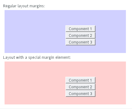
By default, layout components do not have any margin around them. You can
add margin with CSS directly to the layout component. Below we set margins
for a specific layout component (here a horizontallayout):
layout1.addStyleName("marginexample1");
.v-horizontallayout-marginexample1
        .v-horizontallayout-margin {
	padding-left:   200px;
	padding-right:  100px;
	padding-top:    50px;
	padding-bottom: 25px;
}
Similar settings exist for other layouts such as verticallayout.
The layout size calculations require the margins to be defined as
CSS padding rather than as CSS
margin.
As an alternative to the pure CSS method, you can set up a margin around the
layout that can be enabled with setMargin(true).
The margin element has some default margin widths, but you can adjust the
widths in CSS if you need to.
Let us consider the following example, where we enable the margin on all sides of the layout:
// Create a layout
HorizontalLayout layout2 = new HorizontalLayout();
containinglayout.addComponent(
    new Label("Layout with margin on all sides:"));
containinglayout.addComponent(layout2);

// Set style name for the layout to allow styling it
layout2.addStyleName("marginexample");

// Have margin on all sides around the layout
layout2.setMargin(true);

// Put something inside the layout
layout2.addComponent(new Label("Cell 1"));
layout2.addComponent(new Label("Cell 2"));
layout2.addComponent(new Label("Cell 3"));
You can enable the margins only for specific sides. The margins are
specified for the setMargin() method in clockwise
order for top, right, bottom, and left margin. The following would enable
the top and left margins:
layout2.setMargin(true, false, false, true);
You can specify the actual margin widths in the CSS if you are not
satisfied with the default widths (in this example for a
HorizontalLayout):
.v-horizontallayout-marginexample .v-horizontallayout-margin-left   {padding-left:   200px;}
.v-horizontallayout-marginexample .v-horizontallayout-margin-right  {padding-right:  100px;}
.v-horizontallayout-marginexample .v-horizontallayout-margin-top    {padding-top:    50px; }
.v-horizontallayout-marginexample .v-horizontallayout-margin-bottom {padding-bottom: 25px; }
The resulting margins are shown in Figure 6.24, “Layout Margins” below. The two ways produce identical margins.
The CSS style names for the margin widths for
setMargin() consist of the specific layout
name plus -margin-left and so on.
The CSS style names for CSS-only margins consist of the specific
layout name plus -margin.
Below, the style rules are given for
VerticalLayout:
/* Alternative 1: CSS only style */
.v-verticallayout-margin {
    padding-left:   ___px;
    padding-right:  ___px;
    padding-top:    ___px;
    padding-bottom: ___px;
}
/* Alternative 2: CSS rules to be enabled in code */
.v-verticallayout-margin-left   {padding-left:   ___px;}
.v-verticallayout-margin-right  {padding-right:  ___px;}
.v-verticallayout-margin-top    {padding-top:    ___px;}
.v-verticallayout-margin-bottom {padding-bottom: ___px;}