6.3. VerticalLayout and HorizontalLayout
VerticalLayout and
HorizontalLayout are containers for laying components
out either vertically or horizontally, respectively. These are the two most
important layout components in Vaadin and some components, such as
Window and Panel, have a
VerticalLayout as the root layout, which you can set
with setContent().
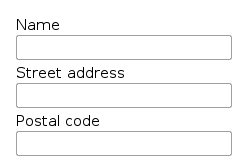
Typical use of the layouts goes as follows:
 |
VerticalLayout vertical = new VerticalLayout ();
vertical.addComponent(new TextField("Name"));
vertical.addComponent(new TextField("Street address"));
vertical.addComponent(new TextField("Postal code"));
main.addComponent(vertical);
In these layouts, component captions are placed above the component. The layout will look on screen as follows:
Using HorizontalLayout gives the following layout:

The layouts can have spacing between the horizontal or vertical cells,
defined with setSpacing(), as described in Section 6.12.3, “Layout Cell Spacing”. The contained components can be
aligned within their cells with
setComponentAlignment(), as described in Section 6.12.2, “Layout Cell Alignment”.
The components contained within an ordered layout can be laid out in a number of different ways depending on how you specify their height or width in the primary direction of the layout component.
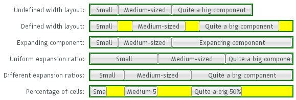
Figure 6.2, “Component Widths in HorizontalLayout” above gives a
summary of the sizing options for a
HorizontalLayout. The figure is broken down in the
following subsections.
If a VerticalLayout has undefined height or
HorizontalLayout undefined width, the layout
will shrink to fit the contained components so that there is no extra
space between them.
HorizontalLayout fittingLayout = new HorizontalLayout();
fittingLayout.setWidth(Sizeable.SIZE_UNDEFINED, 0); // Default
fittingLayout.addComponent(new Button("Small"));
fittingLayout.addComponent(new Button("Medium-sized"));
fittingLayout.addComponent(new Button("Quite a big component"));
parentLayout.addComponent(fittingLayout);

The both layouts actually have undefined height by default and
HorizontalLayout has also undefined width,
while VerticalLayout has 100% relative width.
If such a vertical layout with undefined height continues below the
bottom of a window (a Window object), the
window will pop up a vertical scroll bar on the right side of the
window area. This way, you get a "web page". The same applies to
Panel.
A layout that contains components with percentual size must have a defined size!
If a layout has undefined size and a contained component has, say, 100% size, the component would fill the space given by the layout, while the layout would shrink to fit the space taken by the component, which would be a paradox. This requirement holds for height and width separately. The debug mode allows detecting such invalid cases; see Section 12.4.1, “Debug Mode”.
An exception to the above rule is a case where you have a layout with undefined size that contains a component with a fixed or undefined size together with one or more components with relative size. In this case, the contained component with fixed (or undefined) size in a sense defines the size of the containing layout, removing the paradox. That size is then used for the relatively sized components.
The technique can be used to define the width of a
VerticalLayout or the height of a
HorizontalLayout.
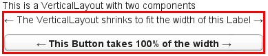
|
// Vertical layout would normally have 100% width
VerticalLayout vertical = new VerticalLayout();

// Shrink to fit the width of contained components
vertical.setWidth(Sizeable.SIZE_UNDEFINED, 0);

// Label has normally 100% width, but we set it as
// undefined so that it will take only the needed space
Label label =
    new Label("\u2190 The VerticalLayout shrinks to fit "+
              "the width of this Label \u2192");
label.setWidth(Sizeable.SIZE_UNDEFINED, 0);
vertical.addComponent(label);

// Button has undefined width by default
Button butt = new Button("\u2190 This Button takes 100% "+
                         "of the width \u2192");
butt.setWidth("100%");
vertical.addComponent(butt);
If you set a HorizontalLayout to a defined size
horizontally or a VerticalLayout vertically,
and there is space left over from the contained components, the extra
space is distributed equally between the component cells. The
components are aligned within these cells according to their
alignment setting, top left by default, as in the example below.
fixedLayout.setWidth("400px");

Using percentual sizes for components contained in a layout requires answering the question, "Percentage of what?" There is no sensible default answer for this question in the current implementation of the layouts, so in practice, you may not define "100%" size alone.
Often, you want to have one component that takes all the available
space left over from other components. You need to set its size as
100% and set it as expanding with
setExpandRatio(). The second parameter for
the method is an expansion ratio, which is relevant if there are more
than one expanding component, but its value is irrelevant for a single
expanding component.
HorizontalLayout layout = new HorizontalLayout();
layout.setWidth("400px");

// These buttons take the minimum size.
layout.addComponent(new Button("Small"));
layout.addComponent(new Button("Medium-sized"));

// This button will expand.
Button expandButton = new Button("Expanding component");

// Use 100% of the expansion cell's width.
expandButton.setWidth("100%");

// The component must be added to layout before setting the ratio.
layout.addComponent(expandButton);

// Set the component's cell to expand.
layout.setExpandRatio(expandButton, 1.0f);

parentLayout.addComponent(layout);

Notice that you must call setExpandRatio()
after addComponent(),
because the layout can not operate on an component that it doesn't
(yet) include.
If you specify an expand ratio for multiple components, they will all try to use the available space according to the ratio.
HorizontalLayout layout = new HorizontalLayout();
layout.setWidth("400px");

// Create three equally expanding components.
String[] captions = { "Small", "Medium-sized",
                      "Quite a big component" };
for (int i = 1; i <= 3; i++) {
    Button button = new Button(captions[i-1]);
    button.setWidth("100%");
    layout.addComponent(button);

    // Have uniform 1:1:1 expand ratio.
    layout.setExpandRatio(button, 1.0f);
}

As the example used the same ratio for all components, the ones with more content may have the content cut. Below, we use differing ratios:
// Expand ratios for the components are 1:2:3.
layout.setExpandRatio(button, i * 1.0f);

If the size of the expanding components is defined as a percentage
(typically "100%"), the ratio is calculated from the
overall space available for the relatively sized
components. For example, if you have a 100 pixels wide layout with two
cells with 1.0 and 4.0 respective expansion ratios, and both the
components in the layout are set as
setWidth("100%"), the cells will have
respective widths of 20 and 80 pixels, regardless of the minimum size
of the components.
However, if the size of the contained components is undefined or fixed, the expansion ratio is of the excess available space. In this case, it is the excess space that expands, not the components.
for (int i = 1; i <= 3; i++) {
    // Button with undefined size.
    Button button = new Button(captions[i - 1]);

    layout4.addComponent(button);

    // Expand ratios are 1:2:3.
    layout4.setExpandRatio(button, i * 1.0f);
}

It is not meaningful to combine expanding components with percentually defined size and components with fixed or undefined size. Such combination can lead to a very unexpected size for the percentually sized components.
A percentual size of a component defines the size of the component within its cell. Usually, you use "100%", but a smaller percentage or a fixed size (smaller than the cell size) will leave an empty space in the cell and align the component within the cell according to its alignment setting, top left by default.
HorizontalLayout layout50 = new HorizontalLayout();
layout50.setWidth("400px");

String[] captions1 = { "Small 50%", "Medium 50%",
                       "Quite a big 50%" };
for (int i = 1; i <= 3; i++) {
    Button button = new Button(captions1[i-1]);
    button.setWidth("50%");
    layout50.addComponent(button);

    // Expand ratios for the components are 1:2:3.
    layout50.setExpandRatio(button, i * 1.0f);
}
parentLayout.addComponent(layout50);
