6.6. Panel
Panel is a simple container with a frame and an
optional caption. The content area is bound to a an inner layout component for
laying out the contained components. The default content layout is a
VerticalLayout, but you can change it with the
setContent() method to be any class implementing the
ComponentContainer interface.
The caption can have an icon in addition to the text.
// Create a panel with a caption.
final Panel panel = new Panel("Contact Information");
panel.addStyleName("panelexample");

// The width of a Panel is 100% by default, make it
// shrink to fit the contents.
panel.setWidth(Sizeable.SIZE_UNDEFINED, 0);

// Create a layout inside the panel
final FormLayout form = new FormLayout();

// Have some margin around it.
form.setMargin(true);

// Add some components
form.addComponent(new TextField("Name"));
form.addComponent(new TextField("Email"));

// Set the layout as the root layout of the panel
panel.setContent(form);
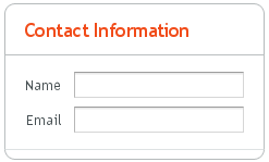
The resulting layout is shown in Figure 6.7, “A Panel Layout in Runo Theme” with
the Runo theme.
See Section 6.2, “Window and Panel Root Layout” for more information about setting the content layout.
Panel has 100% width and undefined width by
default. This corresponds with the default sizing of
VerticalLayout, the default root layout of
Panel. If you set undefined width for a panel, also the
root layout must have undefined width to avoid a paradox.
.v-panel {}
.v-panel-caption {}
.v-panel-nocaption {}
.v-panel-content {}
.v-panel-deco {}
The entire panel has v-panel style. A panel
consists of three parts: the caption, content, and bottom decorations
(shadow). These can be styled with v-panel-caption,
v-panel-content, and
v-panel-deco, respectively. If the panel has no
caption, the caption element will have the style
v-panel-nocaption.
The built-in light style has no borders or border
decorations for the Panel. You enable it simply by
adding the light style name for the panel, as is done
in the example below. You can also use the
PANEL_LIGHT constant defined in
BaseTheme class; it is usable in all subthemes.
// Have a window with a SplitPanel.
final Window window = new Window("Window with a Light Panel");
window.setWidth("400px");
window.setHeight("200px");
final HorizontalSplitPanel splitter =
        new HorizontalSplitPanel();
window.setContent(splitter);

// Create a panel with a caption.
final Panel light = new Panel("Light Panel");
light.setSizeFull();

// The "light" style is a predefined style without borders
light.addStyleName(Runo.PANEL_LIGHT);

light.addComponent(new Label("The light Panel has no borders."));
light.getLayout().setMargin(true);

// The Panel will act as a "caption" of the left panel
// in the SplitPanel.
splitter.addComponent(light);
splitter.setSplitPosition(250, Sizeable.UNITS_PIXELS);

main.addWindow(window);
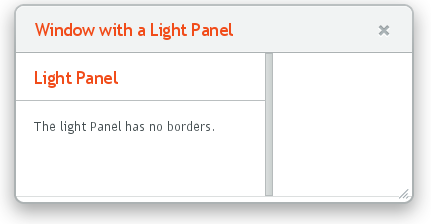
Figure 6.8, “A Panel with Light Style” shows the rendered
Panel in the Runo theme.
The light style is typical when using a
Panel as the root layout of a window or some
similar layout, as in the example above.
Normally, if a panel has undefined size in a direction, as it has by
default vertically, it will fit the size of the content and grow as the
content grows. However, if it has a fixed or percentual size and its
content becomes too big to fit in the content area, a scroll bar will
appear for the particular direction. Scroll bars in a
Panel are handled natively by the browser with the
overflow: auto property in CSS.
In the following example, the Embedded component
has undefined size in both dimensions by default, but we also have to set
undefined size for the root layout of the panel as the default
VerticalLayout only has undefined height by
default.
// Serve the image from the theme
Resource rsrc = new ThemeResource("img/embedded-journalist.jpg");

// Display the image without caption
Embedded image = new Embedded(null, rsrc);
image.setSizeUndefined(); // Actually the default

// The panel will give it scrollbars. The root layout
// (VerticalLayout) must have undefined width to make the
// horizontal scroll bar appear.
Panel panel = new Panel("Embedding");
panel.setWidth("400px");
panel.setHeight("300px");
panel.getContent().setSizeUndefined();
panel.addComponent(image);

layout.addComponent(panel);
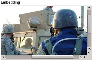
The result is shown in Figure 6.9, “Panel with Scroll Bars”.
Panel implements the
Scrollable interface to allow
programmatic scrolling. You first need to enable
programmatic scrolling with setScrollable(true),
after which you can set the scroll position in pixels with
setScrollTop() and
setScrollLeft().
Consider the following example:
final Panel panel = new Panel("Scrolling Panel");
panel.setHeight("300px");
panel.setWidth("400px");
panel.getContent().setHeight("1000px");
panel.setScrollable(true);

layout.addComponent(panel);

HorizontalLayout scrollButtons = new HorizontalLayout();
layout.addComponent(scrollButtons);

Button scrollUp = new Button("Scroll Up");
scrollUp.addListener(new Button.ClickListener() {
    public void buttonClick(ClickEvent event) {
        int scrollPos = panel.getScrollTop() - 250;
        if (scrollPos < 0)
            scrollPos = 0;
        panel.setScrollTop(scrollPos);
    }
});
scrollButtons.addComponent(scrollUp);

Button scrollDown = new Button("Scroll Down");
scrollDown.addListener(new Button.ClickListener() {
    public void buttonClick(ClickEvent event) {
        int scrollPos = panel.getScrollTop();
        if (scrollPos > 1000)
            scrollPos = 1000;
        panel.setScrollTop(scrollPos + 250);
    }
});
scrollButtons.addComponent(scrollDown);