6.5. FormLayout
FormLayout is the default layout of a
Form component. It lays the form fields and their
captions out in two columns, with optional indicators for required fields and
errors that can be shown for each field.
A Form handles additional layout elements
itself, including a caption, a form description, a form error indicator,
a footer that is often used for buttons and a border. For more
information on these, see Section 5.19, “Form”.
The field captions can have an icon in addition to the text.
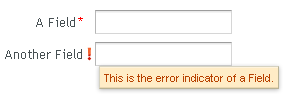
// A FormLayout used outside the context of a Form
FormLayout fl = new FormLayout();

// Make the FormLayout shrink to its contents
fl.setSizeUndefined();

TextField tf = new TextField("A Field");
fl.addComponent(tf);

// Mark the first field as required
tf.setRequired(true);
tf.setRequiredError("The Field may not be empty.");

TextField tf2 = new TextField("Another Field");
fl.addComponent(tf2);

// Set the second field straing to error state with a message.
tf2.setComponentError(
    new UserError("This is the error indicator of a Field."));
The resulting layout will look as follows. The error message shows in a tooptip when you hover the mouse pointer over the error indicator.
.v-formlayout {}
.v-formlayout .v-caption {}

/* Columns in a field row. */
.v-formlayout-contentcell {} /* Field content. */
.v-formlayout-captioncell {} /* Field caption. */
.v-formlayout-errorcell {}   /* Field error indicator. */

/* Overall style of field rows. */
.v-formlayout-row {}
.v-formlayout-firstrow {}
.v-formlayout-lastrow {}

/* Required field indicator. */
.v-formlayout .v-required-field-indicator {}
.v-formlayout-captioncell .v-caption
        .v-required-field-indicator {}

/* Error indicator. */
.v-formlayout-cell .v-errorindicator {}
.v-formlayout-error-indicator .v-errorindicator {}
The top-level element of FormLayout has the
v-formlayout style. The layout is tabular with three
columns: the caption column, the error indicator column, and the field
column. These can be styled with
v-formlayout-captioncell,
v-formlayout-errorcell, and
v-formlayout-contentcell, respectively. While the
error indicator is shown as a dedicated column, the indicator for required
fields is currently shown as a part of the caption column.
For information on setting margins and spacing, see also Section 6.12.3, “Layout Cell Spacing” and Section 6.12.4, “Layout Margins”.