7.3. Using The Visual Designer
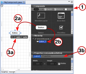
The visual editor view consists of, on the left side, an editing area that displays the current layout and, on the right side, a control panel that contains a component list for selecting new components to add, the current component tree, and a component property panel.
Adding new components to the user interface is done as follows by dragging them from the component list to either the editing area or to the component tree. If you drag the components to the tree,
- Select which components are shown in the component list by entering a search string or by expanding the filters and selecting only the desired component categories.
-
Drag a component from the component list to either:
- Editing area, where you can easily move and resize the component. Dragging a component onto a layout component will add it in it and you can also position components within a layout by dragging them.
- Component tree. Remember that you can only add components under a layout component or other component container.
-
Edit the component properties
- In the editing area, you can move and resize the components, and set their alignment in the containing layout.
- In the property panel, you can set the component name, size, position and other properties.
You can delete a component by right-clicking it in the component tree and selecting . The context menu also allows copying and pasting components.
A composite component created by the plugin must have a
AbsoluteLayout as its root layout. While it is
suitable for the visual designer, absolute layouts are rarely used
otherwise in Vaadin applications. If you want to use another root layout,
you can add another layout inside the mainLayout and
set that as the root with setCompositionRoot() in
the source view. It will be used as the root when the component is
actually used in an application.
The property setting sub-panel of the control panel allows setting component properties. The panel has two tabs: Layout and Properties, where the latter defines the various basic properties.
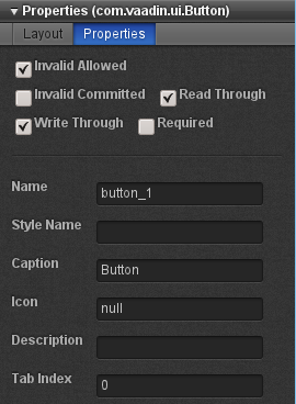
The top section of the property panel, shown in Figure 7.3, “Basic Component Properties”, allows setting basic component properties. The panel also includes properties such as field properties for field components.
The properties are as follows:
- Name
-
The name of the component, which is used for the reference to the component, so it must obey Java notation for variable names.
- Style Name
-
A space-separated list of CSS style class names for the component. See Chapter 8, Themes for information on component styles in themes.
- Caption
-
The caption of a component is usually displayed above the component. Some components, such as
Button, display the caption inside the component. ForLabeltext, you should set the value of the label instead of the caption, which should be left empty. - Description (tooltip)
-
The description is usually displayed as a tooltip when the mouse pointer hovers over the component for a while. Some components, such as
Formhave their own way of displaying the description. - Icon
-
The icon of a component is usually displayed above the component, left of the caption. Some components, such as
Button, display the icon inside the component. - Formatting type
-
Some components allow different formatting types, such as
Label, which allow formatting either as Text, XHTML, Preformatted, and Raw. - Value
-
The component value. The value type and how it is displayed by the component varies between different component types and each value type has its own editor. The editor opens by clicking on the button.
Most of the basic component properties are defined in the
Component interface; see Section 5.2.1, “Component Interface” for further details.
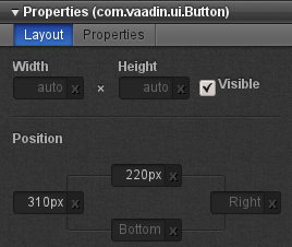
The size of a component is determined by its width and height, which
you can give in the two edit boxes in the control panel. You can use
any unit specifiers for components, as described in Section 5.3.9, “Sizing Components”. Emptying a size box will
make the size "automatic", which means setting the size as
undefined. In the generated code, the undefined
value will be expressed as "-1px".
Setting width of "100px" and
auto (undefined or empty) height would result in
the following generated settings for a button:
// myButton
myButton = new Button();
...
myButton.setHeight("-1px");
myButton.setWidth("100px");
...
Figure 7.4, “Layout Properties” shows the control panel area for the size and position.
The generated code for the example would be:
// myButton
myButton = new Button();
myButton.setWidth("-1px");
myButton.setHeight("-1px");
myButton.setImmediate(true);
myButton.setCaption("My Button");
mainLayout.addComponent(myButton,
                        "top:243.0px;left:152.0px;");
The position is given as a CSS position in the second parameter for
addComponent(). The values
"-1px" for width and height will make the button to
be sized automatically to the minimum size required by the caption.
When editing the position of a component inside an
AbsoluteLayout, the editor will display
vertical and horizontal guides, which you can use to set the position
of the component. See Section 7.3.3, “Editing an AbsoluteLayout”
for more information about editing absolute layouts.
The ZIndex setting controls the "Z coordinate" of
the components, that is, which component will overlay which when they
overlap. Value -1 means automatic, in which case
the components added to the layout later will be on top.
The visual editor has interactive support for the
AbsoluteLayout component that allows positioning
components exactly at specified coordinates. You can position the
components using guides that control the position attributes, shown in the
control panel on the right. The position values are measured in pixels
from the corresponding edge; the vertical and horizontal rulers show the
distances from the top and left edge.
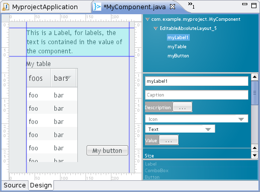
Figure 7.5, “Positioning with AbsoluteLayout” shows three
components, a Label, a
Table, and a Button, inside
an AbsoluteLayout.
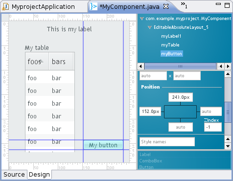
Position attributes that are empty are automatic and
can be either zero (at the edge) or dynamic to make it shrink to fit the
size of the component, depending on the component. Guides are shown also
for the automatic position attributes and move automatically; in Figure 7.5, “Positioning with AbsoluteLayout” the right and
bottom edges of the Button are automatic.
Moving an automatic guide manually makes the guide and the corresponding
the position attribute non-automatic. To make a manually set attribute
automatic, empty it in the control panel. Figure 7.6, “Manually positioned Label” shows a
Label component with all the four edges set
manually. Notice that if an automatic position is 0, the guide is at the
edge of the ruler.