Common Component Features
- Caption
- Description and Tooltips
- Enabled
- Icon
- Locale
- Read-Only
- Style Name
- Visible
- Sizing Components
- Managing Input Focus
The component base classes and interfaces provide a large number of features. Let us look at some of the most commonly needed features. Features not documented here can be found from the Java API Reference.
The interface defines a number of properties, which you can retrieve or manipulate with the corresponding setters and getters.
Caption
A caption is an explanatory textual label accompanying a user interface component, usually shown above, left of, or inside the component. The contents of a caption are automatically quoted, so no raw HTML can be rendered in a caption.
The caption text can usually be given as the first parameter of a constructor of a component or with setCaption().
Source code
Java
// New text field with caption "Name"
TextField name = new TextField("Name");
layout.addComponent(name);
The caption of a component is, by default, managed and displayed by the layout component or component container inside which the component is placed. For example, the VerticalLayout component shows the captions left-aligned above the contained components, while the FormLayout component shows the captions on the left side of the vertically laid components, with the captions and their associated components left-aligned in their own columns. The CustomComponent does not manage the caption of its composition root, so if the root component has a caption, it will not be rendered.
Some components, such as Button and Panel, manage the caption themselves and display it inside the component.
Icon (see Icon) is closely related to caption and is usually displayed horizontally before or after it, depending on the component and the containing layout. Also the required indicator in field components is usually shown before or after the caption.
An alternative way to implement a caption is to use another component as the caption, typically a Label, a TextField, or a Panel. A Label, for example, allows highlighting a shortcut key with HTML markup or to bind the caption to a data source. The Panel provides an easy way to add both a caption and a border around a component.
CSS Style Rules
Source code
CSS
.v-caption {}
  .v-captiontext {}
  .v-required-field-indicator {}
A caption is be rendered inside an HTML element that has the v-caption CSS style class. The containing layout may enclose a caption inside other caption-related elements.
Some layouts put the caption text in a v-captiontext element. An optional required indicator in field components is contained in a separate element with v-required-field-indicator style.
Description and Tooltips
All components (that inherit AbstractComponent) have a description separate from their caption. The description is usually shown as a tooltip that appears when the mouse pointer hovers over the component for a short time.
You can set the description with setDescription() and retrieve with getDescription().
Source code
Java
Button button = new Button("A Button");
button.setDescription("This is the tooltip");
The tooltip is shown in Component Description as a Tooltip.
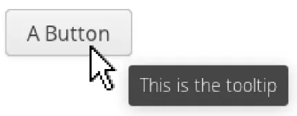
A description is rendered as a tooltip in most components.
When a component error has been set with setComponentError(), the error is usually also displayed in the tooltip, below the description. Components that are in error state will also display the error indicator. See "Error Indicator and Message".
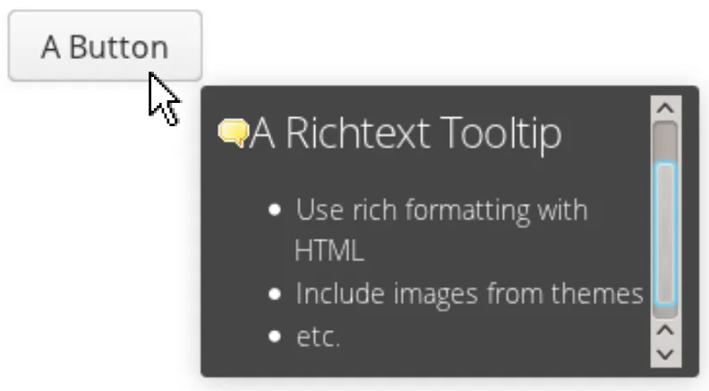
The description is actually not plain text, but you can use HTML tags to format it. Such a rich text description can contain any HTML elements, including images.
Source code
Java
button.setDescription(
    "<h2><img src=\"../VAADIN/themes/sampler/"+
    "icons/comment_yellow.gif\"/>"+
    "A richtext tooltip</h2>"+
    "<ul>"+
    "  <li>Use rich formatting with HTML</li>"+
    "  <li>Include images from themes</li>"+
    "  <li>etc.</li>"+
    "</ul>");
The result is shown in A Rich Text Tooltip.
Enabled
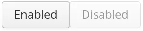
The enabled property controls whether the user can actually use the component. A disabled component is visible, but grayed to indicate the disabled state.
Components are always enabled by default. You can disable a component with setEnabled(false).
Source code
Java
Button enabled = new Button("Enabled");
enabled.setEnabled(true); // The default
layout.addComponent(enabled);

Button disabled = new Button("Disabled");
disabled.setEnabled(false);
layout.addComponent(disabled);
An Enabled and Disabled Button shows the enabled and disabled buttons.
A disabled component is automatically put in read-only like state. No client interaction with a disabled component is sent to the server and, as an important security feature, the server-side components do not receive state updates from the client in the disabled state. This feature exists in all built-in components in the Framework meaning all client to server RPC calls are ignored for disabled components.
CSS Style Rules
Disabled components have the v-disabled CSS style in addition to the component-specific style. To match a component with both the styles, you have to join the style class names with a dot as done in the example below.
Source code
CSS
.v-textfield.v-disabled {
    border: dotted;
}
This would make the border of all disabled text fields dotted.
In the Valo theme, the opacity of disabled components is specified with the
$v-disabled-opacity parameter.
Icon
An icon is an explanatory graphical label accompanying a user interface component, usually shown above, left of, or inside the component. Icon is closely related to caption (see Caption) and is usually displayed horizontally before or after it, depending on the component and the containing layout.
The icon of a component can be set with the setIcon() method. The image is provided as a resource, perhaps most typically a ThemeResource.
Source code
Java
// Component with an icon from a custom theme
TextField name = new TextField("Name");
name.setIcon(new ThemeResource("icons/user.png"));
layout.addComponent(name);

// Component with an icon from another theme ('runo')
Button ok = new Button("OK");
ok.setIcon(new ThemeResource("../runo/icons/16/ok.png"));
layout.addComponent(ok);
The icon of a component is, by default, managed and displayed by the layout component or component container in which the component is placed. For example, the VerticalLayout component shows the icons left-aligned above the contained components, while the FormLayout component shows the icons on the left side of the vertically laid components, with the icons and their associated components left-aligned in their own columns. The CustomComponent does not manage the icon of its composition root, so if the root component has an icon, it will not be rendered.
Some components, such as Button and Panel, manage the icon themselves and display it inside the component.
In addition to image resources, you can use font icons, which are icons included in special fonts, but which are handled as special resources. See "Font Icons" for more details.
Locale
The locale property defines the country and language used in a component. You can use the locale information in conjunction with an internationalization scheme to acquire localized resources. Some components, such as DateField, use the locale for component localization.
You can set the locale of a component (or the application) with setLocale() as follows:
Source code
Java
// Component for which the locale is meaningful
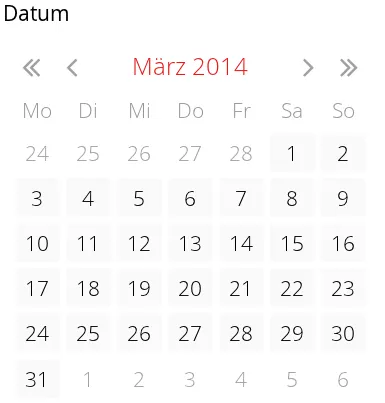
InlineDateField date = new InlineDateField("Datum");
// German language specified with ISO 639-1 language
// code and ISO 3166-1 alpha-2 country code.
date.setLocale(new Locale("de", "DE"));
date.setResolution(Resolution.DAY);
layout.addComponent(date);The resulting date field is shown in Set locale for InlineDateField.
Getting the Locale
You can get the locale of a component with getLocale(). If the locale is undefined for a component, that is, not explicitly set, the locale of the parent component is used. If none of the parent components have a locale set, the locale of the UI is used, and if that is not set, the default system locale is set, as given by Locale.getDefault().
The getLocale() returns null if the component is not yet attached to the UI, which is usually the case in most constructors, so it is a bit awkward to use it for internationalization. You can get the locale in attach(), as shown in the following example:
Source code
Java
Button cancel = new Button() {
    @Override
    public void attach() {
        super.attach();
        ResourceBundle bundle = ResourceBundle.getBundle(
            MyAppCaptions.class.getName(), getLocale());
        setCaption(bundle.getString(MyAppCaptions.CancelKey));
    }
};
layout.addComponent(cancel);
However, it is normally a better practice to use the locale of the current UI to get the localized resource right when the component is created.
Source code
Java
// Captions are stored in MyAppCaptions resource bundle
// and the UI object is known in this context.
ResourceBundle bundle =
    ResourceBundle.getBundle(MyAppCaptions.class.getName(),
        UI.getCurrent().getLocale());

// Get a localized resource from the bundle
Button cancel =
    new Button(bundle.getString(MyAppCaptions.CancelKey));
layout.addComponent(cancel);
Selecting a Locale
A common task in many applications is selecting a locale. The locale can be set for the UI or single Component. By default each component uses the locale from the UI it has been attached to. Setting a locale to a Component only applies the locale to that component and its children. Note, that updating the locale for a component does not update its children, thus any child component that uses the locale should be updated manually.
Read-Only
The property defines whether the value of a component can be changed. The property is only applicable to components implementing the HasValue interface.
Source code
Java
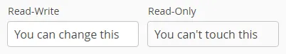
TextField readwrite = new TextField("Read-Write");
readwrite.setValue("You can change this");
readwrite.setReadOnly(false); // The default

TextField readonly = new TextField("Read-Only");
readonly.setValue("You can't touch this!");
readonly.setReadOnly(true);
The resulting read-only text field is shown in A read-only component.
Notice that the value of a selection component is the selection, not its items. A read-only selection component doesn’t therefore allow its selection to be changed, but other changes are possible. For example, if you have a Grid with a read-only selection model in editable mode, its contained fields and the underlying data model can still be edited, and the user could sort it or reorder the columns.
Client-side state modifications will not be communicated to the server-side and, more importantly, server-side field components will not accept changes to the value of a read-only HasValue component. The latter is an important security feature, because a malicious user can not fabricate state changes in a read-only field.
Also notice that while the read-only status applies automatically to the value of a field, it does not apply to other component variables. A read-only component can accept some other state changes from the client-side and some of such changes could be acceptable, such as change in the scroll bar position of a ListSelect. Custom components should check the read-only state for variables bound to business data.
CSS Style Rules
Setting a normally editable component to read-only state can change its appearance to disallow editing the value. In addition to CSS styling, also the HTML structure can change. For example, TextField loses the edit box and appears much like a Label.
A read-only component will have the v-readonly style. The following CSS rule would make the text in all read-only TextField components appear in italic.
Source code
CSS
.v-textfield.v-readonly {
    font-style: italic;
}
Style Name
The style name property defines one or more custom CSS style class names for the component. The getStyleName() returns the current style names as a space-separated list. The setStyleName() replaces all the styles with the given style name or a space-separated list of style names. You can also add and remove individual style names with addStylename() and removeStyleName(). A style name must be a valid CSS style name.
Source code
Java
Label label = new Label("This text has a lot of style");
label.addStyleName("mystyle");
layout.addComponent(label);
The style name will appear in the component’s HTML element in two forms: literally as given and prefixed with the component-specific style name. For example, if you add a style name mystyle to a Button, the component would get both mystyle and v-button-mystyle styles. Neither form may conflict with built-in style names of Vaadin. For example, focus style would conflict with a built-in style of the same name, and an content style for a Panel component would conflict with the built-in v-panel-content style.
The following CSS rule would apply the style to any component that has the mystyle style.
Source code
CSS
.mystyle {
    font-family: fantasy;
    font-style:  italic;
    font-size:   25px;
    font-weight: bolder;
    line-height: 30px;
}
The resulting styled component is shown in Component with a custom style
Visible
Components can be hidden by setting the visible property to false. Also the caption, icon and any other component features are made hidden. Hidden components are not just invisible, but their content is not communicated to the browser at all. That is, they are not made invisible cosmetically with only CSS rules. This feature is important for security if you have components that contain security-critical information that must only be shown in specific application states.
Source code
Java
TextField invisible = new TextField("No-see-um");
invisible.setValue("You can't see this!");
invisible.setVisible(false);
layout.addComponent(invisible);
If you need to make a component only cosmetically invisible, you should use a custom theme to set it display: none style. This is mainly useful for some special components that have effects even when made invisible in CSS. If the hidden component has undefined size and is enclosed in a layout that also has undefined size, the containing layout will collapse when the component disappears. If you want to have the component keep its size, you have to make it invisible by setting all its font and other attributes to be transparent. In such cases, the invisible content of the component can be made visible easily in the browser.
Sizing Components
Vaadin components are sizeable; not in the sense that they were fairly large or that the number of the components and their features are sizeable, but in the sense that you can make them fairly large on the screen if you like, or small or whatever size.
The Sizeable interface, shared by all components, provides a number of manipulation methods and constants for setting the height and width of a component in absolute or relative units, or for leaving the size undefined.
The size of a component can be set with setWidth() and setHeight() methods. The methods take the size as a floating-point value. You need to give the unit of the measure as the second parameter for the above methods.
Source code
Java
mycomponent.setWidth(100, Unit.PERCENTAGE);
mycomponent.setWidth(400, Unit.PIXELS);
Alternatively, you can specify the size as a string. The format of such a string must follow the HTML/CSS standards for specifying measures.
Source code
Java
mycomponent.setWidth("100%");
mycomponent.setHeight("400px");
The "100%" percentage value makes the component take all available size in the particular direction. You can also use the shorthand method setSizeFull() to set the size to 100% in both directions.
The size can be undefined in either or both dimensions, which means that the component will take the minimum necessary space. Most components have undefined size by default, but some layouts have full size in horizontal direction. You can set the height, width, or both as undefined with the methods setWidthUndefined(), setHeightUndefined(), and setSizeUndefined(), respectively.
Always keep in mind that a layout with undefined size may not contain components with defined relative size, such as "full size", except in some special cases. See "Layout Size" for details.
If a component inside HorizontalLayout or VerticalLayout has full size in the namesake direction of the layout, the component will expand to take all available space not needed by the other components. See "Layout Size" for details.
Managing Input Focus
When the user clicks on a component, the component gets the input focus, which is indicated by highlighting according to style definitions. If the component allows inputting text, the focus and insertion point are indicated by a cursor. Pressing the Tab key moves the focus to the component next in the focus order.
Focusing is supported by all AbstractField and AbstractListing components and also by components such as Button, Upload, and TabSheet.
The focus order or tab index of a component is defined as a positive integer value, which you can set with setTabIndex() and get with getTabIndex(). The tab index is managed in the context of the page in which the components are contained. The focus order can therefore jump between two any lower-level component containers, such as sub-windows or panels.
The default focus order is determined by the natural hierarchical order of components in the order in which they were added under their parents. The default tab index is 0 (zero).
Giving a negative integer as the tab index removes the component from the focus order entirely.
CSS Style Rules
The component having the focus will have an additional style class with the -focus suffix. For example, a TextField, which normally has the v-textfield style, would additionally have the v-textfield-focus style.
For example, the following would make a text field blue when it has focus.
Source code
CSS
.v-textfield-focus {
    background: lightblue;
}